Save 23% ($351) & Get a Free 1-1 Call with our Team ⏰ : 0d 2h 59m 43s
Yes guys! We’ve had a couple of requests to walk you through how to use the liquidation heat map—how I use it, how we use it at Cryptonary, and what the purpose is behind it.
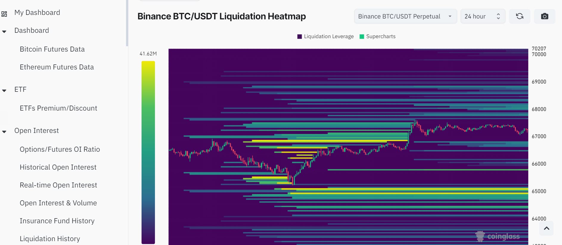
Where to find it
First off, you can find the liquidation heat map on a website called CoinGlass. It’s a great platform on which we do our market mechanic analysis. You’ve got everything on there.So, head to the homepage, select the asset you want to analyze, and you’ll see options like weighted funding rate, open interest, volume, liquidation, and all that good stuff. At the top, you’ll find the liquidation heat maps—this is where we come to do our analysis.
Disclaimer: This is not financial or investment advice. You are responsible for any capital-related decisions you make, and only you are accountable for the results.
What is a Liquidation level?
A liquidation level is essentially where an exchange protects itself from the capital you’ve borrowed to use as leverage in a trade. You get a build-up of liquidation leverage because we’re all trading in the same market, watching the same news, analyzing the same assets, and following similar technical levels.This shared behavior leads to similar liquidation levels, and that’s where we can use it as a tool in our trading arsenal.
Time frames and analysis
Just like with technical analysis, you’ve got different time frames to consider—12-hour, 24-hour, etc. I’d always suggest sticking to the zoomed-out time frames for a broader perspective. It helps you stay calm and composed, avoiding the noise of the market.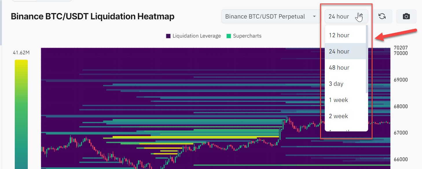
How to read it
Reading the liquidation heat map is pretty straightforward. Essentially, liquidation levels indicate points in price where many traders have taken similar positions, be it long or short. Thanks to the transparency of the crypto market, you can see where these potential liquidation levels are. For us as analysts, these levels can act like magnet zones, guiding us on where support and resistance might be.Using it as a tool
When you see a build-up of liquidation levels on either side of the market, it might indicate a range. For example, if you think the market is going to go up and there’s a significant amount of liquidation levels above the current price, this could suggest that sellers have stepped in, and the market might seek out that liquidity.The heat map helps you project these levels as potential targets, acting as an additional layer of confluence with your other analysis tools.
What does a Liquidation event mean?
A liquidation event happens when someone trades using borrowed money (called leverage), and the price of what they are trading goes in the wrong direction too much. If the price drops (for a long position) or rises (for a short position) to a certain level, the trading platform automatically sells its assets.This is done to protect both the trader and the platform, making sure they don’t lose more money than they have. It’s like the platform taking back its money before the trader loses it all. Liquidation events help keep the system fair and protect everyone involved.
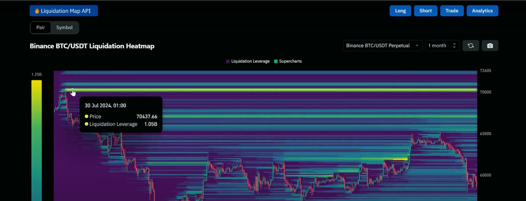
Practical example: Identifying liquidation clusters
Let’s walk through an example:- On the weekly timeframe, you may notice a yellow zone indicating a high concentration of liquidation levels. This indicates that price action is gravitating towards these areas as the market seeks liquidity.
- On Coin Glass, you might find a buildup of around 70K for Bitcoin, suggesting that if Bitcoin rises to that level, it could trigger a short liquidation event, pushing the price even higher.
Pairing liquidation data with other market metrics
A liquidation heat map is most effective when used alongside other market mechanics, such as:- Open interest: Helps determine if there’s a large number of traders holding leveraged positions.
- Funding rate: Indicates market sentiment; a high funding rate means traders are predominantly long.
- Volume: Confirms if there’s enough market activity to push price levels to liquidation zones.
Tips for effective use of the Heat map
- Stay on higher timeframes: To avoid short-term noise and keep your analysis accurate, stick to higher timeframes like weekly or monthly views. This approach provides a clearer picture of significant liquidation zones and overall market trends.
- Look for confluence: Combine the heat map analysis with technical chart setups. For example, if you see a buildup of liquidation levels aligning with a major support/resistance zone on your price chart, it increases the likelihood of a significant price reaction.
Cryptonarys take
In short, the liquidation heat map is like a map—just like your charts. It’s especially useful when it correlates beautifully with price action. I’d recommend getting stuck into it and exploring how it can enhance your analysis. It’s available for most assets on major exchanges like Binance. If you have any more questions about it, feel free to fire them on Discord. Thanks for watching, and I’ll see you in the next one!Master Crypto Trading with Cryptonary 🚀
Understanding tools like the liquidation heat map is key to making smart trades—but what if you had expert insights to guide you?With Cryptonary, you get: ✅ Exclusive crypto research & market updates ✅ Proven trading strategies for bull & bear markets ✅ A community of 17,000+ investors winning together
Try Cryptonary risk-free for 7 days! Click below to start your journey. 🔥
Recommended from Cryptonary