Save 23% ($351) & Get a Free 1-1 Call with our Team ⏰ : 0d 2h 59m 43s

- The Net Position Change shows accumulation, however Bitcoin has been more heavily accumulated during the dip in comparison to Ether.
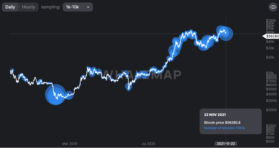
- Large Wallet Inflows for Bitcoin have recently seen one of the largest inflows, a 118k Bitcoin purchase. We are seeing large levels of buying from large wallets in this 20% dip in price over the last week or two.
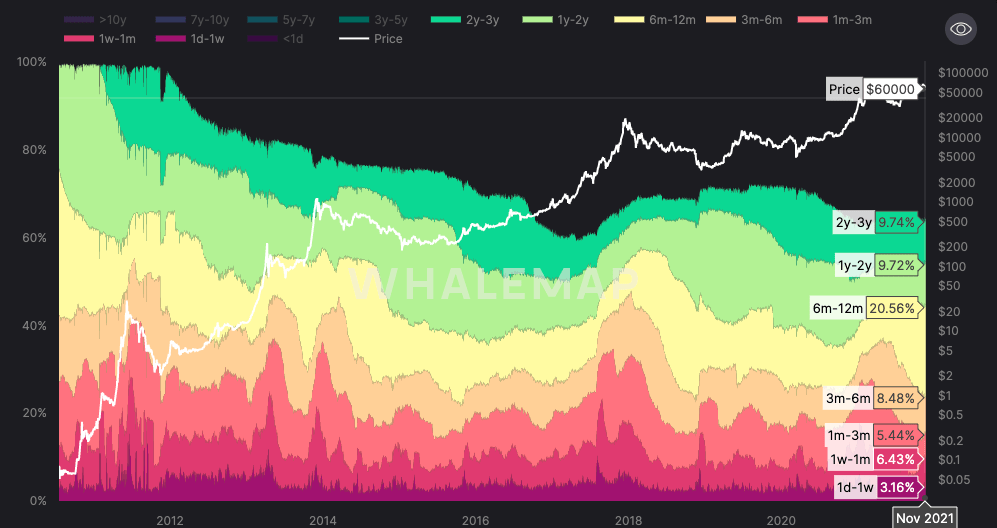
- The HODL Waves has seen longer-term holders own a greater percent of the Bitcoin supply since the May correction, indicating a willingness amongst the longer-term investors to continue holding their coins.
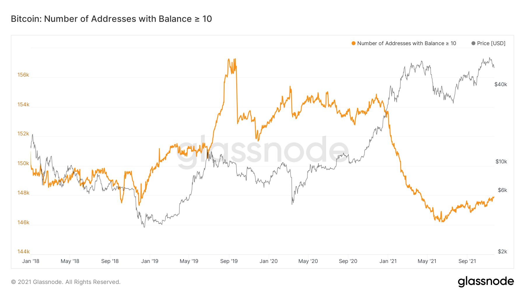
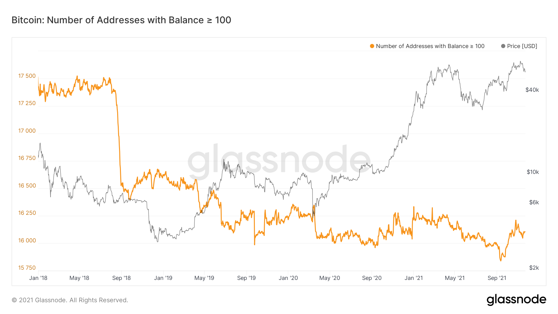
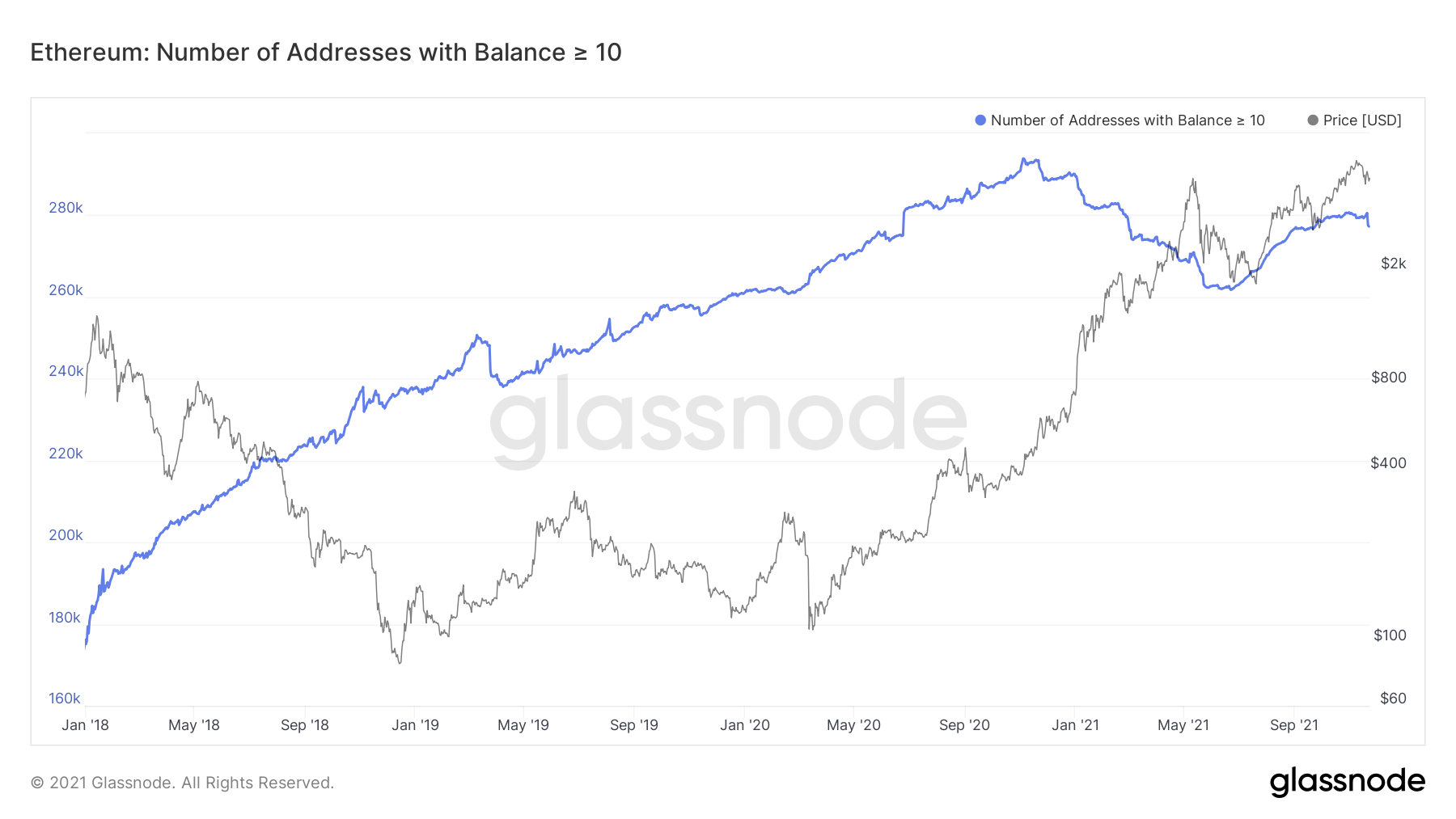
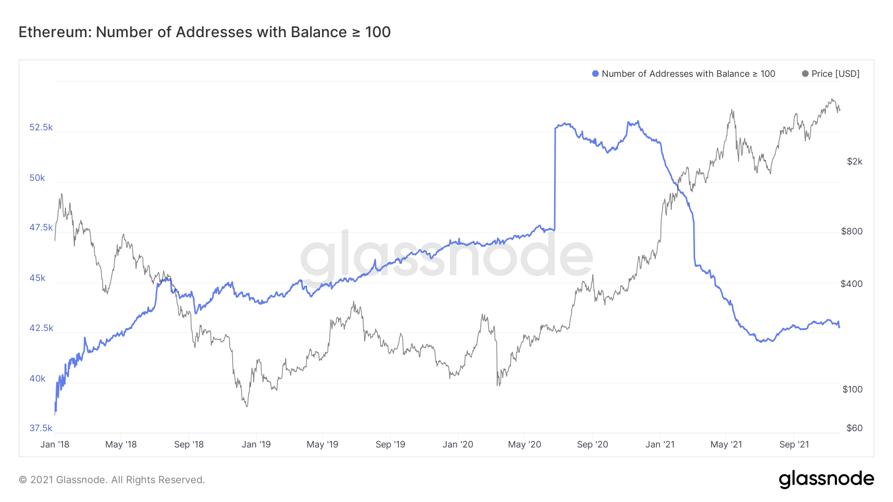
- We are seeing the number of addresses holding more than 10 and 100 Bitcoin/Ether increasing.
- Realised Profit has recently had a huge spike, historically a bearish signal, however it is important to track this and see how it develops over the coming weeks.
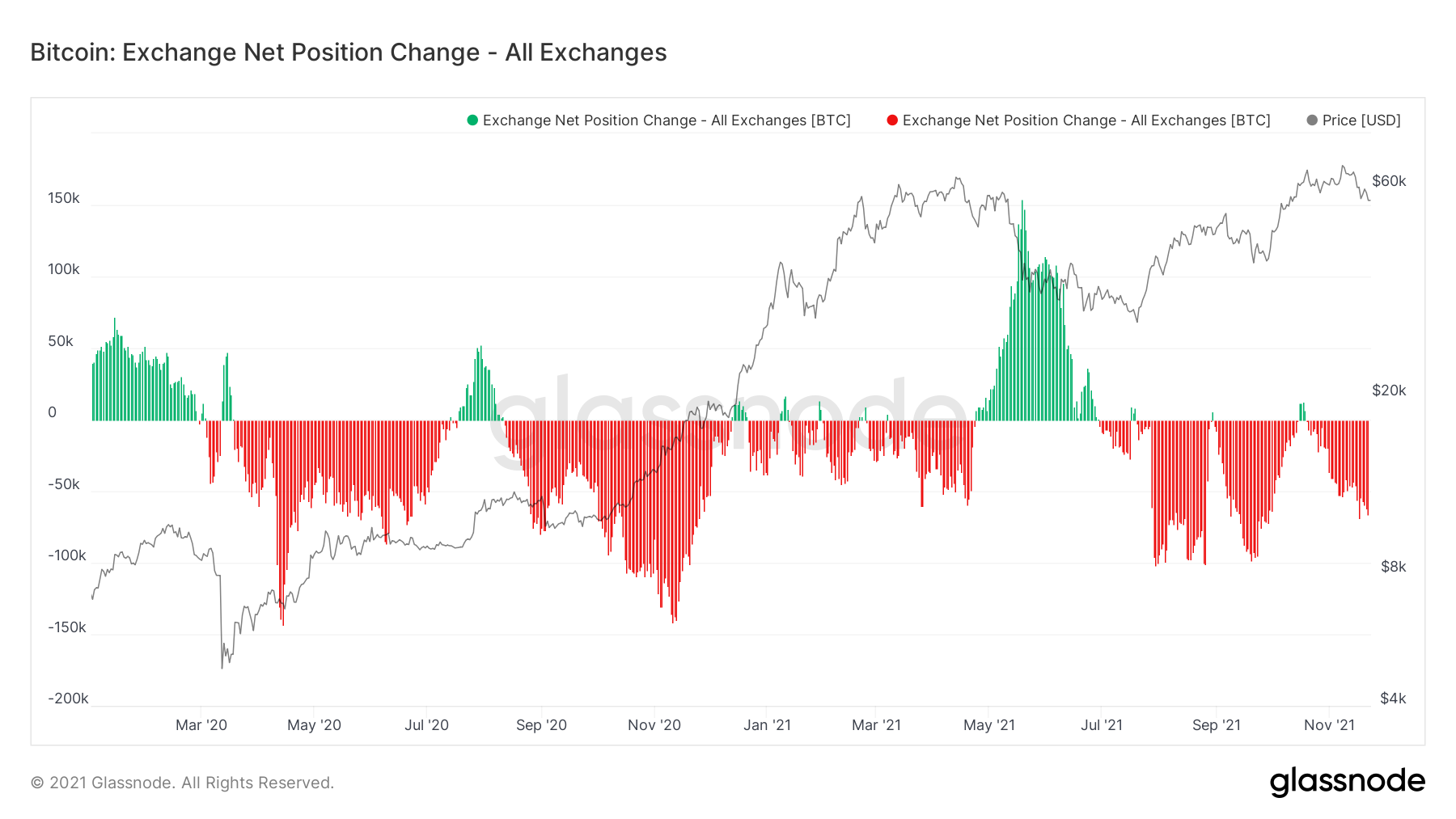
Metric 1 – Exchange Net Position Change
Starting off with the Exchange Net Position Change, we can see that Bitcoin was heavily accumulated over the last week as price has dipped from $64,000 to $56,000. Considering over the past two weeks, price has declined approximately 20%, it is very positive to see red spikes that are down trending (greater accumulation each day).
Bitcoin: Exchange Net Position Change
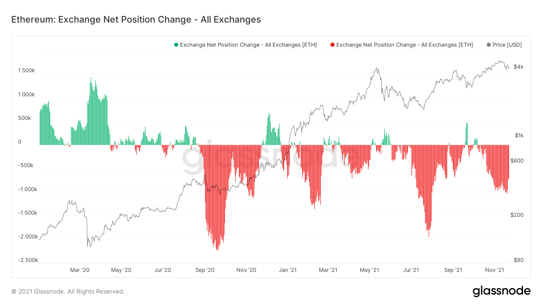
Now, if we turn our attention to Ether, we can see that there has also been a red spike but that over the last few days we have had decreasing red spikes, rather than increasing, like Bitcoin. This indicates that there has still been continued accumulation of Ether amongst investors, however, by a lesser amount than in previous days. This is still bullish to see but we would have preferred to see more Ether leaving Exchanges than the previous days (continued down trending red spikes).
Ether: Exchange Net Position Change
Metric 2 – Large Wallet Inflows
Looking into the Large Wallet Inflows we can see that over the past two weeks we have witnessed large blue bubbles (Whales buying large numbers of Bitcoins) that they are still holding onto. We can see that the size of the bubbles are perhaps the biggest we have seen in this Bitcoin bull run so far (excluding the buying in December 2018 – end of the Bear cycle).
Metric 3 – HODL Waves
HODL Waves show what percentage of total circulating supply of Bitcoin belongs to which cohort of Hodlers. We can see from the chart below, that following the May crash, the 6-12 Month holders increased their amount of circulating supply ownership from 10.08% to 20.56% (as seen in the second image). This shows a real willingness amongst the longer-term holders (the cohort that is historically the most profitable) to accumulate more of the supply, in anticipation of higher prices in the future.
HODL Waves in May
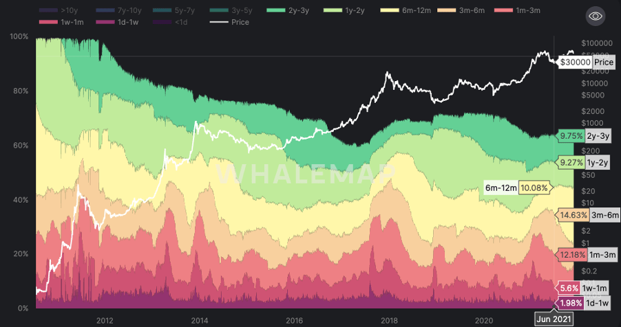
HODL Waves in November.
Metric 4 – Address Balances
If we take a look into the Address Balances, we are looking to see large balances increasing their balances. In other words, the number of Addresses with Balance > 10 or 100 (Bitcoin, Ether) increasing.
We can see in the graph below that the number of Addresses with more than 10 Bitcoin, have been increasing (up trending).
Bitcoin: Number of Addresses with Balance > 10 Bitcoin
We can also see that the number of Addresses with more than 100 Bitcoin in have also been increasing.
Bitcoin: Number of Addresses with Balance > 100 Bitcoin
Now, let’s turn to Ether to see if the story there is similar.
We can see below that Ether is also being accumulated with an increasing number of Wallets looking to get sizable exposure to the asset. The number of Ether wallets with more than 10 Ether is increasing for now. However, it is important that we continue to see these metrics continue as they are, a downturn may indicate that there is some selling in the market and that perhaps we should think about selling some of our own holdings.
Ether: Number of Addresses with Balance > 10 Ether
We can also see that the situation for Addresses with Balance > 100 Ether looks just as positive. A continued up trend indicates investors want more of the asset in hope of higher prices in the future.
Ether: Number of Addresses with Balance > 100 Ether
Metric 5 – Realised Profit
One last metric we’re going to look into is the Realised Profit. Unfortunately, we only have this metric for Bitcoin but it is a great indication nonetheless. With Realised Profit, it is possible to see where investors are booking profits and in what sort of size. In the graph below, you can see that in March and April of 2021, there was some significant profit taking, hence we see the large orange spikes. What you will also notice is that we have recently had another large spike. This has indicated that there has been a large amount of profit booking.
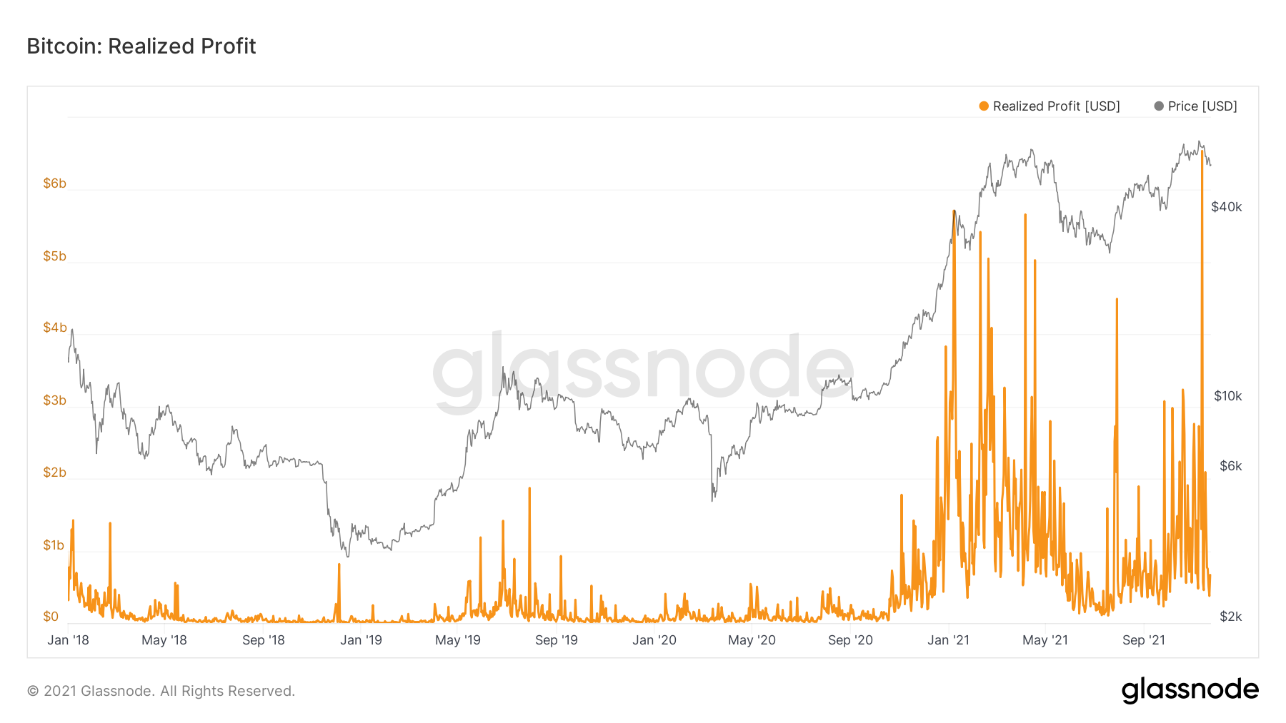
One spike is okay, however, if we see a few more of these, this may signify to us that investors are selling into price spikes and perhaps we should be doing the same, as the supply will begin to outweigh the level of demand. This is similar to what we saw in May and a large correction occurred.
Summary
The strong majority of the metrics are still bullish and indicate more smart money entering the space and looking to get exposure with reasonably sized positions, whilst those who are already in the market, look to increase their positions. However, there are some negative signs that profits are being taken into some price rallies, so this is something we will need to pay close attention to over the coming weeks.
Recommended from Cryptonary