Save 23% ($351) & Get a Free 1-1 Call with our Team ⏰ : 0d 2h 59m 43s

TLDR
- The Exchange Net Position Change still shows that Bitcoin and Ether are being accumulated but at a decreasing rate.
- The amount of BTC available on exchanges has slightly increased whereas that metric kept decreasing for ETH.
- Options' Open Interest has returned to healthy levels after last Friday’s Options expirations.
- We have seen some long-term holders in both Bitcoin and Ether begin to book profits, it is important this does not continue if the bull-run is going to continue.
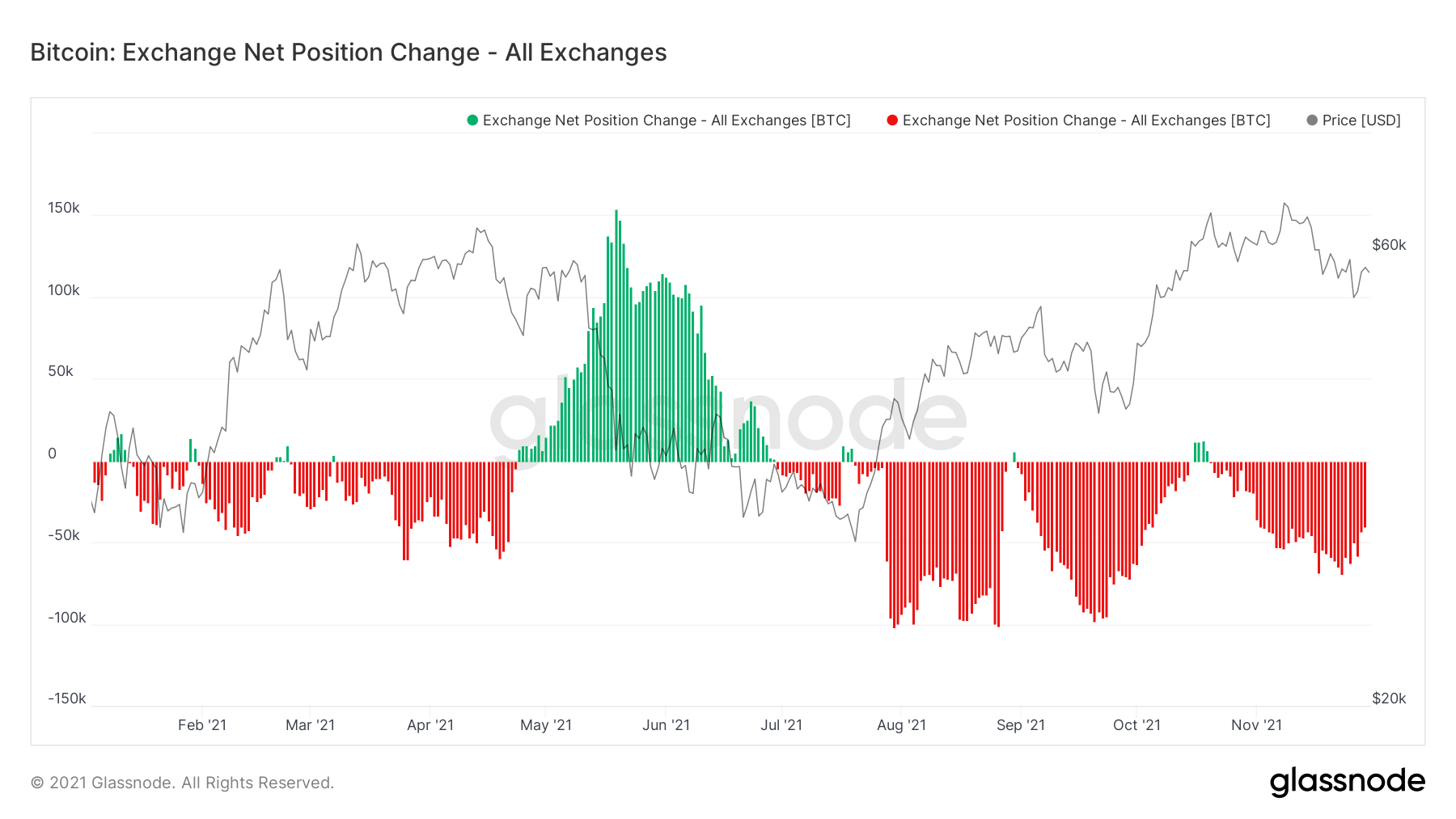
Metric 1 – Exchange Net Position Change
Looking into the Exchange Net Position Change, we can see that more Bitcoin has left Exchanges than flown into them (bullish overall). However, over the past week, we have seen the overall amount of Bitcoin leaving Exchanges decrease day on day, meaning that accumulation has slowed down, or that there has been some increased selling. We will further dive into this below.Bitcoin: Exchange Net Position Change
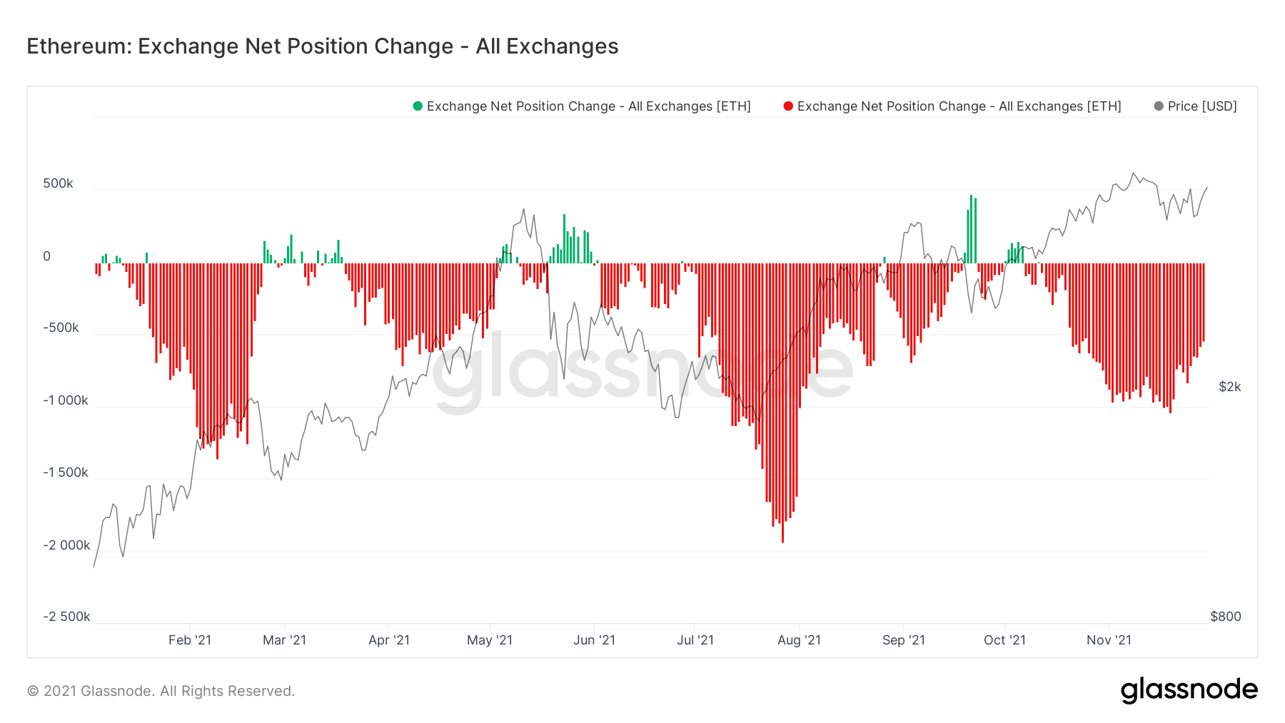
Ether: Exchange Net Position Change
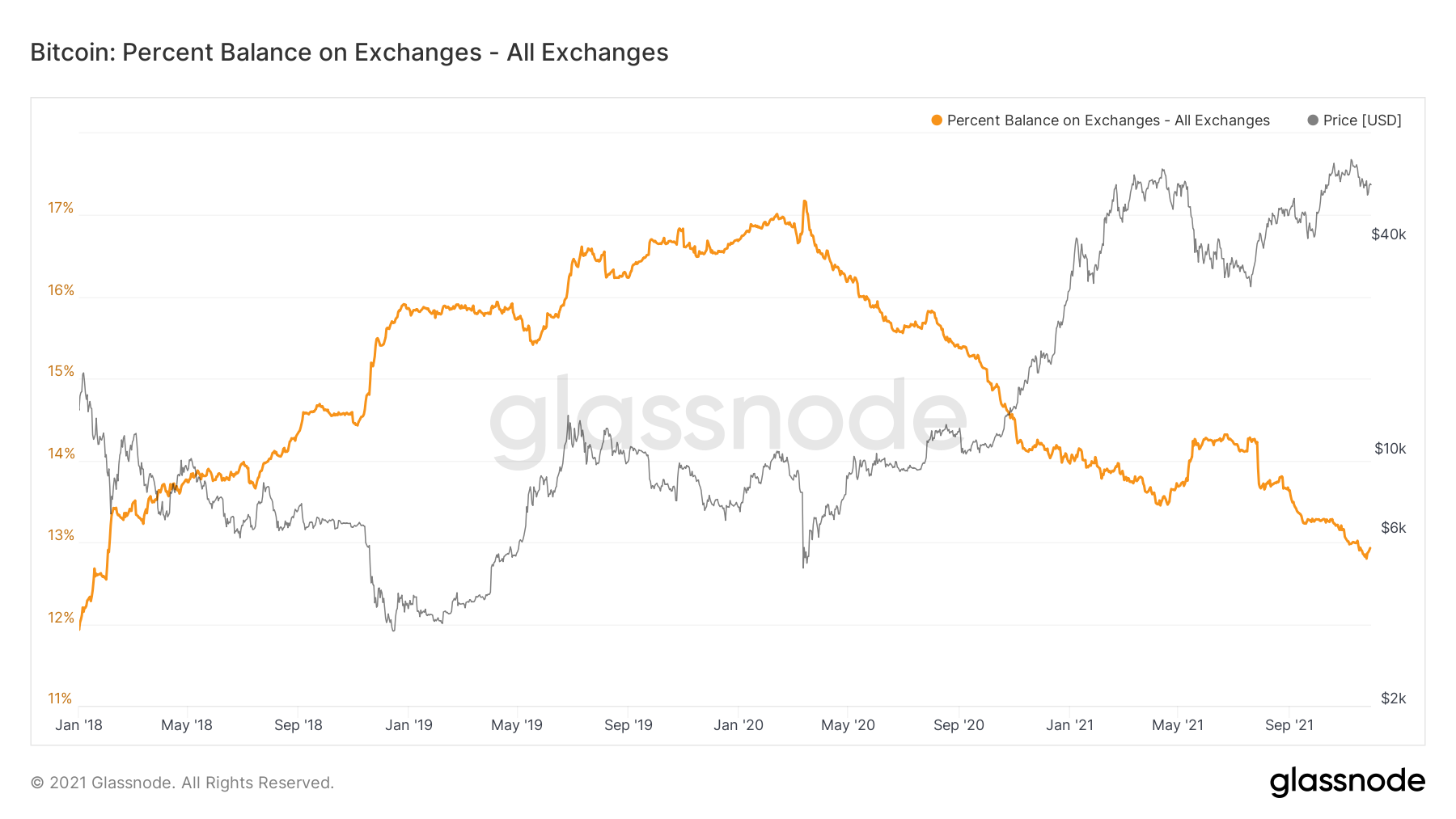
Metric 2 – Exchange Balance (%)
A second metric that has significant importance when evaluating the mid to long term on-chain picture for Bitcoin and Ether is the Exchange Balance (%). This shows the amount of circulating supply (as a percent) that is currently on Exchanges. As you can see from the graph below, since March 2020, this has been down trending. It is possible that if this downtrend continues, such a little amount of circulating supply will remain on exchanges that it results in a supply shock, where demand heavily outweighs supply, meaning prices go up. We can see below, that recently there has been a slight uptick in this metric, so it is important to see if this continues upwards (ending the downtrend), or if it maintains the downtrend.Bitcoin: Exchange Balance (%)
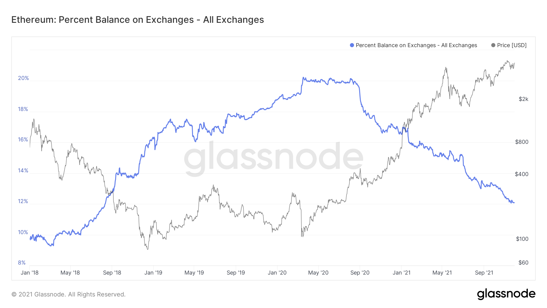
If we now look at this same metric but for Ether, we can see that Ether has been very similar but that it has not had a small spike up recently, it has generally just continued downwards, positive to see.
Ether: Exchange Balance (%)
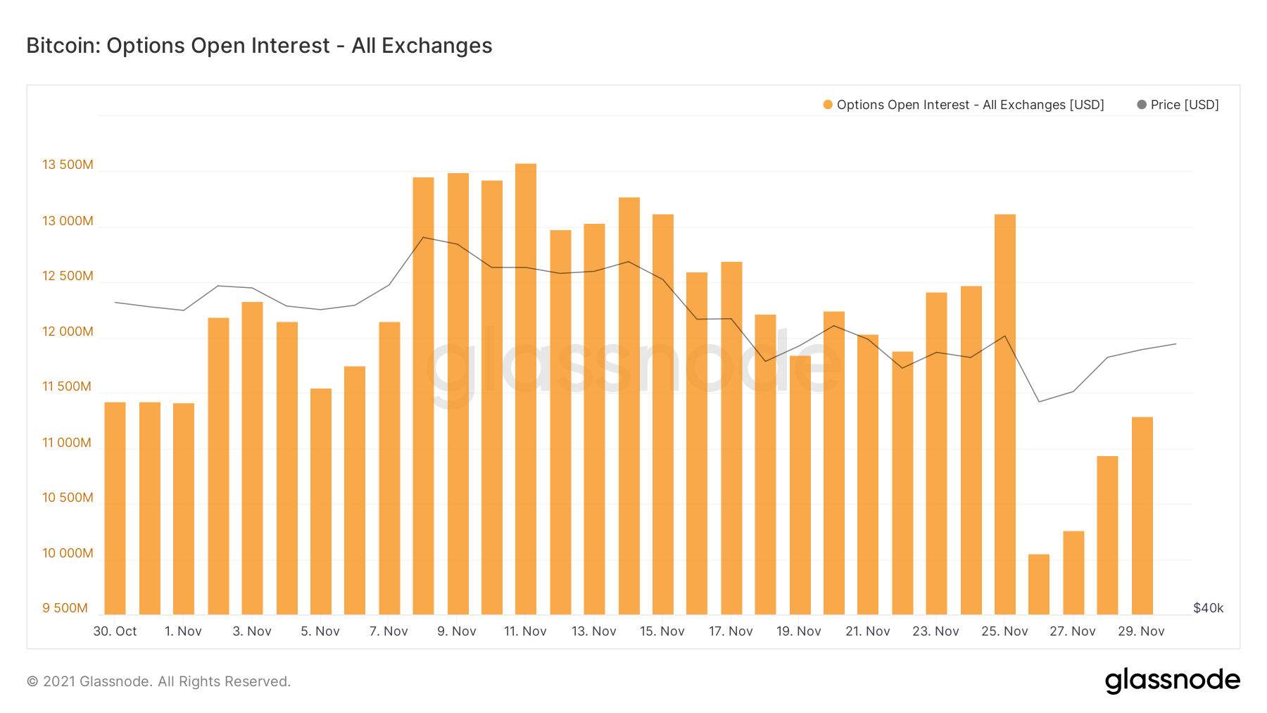
Metric 3 – Options Open Interest
On the 26th of November, Bitcoin saw a sell-off early in the morning based off the news of the new Covid variant. However, the options market was relatively high at $13 billion, following Friday’s price pullback and a significant number of options expiring, we have seen options open interest return down to healthier levels of $11 billion. Note the decrease in the graph below following the options expiration on Friday the 26th.Bitcoin: Options Open Interest
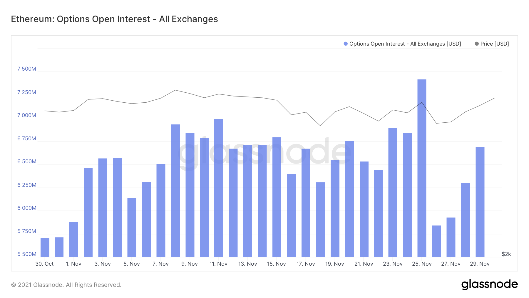
Again, now turning our attention to Ether, it represents a very similar chart, with Options Open Interest returning back to reasonably normal and therefore healthy levels if we’re looking to see prices increase.
Ether: Options Open Interest
Metric 4 – Coin Days Destroyed
The Coin Days Destroyed Metric gives analysts an insight into whether there has been any selling from the longer-term holders. An orange spike would indicate that there has been, the greater the spike the greater the amount of long-term holders sold.Bitcoin: Coin Days Destroyed
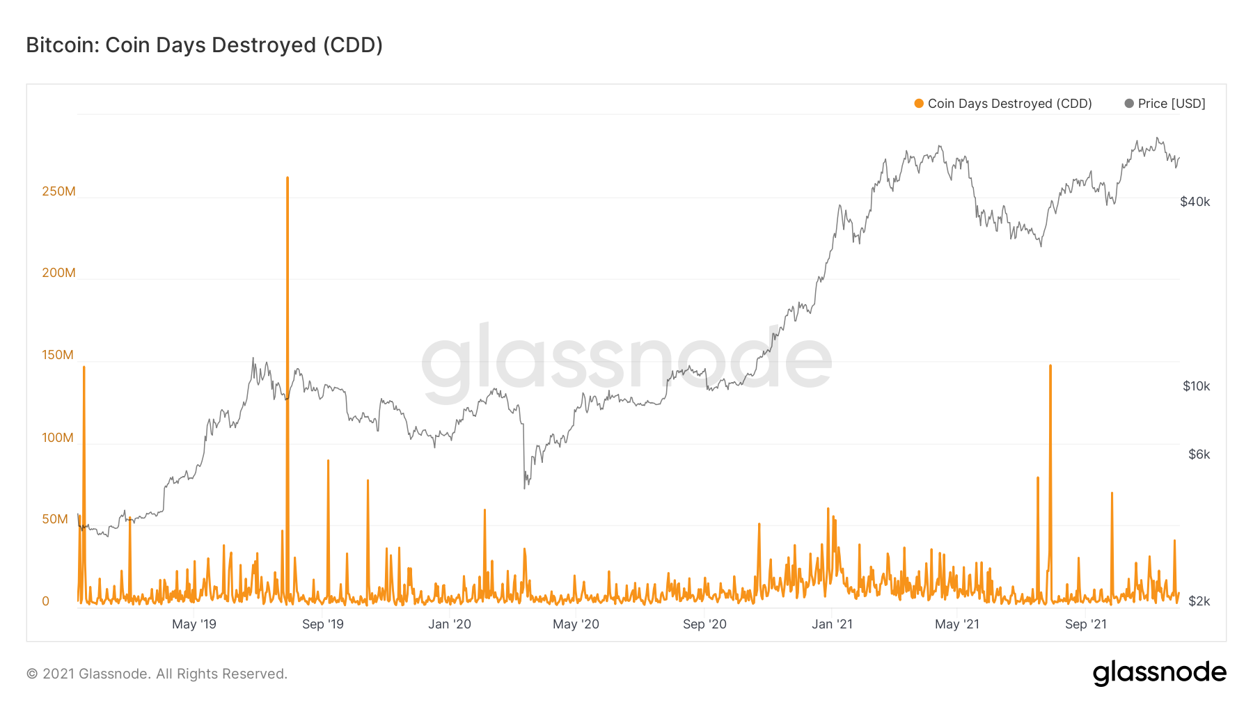
If we look at the chart above, there has been a recent spike. As you can see it is not huge in size, but it indicates that some selling has been done by some form of long-term holders, therefore we should try to investigate this further.
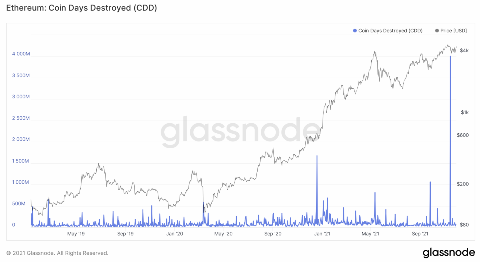
Now looking at this metric for Ether, we can see a huge spike, so we will look into this in greater detail also.
Ether: Coin Days Destroyed
In analysing the above further, we will look into the different cohorts (age of coins) that were sold, to work out which length of long or short term investors were responsible for the selling of both Bitcoin and Ether.
Metric 5 – Lifespan
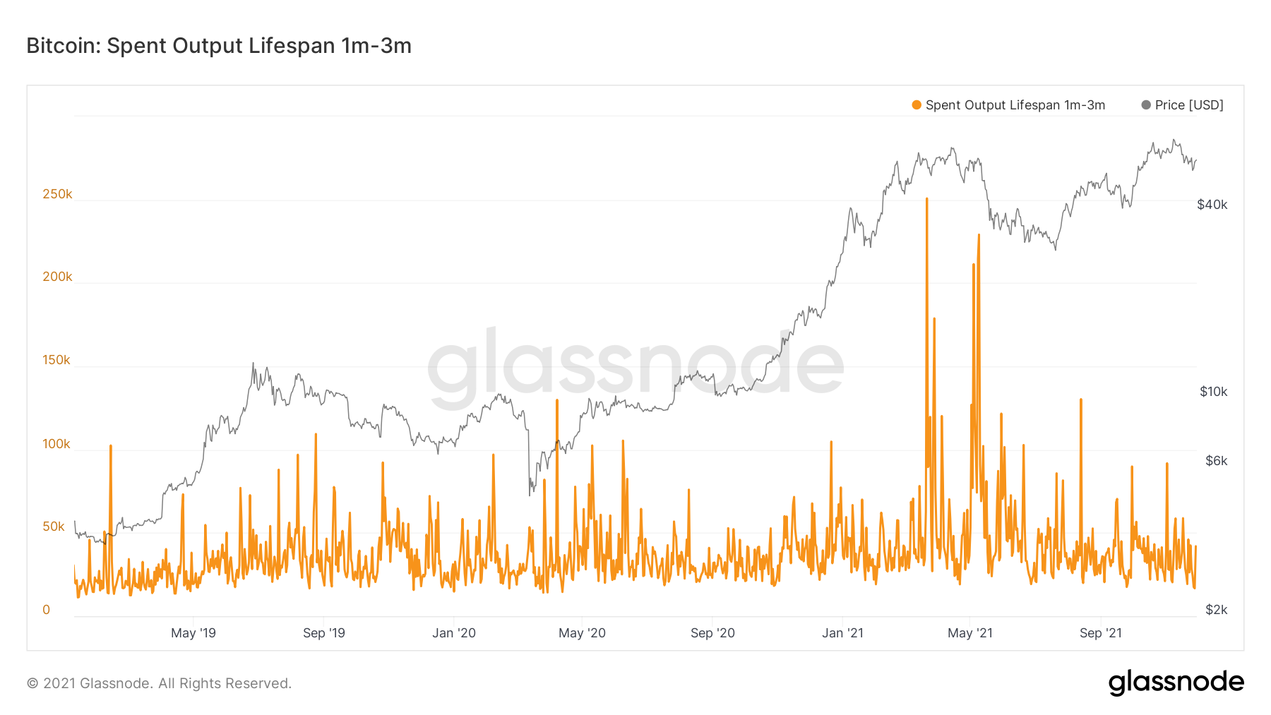
If we begin by looking at the more short term Bitcoins – aged between 1-3 months old, we can see that there is no real significant orange spike, indicating it was not short term sellers that led to the slight spike on the Coin Days Destroyed graph.Bitcoin: Spent Output Lifespan (1-3 months)
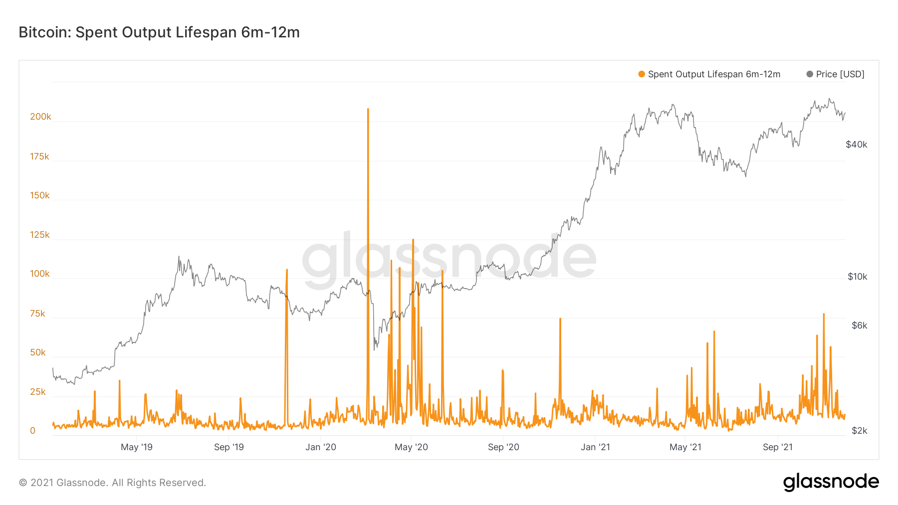
Now if we look at the 6-12 months aged coins, again we can see no real significant spike in coins being sold, some profit taking around All-Time-Highs but nothing significant in the last two weeks.
Bitcoin: Spent Output Lifespan (6-12 months)
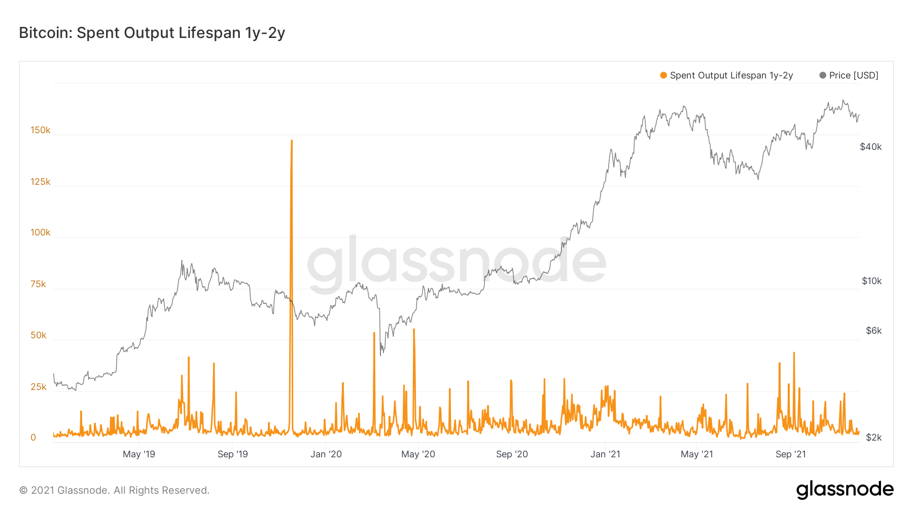
If we look at the 1-2 year coins, even less significant.
Bitcoin: Spent Output Lifespan (1-2 years)
However, if we now look at the coins aged between 2-3 years old, we can see there was a hefty amount of profits being taken from this cohort of investor.
Bitcoin: Spent Output Lifespan (2-3 years)
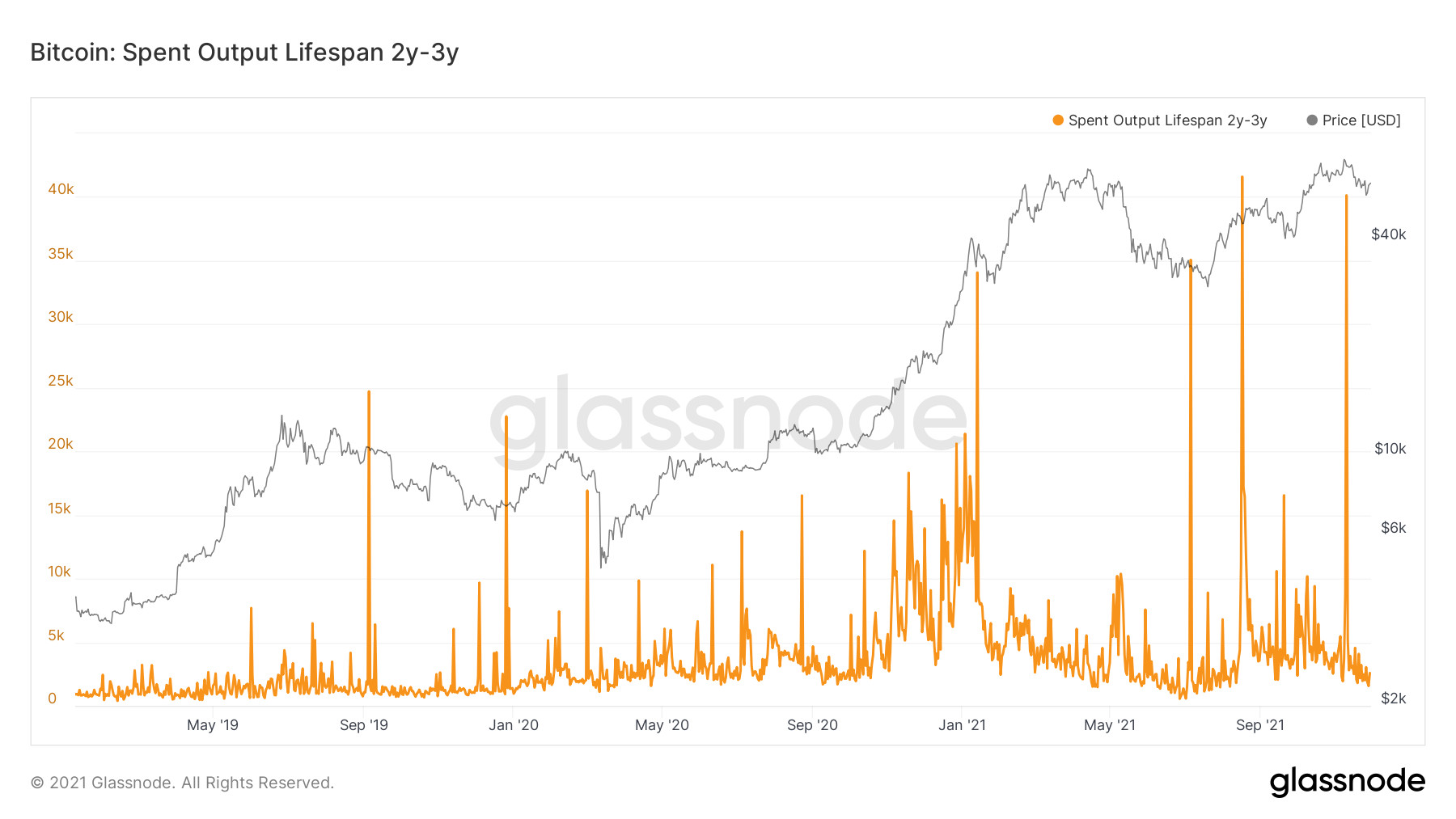
This is a concern. Seeing this cohort of investor take profits could alarm us as they are known to historically be one of the most profitable cohorts of investor. It is important we don’t see any more sizable spikes like this most recent one.
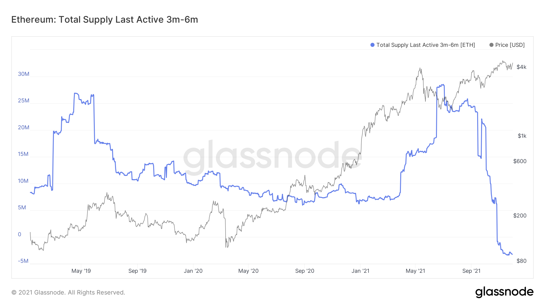
If we now look at Ether, we can see that in the short term, all investors with coins younger than 6 months are not hugely active. This is overall reasonably bullish as it shows these cohorts of investors are not rushing to sell their supply.
Ether: Supply Last Active (3-6 months)
However, if we look at the 6-12 month cohort of investors, we can see that significant profits were taken around $4,500. This is the cohort that was responsible for the selling.
Ether: Total Supply Last Active (6-12 months)
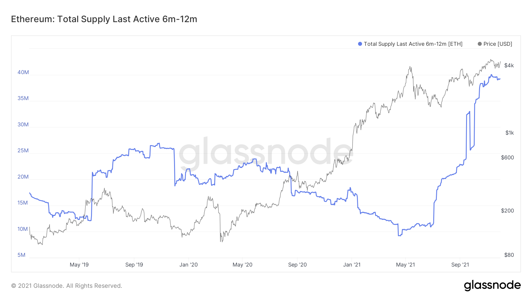
Again, this is an area of concern to see this cohort of investors sell, as these are considered reasonably long-term. However, all Ether older than 1 year has had very little sign of profit taking, which is positive to see.
Summary
Over the past few weeks, we have seen levels of accumulation decrease yet we still remain in an accumulation mode. Yet, at the same time, over the last week, we have seen some long-term investors in both Bitcoin and Ether begin to take profits. This is something to keep watch of as we do not want to see this continue as it is a warning sign.
Recommended from Cryptonary