Save 23% ($351) & Get a Free 1-1 Call with our Team ⏰ : 0d 2h 59m 43s
On-Chain Forensics 33
This all meant that the Bond buying by the Federal Reserve was going to continue slowing down (less and less money coming into the markets from the Fed itself), this was taken negatively by investors and therefore the market, hence we then began seeing investors begin to risk-off and close some positions, so we saw a barrage of selling.

TLDR
- The wider market has seen a number of negative news come out last week which was ultimately bearish for the markets; new Covid variant and the Fed continuing to taper.
- In the Crypto market, Futures Open Interest was at extremely high levels meaning a squeeze to the downside would be possible, liquidating these over-leveraged traders and returning the futures market to a healthier state.
- Most of the selling was done by the short and mid-term investors, with the long-term investors being very unwilling to sell into the price low.
- The Large Wallet Inflows shows us that Whales have been adding to their balances over the previous few days.
Wider Market
We will assess the macro picture to see how real-world news may have created some risk off-behaviour amongst investors. Firstly, the week leading up to Friday/Saturday’s price crash saw news of the new Covid variant (nicknamed Omicron) come out. This released some fear into the market and initiated some risking-off by investors (selling some of their open positions back into USD or USDT). Secondly, we had the Jobs report released in the US. Analysts had expected 500,000 people to have found jobs, with only 200,000 actually finding jobs that month. This was then expected to be a positive sign for the markets as this lack of job filling may mean that the Fed slows down on their tapering of the economy. This is the process of slowing down their bond buying scheme which is how they effectively print money and get it into the economy. However, Jerome Powell, Chairman of the Federal Reserve, indicated that tapering would continue to go ahead at the rate he had previously outlined – negative for the markets.Let’s now look at the metrics that highlighted some risk in the crypto market itself that may have then fueled the crash.
Metric 1 – Futures Open Interest
When there is too much leverage in the market with declining prices, this can lead to a large leverage flush out. As price declines, those who are over-leveraged will have their stop loss’s hit. If this continues to happen where stop losses are continually hit, prices will be driven down until all over-leveraged trades are liquidated or stop loss’d. We can now see that after the flush out, Futures Open Interest has returned down to healthier levels.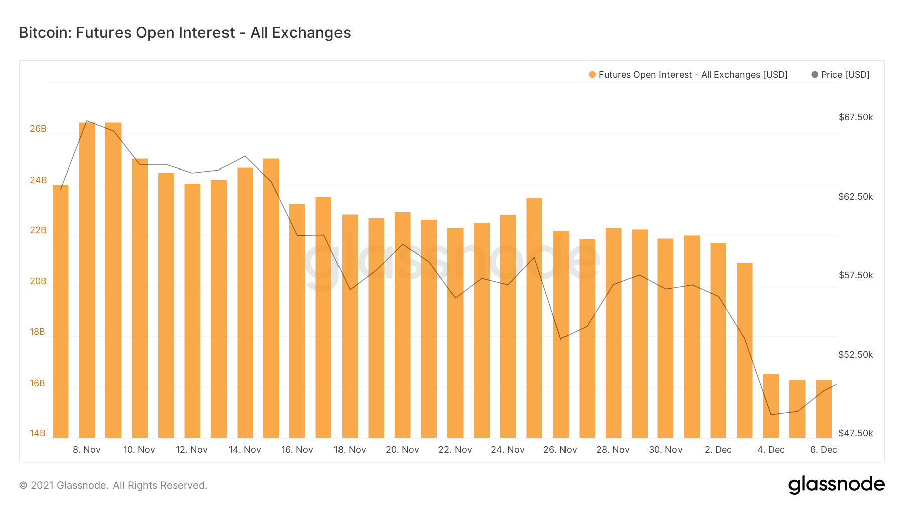
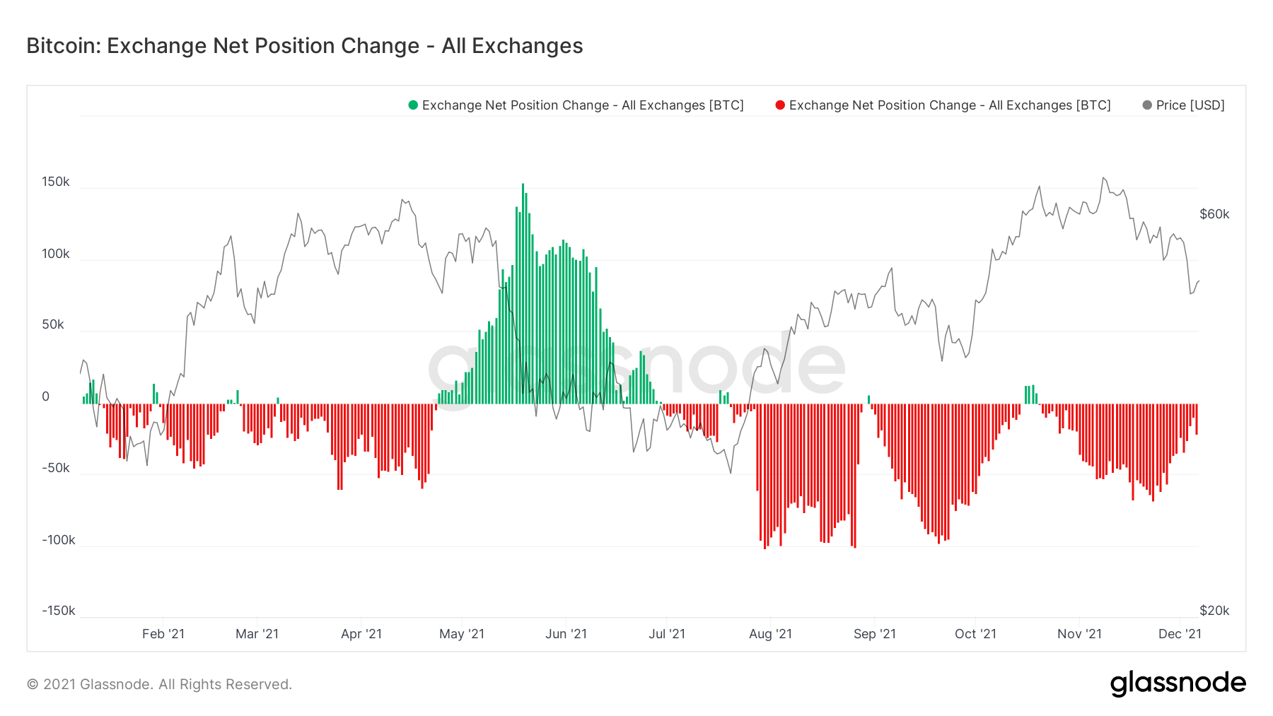
Metric 2 – Exchange Net Position Change
We can see in the Exchange Net Position Change for Bitcoin that the red spikes were decreasing day after day, meaning either less accumulation or more selling. We can see that in the last day, we had a more significant uptick in a negative Net Change, which shows either accumulation of coins has increased or that selling of coins has eased off, maybe even a mix of the two. We will dive into analysing this further below.Bitcoin: Exchange Net Position Change
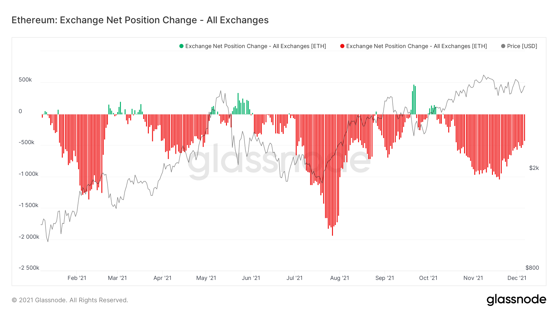
If we look at the Exchange Net Position Change for Ether, we can see a slightly different picture. We have seen continued accumulation with no significant downturn in red spikes.
Ether: Exchange Net Position Change
Metric 3 – Lifespan
The Lifespan splits coins up into different cohorts of ages. By looking at this we try to work out if it is short-term (young coins) being spent or if it is long-term investors (old coins) being spent/sold. We ideally don’t want to see the diamond handed long-term investors selling. So, we would rather see the young coins being the ones that are sold.Bitcoin: Spent Output Lifespan 1-3 Months
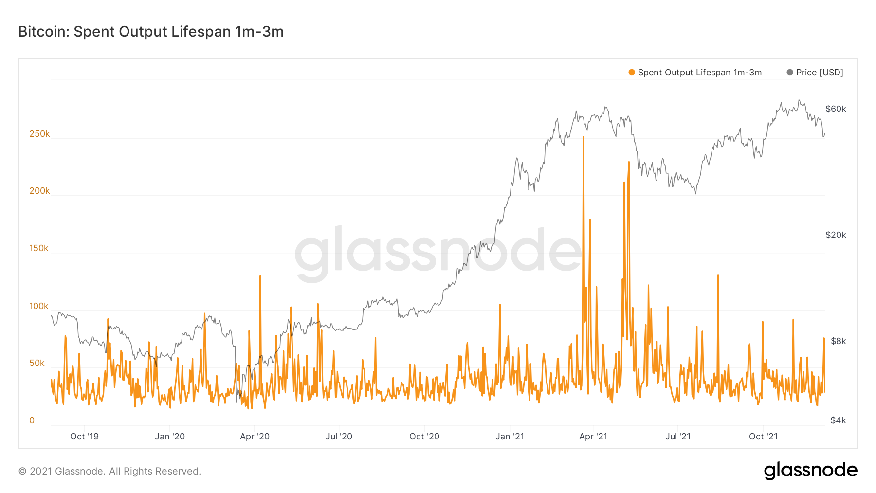
The orange spikes indicate the significance of the sell side pressure from this cohort of investors that own these coins. As we can see, there is a reasonable spike but nothing disastrous.
Bitcoin: Spent Output Lifespan 3-6 Months
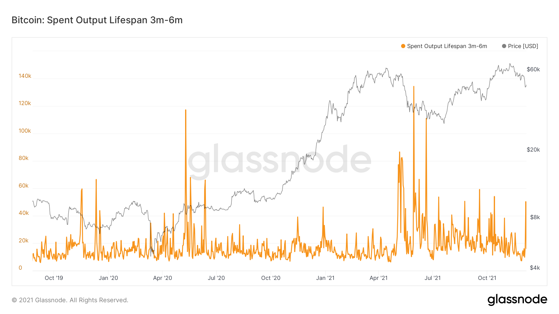
Again, another reasonable spike on the 3-6 Month aged coins, indicating there was considerable selling from short-term investors.
Bitcoin: Spent Output Lifespan 6-12 Months
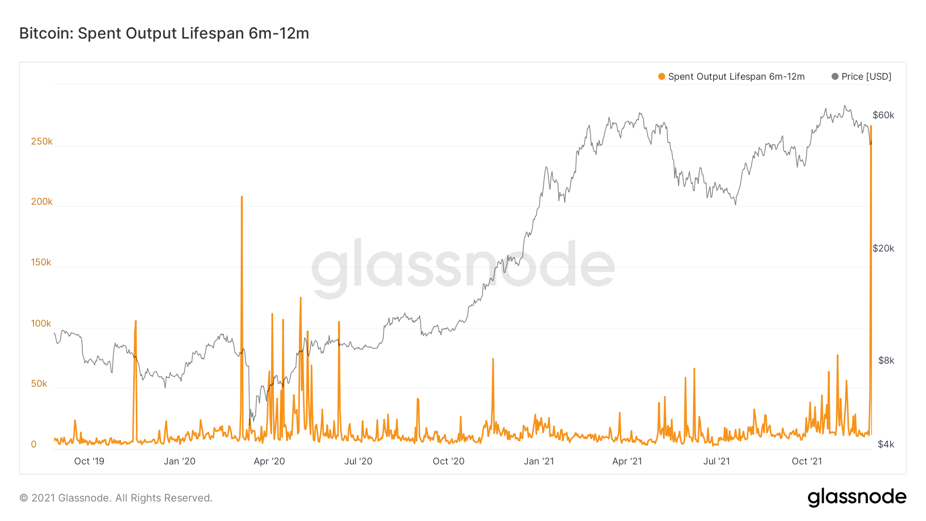
A huge spike in selling from this cohort of investor, this is not good to see. However, it can be said that this cohort has a wide range in terms of their cost basis. For instance, investors that own Bitcoins that fall into this cohort could have paid anywhere from $18,000 a coin to $64,000 a coin. It is also important to note that this cohort is no longer considered long-term, we also know from previous reports, that Whales were not adding into the highs of the first half of the year, they accumulated following the crash in May. This means that the majority of this cohort (6-12 Months owners), were probably retail, and probably panic sold once Bitcoin came down to a level that was similar to their cost basis.
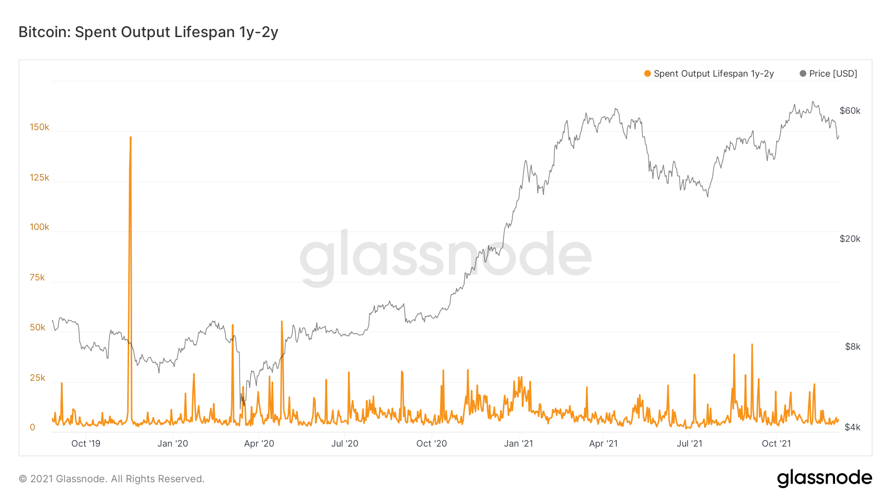
Bitcoin: Spent Outputs 1-2 Years
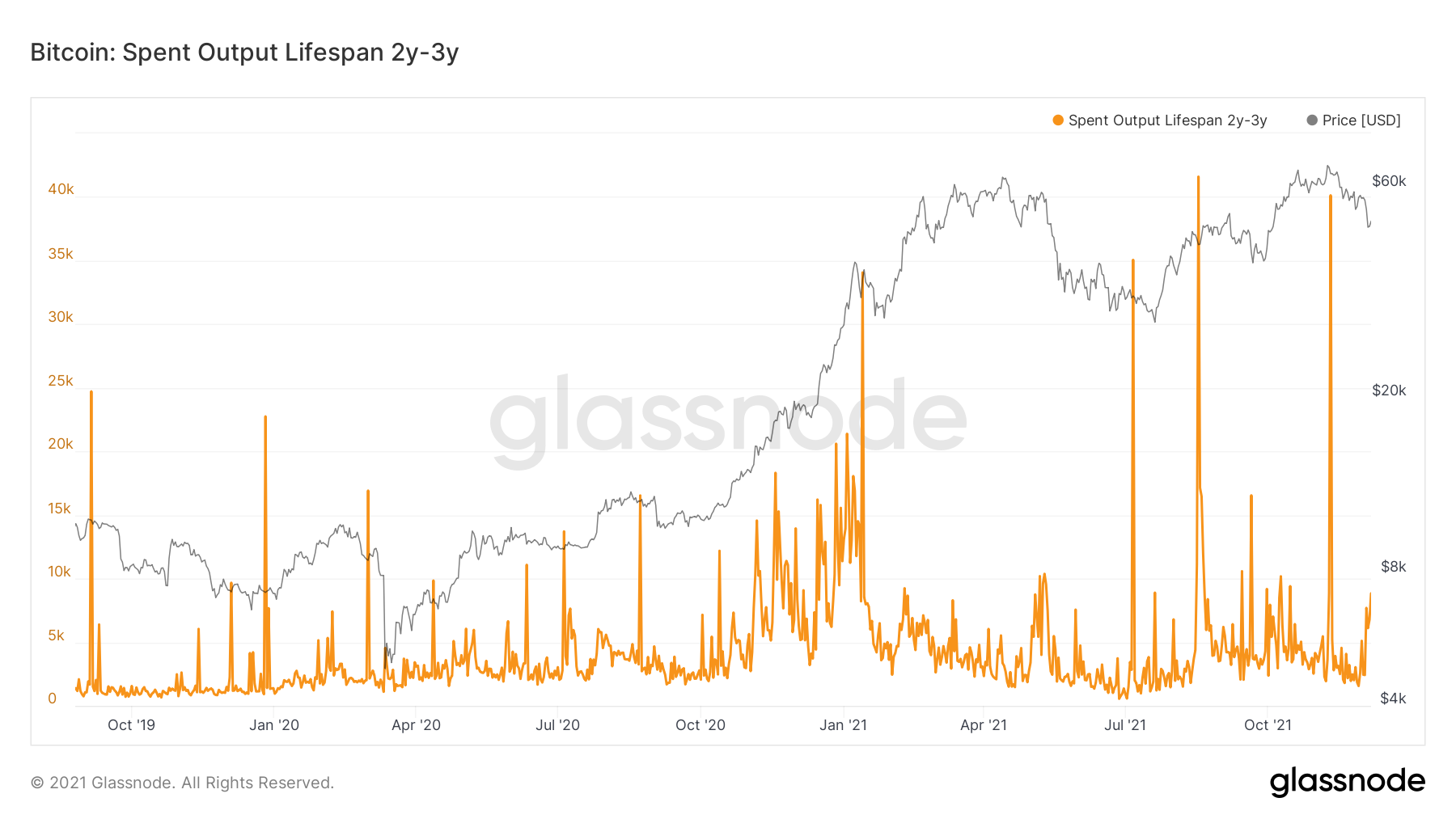
Bitcoin: Spent Outputs 2-3 Years
We can now see from the long-term investors, particularly the 1-2 Year cohort, that there was very little selling. This is positive to see.
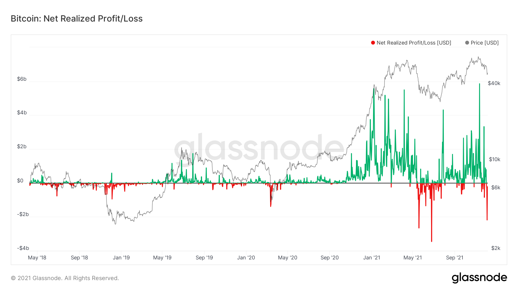
Metric 4 – Net Realised Profit/Loss
We look at the Net Realised Profit/Loss as it is a good indicator of when a rebound in prices may be possible. As we can see from the chart below, in all times where there has been significant loss taking, this has usually been followed by prices rebounding and investors having the opportunity to realise some profits.Bitcoin: Net Realised Profit/Loss
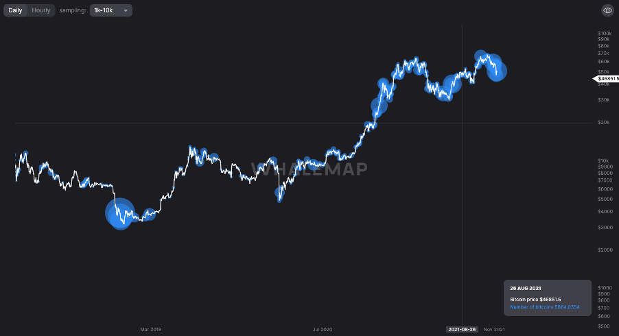
Metric 5 – Large Wallet Inflows
As we can see from the chart below, Whales were accumulating on the price dip, signaled by the large blue bubbles.Large Wallet Inflows
Summary
The price crash was in the majority caused from over-leveraged traders being wiped out/liquidated as prices declined, which was catalysed by negative news in the macro world eg, new Covid variant and the Fed continuing to taper. However, we have seen long-term investors continue to hold, and most of the supply sold originated from short-term investors.Recommended from Cryptonary