Save 23% ($351) & Get a Free 1-1 Call with our Team ⏰ : 0d 2h 59m 43s

- Bitcoin’s Exchange Net Position Change still sees net outflows being greater than net inflows, but the net change is decreasing (fewer coins being accumulated).
- The smallest wallet sizes are responsible for the accumulation, and the largest wallets continue to sell down their Bitcoin positions.
- Active and new addresses continue to decline since the all-time high in November, suggesting decreasing demand levels.
- The unrealised losses metric is still yet to significantly spike, indicating a market bottom is still to come. Historically, this metric has been great at identifying market bottoms.
All markets are currently seeing a decrease in demand due to several macro headwinds. The first is the expectation of rate hikes (interest rates) at the next FED meeting in mid-March. An increase in interest rates will mean the cost of borrowing capital has increased, and therefore less capital will be borrowed – a reduction in the money supply. The second macro headwind on the near-term horizon is the geo-political tensions we’re seeing between Russia and the US over Ukraine joining NATO. Understandably so, Putin does not want a neighbouring country to join NATO (effectively becoming allies with the West) as this could pose a threat to Russia in the future. So, with these macro concerns at play, this has ultimately led to a risk-off environment from investors. Hence a lack of demand and, therefore, declining asset prices.
But, how does this look on-chain? We will take a deep dive into some of the metrics below to assess where investors are currently positioning themselves.
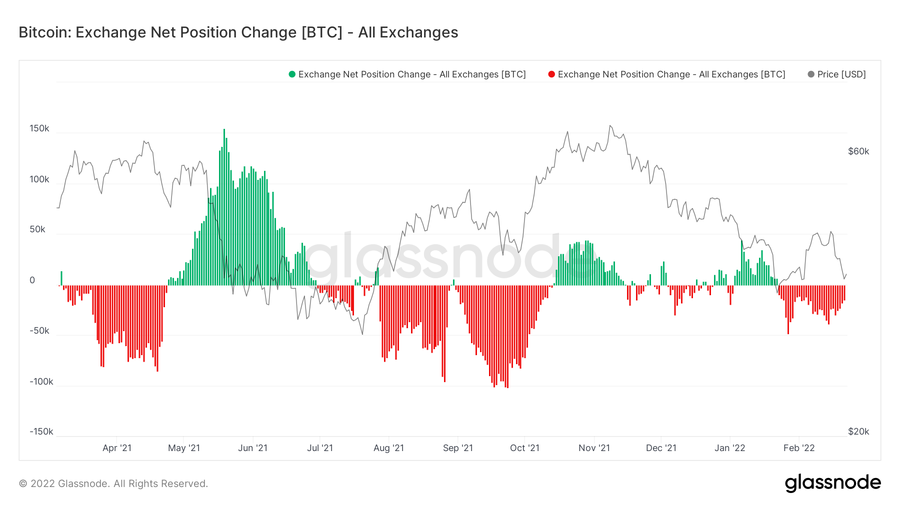
Metric 1 – Exchange Net Position Change
The Exchange Net Position Change tracks the flows of Bitcoin and Ether into and out of Exchanges. A net inflow (green spikes) is bearish as it indicates more coins are flowing out of cold storage wallets to Exchanges (to be sold). A net outflow (red spikes) is bullish. However, it must be contextualised with other on-chain indicators to be bullish. In recent weeks, we have reported that the Exchange Net Position Change of Bitcoin was seeing red spikes that were increasing – increased outflows of Bitcoins from Exchanges each day. However, this has now flipped to decreasing red spikes each day – a daily decrease in outflows. This suggests that the accumulation of coins is slowing.
Bitcoin – Exchange Net Position Change
It is important to recognise which cohorts of investors are doing this accumulation. We will take a more in-depth look into this later. But firstly, we will cover the Exchange Net Position Change for Ether.
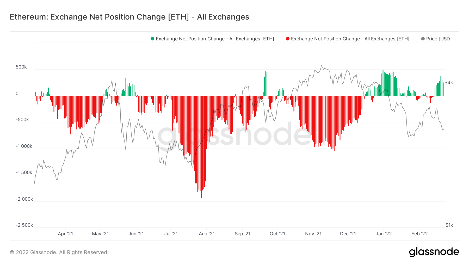
We can see that for Ether, this picture is the opposite. We’re seeing green spikes that are actually increasing in size. This suggests the inflows of Ether to Exchanges is becoming greater each day.
Ether – Exchange Net Position Change
Metric 2 – Addresses
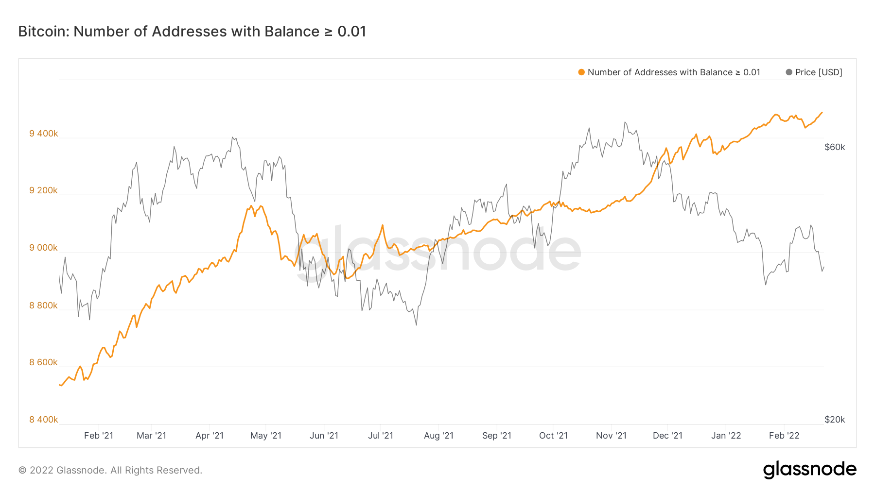
If we refer back to Bitcoin’s Exchange Net Position Change, we want to identify which cohort of investor is responsible for the accumulation of coins. We want to replicate the largest wallets, as historically they are the most profitable, so if they are the ones doing the accumulating, we should consider doing the same, but let’s look into it below.
Bitcoin – Addresses with Balance > 0.01 Bitcoin
Bitcoin – Addresses with Balance > 0.1 Bitcoin
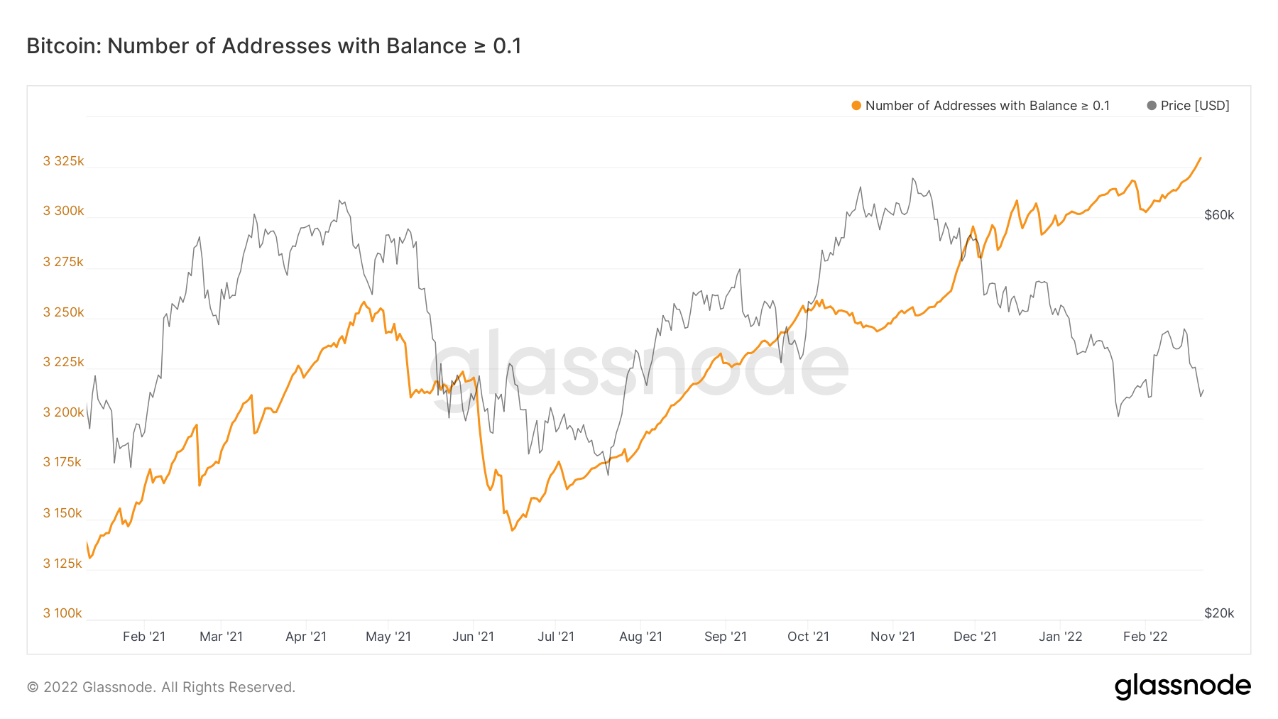
The above two charts show us that Bitcoin wallets with less than 0.1 Bitcoin in them have accumulated into the most recent price declines. Overall, this is a negative sign, particularly if the larger wallets are not accumulating also.
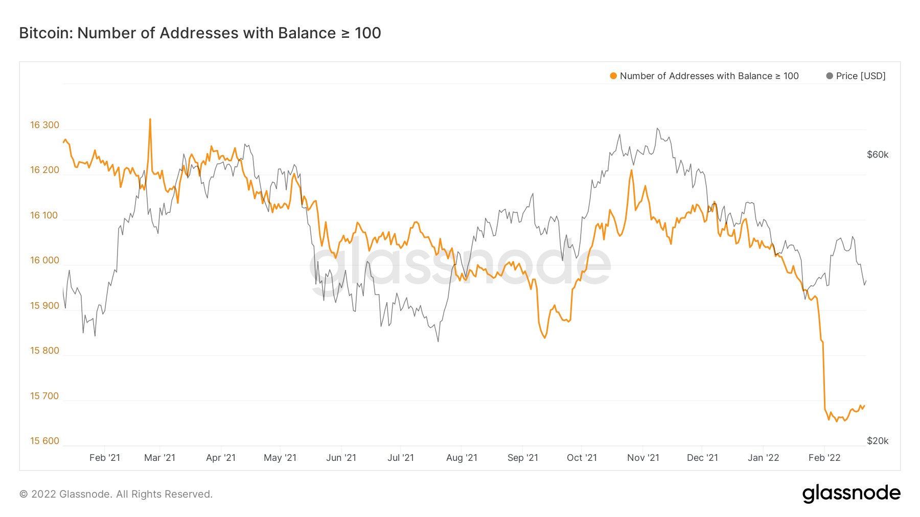
Bitcoin – Addresses with Balance > 100 Bitcoin
Bitcoin – Addresses with Balance > 1,000 Bitcoin
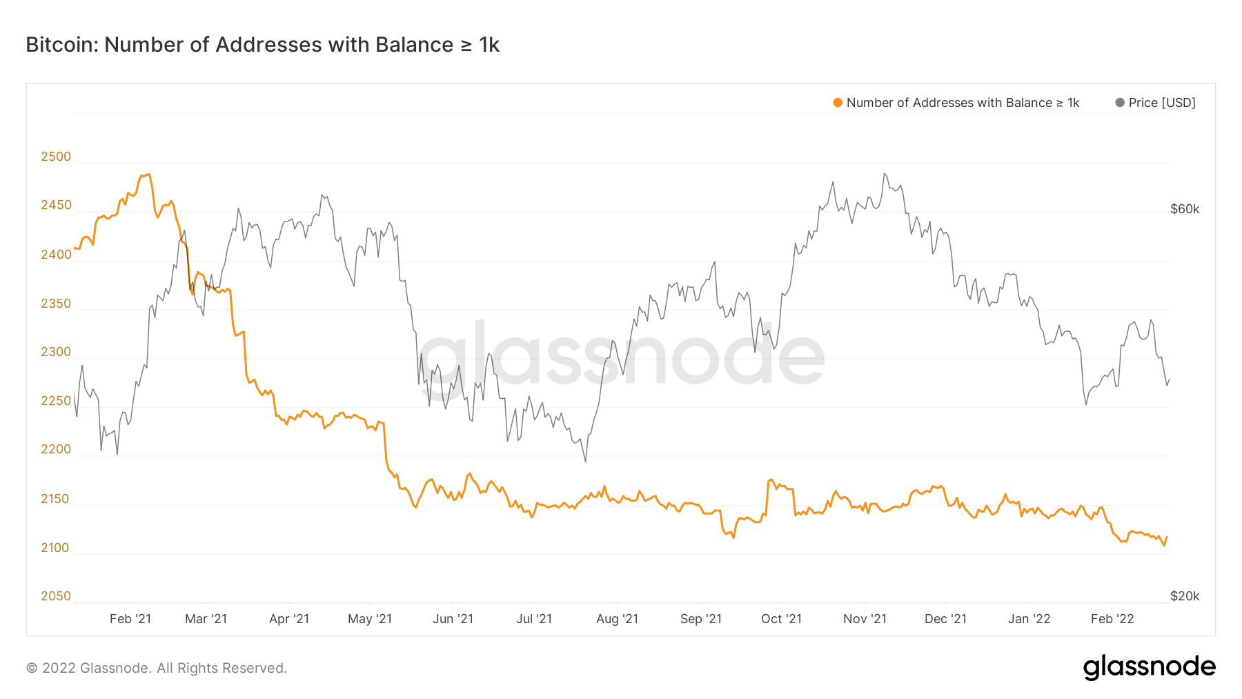
The above two charts show us that the larger wallets have not been accumulating, with the wallets holding greater than 1,000 Bitcoin actually again reducing in number. So, what this section tells us is this; the small wallets have accumulated into this dip and are likely responsible for the red spikes on the Exchange Net Position Change. The large wallets have not. In fact, they have actually decreased, meaning they have sold some of their coins into the most recent price declines.
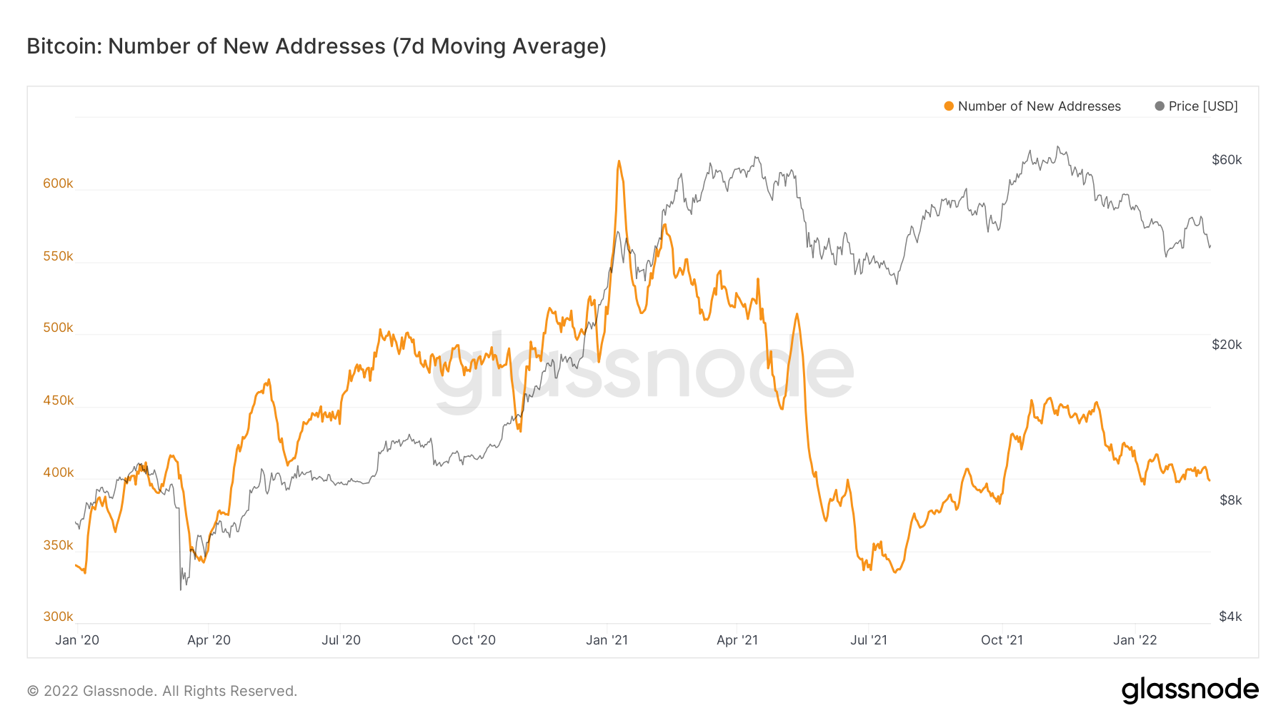
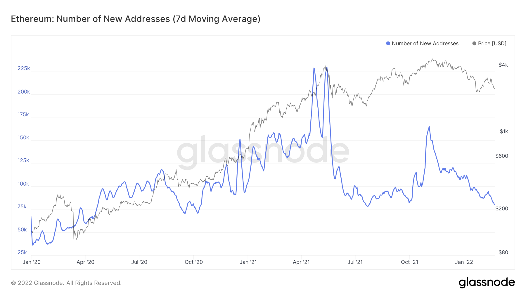
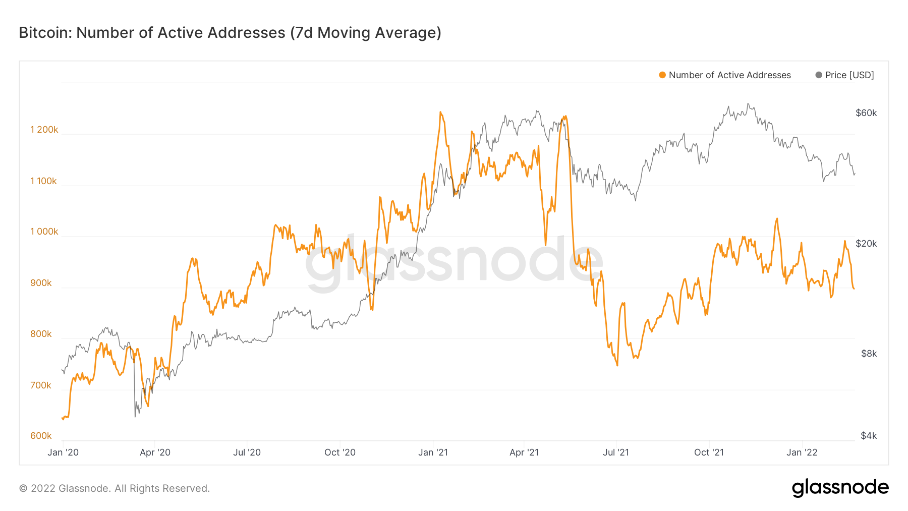
Metric 3 – New & Active Addresses
If we want to investigate the demand aspect of the market more, an increased level of demand is usually highlighted in the new and active addresses metrics. If we see spikes in these metrics, we know the demand for crypto is increasing/up-trending. However, the opposite, of course, apply.
Bitcoin – New Addresses
Ether – New Addresses
Bitcoin – Active Addresses
Ether – Active Addresses
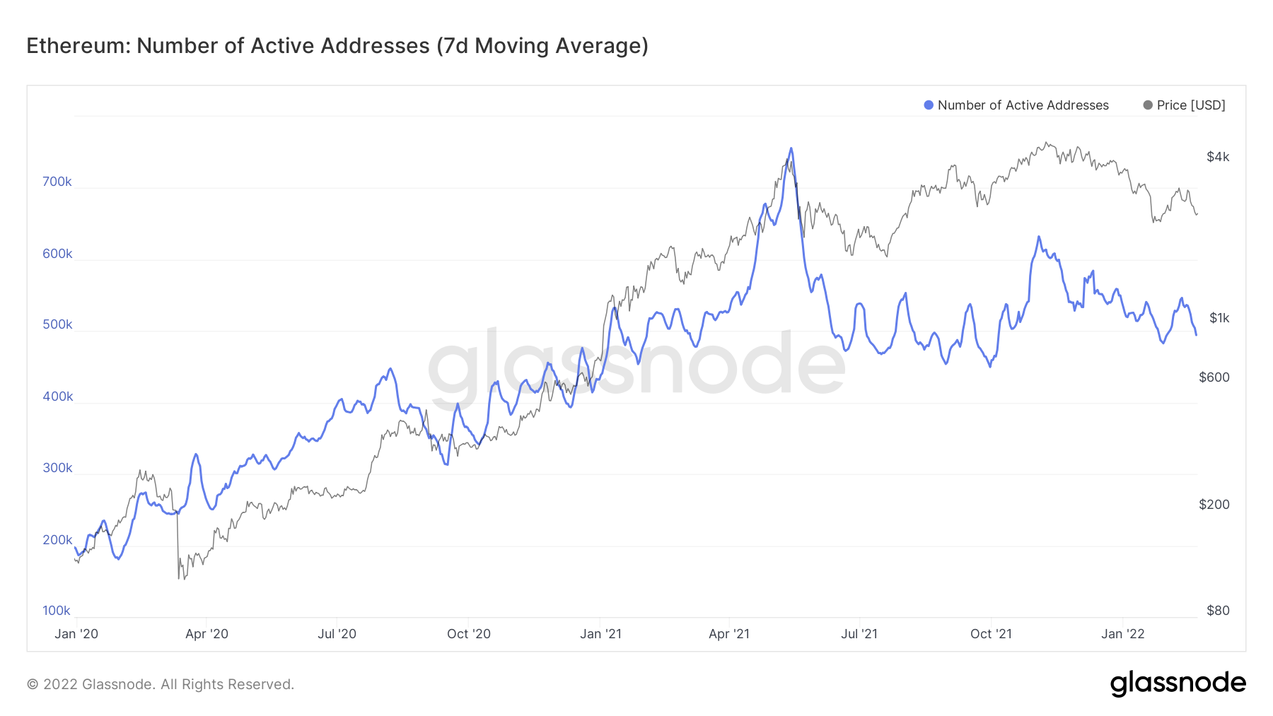
The charts above show us that both new and active addresses are down-trending for Bitcoin and Ether since the all-time high in early November. There are some spikes in the active addresses, but this is to be expected with the increased volatility we are seeing in the markets over the past months. However, the general direction has been down in the above metrics suggesting falling demand for the assets, which emphasise a bear market.
Metric 4 – Relative Unrealised Loss
Historically in Bitcoin, the bottom of bear markets is identified through large capitulation candles where large unrealised losses turn into large realised losses. With the macro headwinds we have spoken about on the horizon, the next few months look like they should be played with an air of caution. Particularly as we haven’t yet seen a capitulation event like the ones in late 2018 and March 2020. It may be this kind of event we’re waiting for to catalyse a shift in investor sentiment that begins to see the large wallets start to accumulate coins again. The Relative Unrealised Loss chart below emphasises this. We are yet to see a capitulation event, and for the unrealised losses to spike, both prior times have signalled the bottom.
Bitcoin – Relative Unrealised Loss
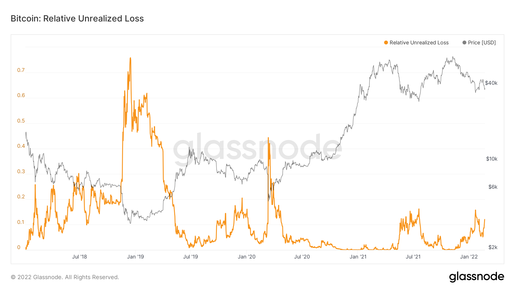
The above metric will likely be key in identifying a market bottom where we see a large spike in the above metric.
Summary
The upcoming macro headwinds are causing asset demand levels to decrease, particularly risk-on assets such as crypto. The above metrics have shown us that small wallets still feel comfortable accumulating (i.e. Enough pain has not been administered yet). The large wallets are still risking-off even though we have already seen huge risk-off in the past weeks. Lastly, we see the number of new wallets continue to decline, which indicates that demand isn't there yet. Along with this, the general level of relative unrealised loss has not spiked high enough to indicate a market bottom has been made, suggesting it is still to come.
Recommended from Cryptonary