Save 23% ($351) & Get a Free 1-1 Call with our Team ⏰ : 0d 2h 59m 44s

- Macro changes have turned many market uncertainties to certainties, potentially meaning that a lot of the negative news has been priced in. With some of these events becoming certain, it pushes investors to consider risking back on again.
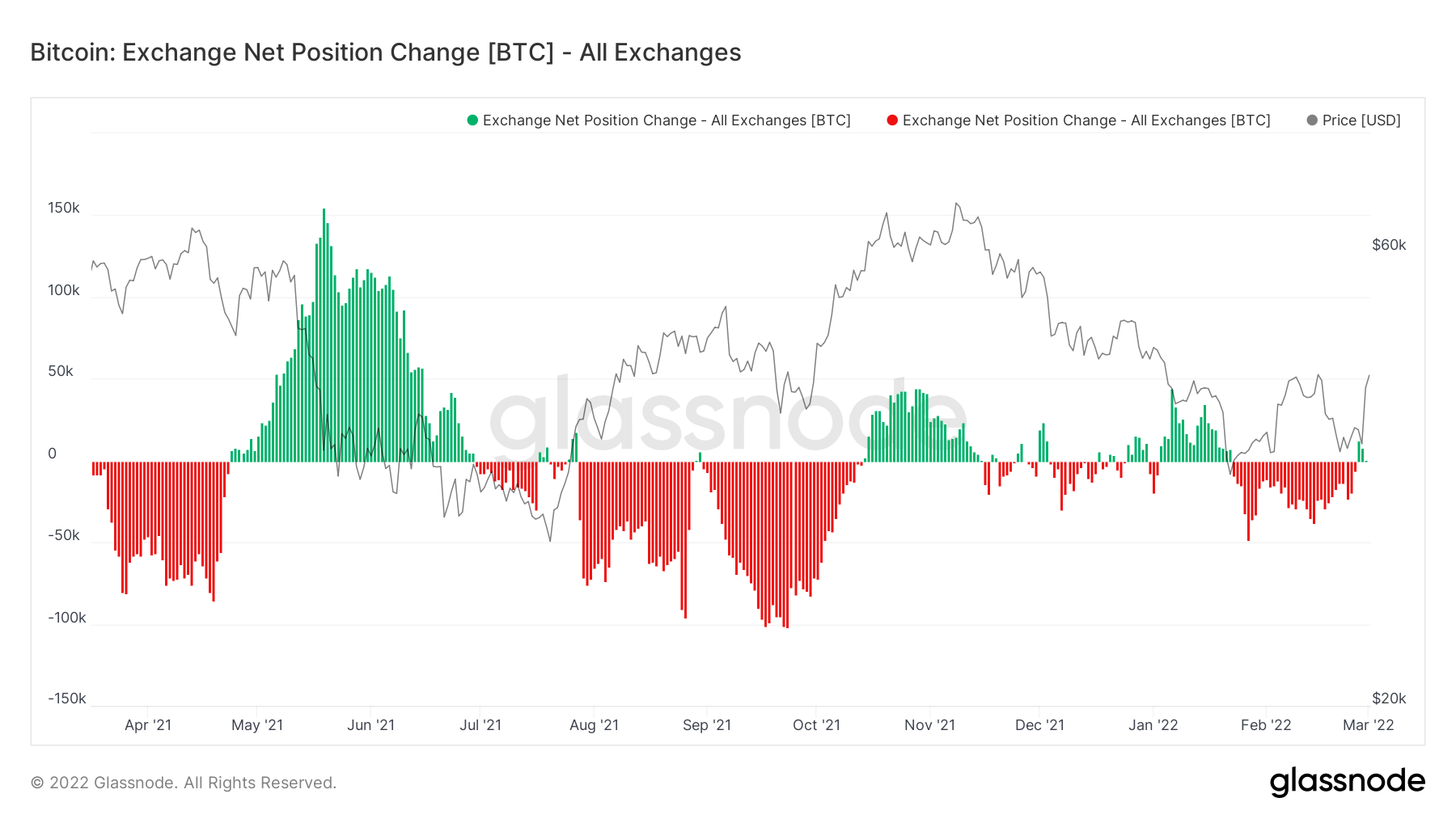
- The Exchange Net Position Change does not really show what’s going on in the market. We’re still seeing net inflows of coins, when actually the main cohorts we want to emulate are currently adding to their wallets.
- The Large Wallet Inflows metric saw its largest blue bubble (the largest I have personally ever seen in this metric) yesterday. This metric tracks the buying of the Whale cohort.
- As of yesterday, large Bitcoin wallets are adding and adding with significant size; hence we have seen the number of wallets in these cohorts increase dramatically over the past 24 hours.
- The New Addresses metric has not yet spiked, indicating retail has not yet returned.
Market Psychology & Macro Changes
In general, markets go up with underlying demand and confidence not to sell (withstand sell pressure). On the other hand, markets go down when there is a lack of demand. Recently, we have seen several possible headwinds for why investor demand may be lacking. But in my experience, the times when markets go down the most is when the level of uncertainty (and therefore fear) is at its highest.
Over the past week, we have seen changes in sentiment, and the level of uncertainty in markets significantly diminish. For instance, a week ago, we thought the FED could look to raise rates at the March meeting by either 0.25% or 0.5%, and the market was very split on this. We also had tension increasing dramatically on the Ukraine/Russian border, with war looking like a possibility but people believing ‘no, surely not?’. Now, these uncertainties are certainties. We know Russia has bombed Ukraine cities, and due to this, the FED will perhaps be more cautious in their rate increases, so now likely 0.25%. The uncertainty and hence the fear has become a reality. These uncertainties (now certainties) have been priced in (these things have now happened, or the FED doesn’t have much option in doing anything other than raising rates by 0.25%). So, with no major uncertainties on the near term horizon, investors now effectively have the ‘all-clear’ signs they need to begin deploying capital again. To what extent this deployment extends to high risk-on assets such as crypto was unknown. However, yesterday, we perhaps got some answers to this question, and we will cover this in some of the metrics below.
Metric 1 – Exchange Net Position Change
As usual, we begin with the Exchange Net Position Change. Over the past few days, we can see that there have been several small green spikes, indicating a net flow of Bitcoins into Exchanges rather than out of Exchanges. However, these spikes are not large in size, and therefore we need to look under the hood of this to understand the on-chain picture more greatly.
Bitcoin – Exchange Net Position Change
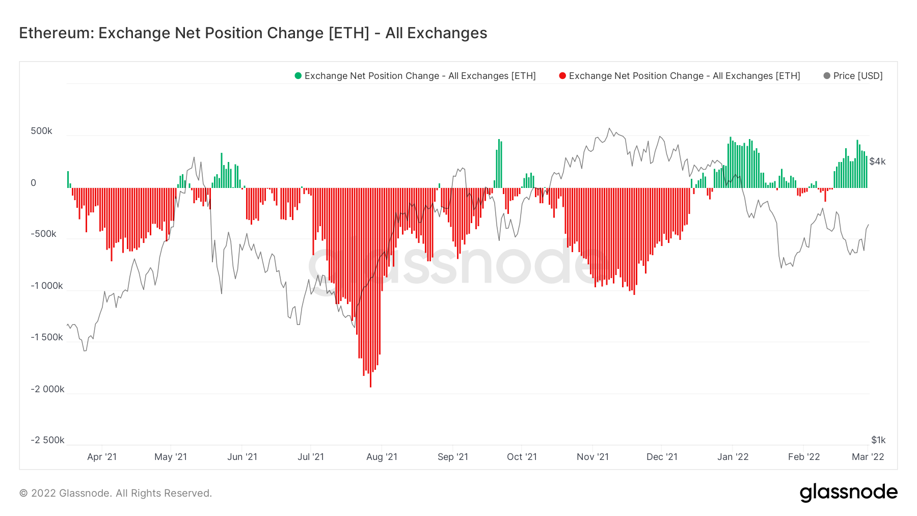
If we look at the Exchange Net Position Change for Ether, we can see that it has been dominated in recent weeks by green spikes, a net flow of Ether into Exchanges rather than out of Exchanges (indicating a greater willingness to sell Ether rather than accumulate it). However, we know from watching this metric that the correlation between price and net inflow/outflow is reasonably strong, so this metric doesn’t give us a huge indication of what will happen but rather a summary of what has happened.
Ether – Exchange Net Position Change
Metric 2 – Large Wallet Inflows
When taking a look ‘under the hood’ of the on-chain metrics, one of the first things we want to know is, ‘what are the large wallet holders doing?’ Historically, they are the most profitable cohorts, so we look to them to emulate their actions.
Bitcoin – Large Wallet Inflows
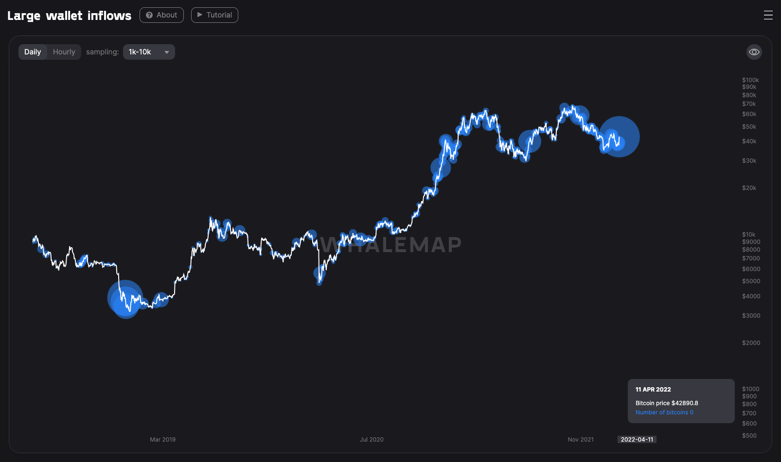
The above is exactly what we’ve been looking for to re-think flipping bullish again. The blue bubbles indicate points in which the Whale cohort bought Bitcoin. The larger the blue bubble, the more Bitcoin purchased. A day where purchases exceeded 100k Bitcoin is seen as positive. The latest blue bubble (produced in yesterday’s buying) was for 320k Bitcoin (the most I have personally ever seen whilst tracking this metric).
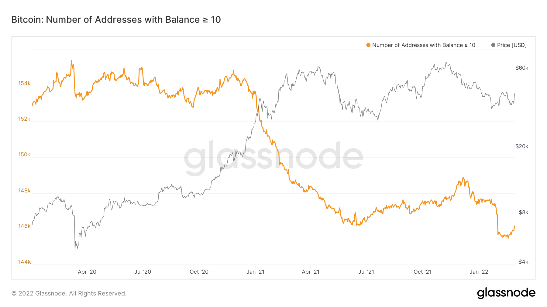
Metric 3 – Addresses
Following on from the above, we want to see that the larger wallet cohorts have begun to risk back on rather than remain in a risk-off territory (which is where they have been for the past few weeks).
Bitcoin – Addresses with Balance > 10 Bitcoin
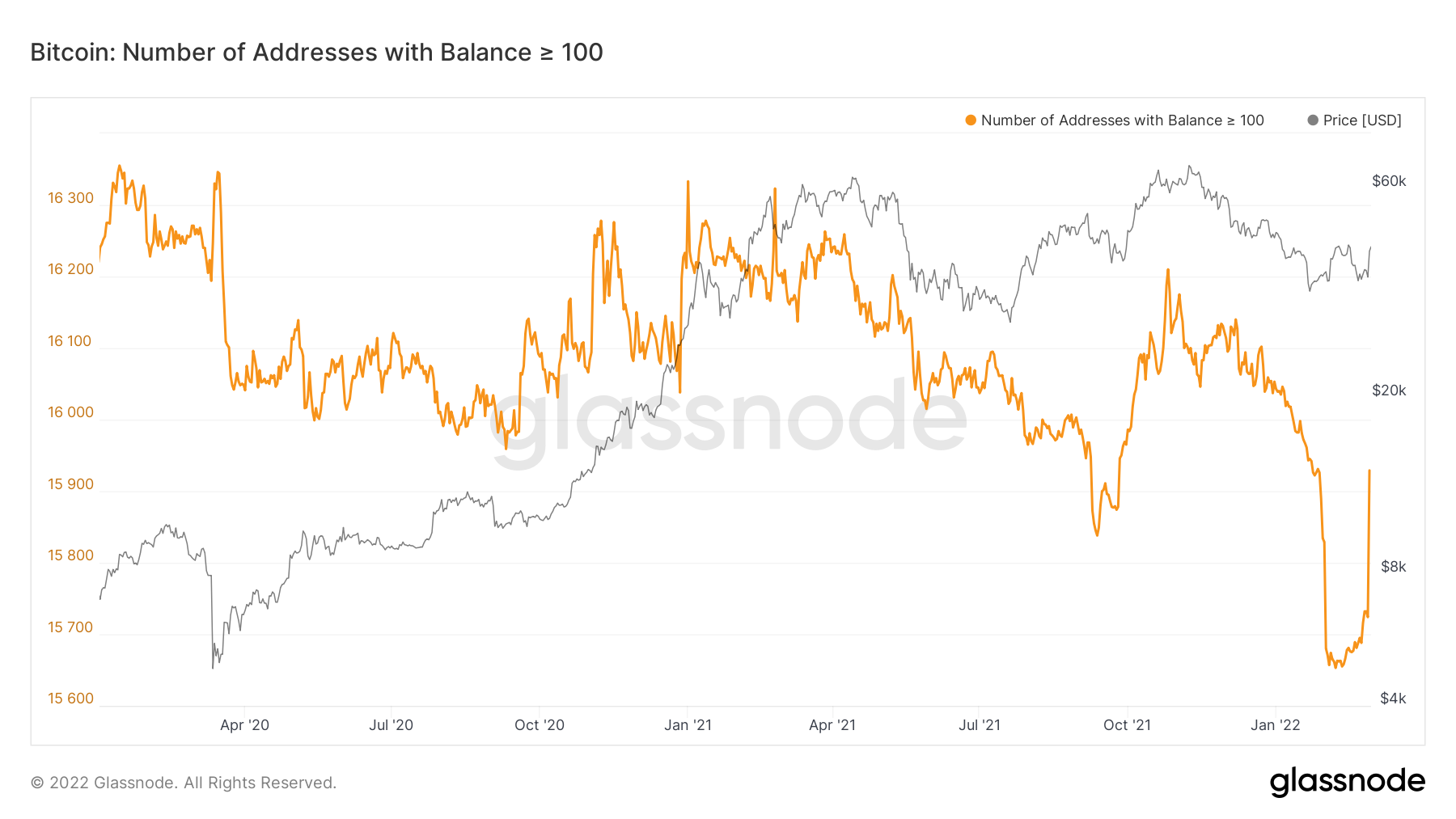
Bitcoin – Addresses with Balance > 100 Bitcoin
Bitcoin – Addresses with Balance > 1,000 Bitcoin
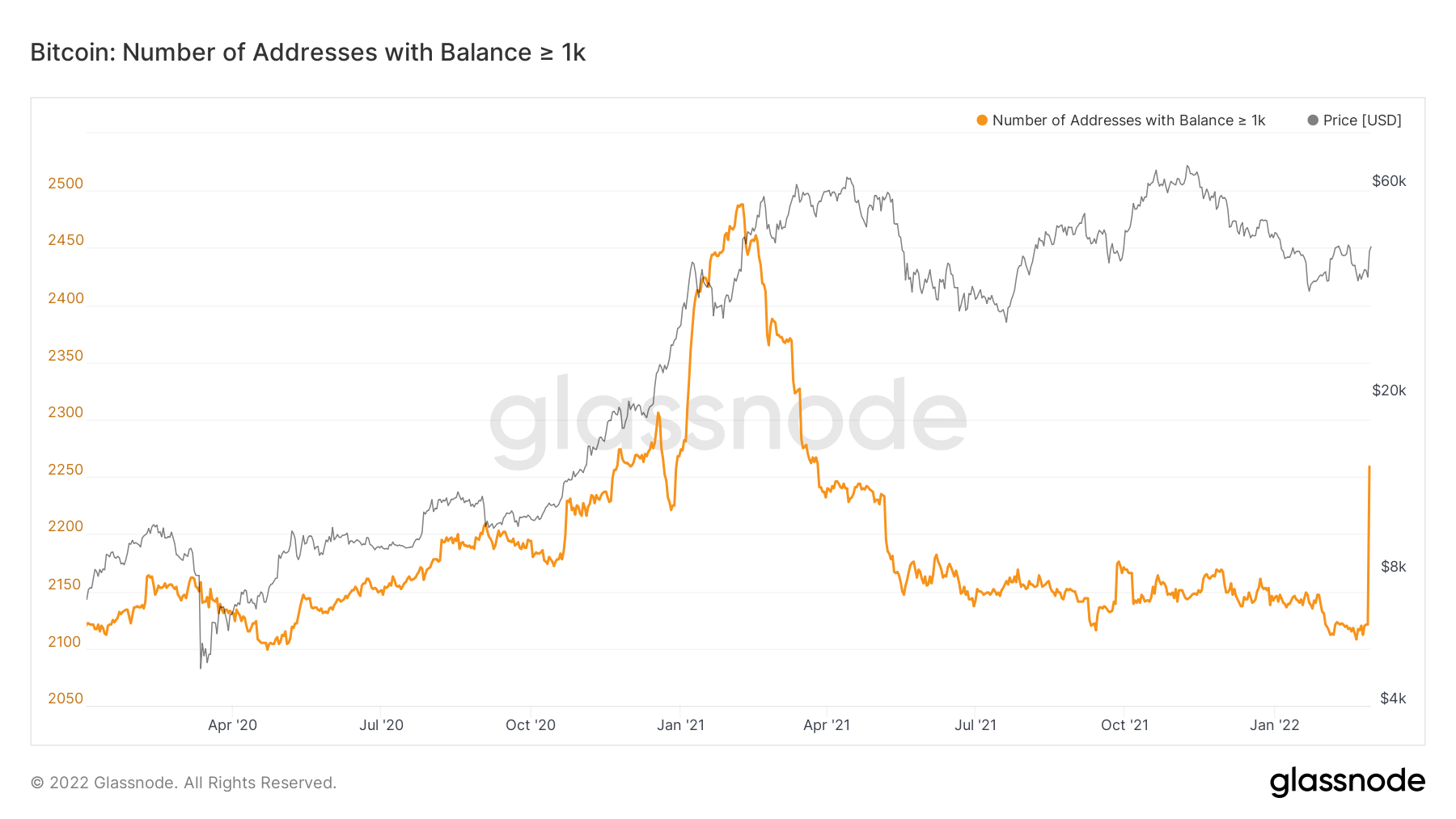
The above is quite extraordinary. The spike in the addresses with a balance greater than 100 and 1,000 Bitcoin is huge, particularly the latter. We have not seen this since the run-up in the first quarter of 2021. This clearly shows a risk-on approach from investors and a clear flip in sentiment.
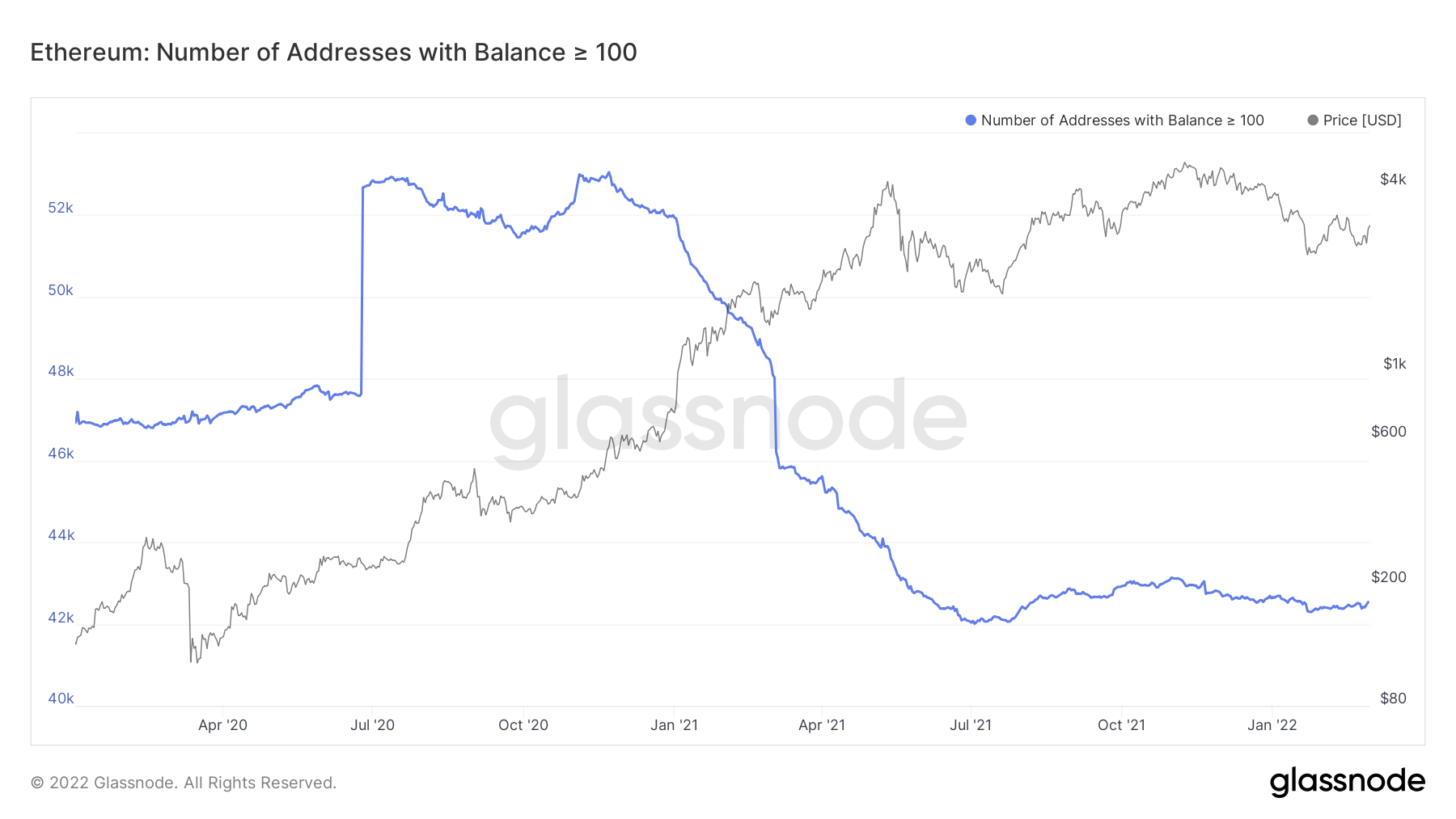
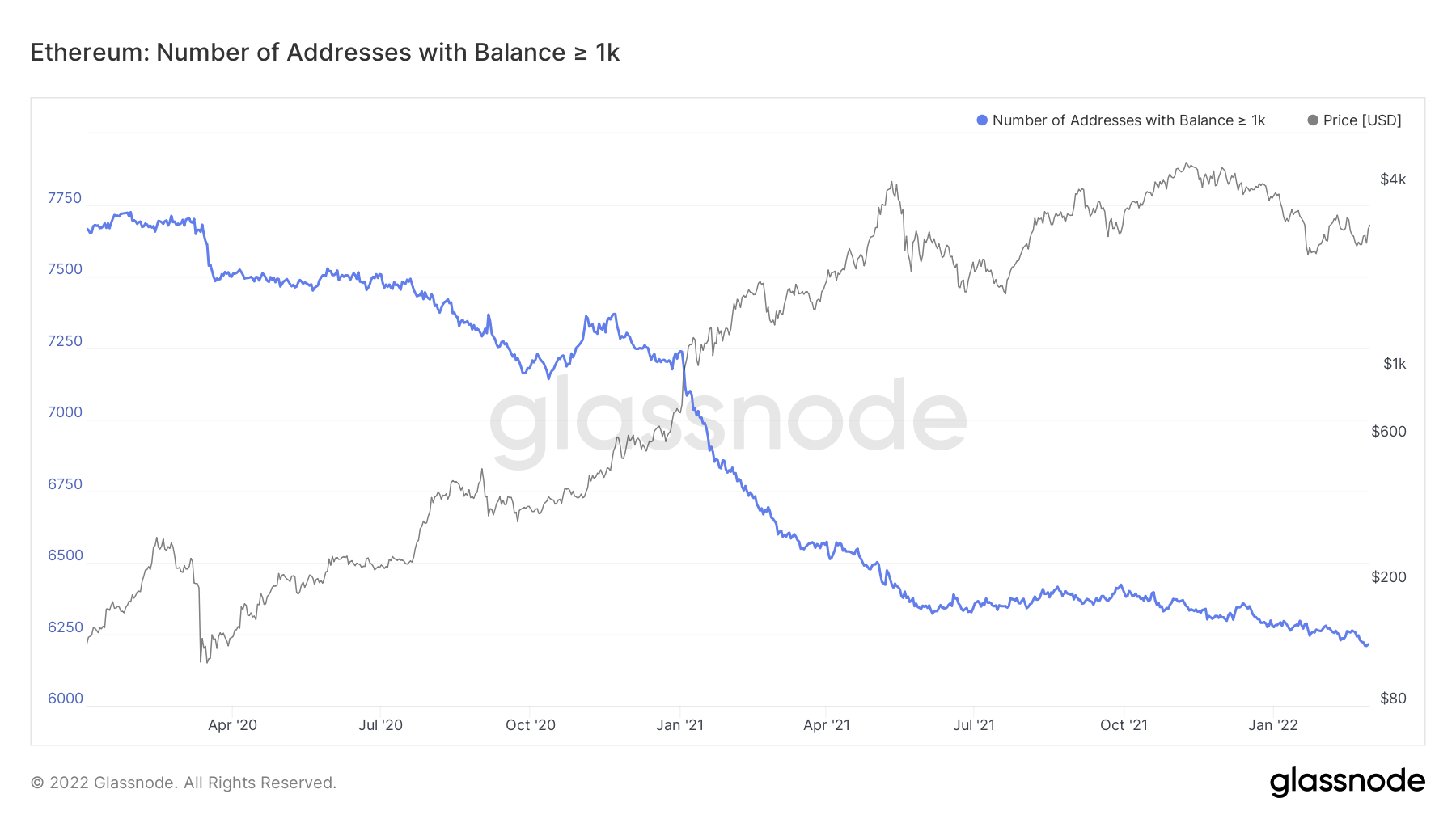
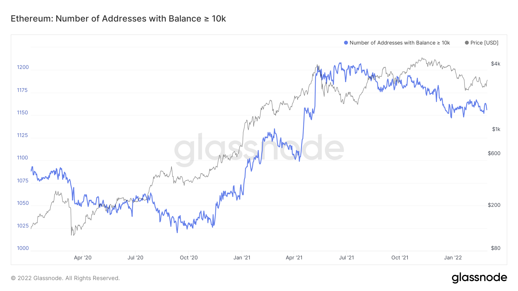
Looking at the same metrics for Ether, we can see that the same has not happened. However, Ether is usually lagging in comparison to Bitcoin, so it can be possible that we see the Ether wallets' uptick in size considerably over the coming weeks.
Ether – Addresses with Balance > 100 Ether
Ether – Addresses with Balance > 1,000 Ether
Ether – Addresses with Balance > 10,000 Ether
In assessing the above, it is clear that the large wallets have begun to risk back on and reload their ‘bags’. However, we want to see new liquidity come into the market to drive prices high. The metric we track for this is New Addresses.
Metric 4 – New Addresses
When assessing this metric, we ideally want to see it spike higher. This indicates new wallets are being created, and new money is flowing into the space, which is needed to push prices higher.
Bitcoin – New Addresses
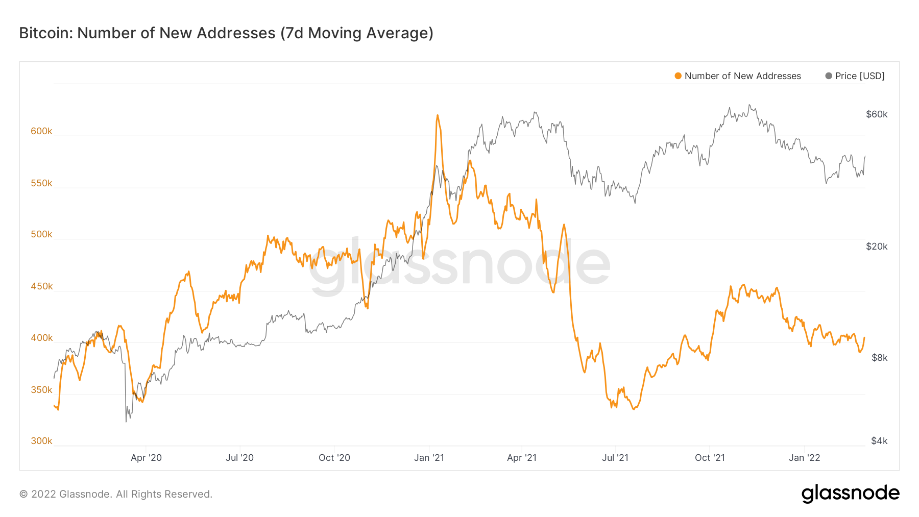
So, in the above, we can see we have had a slight spike but nothing major at all. This tells us that yesterday’s significant price increase was due to larger wallets buying rather than new money entering the space. This is something to keep a close eye on in the coming weeks, and we may see it climb higher if prices begin to rise consistently.
Ether – New Addresses
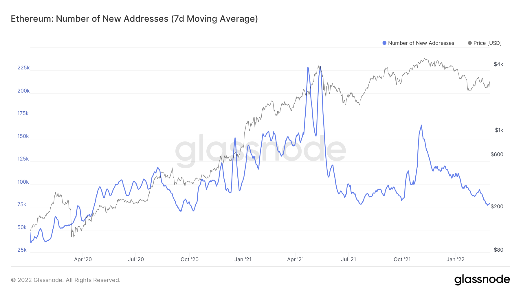
Currently, the same cannot be said for Ether. However, as we have already mentioned, Ether usually lags compared to Bitcoin, so again, something to keep watching. We will potentially see this increase more significantly once the Bitcoin new addresses metric spikes more (assuming it does this).
Summary
So, these are the first positive signs that we are seeing on-chain since the all-time high. Since the all-time-high, we had seen addresses reduce their size, the net flow of coins on Exchanges be either neutral or minimal in no clear direction. We also saw the lifespan metrics spike into some of the relief rallies, indicating that the older cohorts were de-sizing into price rallies. But now, we’re beginning to see signs that the larger wallets are risking on again (rather than off). It is important that we see these metrics stay high (hopefully climbing higher) and that there isn’t selling into higher prices. But the spikes in the metrics we have been watching for some time indicate that we should be risking back on again, emulating what the Whale cohort are doing.
Recommended from Cryptonary