Save 23% ($351) & Get a Free 1-1 Call with our Team ⏰ : 0d 2h 59m 43s

- The macro situation continues to be a major headwind in terms of new demand flowing into the market.
- The Exchange Net Position Changes show a decreasing amount of demand for Bitcoin and Ether.
- The spike on the 1,000 Bitcoin wallets cohort wasn’t an error but rather not an organic move, so this resets our thinking on this metric – no longer bullish.
- The average cost basis of the Bitcoin holders, suggests that there could be more downside ahead of us if this bear market is to repeat what others have done.
Macro
In the past week’s we have seen matters of the FED become more clear, there will likely be a 0.25% increase in interest rates at the March meeting with Powell laying down the likelihood for this in his last speech. His reasoning for doing this is simple, he needed to provide clarity to the markets as to what the FED is looking to do going forward, and simultaneously imply they are aware that the market does not need any further shocks (as this is the case with the Russia/Ukrainian war) and stability is the short-term goal.
However, what looked a week ago like the Russia/Ukrainian war might be over in just days/a week or so, now looks like it may drag on. As a result, the US have now effectively entered economic war with Russia, with sanctions only likely to get worse. What does this do for markets and how does it apply to crypto and the on-chain data?
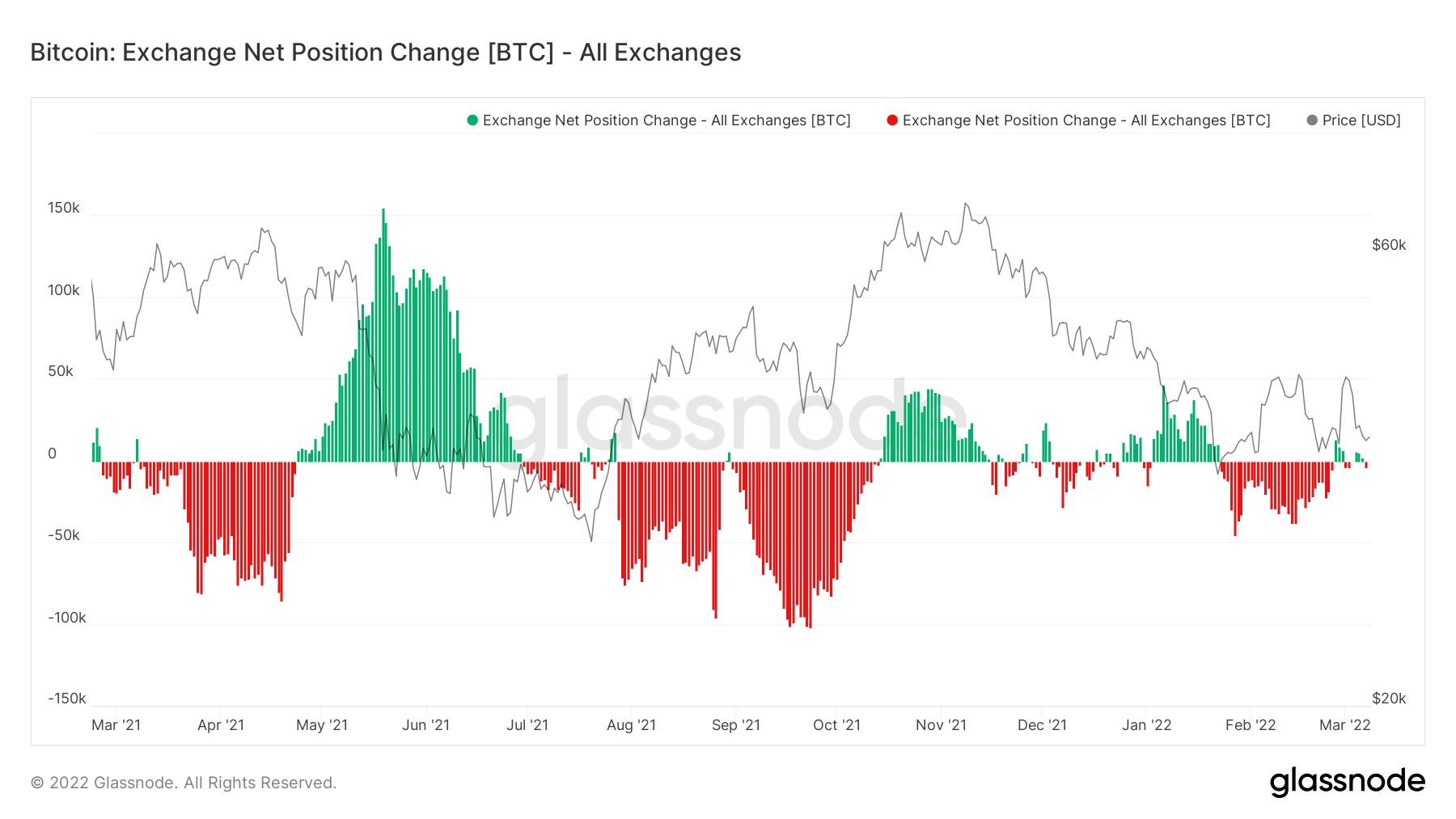
The first thing that extreme economic sanctions (alongside a war) does, is reduce demand. The metric that shows this the best is the Exchange Net Position Change.
Metric 1 – Exchange Net Position Change
We mentioned last week with the macro headwinds in front of us, demand for risk-on assets (crypto, and therefore Bitcoin) is likely to begin drying up. We can see in the Exchange Net Position Change below, that for the first time since late January, there have been green spikes (more Bitcoin flowing into Exchanges to be sold than actually flowing out to be stored in cold storage wallets). This suggests to us that demand for Bitcoin is beginning to subside.
Bitcoin – Exchange Net Position Change
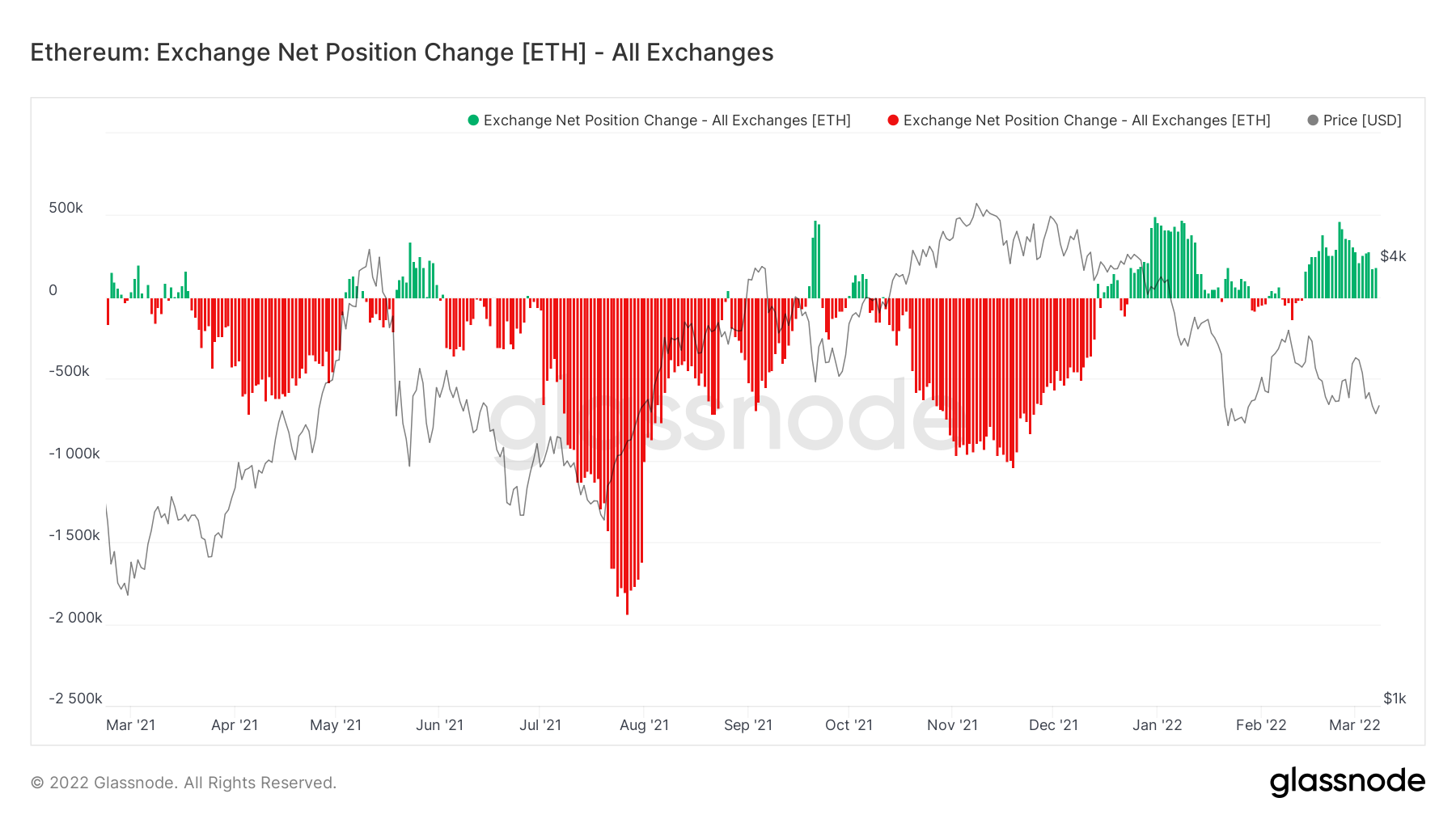
If we look at the same metric for Ether, we can see that the picture is worse. Green spikes are far greater, signalling a more significant gap between the demand for Ether and the amount of Ether being sold (the amount being sold being far greater).
Ether – Exchange Net Position Change
Metric 2 – Addresses (UPDATE)
Last week, we published a report where the addresses that contained more than 1,000 Bitcoin spiked massively, however, this was effectively false information as confirmed by the data provider Glassnode later in the week. This metric is one of the most important metrics we track to determine what the Whale cohorts are doing, and seeing the spike that we saw, immediately encouraged us to turn more bullish. However, the data was correct, but the increased number of addresses were not organic, in fact they were created by an Exchange to effectively move internal funds. This is something we see a lot on the Ether addresses, so it is not uncommon, but we just have to be aware what this meant and what it now means for us assessing the markets going forward.
Bitcoin – Addresses with Balance > 1,000 Bitcoin
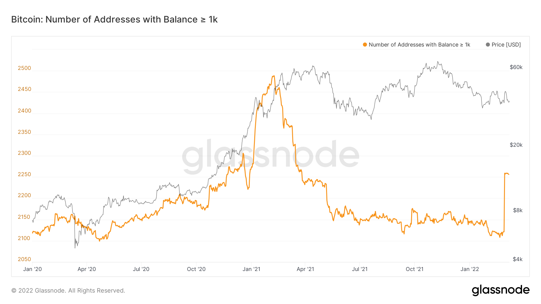
If done organically, this would have been incredibly bullish, but for Glassnode (the data provider) to come out and declare it as not means we have to re-assess. If this were organic, we’d likely see this metric continue to climb as it would flip a lot more investors bullish, however, we can see that it has just plateaued off at the top (far right).
This then effectively brings us back to square one and we’re yet to see any major bullish signals flash up in the key metrics, so still we continue to wait.
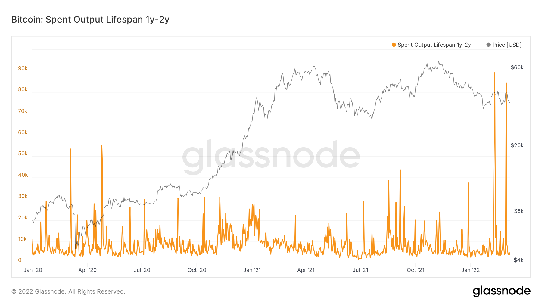
Metric 3 – Lifespan
So far, we know from the Exchange Net Position Change that there is slowing demand, but what truly defines the end of a bear market is a large reduction in sell-side pressure. If we look at the Lifespan metric for Bitcoin of all the coins aged between 1 and 2 years old, we can see that we have spiked recently on the graph. This means that investors who had held their coins for between 1 and 2 years, have sold significant amounts of size in the past month. However, other metrics had spiked previously (mostly around the beginning of the year) but not recently. This may suggest that the sell-side pressure is beginning to slow. We do not know if all the selling is done, but we do know that in the last months there has been significant sell-side pressure which is now beginning to fade. This is something to keep in mind as we progress through the report.
Bitcoin – Spent Outputs Between 1-2 Years Old
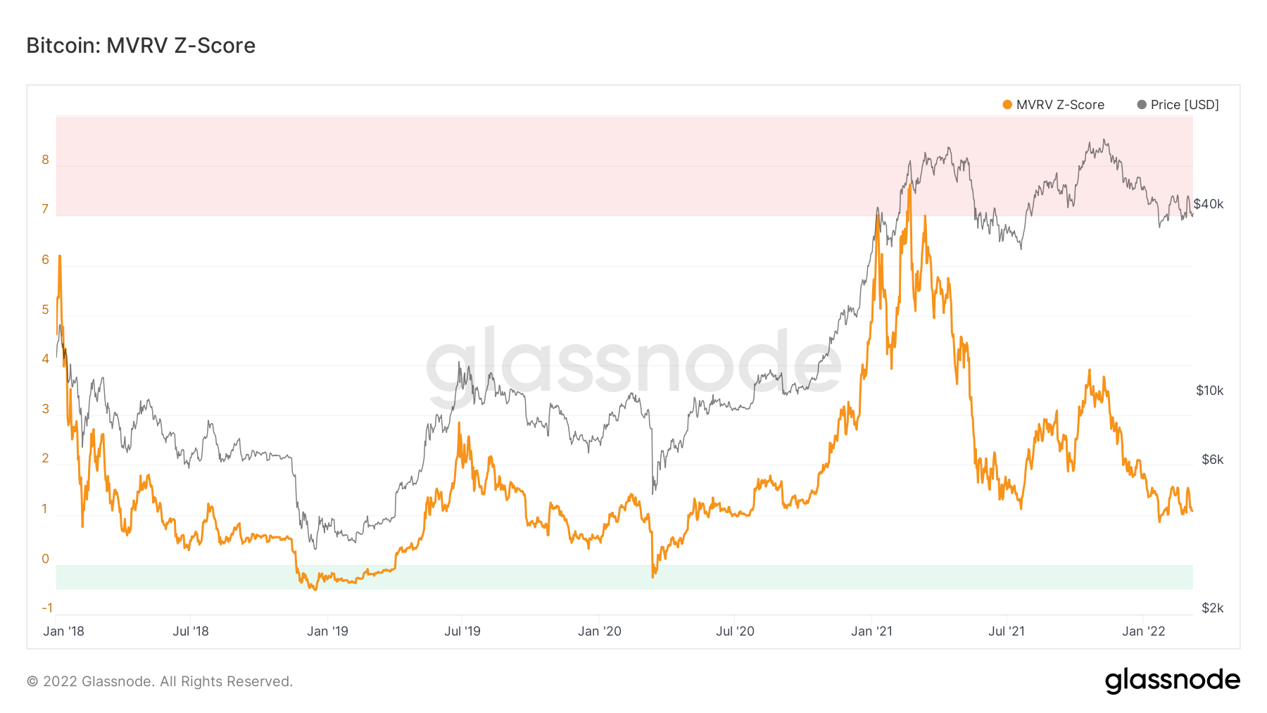
Metric 4 – MVRV-Z Score
The MVRV-Z Score has historically been a good metric for predicting market bottoms. If we look in the graph below, the 2018 bear market produced a value on this metric of 0.5 (on average) which acted as a floor for a long period of time. Notice how in this bear market we’re seeing a general floor in this metric of a value of 1. However in 2018, eventually price crashed low enough, that this metric registered below the value of 0. We can see this as the green zone. This metric has historically been excellent at signalling market bottoms and therefore perhaps we need to expect a flush lower in this metric and see the green zone once more.
MVRV-Z Score
Metric 5 – Realised Price By Address
The last metric we’re going to cover in today’s report is the Realised Price By Address. This metric visualises the average price at which unspent Bitcoins belonging to each category of addresses were purchased for. This metric is fascinating for analysing the last two bear markets and therefore what we may predict to happen in this one – in terms of calling a market bottom. We will do this by comparing the 2015 and 2018 bear markets with the one we find ourselves in now.
2015 Bear Market
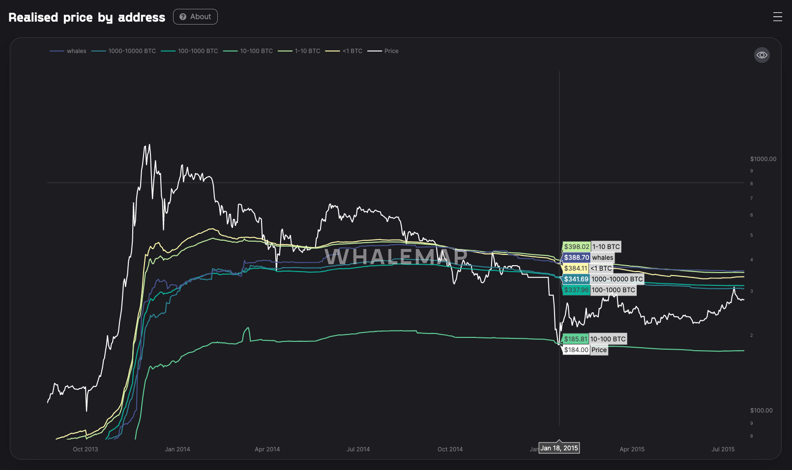
By looking at the above graph, we can see that the average cost basis for each cohort of wallet size differed. The 10-100 Bitcoin wallet cohort had the lowest average cost basis, and when price fell enough that the other cohorts were in reasonable unrealised losses, investors began to crystalise losses which drove others to do the same, until many investors had been flushed out. However, the 10-100 Bitcoin wallet cohort average realised price acted as a support in this bear market, and ultimately as the market bottom.
2018 Bear Market
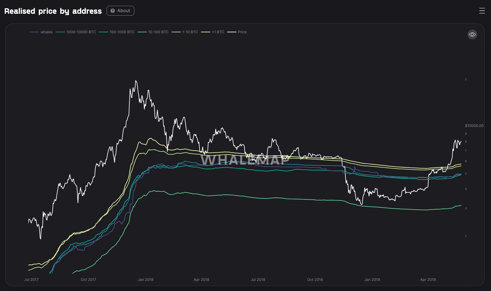
If we now look into the 2018 bear market, we can see remarkably similar results; price held a floor level around a level in which many of the cohorts were effectively at an unrealised break-even. But, as price went slightly lower, investors crystalised losses driving the remainder of the market to capitulate. Once again the 10-100 Bitcoin wallet cohort realised average price, acted as a support level.
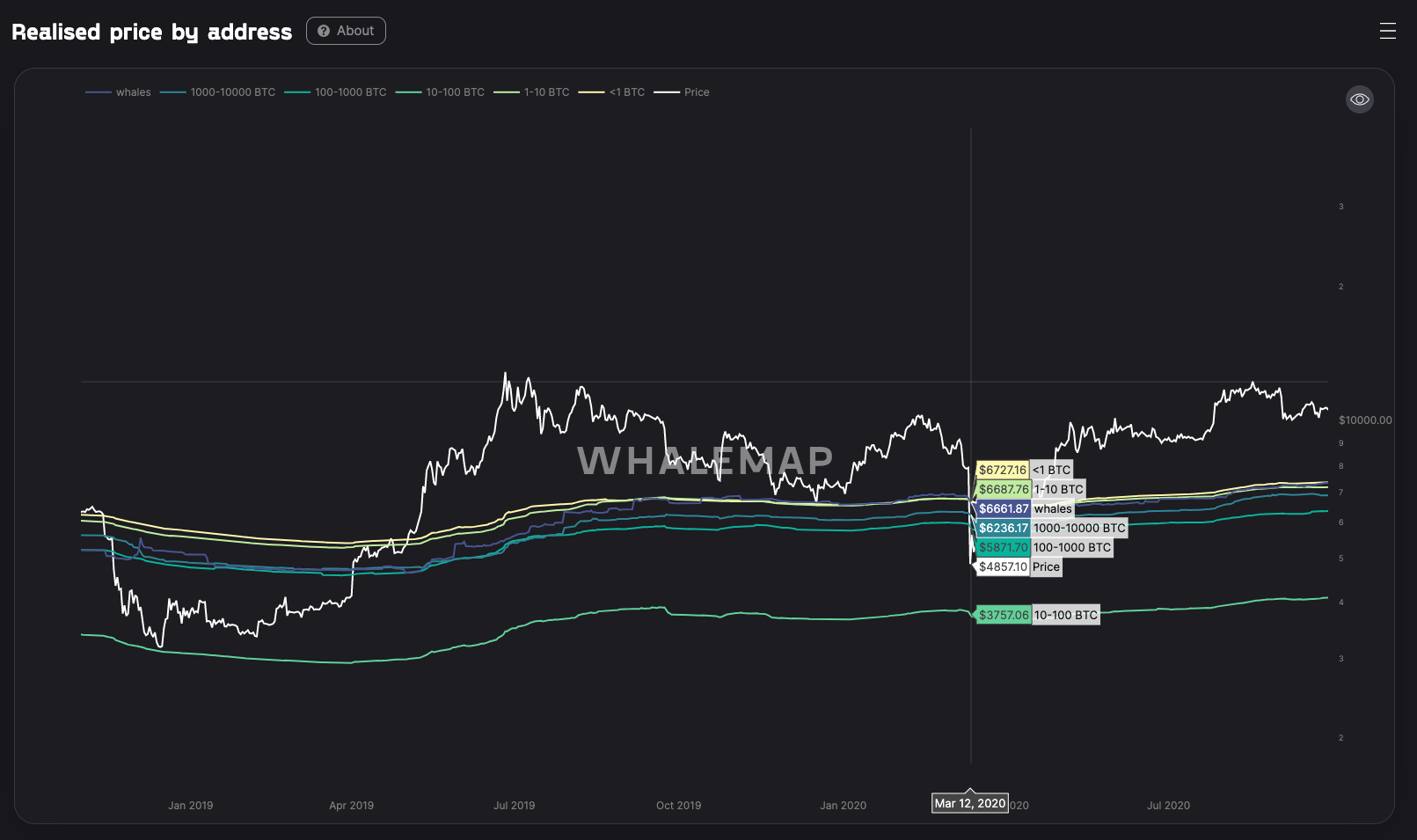
I will provide another example below, not quite a bear market but the COVID crash, showed similar levels of support.
2020 March (Capitulation Event – COVID)
So, with the above being said, and now uploading the following chart below, am I crazy to think with the current macro situation looking extremely tumultuous, the lack of demand in the market that we’re seeing currently, and sell-side pressure beginning to fade, that we could once again visit these realised price levels?
2022 Bear Market
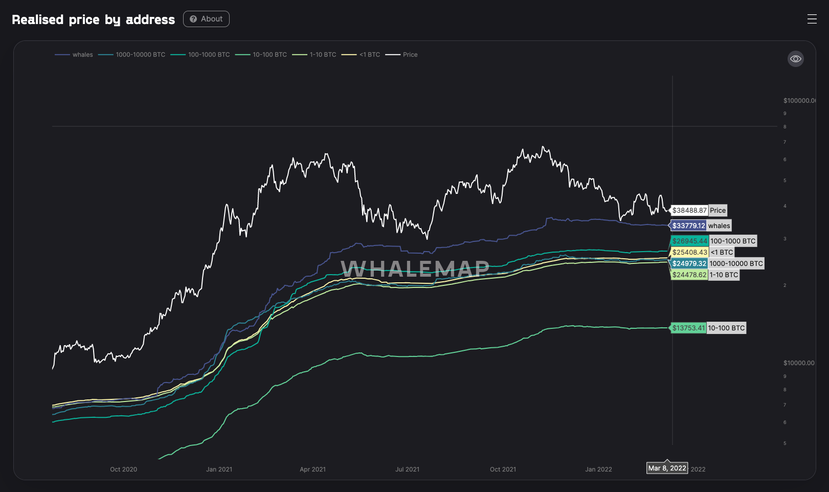
The strong majority of the average cost basis lies between $24,000 and $27,000. For many of the reasons outlined in this report, it may be increasingly possible that we set the $30,000 as a floor. This may then be broken and we have a capitulation event into this $24,000 to $27,000 region. Something to seriously consider.
Summary
Over the past months, the sell-side pressure has built up and is now beginning to decline, however, fresh demand is not exactly flooding in at this moment in time, which effectively means the market is quite stagnant. However, with the increased macro headwinds on the horizon, it may be possible we see a capitulation event in which price drops somewhere into the $20,000’s.
Recommended from Cryptonary