Save 23% ($351) & Get a Free 1-1 Call with our Team ⏰ : 0d 2h 59m 44s

- There are a number of macro headwinds on the near-term horizon which may prove problematic to prices going forward.
- The Exchange Net Position Change is showing high levels of accumulation, but from last week’s report, we know that this is from the smallest cohorts of wallets.
- The Net Realised Profit/Loss shows investor sentiment is low and that investors have been willing to sell into break-even levels rather than waiting for higher prices.
- The Bitcoin network is showing decreased levels of activity, which is typical of bear markets.
- The Realised Price suggests historically that prices could return to the realised price range of $24,000 - $27,000.
Macro
We currently sit less than week away from the May FED Meeting. It is expected that FED Chair, J Powell, will increase interest rates 0.5%. It is likely that Powell will also lay out the plan for the selling of FED assets (aim is to get to $95 billion/month), and also lay some suggestions for future rate hikes. Powell may potentially hint to increased rate rises in upcoming meetings (possibly greater than 0.5%). This will more than likely catalyse the markets to retract. With this known, the other increased macro headwinds are; the Russia/Ukraine war has escalated, and China is in another Covid lockdown. Both issues will cause even greater supply-chain shocks which in turn, can push inflation higher.
All of the above are significant macro concerns and will most probably prohibit the markets from gaining any real upside momentum, and fuel further price moves lower. With the macro conditions laid out, let’s look at some of the on-chain metrics to assess what investors are doing with their crypto holdings.
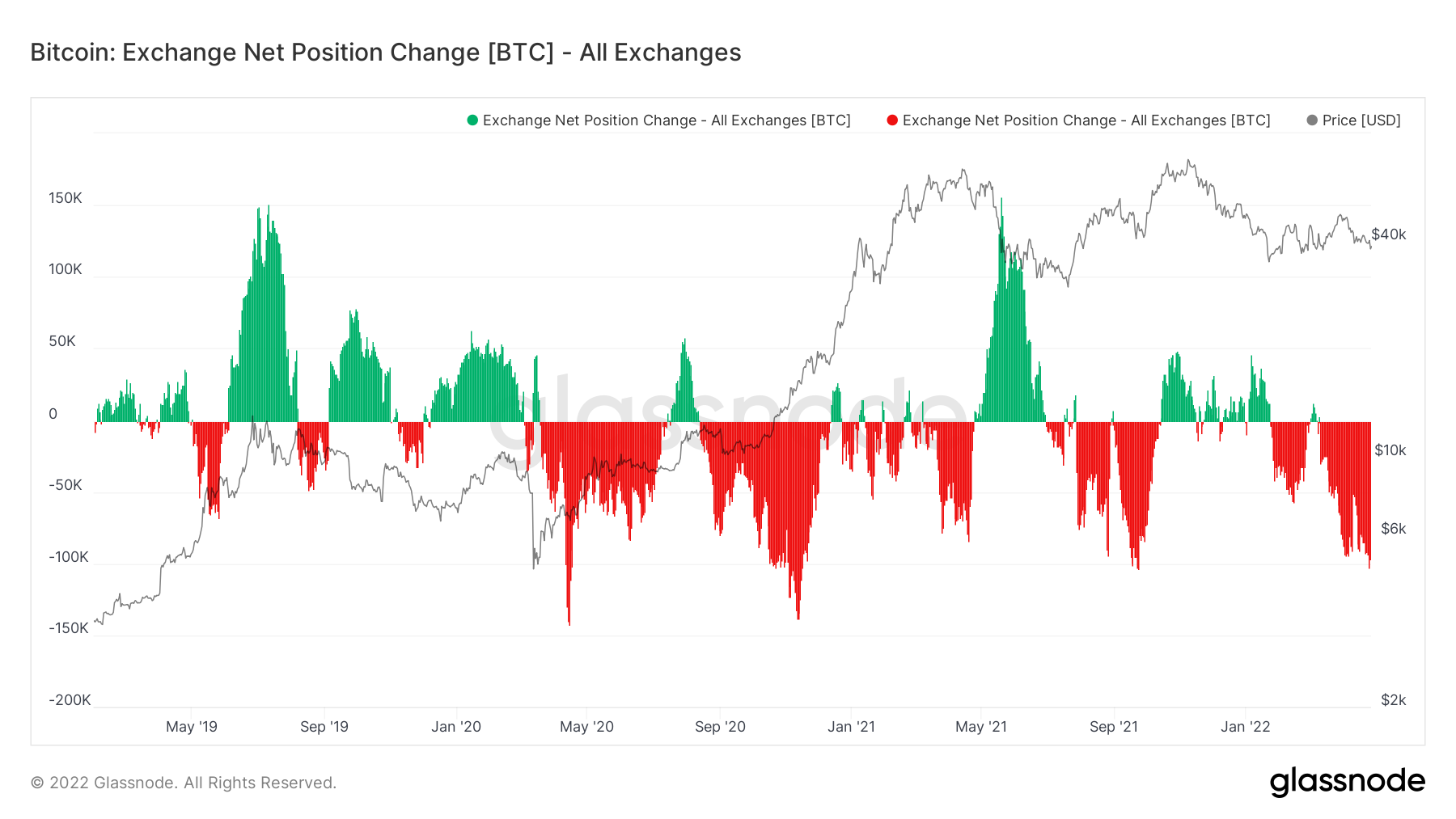
Metric 1 - Exchange Net Position Change
The Exchange Net Position Change shows increased levels of accumulation (red spikes – coins leaving Exchanges and flowing into cold storage wallets), with accumulation levels similar to that of September 2021, and only slightly less than Q4 2020 (the largest number of net outflows in Bitcoin’s history).
Bitcoin – Exchange Net Position Change
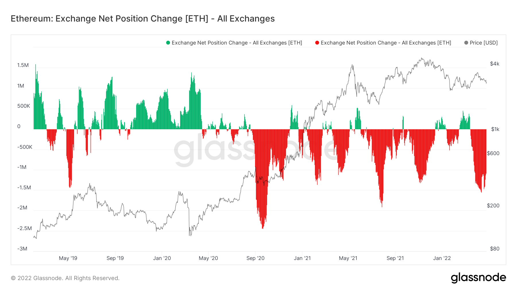
If we look at Ether on the other hand, the story is not too dissimilar, however, we are beginning to see slightly less coins being net withdrawn from Exchanges over the past few days. Overall, net accumulation of both Bitcoin and Ether is remarkably high considering the macro headwinds that look to be on the near-term horizon.
Ether – Exchange Net Position Change
Metric 2 - Large Transactions & Network Activity
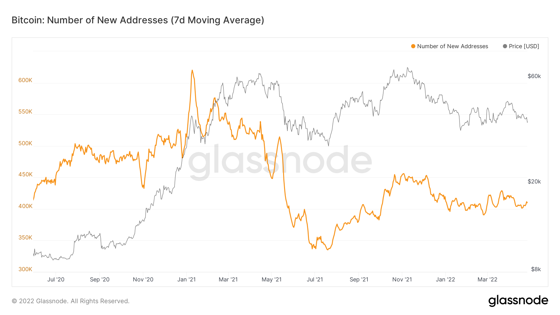
There are several metrics we can investigate to assess the general activity in the market, with the first of these being the number of New Addresses. We can see in the below graph that the number of new addresses is down trending. This shows that the number of new entrants into the space is decreasing, which is typical of bear markets.
Bitcoin – Number of New Addresses
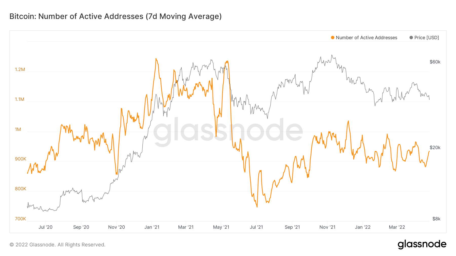
The second metric we can look to is Active Addresses. We can see below that this metric is also in a general down trend, suggesting that the number of users using the Bitcoin network on a day-to-day basis is decreasing, again typical of bear markets.
Bitcoin – Number of Active Addresses
The last metric we’re going to cover in this section is Large Transactions. We can see in the below graph that in the last few quarters, the number of large transactions have been increasingly higher, particularly at the all-time-high back in November 2021. It is therefore possible that a significant portion of the network is made up of these larger transactions rather than many smaller transactions, which is what we typically in bull markets.
Bitcoin – Large Transactions
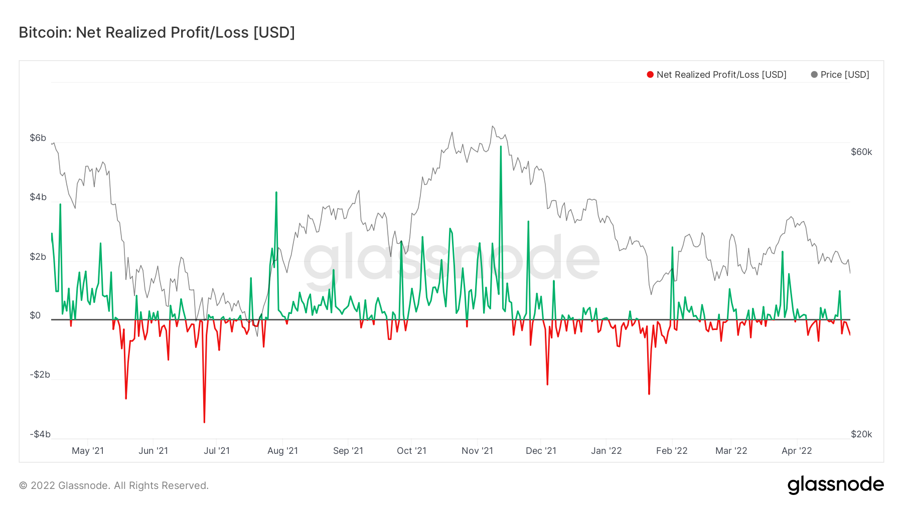
Metric 3 – Net Realised Profit/Loss
We will now assess a metric that is used to gauge overall investor sentiment. The Net Realised Profit/Loss shows if investors are selling at realised profits or losses. In the below chart, we see the red line dip below the black horizontal line, before almost looking like it is being held below. What this means is that investors have been willing to sell coins at a loss, then as prices go higher, investors have sold into break-even levels, suggesting that they do not have the confidence that the market will move considerably higher and wait to sell their coins in a profit.
Bitcoin – Net Realised Profit/Loss
Summary & Metric 4 – Realised Price
After analysing the above metrics, we see that the network activity has decreased and is currently showing signals that are more typically seen in bear markets. We also see that investor sentiment is low in that investors are choosing to sell into price rallies – in order to just break-even rather than waiting for higher prices in order to sell at a profit. The macro situation is also looking increasingly bearish, with a tightening FED (rate rises and the selling of Balance Sheet assets) there is an increasing likelihood that markets go lower, particularly in the short-term. The one contrasting metric is the Exchange Net Position Change, which is showing increased levels of accumulation. However, we know from last week’s report that this accumulation is in the majority being done by the smallest wallet cohorts i.e., it is not big players that are doing the accumulating. This is usually a negative sign, particularly as we watch the largest wallet cohorts to see when they’re accumulating so that we are able to emulate them, as historically they’re the most profitable.
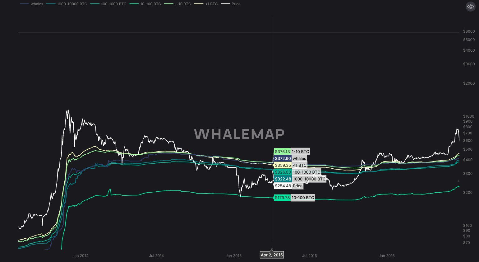
So, it is possible that there is more downside risk ahead of us, but how low could we possibly expect prices to go? For this, we turn to our 4th metric, Realised Price. Realised Price by address is the average price at which current unspent Bitcoins belonging to each category of addresses were purchased for.
Below are several graphs showing the previous bear markets in Bitcoins history where Bitcoin price has fallen below all the average cost basis for all the wallet cohorts.
Bitcoin – Realised Price (2014-2015 Bear Market)
Bitcoin – Realised Price (2018-2019 Bear Market)
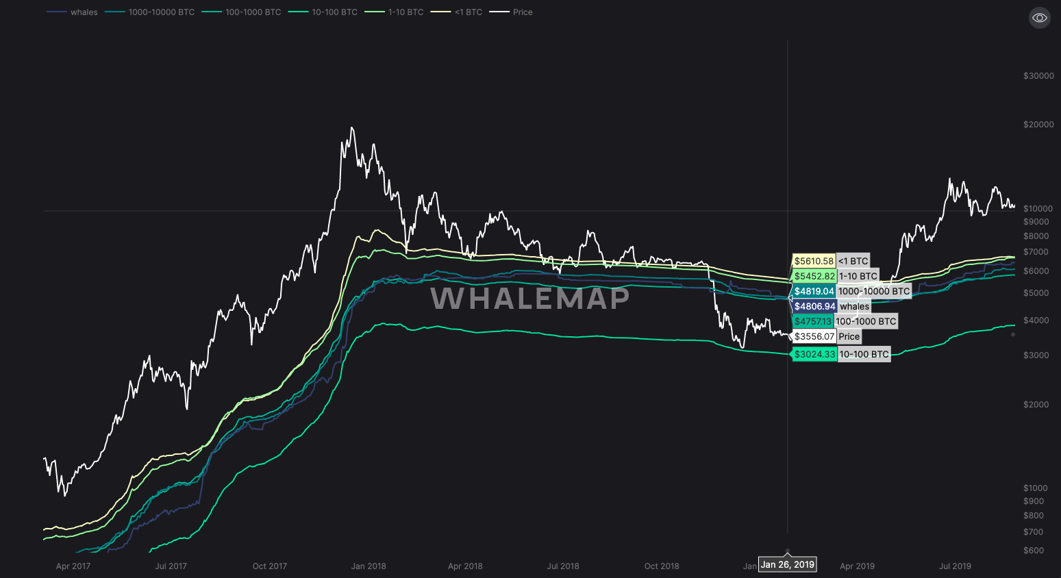
Bitcoin – Realised Price (2022-Present Bear Market)
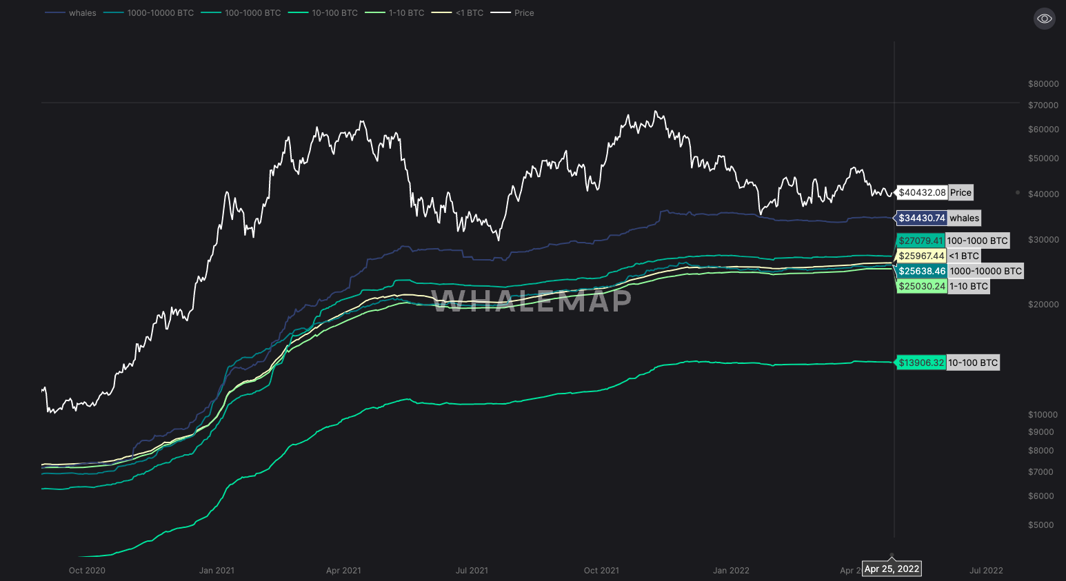
From the above graphs and with the macro and on-chain metrics covered above, it looks entirely possible that if the Bitcoin market is to draw back significantly, perhaps the realised costs could be tested. We can see in the last graph that these costs are in a tight range, between $25,000 - $27,000. If markets are to go lower, perhaps this range can be tested.
Recommended from Cryptonary