Save 23% ($351) & Get a Free 1-1 Call with our Team ⏰ : 0d 2h 59m 43s

TLDR
- Investors have looked to acquire and hold Ethereum coins over the last Year to 18 Months, even though recently accumulation has slowed.
- Long-term investors are still reluctant to sell and book profits, however, they’ve slowed in terms of their aggressiveness towards accumulating more.
- Short-to-mid term investors have dominated selling in recent weeks.
- The MVRV is still not relatively high, particularly in comparison to the 2017 Bull cycle. This could mean that we have still got some more room to go.
Today’s report is unique in that this is the first time we will be going through and analysing the On-Chain Metrics for Ethereum. In all previous reports we have mainly covered Bitcoin, so today we believe it will be beneficial to see how the On-Chain picture for Ethereum either does or doesn’t differ from the On-Chain picture for Bitcoin.
Exchange Net Position Change
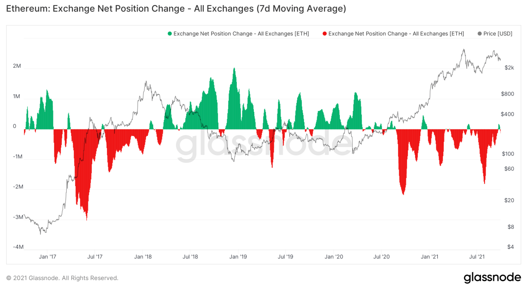
We can see in the chart above that since September of 2020, we have been predominantly in an accumulation phase (red spikes = more Ether leaving Exchange Wallets for Cold Storage Wallets = usually bullish). It’s important to notice that there was big accumulation after the crash in May 2021 when ETH was between $2,000 - $3,000, however, ETH has spiked up again to near $4,000 recently and it is back down to $3,000, yet we are not seeing the same levels of buying/ETH being withdrawn from Exchange Wallets as we were back in June and July at these similar price levels. Something to be cautious and aware of for now.
The above could mean investors have finished their accumulation phase and are simply sitting on their hands, hence the deceleration in withdrawals from exchanges.
Let’s dive into the rest and see how we’re looking.
Exchange Balance (%)
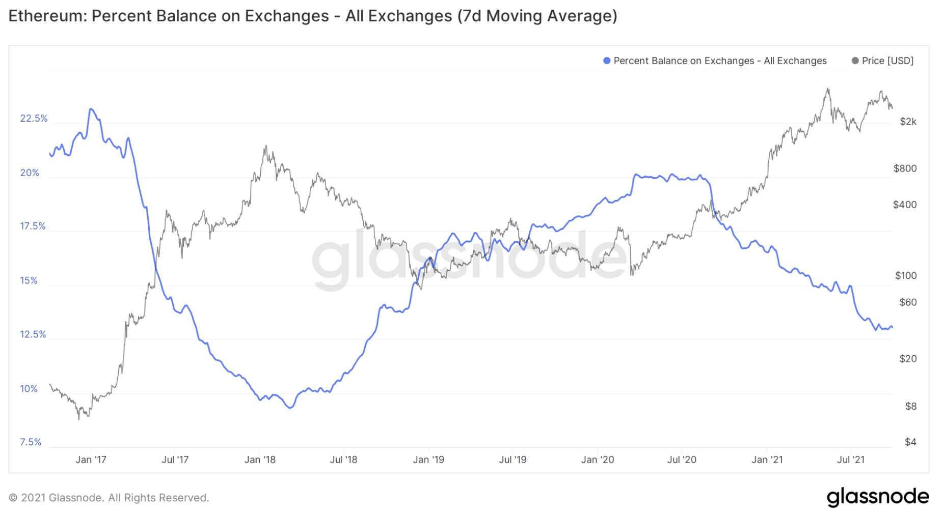
If we look at the Exchange Balance (%), this is the amount of the circulating Ethereum supply that is on the Exchanges. The less coins are available on exchanges, the less supply that is readily available for sale and hence the more bullish an asset becomes.
We can see from March 2018, the amount of ETH on Exchanges (% wise) has been increasing until September of 2020, where a new downtrend in % of ETH on Exchanges had begun. We are now seeing this downtrend slow slightly and it begin to flatten out. However, we have had slight flattening outs or upticks, but the general downtrend has continued. Keeping a close eye on this, however unless the downtrend bends, this metric remains bullish for ETH.
Lifespan
Another key Metric we can look at is the Lifespan. This is separated into the cohorts of investors from different age bands to work out which types are selling and which are holding. Long-term investors selling is a bearish signal and vice versa. The Long-Term investors are known as the Smart Money. Let’s look into this.We will start with a chart that represents the investors who have held coins for 3 – 6 Months before selling them. These are known as shorter-term traders, and this is not classified as Smart Money, as they are in the majority, less profitable than the longer-term, Smart Money investors. We can see in the chart below that selling is usually done into panics and then the following price rebounds. This is very typical of shorter-term sellers who are always happy to ride the wave whilst prices are shooting up, but as soon as there is any major sells, they’re rushing for the exit door.
6-Months-Old Coins
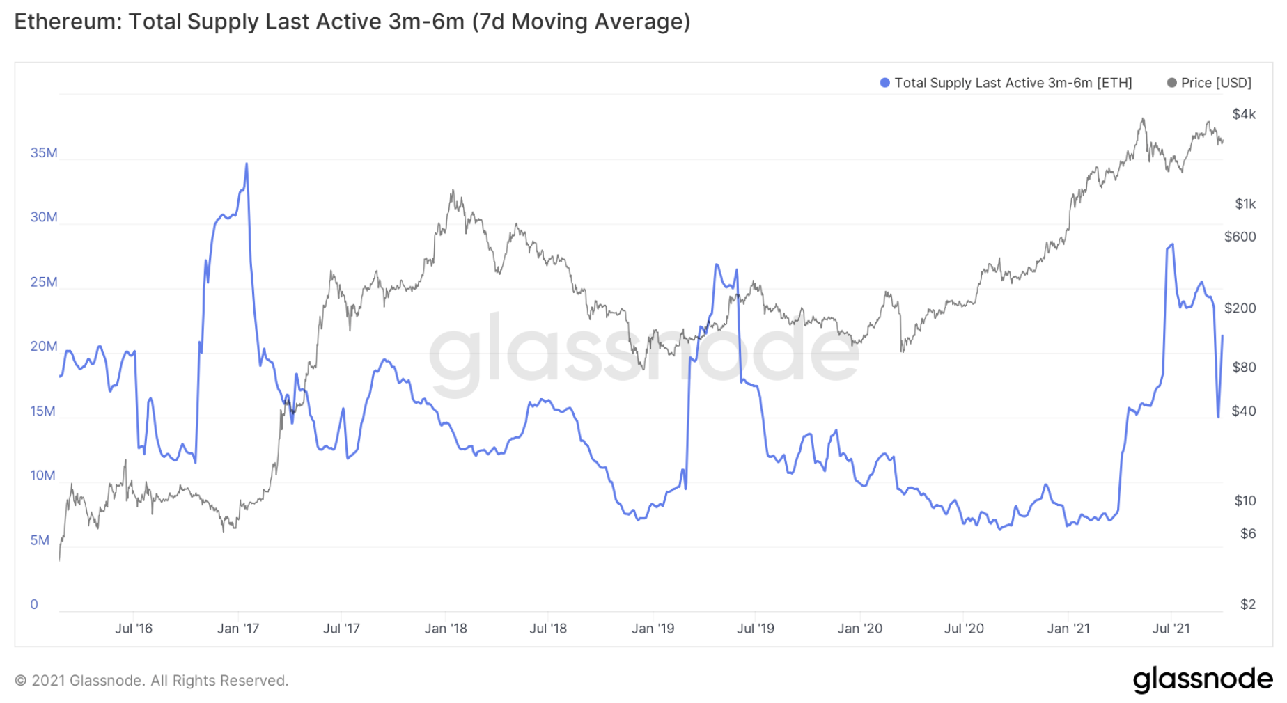
If we look at the 6 – 12 Months cohort of Bitcoin holders, we can see that we have had some spike in selling on the rejection of the second bounce up to the $4,000 area, with the profit booking coming in at the $3,000 level. This is reasonably concerning. This may encourage some investors to act more cautiously but it doesn’t mean full change in opinion as Bitcoin’s overall Metrics still look positive. But this is something to be paying close attention to just in case it worsens.
12-Months-Old Coins
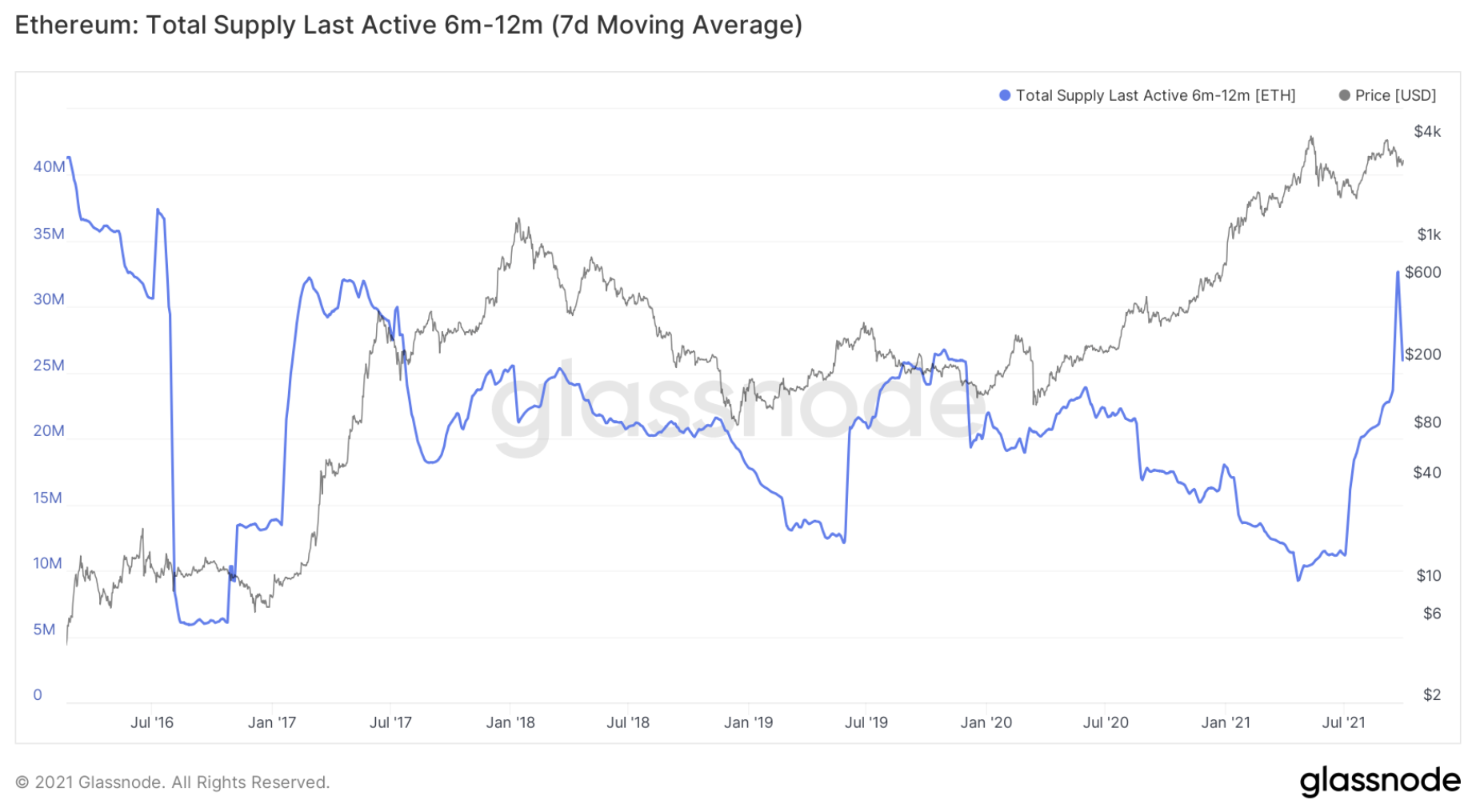
However, if we look at the 1 – 2 Year holders, this cohort’s level of profit taking has been considerably low, in fact, close to nothing. Ideally, we’d see the line start down trending again or even flatten. The below chart shows that these Long-Term investors are content in still holding their coins, but we’re seeing some small amounts of selling, perhaps for investors to take some of their initial risk back out. This is overall positive, as the Long-Term investors are usually the most profitable cohort of investor. We can see that the 1-2 Year Old Coins (Longer-Term investor) were selling into the initial spikes in 2018 and then were holding or even accumulating on the big price dips. Where as if we look at the 3-6 Month Old Coins (the Shorter-Term investors), their spikes in activity were during the large price crashes, a poor decision now being able to look back and reflect.
1 /2-Years Old Coins
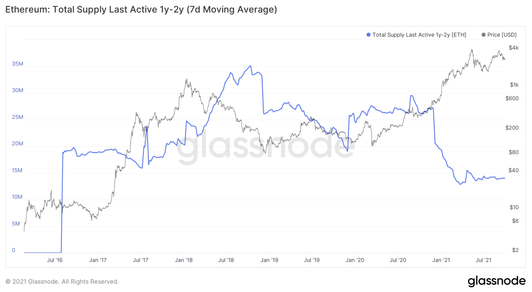
This is more positive and should settle us back down a bit after seeing the 6 - 12 Month cohort’s substantial amount of profit-booking.
MVRV Ratio
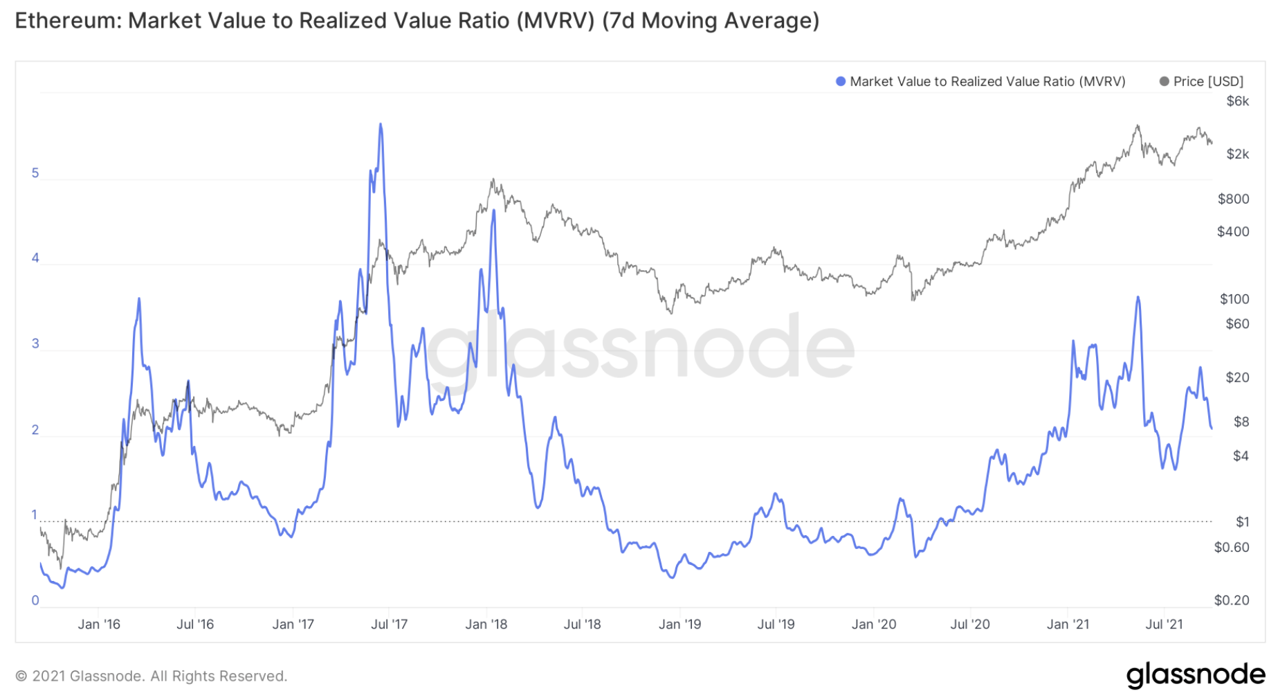
One last Metric to look into is the MVRV Ratio, this is the Market Value to Realised Value as a ratio between the market cap and realised cap. The blue line tracks the ratio value.
In times of an over-hyped Bull market, the Ratio will be high (price is a considerably higher than its fair value). In a Bear market the price may be significantly under its “fair value”, a value on the Ratio under 1. We can see in the chart below that even though the MVRV has spiked in this Bull cycle, we can see that the spikes are not registering a value anything close to the peak in mid 2017 of the last Bull cycle. This may signal that we have more room to go.
Summary
To summarise this report, we can say the main Metric to read is the Exchange Net Position Change, even though this is largely positive, it has slowed down recently. This is perhaps due to selling by younger to mid cohorts of investors and we have seen a slowdown in accumulation even though older cohorts aren’t wanting to really offload their positions. Let’s see how this changes over the next few weeks.Recommended from Cryptonary