Save 23% ($351) & Get a Free 1-1 Call with our Team ⏰ : 0d 2h 59m 43s

Disclaimer: Not financial nor investment advice. You are responsible for any capital-related decisions you make, and only you are accountable for the results.
Macro
After last week’s hotter-than-expected Inflation data, there have been calls for the FED to be more aggressive this week (with regards raising Interest Rates) at the FOMC on Wednesday, September 21st.Last week’s Inflation data:
- wInflation Rate YoY: 8.3% (DOWN 0.2% on prior month). Forecast was 8.1%.
- Inflation Rate MoM: 0.1% (UP 0.1% on prior month). Forecast was -0.2%.
- Core Inflation Rate YoY: 6.3% (UP 0.4% on prior month). Forecast was 5.9%.
- Core Inflation Rate MoM: 0.6% (UP 0.3% on prior month). Forecast was 0.3%.
- CPI AUG: 296.171. Forecast was 295.7
It is widely expected that the FED will raise interest rates this Wednesday by 75 basis points (0.75%) with there being an outside possibility of a 100 basis point raise, although this is unlikely.
Total Market Cap
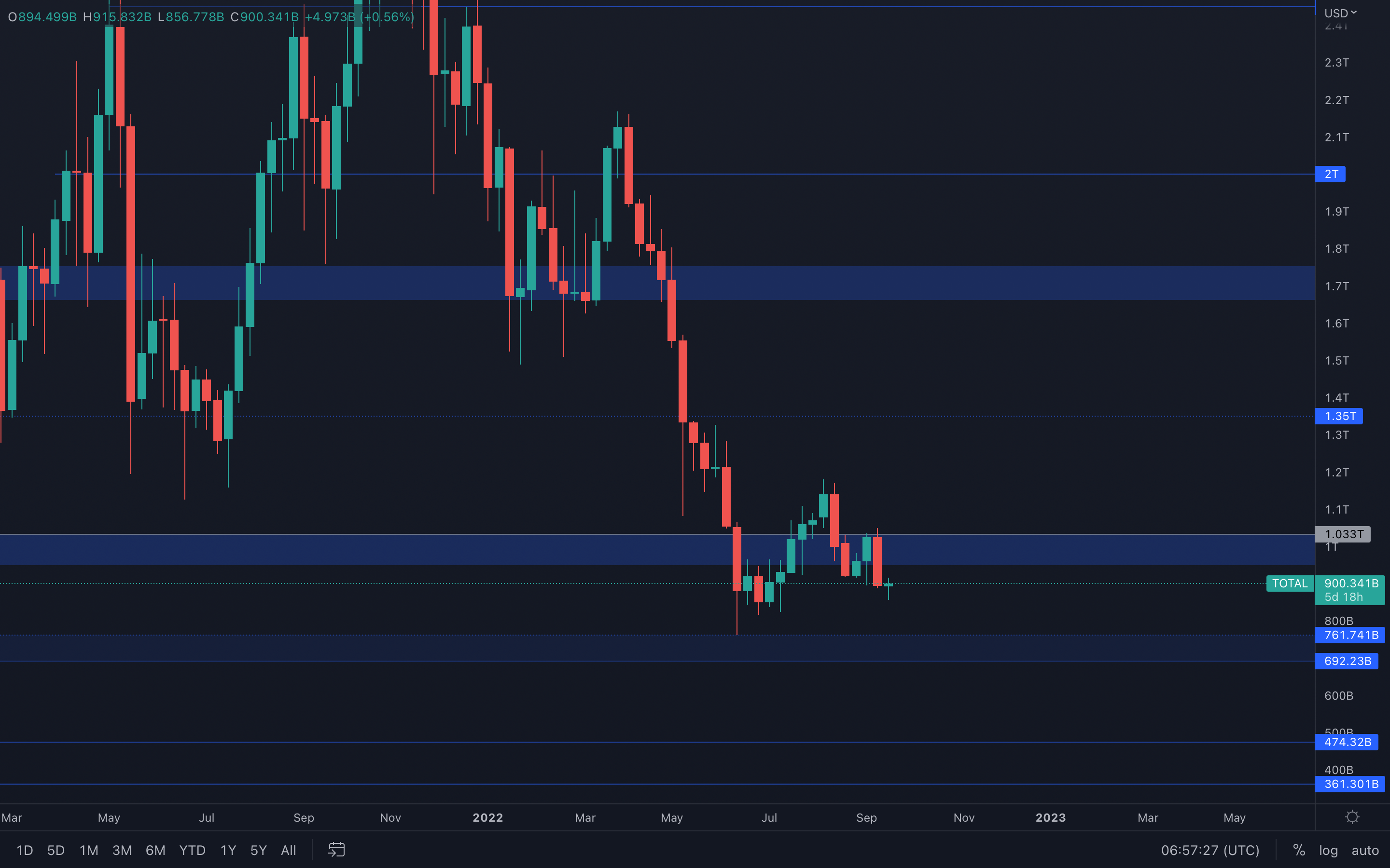 There's no doubt that sellers are once again in complete control. Last week's candle closed full-bodied, indicating selling pressure is at an apex point. Not only that, but the Total Market Cap index registered a bearish engulfing candle on the weekly timeframe.
In terms of market structure, the potential shift we've been hoping for (bearish to bullish) has been invalidated after the index was unable to reclaim $1.03T and as a result, registered a bearish engulfing candle right from resistance.
When pairing the above, we should now expect June lows ($760B) to be tested once again in the foreseeable future.
Altcoins Market Cap
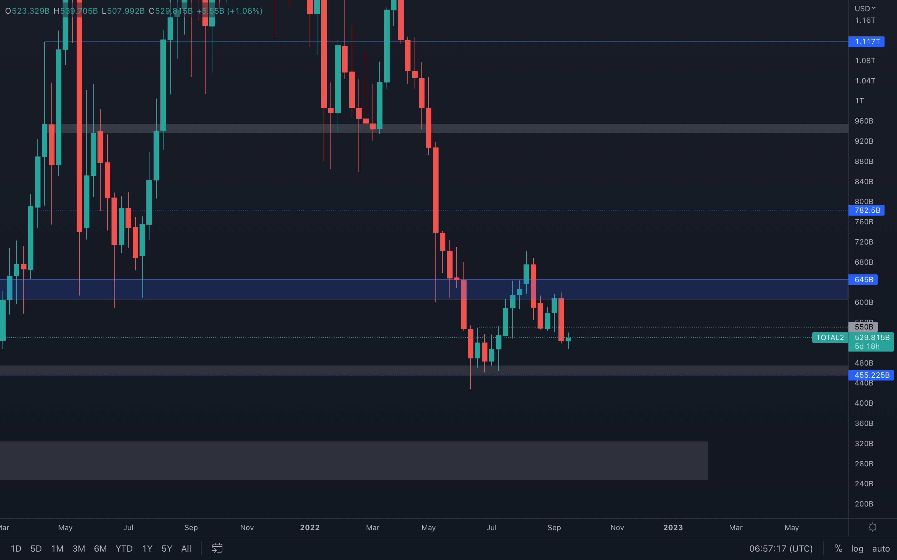 What we're witnessing here is basically the same chart as the Total Market Cap index, so all that was stated above should also be taken into consideration for the Altcoins Market Cap index.
Last week, the index closed a full-bodied candle under its $550B intermediate support level, which suggests a $455B support test is now on the cards - a failure in reclaiming $550B will offer sellers the necessary traction to push prices lower.
Bitcoin - Technical & On-Chain Analysis
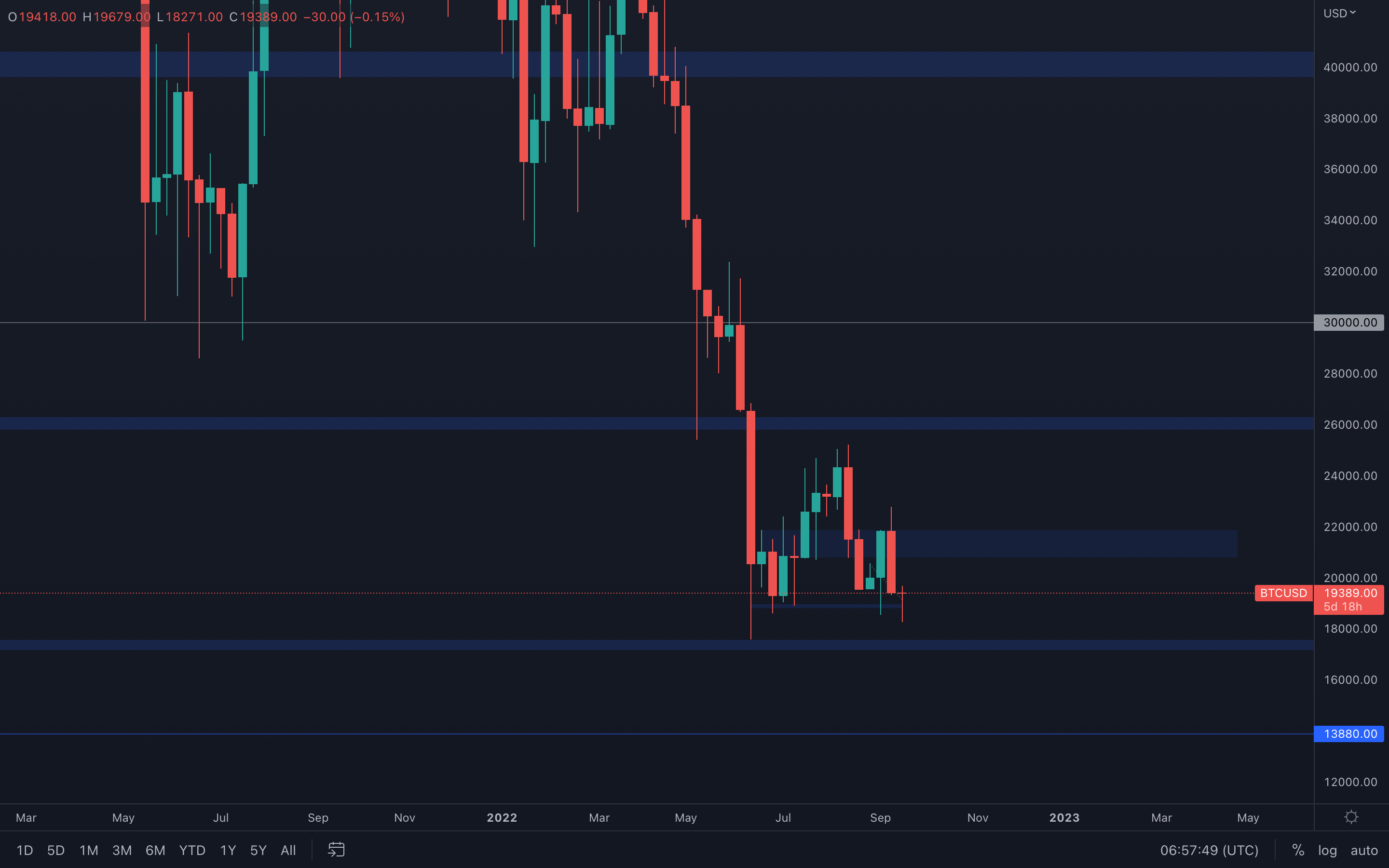 Bitcoin registered a bearish engulfing candle perfectly from resistance. Even though there are lower-timeframe levels that can aid in holding BTC above support ($19,000), these levels can easily be invalidated by the obvious selling pressure in the markets.
We're going to keep it as simple as possible here - unless the $19,000 level isn't keeping up with the selling pressure, then we should expect June lows to be tested once more ($17,500).
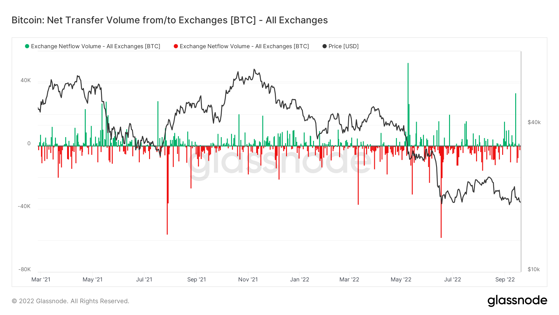
Metric 1 – Exchange Netflow Volume
The Exchange Netflow Volume shows the net flow of coins in and out of Exchanges. We can see that on September 13th, there was a large green spike on this metric. This was because a large number of coins flowed into Exchanges due to the inflation data coming in higher/worse than expected. This is likely why we saw the price fall significantly on the following day.
Bitcoin – Exchange Netflow Volume
Metric 2 – Addresses
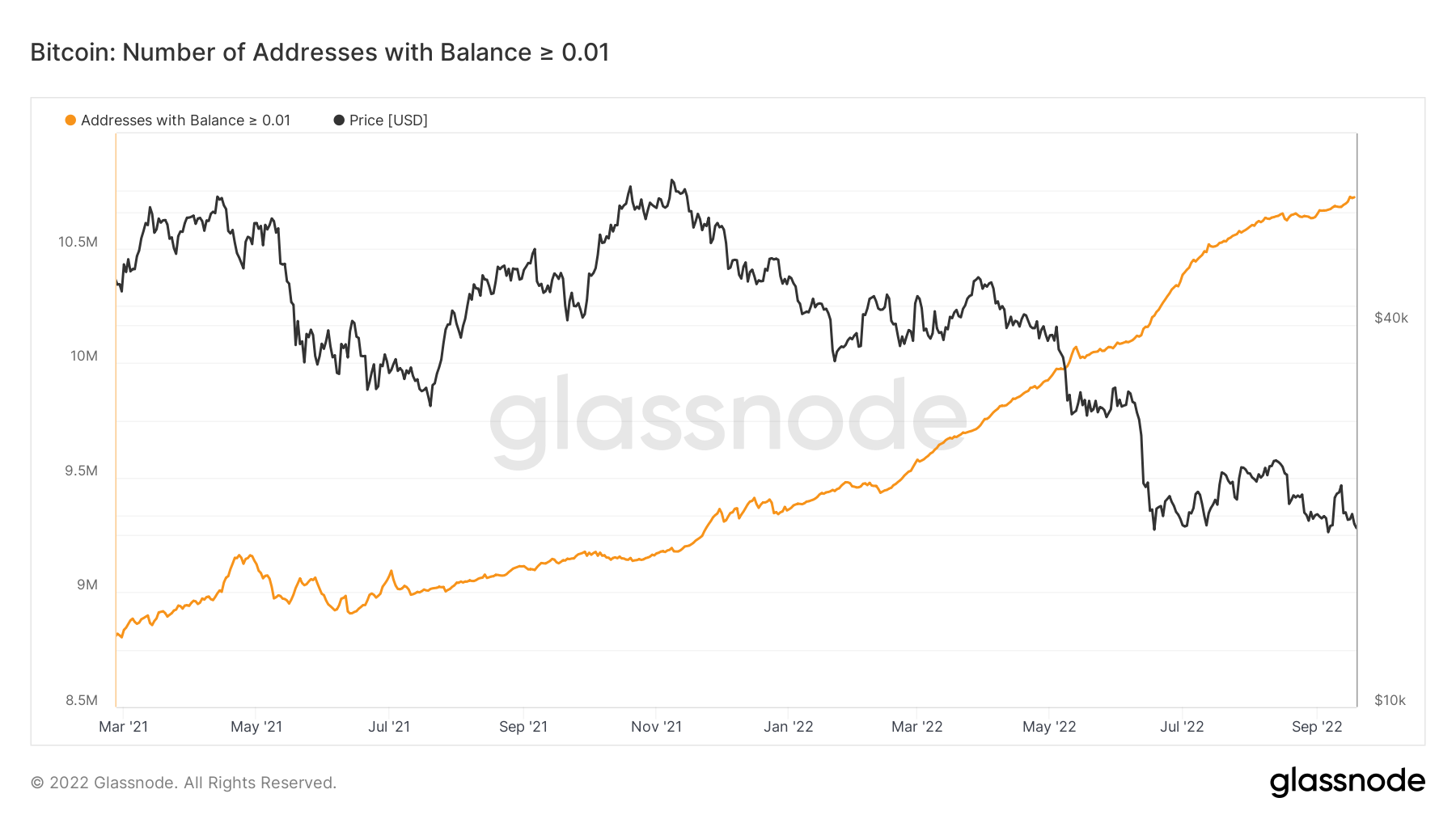
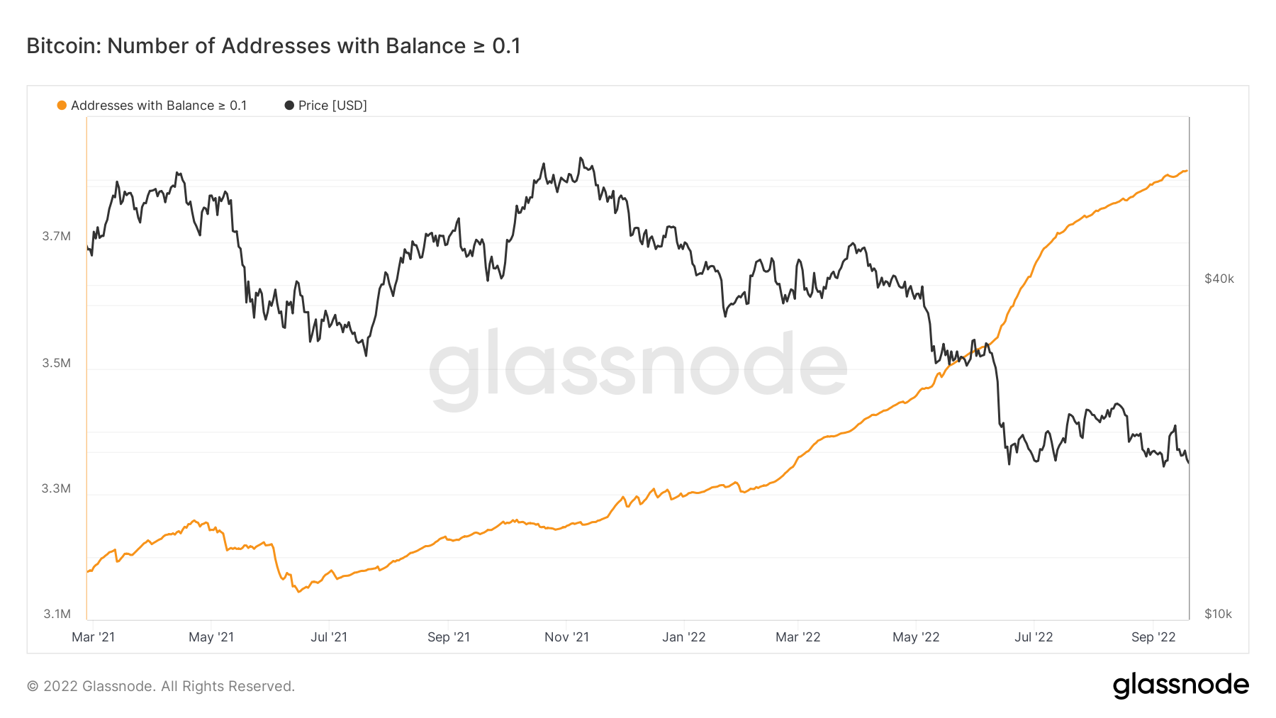
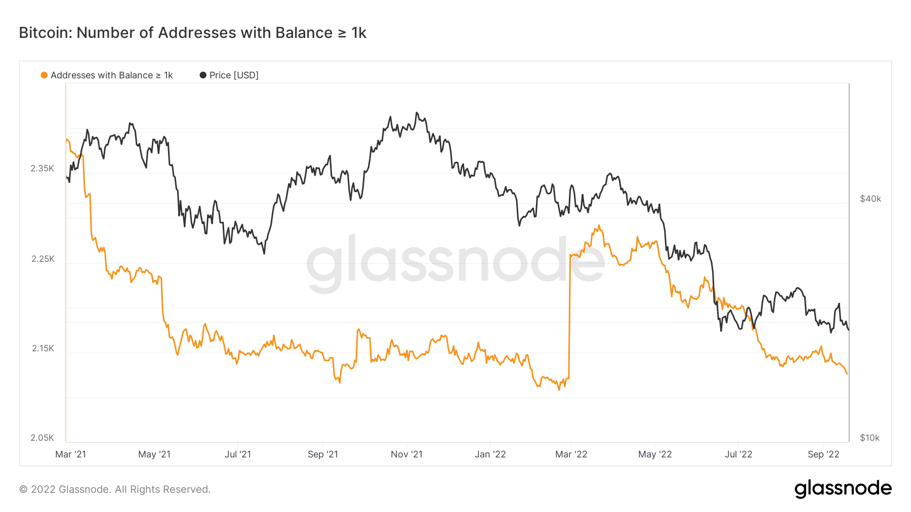
One key set of metrics we regularly look to is the Addresses data. The Addresses data separate wallets into cohorts based on the amount of Bitcoin that they hold. Usually, the cohort we watch and try to emulate is the Addresses with Balance > 1,000 BTC as historically they have been the best at knowing when to risk-off (sell coins) and when to risk-on (buy coins). On the opposite side of this, we try to not copy the wallet cohorts holding the least amount of Bitcoin.
We can see below that the Wallet cohorts with the smallest number of coins have begun risking back-on again – adding to their balances.
Bitcoin – Addresses with Balance > 0.01 Bitcoin
Bitcoin – Addresses with Balance > 0.1 Bitcoin
However, if we compare the above to the Addresses with Balance > 1,000 Bitcoin, we can see that they are behaving in the opposite way. They have actually risked off (sold more coins) as the price has come lower recently.
Bitcoin – Addresses with Balance > 1,000 Bitcoin
Metric 3 – Realised Price by Address
Another important metric is the Realised Price by Address. This metric visualises the average price at which current unspent Bitcoins belonging to each category of addresses were purchased for. What this average cost basis per wallet cohort shows us is the possible areas that might be strong support or resistance for the Bitcoin price. We can see in the below that the realised price has acted as strong resistance in the prior weeks as investors have had little confidence that the price will go higher and they will be able to sell in a profit. This leaves them selling their coins at break-even levels, hence the realised price (average costs basis) acts as a strong resistance area.
Bitcoin – Realised Price by Address
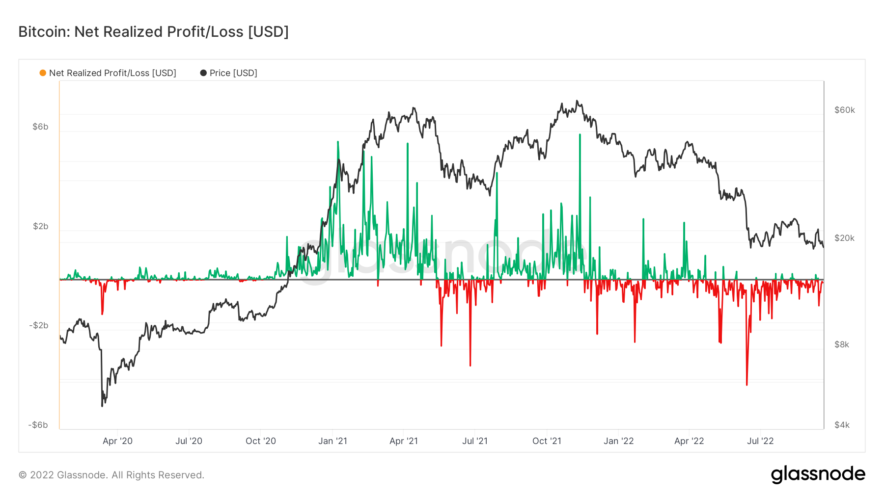
Metric 4 – Realised Profit/Loss
The Realised Price by Address metric can also be supported by the Realised Profit/Loss metric. This shows the number of coins that are being moved at a profit or a loss. In bear markets, many coins are moved in large losses or are moved into break-even levels. The black horizontal line acts as a break-even point, hence we struggle to see green spikes (profit taking) get above the black horizontal line. This is due to investors again, lacking this confidence and exiting the market when the price gets back to or near their average cost basis as in the bear markets, investors lack the confidence that the price will go higher and they’ll be able to sell into a profit.
Bitcoin – Realised Profit/Loss
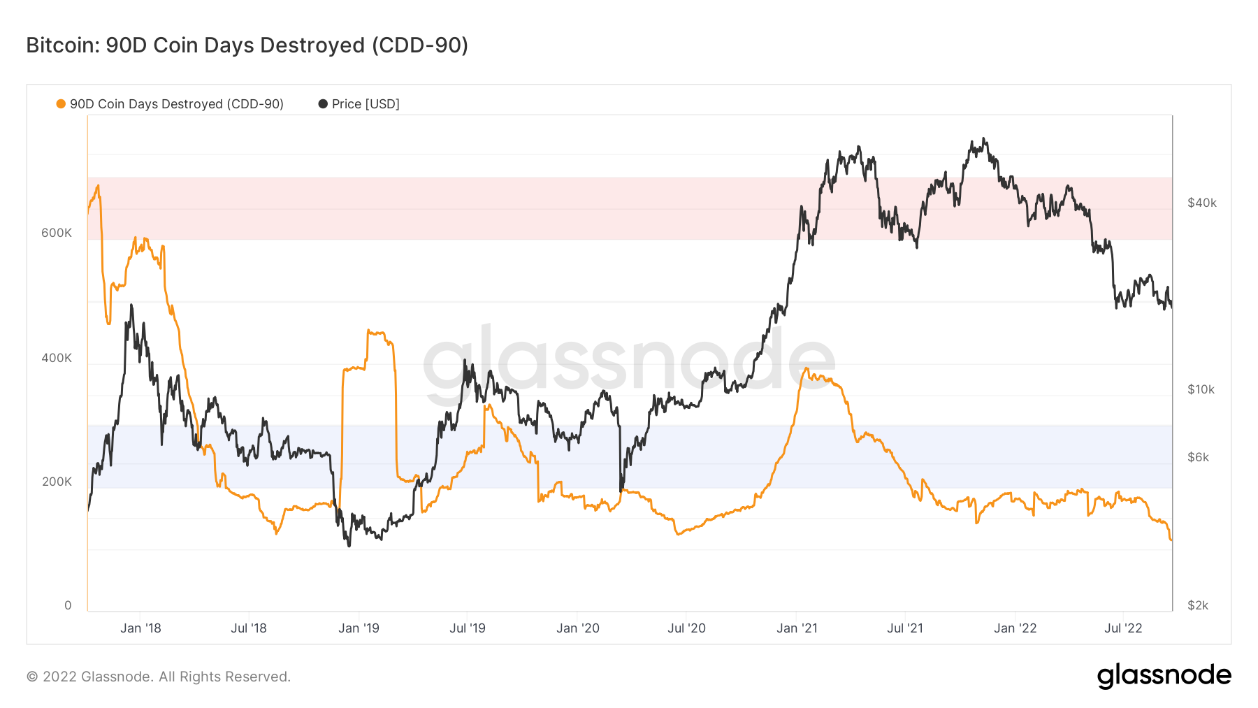
Metric 5 – 90D Coin Days Destroyed
The 90D Coin Days Destroyed metric is the 90-day rolling sum of Coin Days Destroyed. This metric has historically shown that in late-stage bear markets, Coin Days Destroyed decreases significantly before a large capitulation event flushes out the last remaining groups of sellers. Once the last groups of sellers have sold their coins, there is little to no sellers remaining, meaning the market can begin to make a recovery. We can see from the below chart that in late 2018, this metric spiked up significantly in the last capitulation event but reached a new low beforehand. Currently, this metric has now reached a new low which may precede a capitulation event. Worth watching to see how this metric plays out.
Bitcoin – 90D Coin Days Destroyed
S&P 500 Index
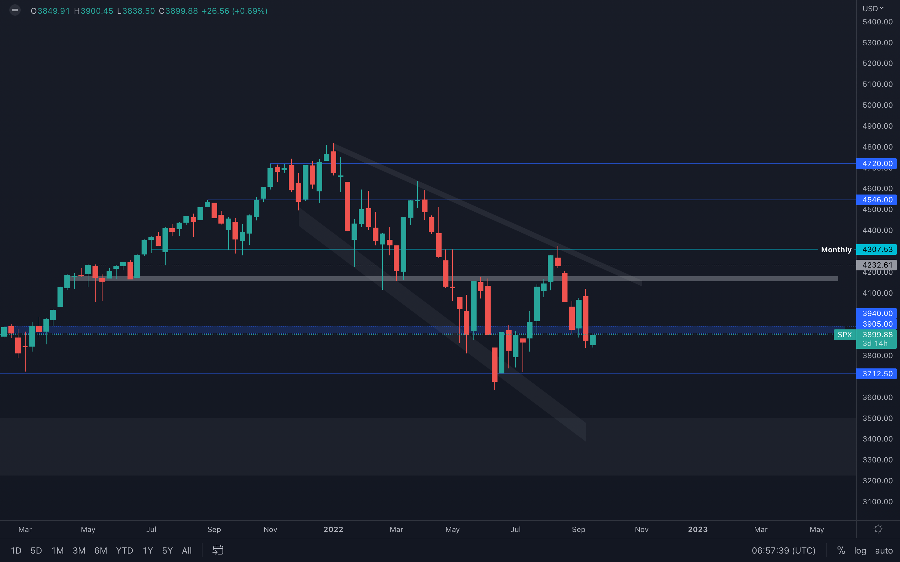 Weekly closure under support ($3900) - failure in reclaiming this level will push the S&P 500 Index toward its $3700 support level, which will likely affect the crypto market and is in confluence with everything that was stated so far in this report.
Even though the market structure shift we mentioned in last week's report is still valid, this change will be invalidated once the index drops under $3700 and forms a new low. If this scenario occurs, then we might even test $3500 in the near future and witness the crypto market test 2-year lows once again.
Ether - Technical Analysis
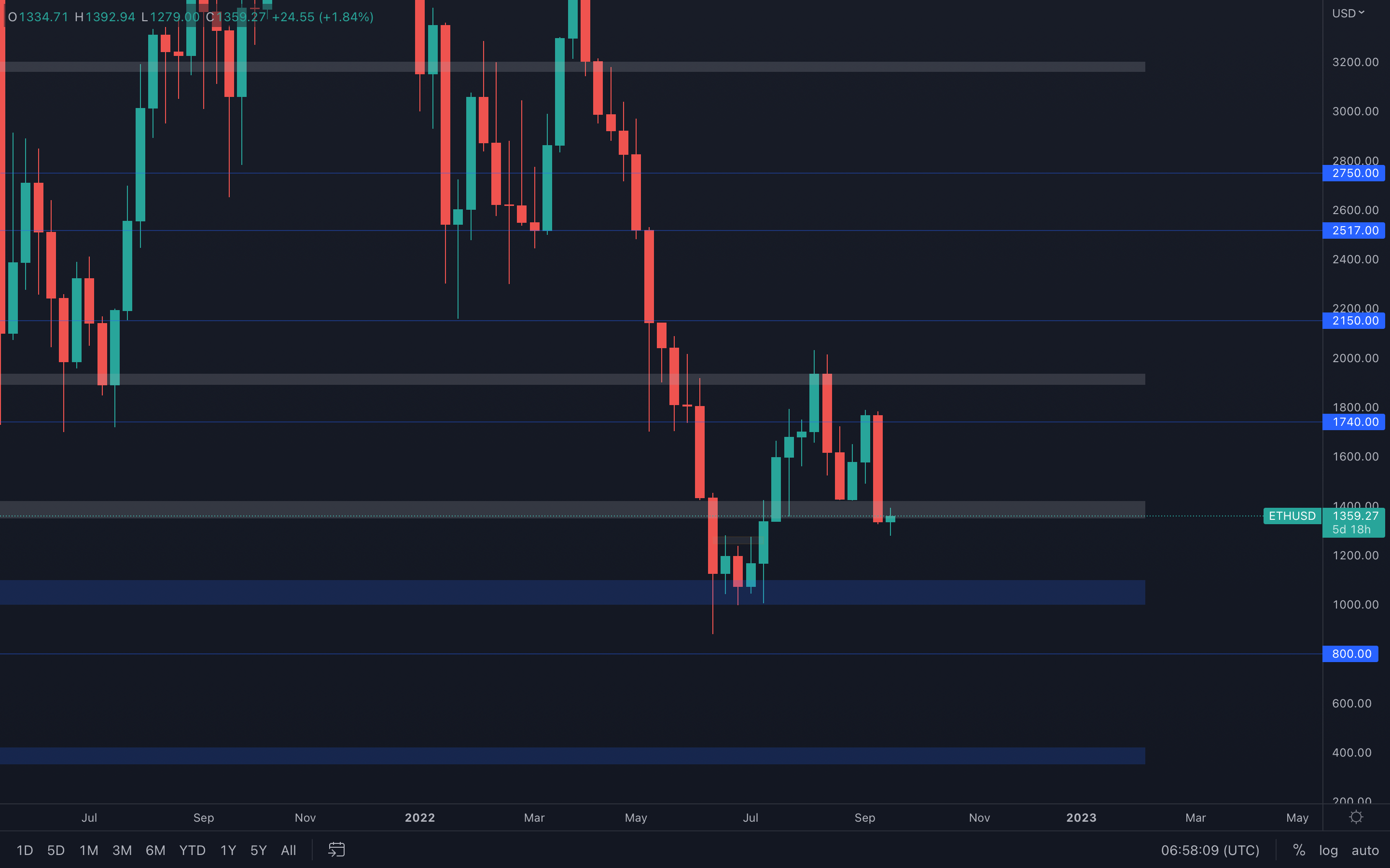 It seems that closing the Alpha-DAO trade was indeed the right call, as ETH dropped over 25% last week and invalidated any potential weekly market structure shifts - the market structure continues to be bearish. There's obviously a similarity with Bitcoin in Ether's price action, which is registering a bearish engulfing candle right from resistance.
However, a big difference here is that Ether has closed last week's candle under the support and is now battling with reclaiming this level. If a reclaim of $1400 is unsuccessful, then we are going to see Ether test summer lows, around the $1100 - $1000 area. We know for a fact that this level is not only a technical one but also a psychological one, which might suggest there is going to be a bullish reaction upon a test of this area due to lots of buying orders placed between the two levels.
DOT
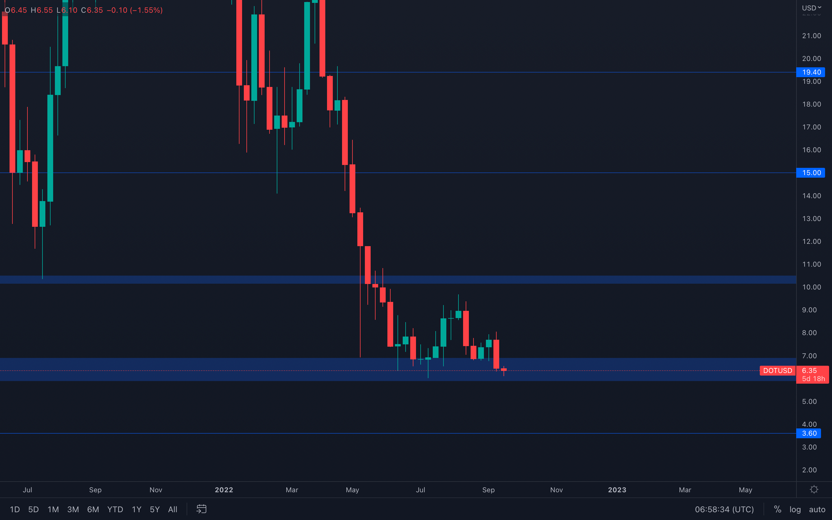 Bearish engulfing formed into support, this type of scenario is a bit contradictive for solid reasons. The bearish engulfing candle clearly suggests the amount of selling pressure there currently is in the market. Not only that but the candle closed almost full-bodied, which also indicates increased bearishness.
The contradictive state in this scenario is that the candle closed into support, which makes the situation confusing as to who is actually in control - buyers or sellers.
This leaves us with a few statements to make when looking ahead - if DOT is unable to hold its $6 level (bottom part of the $7 - $6 support area), then further downside toward $3.60 will occur over the span of multiple weeks. However, if DOT manages to hold $6, then the asset can continue to range between $6 and $8 until either of these levels is broken.
SNX
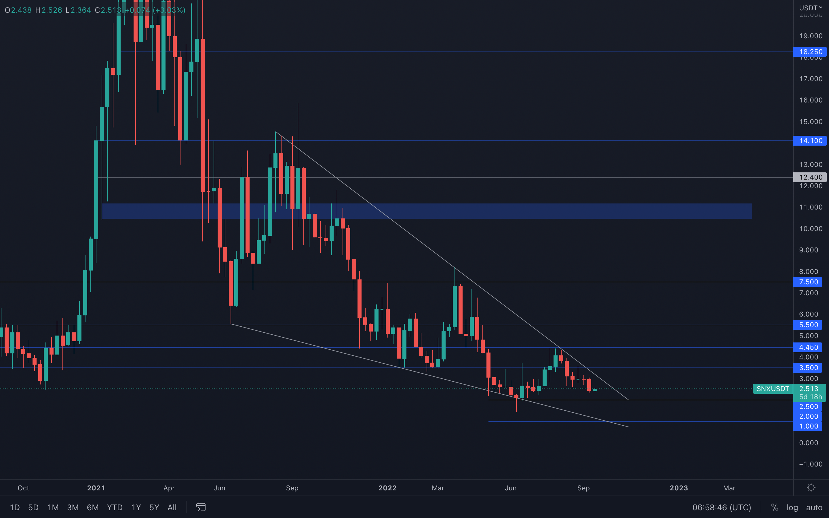 The falling wedge is still of interest to us and is still on the cards unless the pattern itself is invalidated by a drop under the wedge or by a massive consolidation that leads to there being no breaks of either of the trend lines.
For now, SNX is currently above its $2.50 support level - a loss of this level will lead to a $2 test in the coming week(s).
RUNE
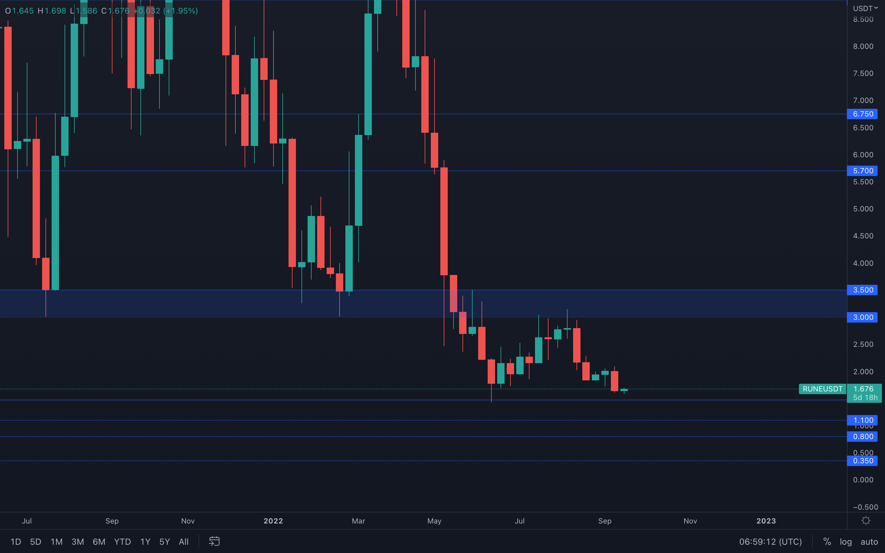 Another full-bodied weekly candle closure that makes the situation simple - RUNE is now on a path to $1.50 (June low) as sellers remain in complete control.
SOL
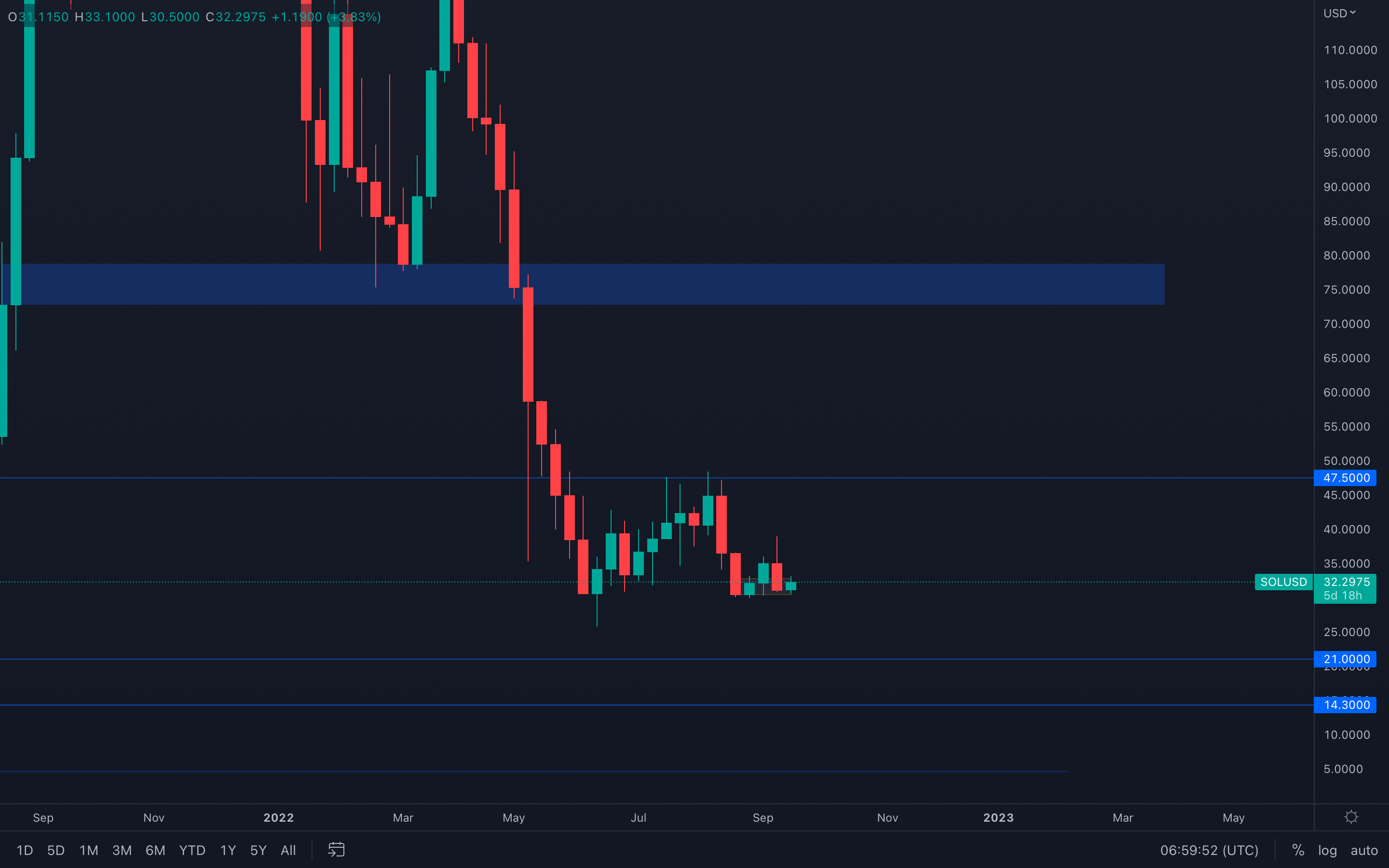 With last week's bearishness, SOL came down and tested its $30.5 local support level. After registering a bearish engulfing candle into the $30.5 support, the asset has quickly risen to $32+ which suggests buyers are interested in this level in the short-term.
The situation is fairly simple - if SOL drops and closes below $30, then we will see $21 tested in the coming weeks. If $30 is held, then SOL can continue to range above this level with an indecisive view on what targets may or may not be achieved.
SRM
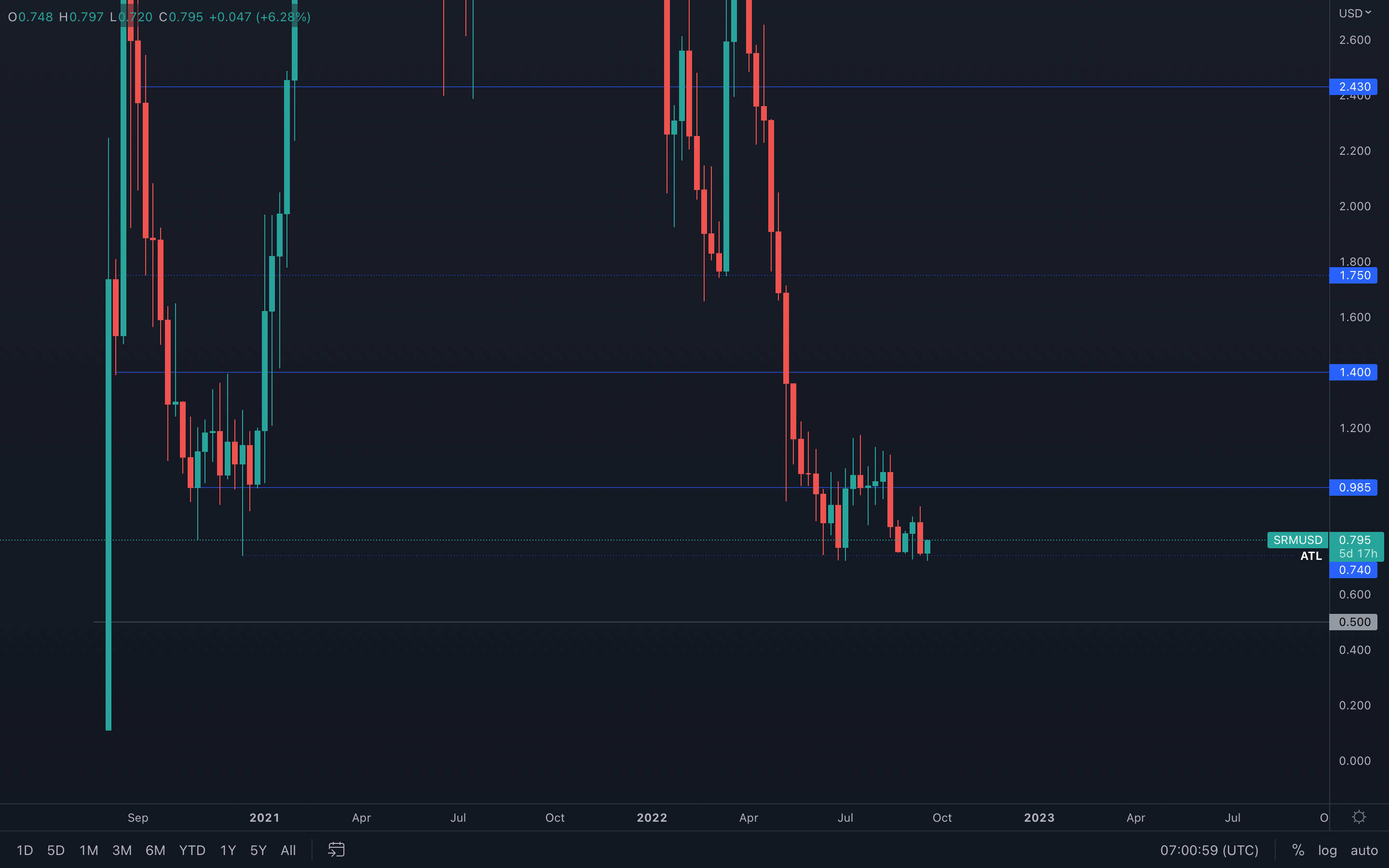 Another all-time low test occurred last week, and SRM is seeing yet another positive reaction from that level, which suggests buyers are present. Last week, we mentioned that $1 was on the cards - this statement still remains valid until SRM losses its $0.74 level and hops on a downside price discovery, with $0.50 as the closest psychological level that many market participants might be expecting.
FTT
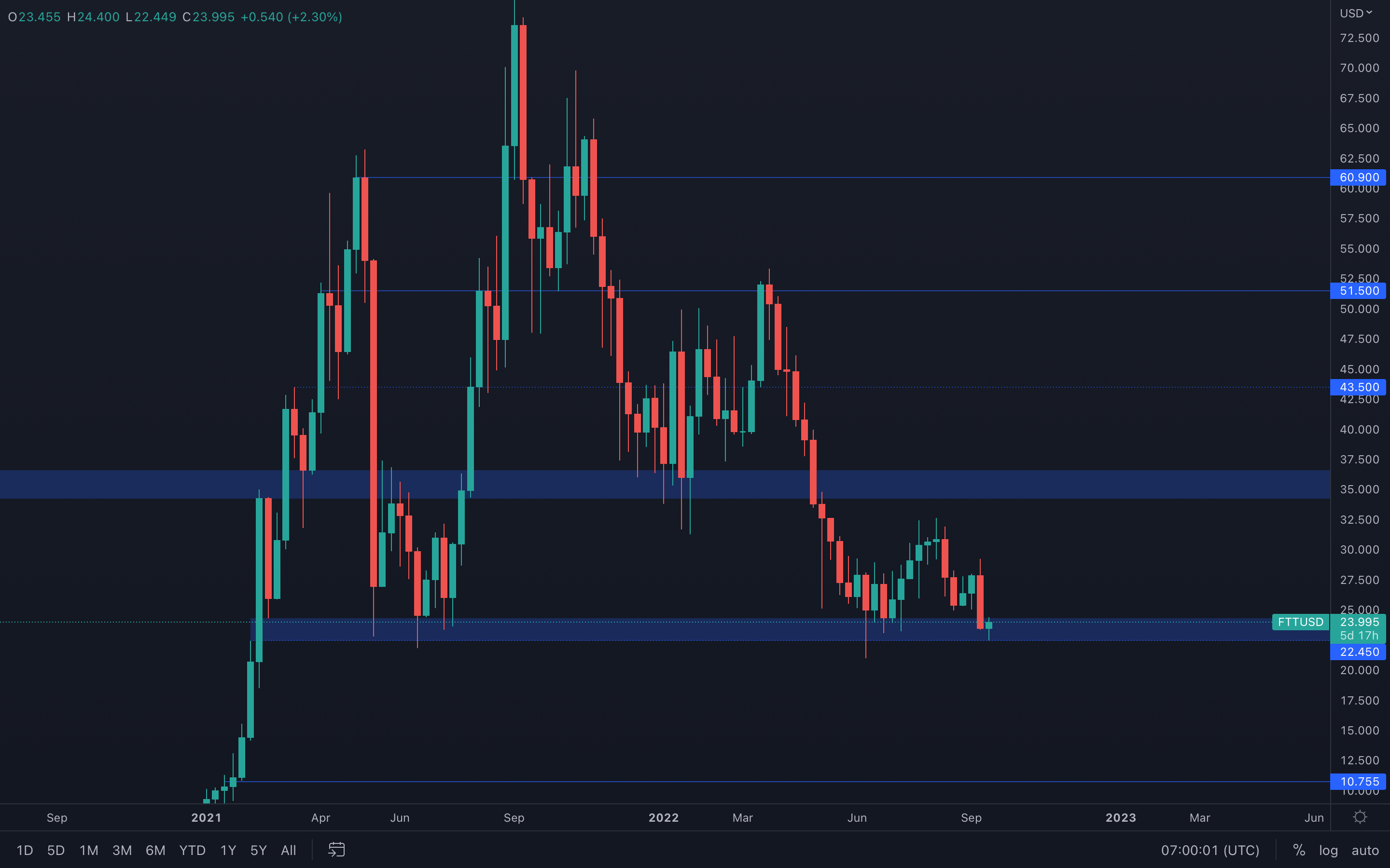 FTT shows a similar scenario to that of DOT - a full-bodied bearish engulfing candle has formed right into support, and as a result, FTT tested the bottom part of its current support area ($22.45). We're currently witnessing some buying pressure coming in, which indicates that the $22.45 level has enough buy orders around to sustain the price of FTT above this support.
There is one thing that requires notice here - last week, FTT closed the lowest weekly candle since February 2021, which might indicate a potential loss of $22.45 in the near future. Caution is advised.
MINA
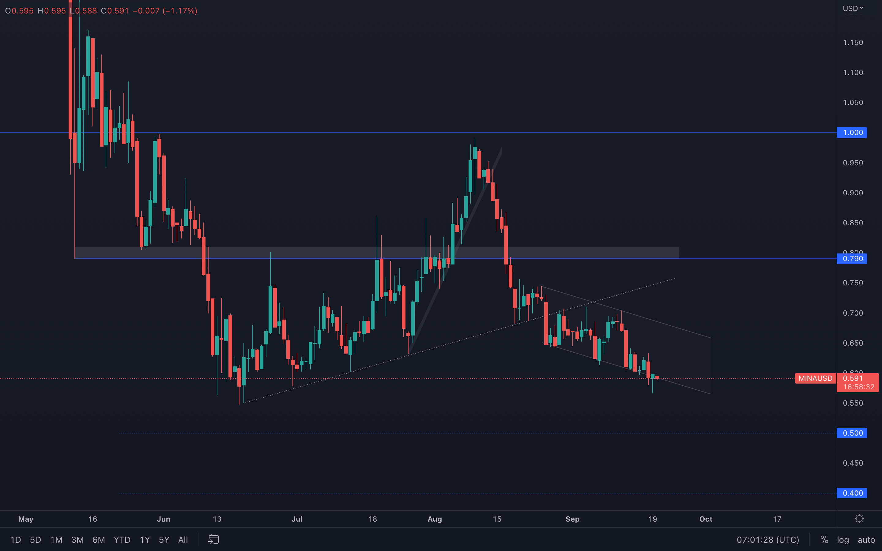 (Daily chart was used)
MINA has been trading inside of a descending channel since the loss of its trend line and there are still no signs of upside movement coming in anytime soon. Same as FTT, MINA also closed its lowest weekly candle, but in this case, it's the lowest weekly closure in MINA's existence. This is an obvious sign of weakness and reducing any over-the-moon exposure might be the best decision in this scenario.
(Daily chart was used)
MINA has been trading inside of a descending channel since the loss of its trend line and there are still no signs of upside movement coming in anytime soon. Same as FTT, MINA also closed its lowest weekly candle, but in this case, it's the lowest weekly closure in MINA's existence. This is an obvious sign of weakness and reducing any over-the-moon exposure might be the best decision in this scenario.
On a larger scale, MINA is now on a path to $0.50.
dYdX
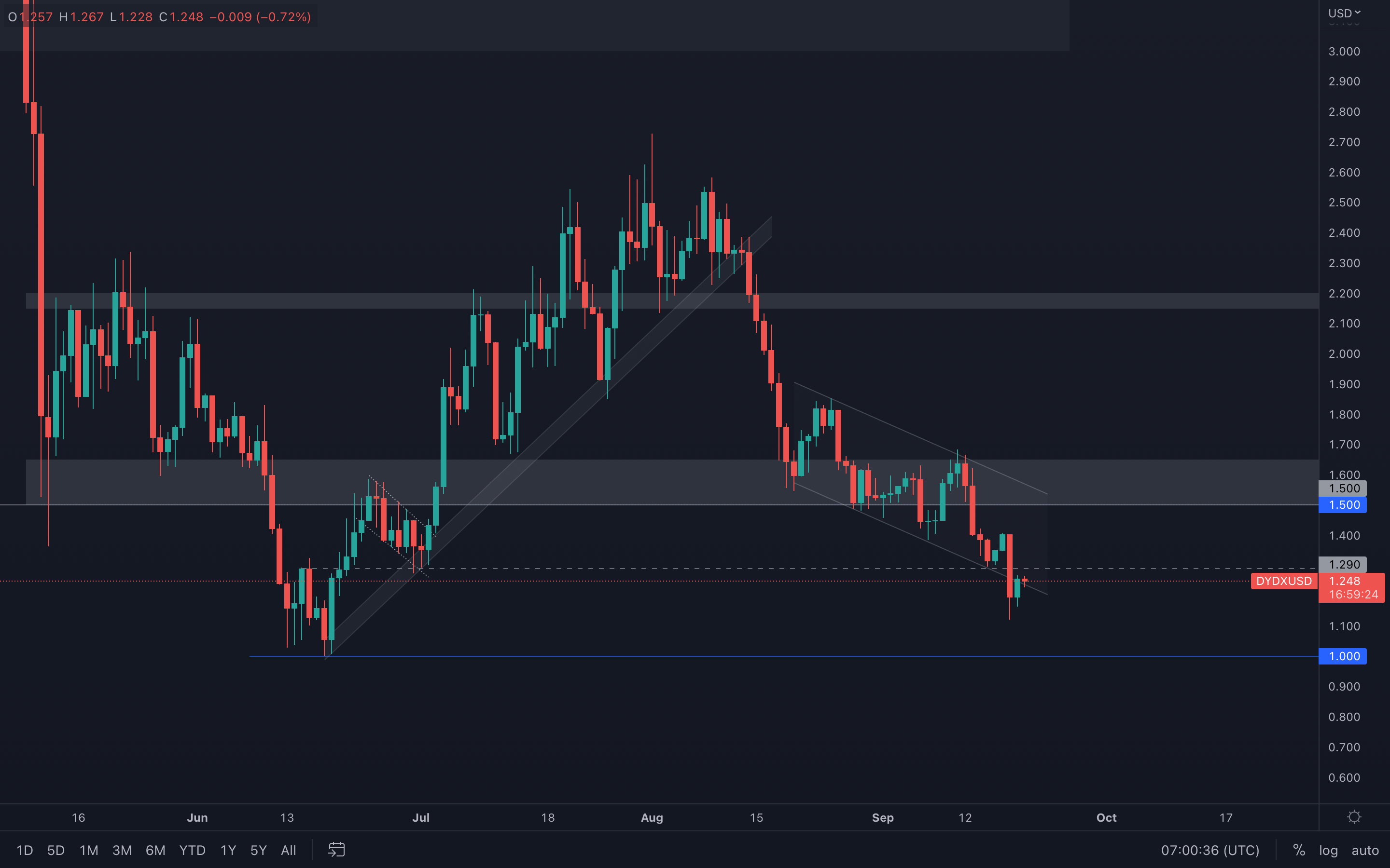 (Daily chart was used)
The similarities between MINA & dYdX's performances are extremely similar, in terms of both price action and volume. Unfortunately for dYdX, $1.50 has been brutally lost which lead to the asset also closing its lowest weekly candle yet. This invalidates the "dYdX will outperform" scenario and suggests that $1 is now the next target for dYdX.
(Daily chart was used)
The similarities between MINA & dYdX's performances are extremely similar, in terms of both price action and volume. Unfortunately for dYdX, $1.50 has been brutally lost which lead to the asset also closing its lowest weekly candle yet. This invalidates the "dYdX will outperform" scenario and suggests that $1 is now the next target for dYdX.
For the short-term, we might be looking at a proper retest of $1.29, but due to minuscule volume and high selling pressure, it's safe to assume the asset will then be heading toward the psychological and technical level of $1.
Summary
The macro environment still provides many headwinds in the coming months, particularly as the interest rate hikes have a lag time before the full effects are felt. However, many on-chain data metrics suggest that new lows could be on the horizon, even if these charts operate very close to their most recent lows. This is likely due to months of weak market sentiment and little confidence from investors to continue holding their coins. It is possible that a final capitulation event may be on the horizon but current price ranges could be considered for Dollar-Cost Averaging.
Recommended from Cryptonary