Save 23% ($351) & Get a Free 1-1 Call with our Team ⏰ : 0d 2h 59m 43s

Disclaimer: Not financial or investment advice. You are responsible for any capital-related decisions you make, and only you are accountable for the results.
Macro:Last week’s stock market closed with a flurry of incoming Labour market data. The Unemployment Rate remained unchanged at 3.7%, but the US added 263k jobs, well above the 200k estimated. Alongside this, the Participation Rate fell from 62.2% to 62.1% (wrong direction for the FED), and Average Hourly Earnings increased by 0.6% MoM (more than the 0.3% Consensus and the prior month of 0.5%) and also increased YoY by 5.1% (well above the 4.6% Consensus and the 4.9% prior).
This data would not have been an encouraging sign for the FED, who have raised interest rates to squash demand in the hope of bringing down inflation. Currently, wages remain hot, and the FED may need to go further with rates than what the market is currently pricing. Traders of risk assets (Crypto) should be aware of this and consider it when constructing Portfolios.
TLDR:
- The number of BTC Shorts has exploded recently but has come down a tad in the past week, yet it remains highly elevated. Historically, Shorts at these levels have been squeezed.
- The Moving PnL shows similar characteristics to the late-stage bear market of 2018/2019, where losses on-chain far exceed profits.
- The Balanced Price and the Supply-Adjusted Dormancy show that older coins have been spent in the past few weeks and months, again another signal of a late-stage bear market.
DXY (U.S. Dollar Currency Index)
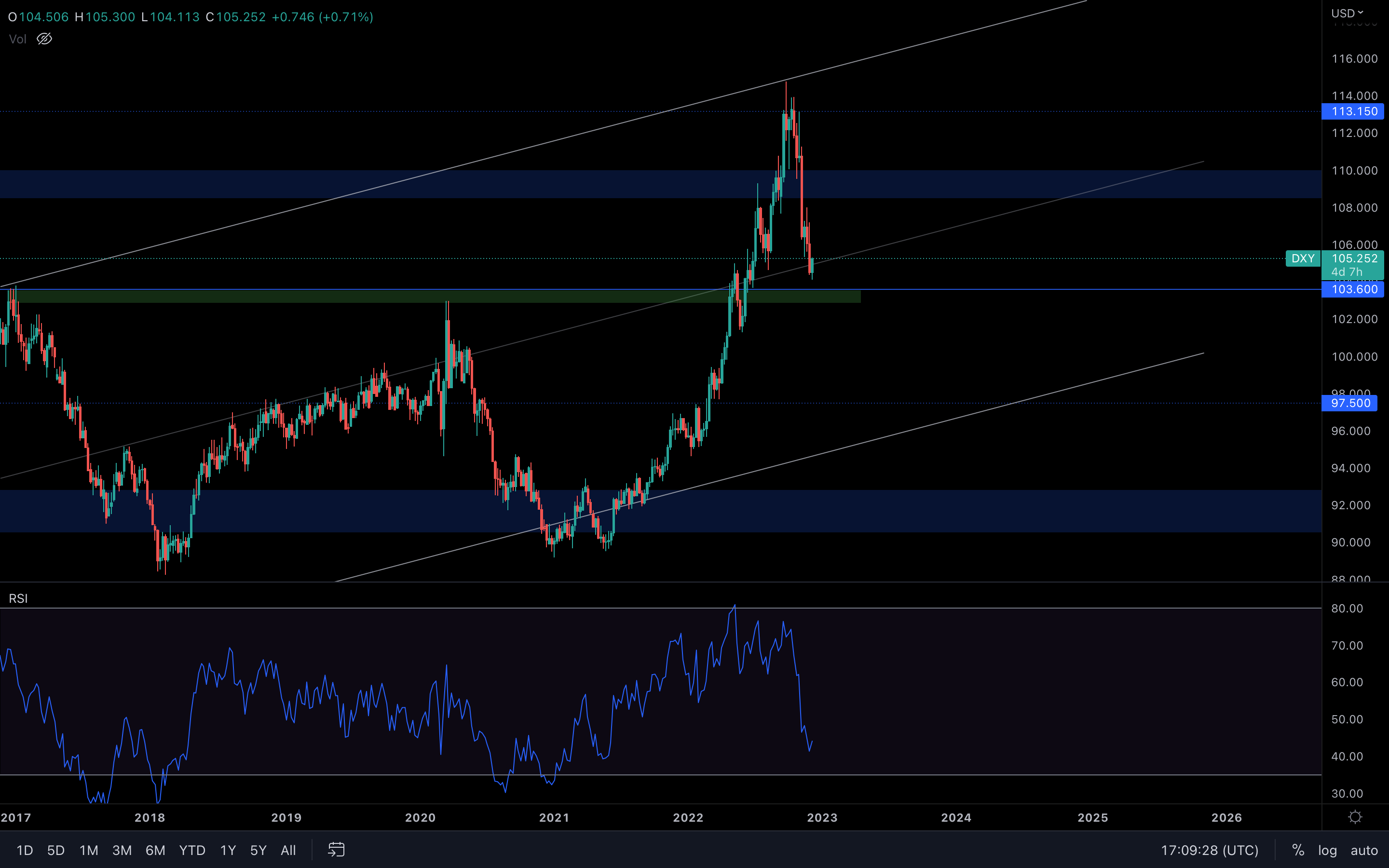
The DXY is now seeing an increase here in the middle of this ascending channel. Since the week has barely started, it's hard to assume if the index will close above the trend line this week. If it were to happen, the crypto market might experience a slowdown, putting the DXY on a path toward $108 - $110.
S&P 500 Index
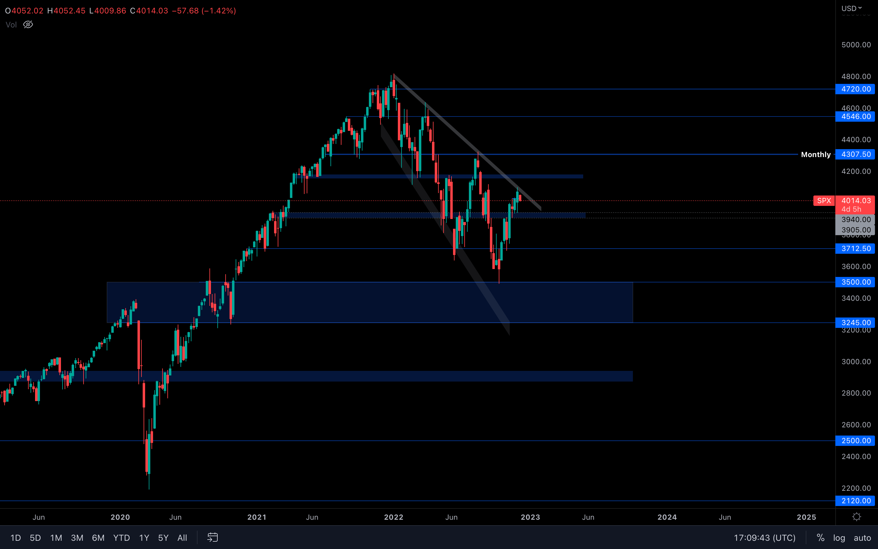
The S&P 500 Index is currently battling with this resistance. Failure to break above could lead to a $3900 retest, which is not actually something to worry about. On the contrary, we'd like to see a $3900 retest first before a break from this broadening wedge. If that doesn't hold, then we could be looking at $3700 as the next target for the SPX.
In case of a break out from the wedge, $4100 is the level to look out for.
Total Market Cap
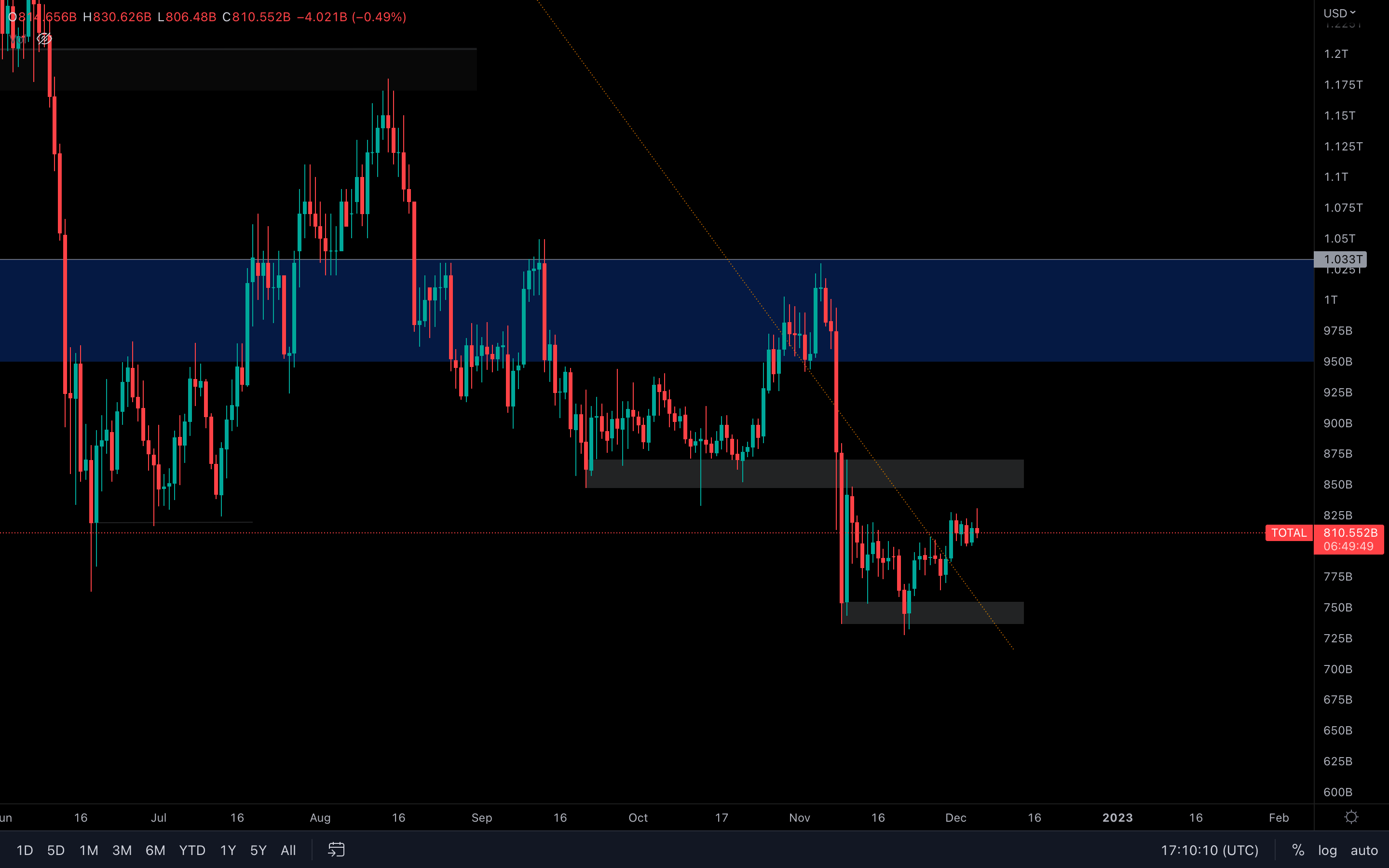
(Daily chart was used) We can see that the Total MCap has been ranging for the past few days. This specific type of price action usually suggests that a move will occur at some point, either to the upside or to the downside. Now, whether the move will happen towards the upside remains to be seen, as the current daily candle doesn't inspire much trust. On a larger timeframe, $850 - $875B is where we should be looking.
Altcoins Market Cap
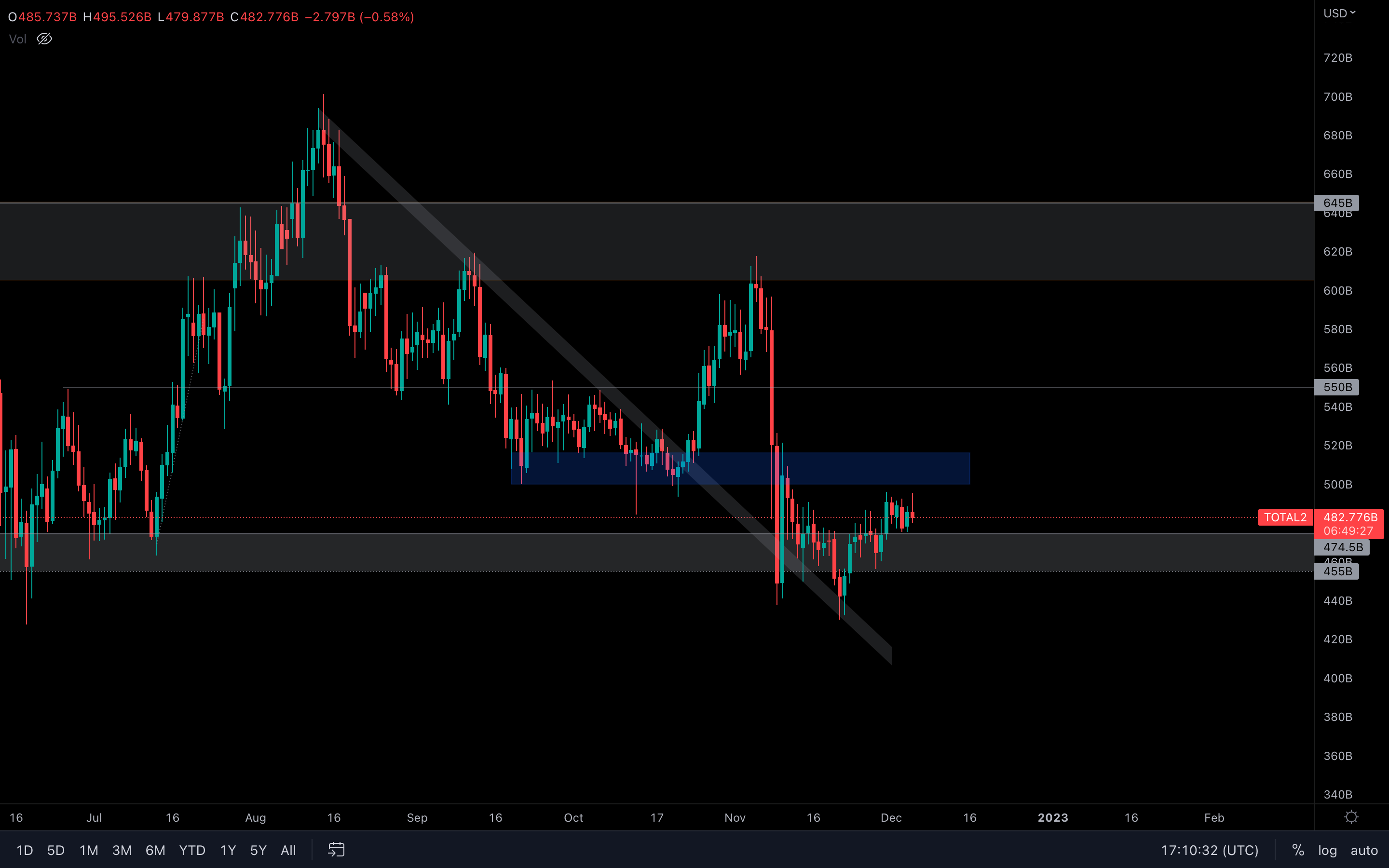
(Daily chart was used) The same price action can be seen here, with the difference being that the Altcoins MCap index is above support. We can only assume that anywhere inside the blue area is where the index is headed next, but this could easily be invalidated by a bad performing BTC.
Bitcoin
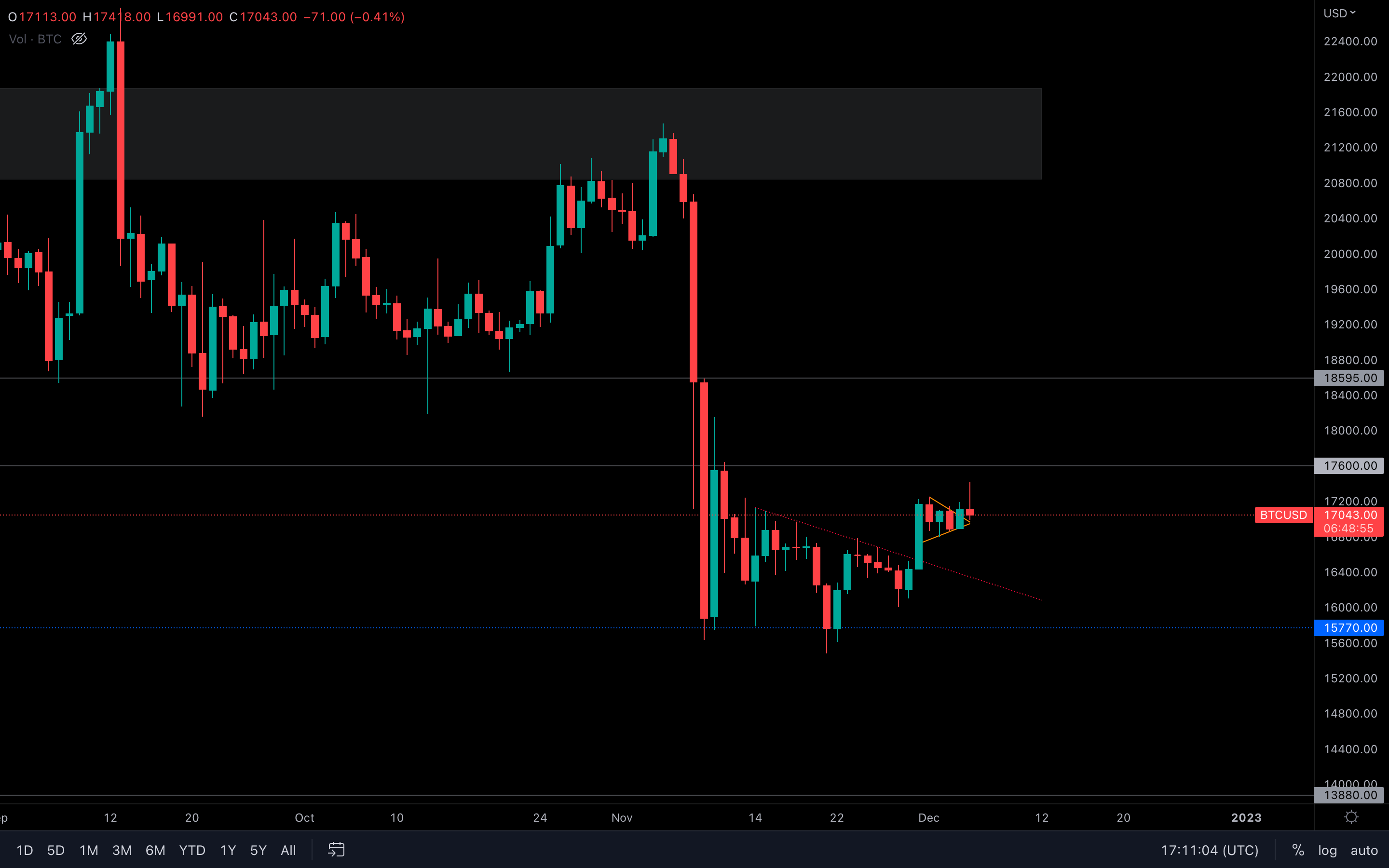
(Daily chart was used) Same price action here. However, Bitcoin broke out from a symmetrical triangle on lower timeframes and even registered a bullish engulfing candle yesterday, which is why we saw the price rise a bit today. However, it seems sellers have stepped in and invalidated the entire day. This is quite concerning in the short-term, as it could mean that sellers have regained control even on the daily timeframe and that $17,600 might not be next just yet. We'll have to see how today's candle closes (maybe the next few daily candles as well) to act accordingly.
Metric 1 – Open BTC Shorts
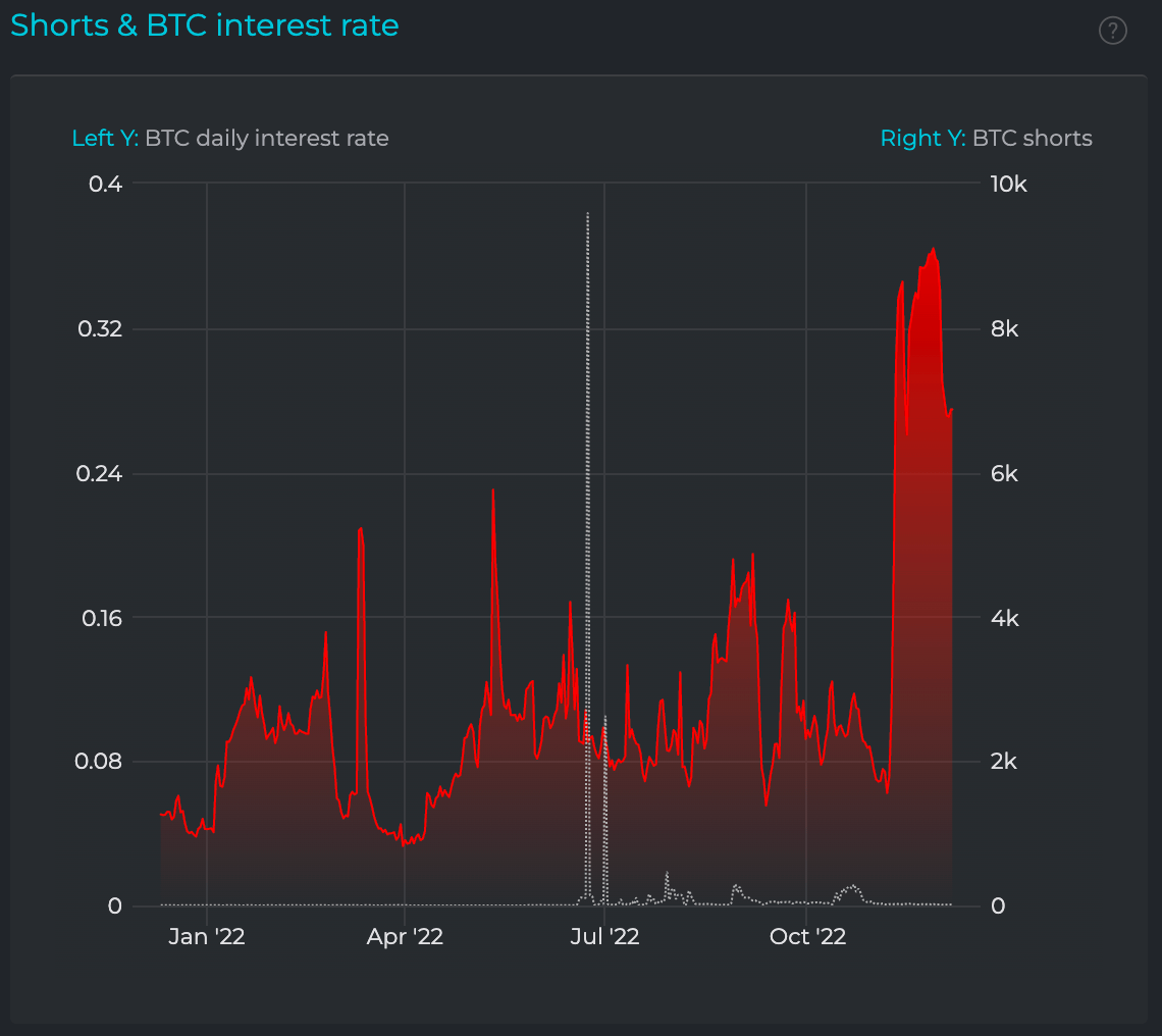
There are currently a large number of open BTC Shorts. If we look back at this metric, when the number of BTC Shorts has risen dramatically, this is usually inexperienced traders Shorting into the lows only to be squeezed out in the following days by price rebounding and moving higher.
Metric 2 – Moving PnL
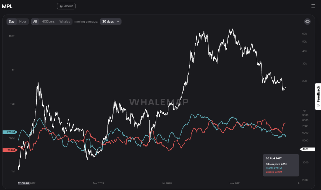
The Moving PnL visualises if investors are selling their coins at a profit or a loss. High amounts of loss-taking usually occur in late-stage bear markets during capitulation events or in the height of bear markets during over-excessive leverage flush-outs. We can see below that since the June lows, Moving PnL has seen losses exceed profits (red above blue). This was very similar to the Q4 2018/Q1 2019 in the depths of the last cycle’s bear market. There was a brief period where losses exceeded profits during Covid (March 2020) and in the summer of 21 (the Miner migration and leverage flush out).
This metric is telling us that the current period is extremely similar to the latter-stage bear market of 2018, and we should therefore consider positioning now for how we would have liked to have positioned our portfolios back then – maintaining a DCA strategy where the focus is on acquiring Bitcoin in the Spot markets rather than the Derivatives markets.
Metric 3 – Bitcoin: Net Realised Profit/Loss
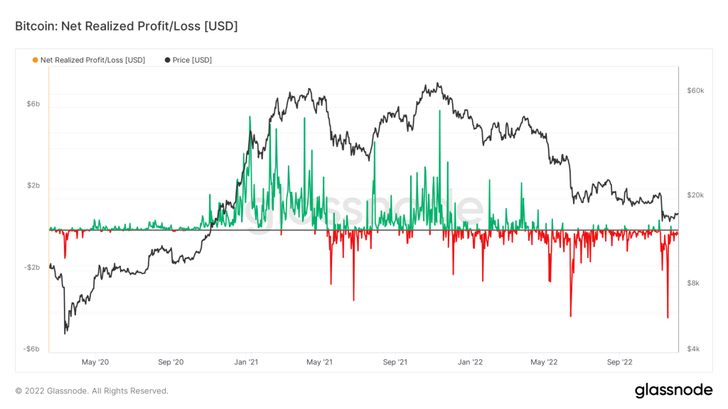
The Net Realised Profit/Loss is the profit/loss of all moved coins. This is investors moving coins and ‘realising’ the loss or the profit. The graph below shows that losses are still being realised (red below the black horizontal 0 break-even line). This shows a continued risking-off sentiment amongst investors, and until the sentiment changes, the price is unlikely to reach higher levels if investors just continue to sell their coins when the price reaches their break-even level.
Metric 4 – Bitcoin: Balanced Price
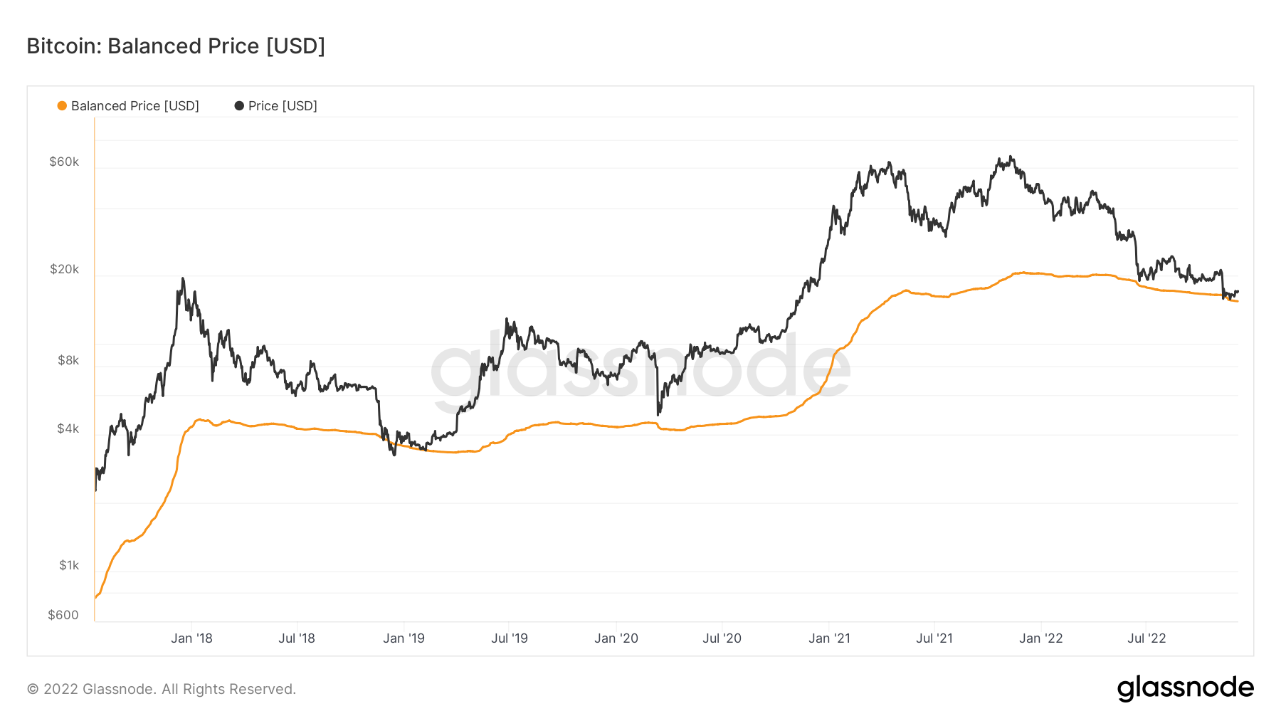
Balanced Price is the difference between Realised Price and Transfer Price. Transfer Price is the cumulative sum of Coin Days Destroyed in USD. This metric gives us a zoomed-out view of where we might be in terms of the overall cycle. A precise bottom is harder to predict, but this metric gives great insight into identifying a range in which a DCA strategy could become appropriate.
We are now seeing that this metric is identifying a range. Any dips below the Balanced Price should be considered good long-term entries for Bitcoin.
Metric 5 – Bitcoin: Supply-Adjusted Dormancy
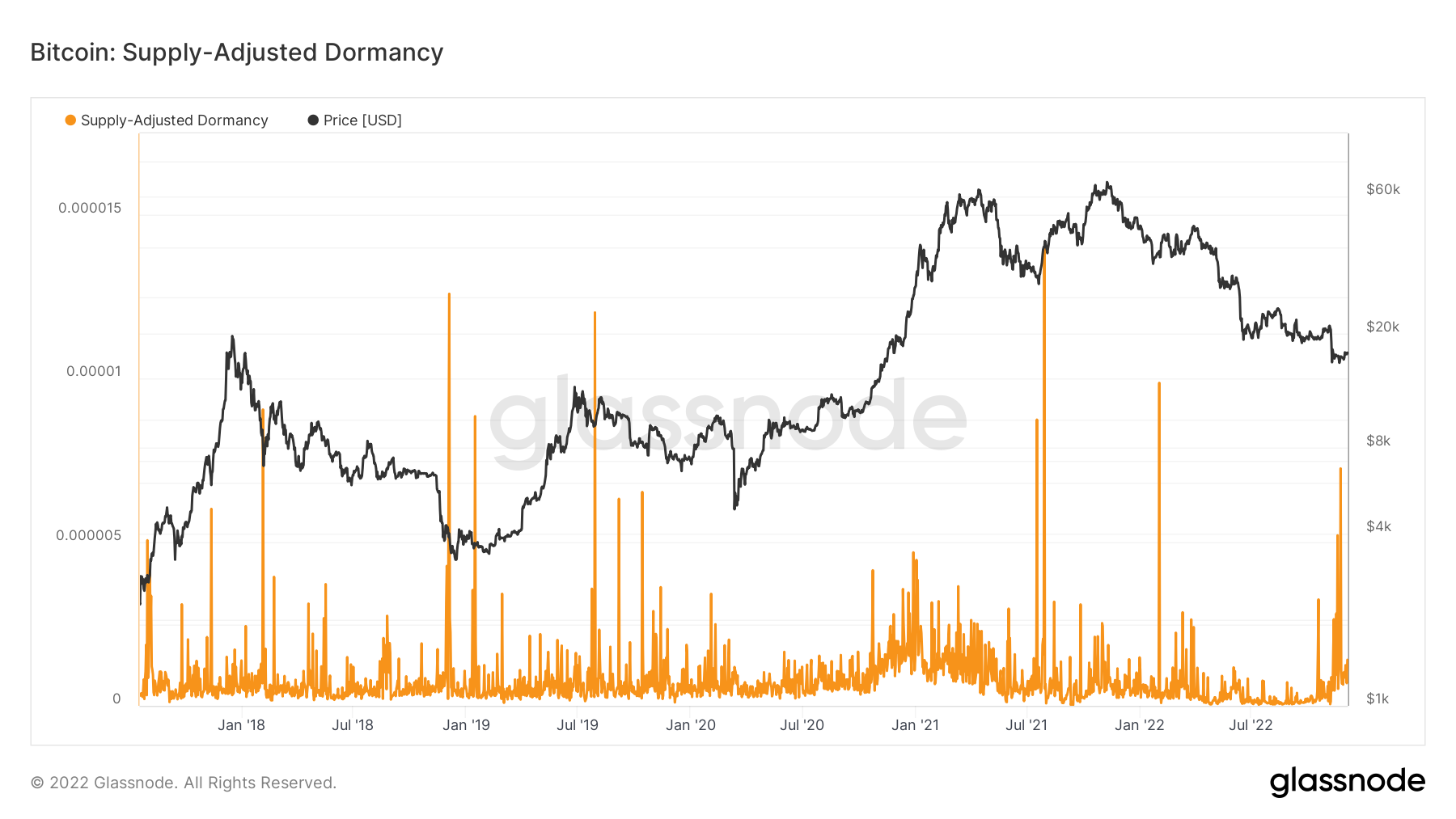
The Supply-Adjusted Dormancy metric is the average number of days destroyed per coin transacted and is defined as the ratio of coin days destroyed and total transfer volume. This metric has spiked in the past, likely due to older coins being spent in times of selling into early-stage bear market rebounds or late-stage bear market capitulation events. We can see that we have had the early stage spikes in 2022, and now we seem to have gotten a spike in older coins selling into the most recent drawdown after the FTX debacle.
Ether
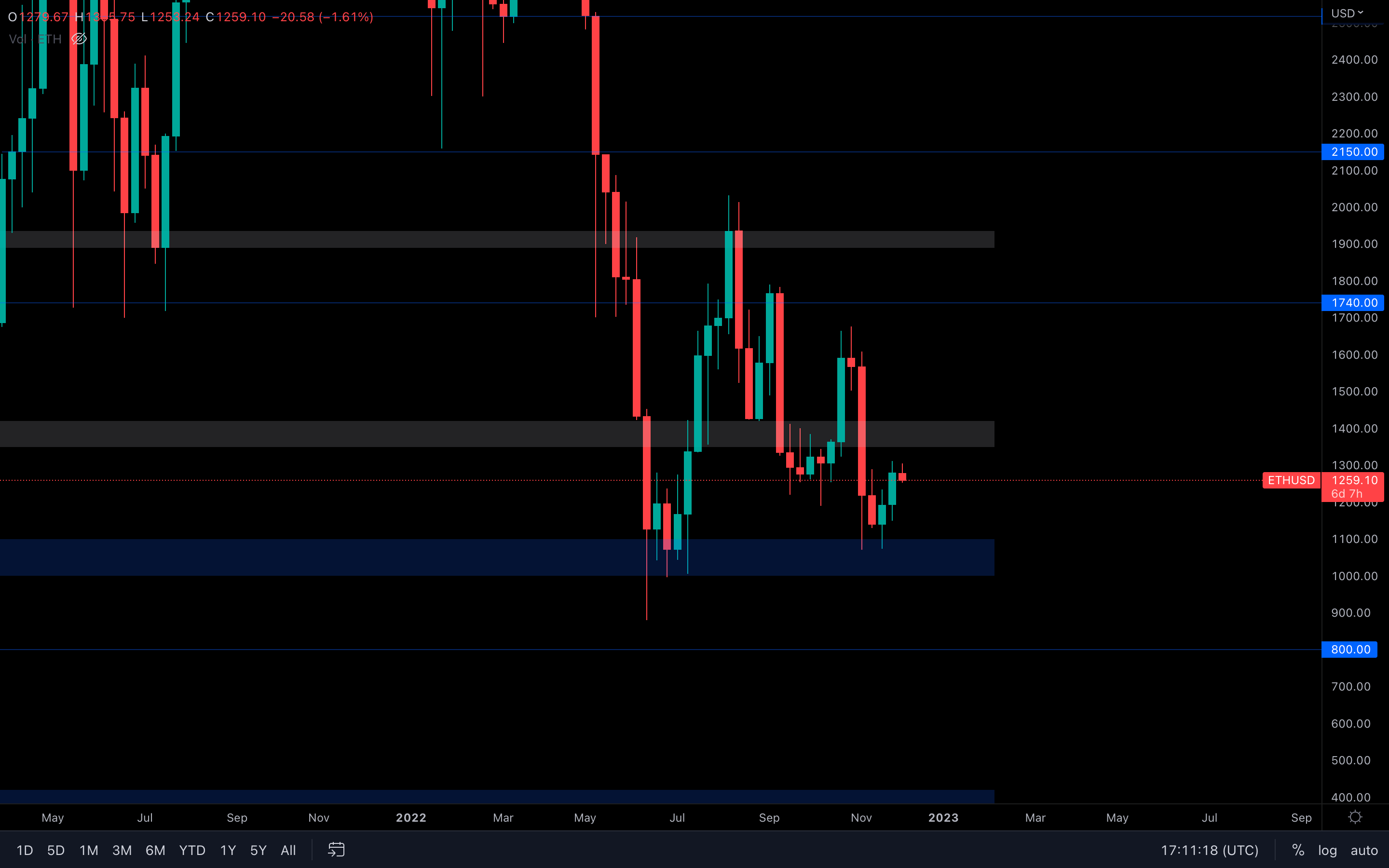
Looking good on the weekly timeframe, $1400 still remains ETH's next target. However, if we dive into lower timeframes, the same price action as we have seen on both indexes and Bitcoin can be seen here, which isn't surprising at all. Even though weekly ETH is still heading toward $1400, Bitcoin could invalidate that by going the other way, after which Ether will follow shortly.
Polkadot
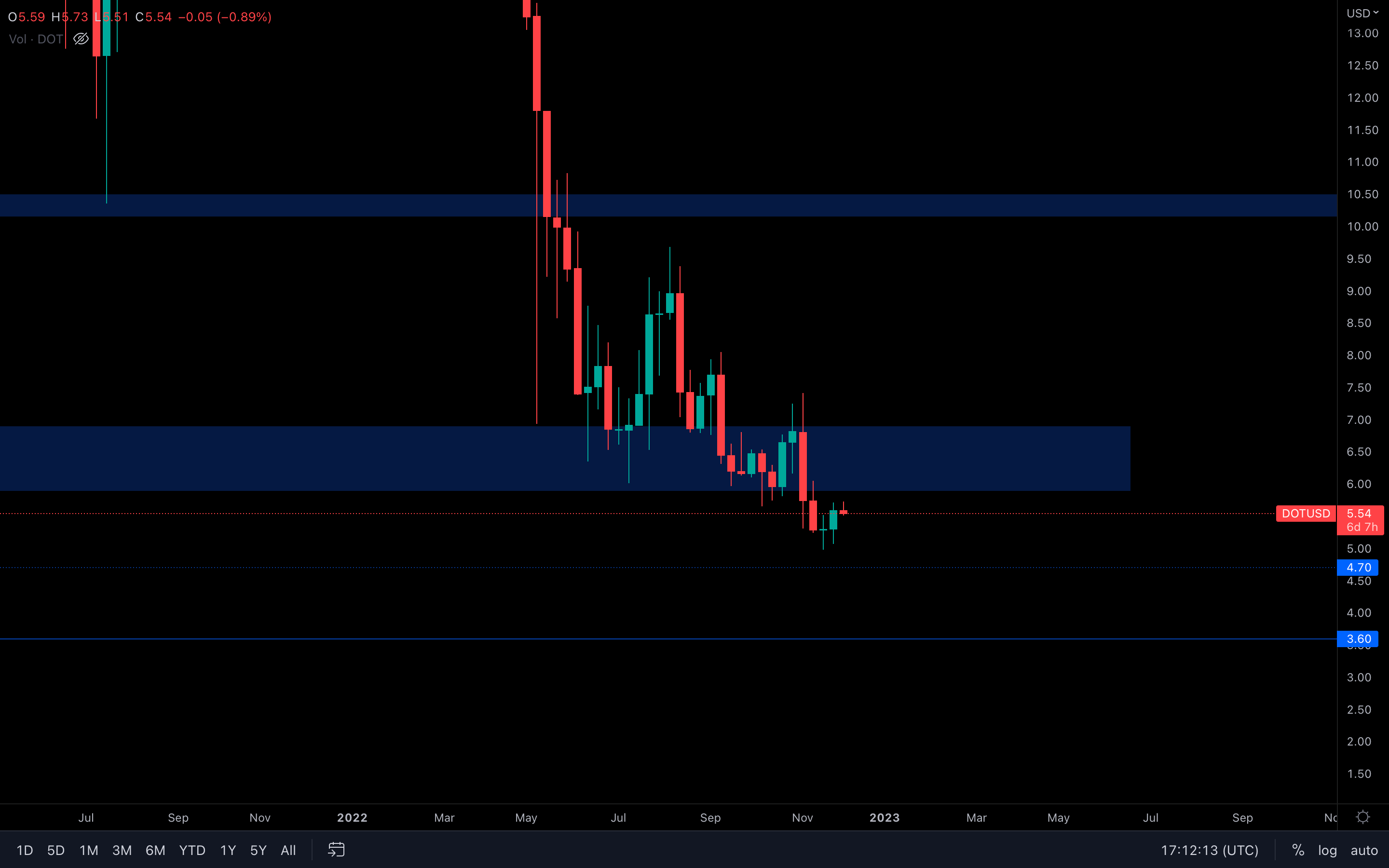
DOT is still in a bearish market structure, and $4.70 still remains its next target. However, a retest of $6 isn't ruled out either, especially after last week's candle closure. A small concern would be that DOT is forming a bearish engulfing candle on the daily timeframe. If it closes like that, we could go lower in the next few days.
Synthetix
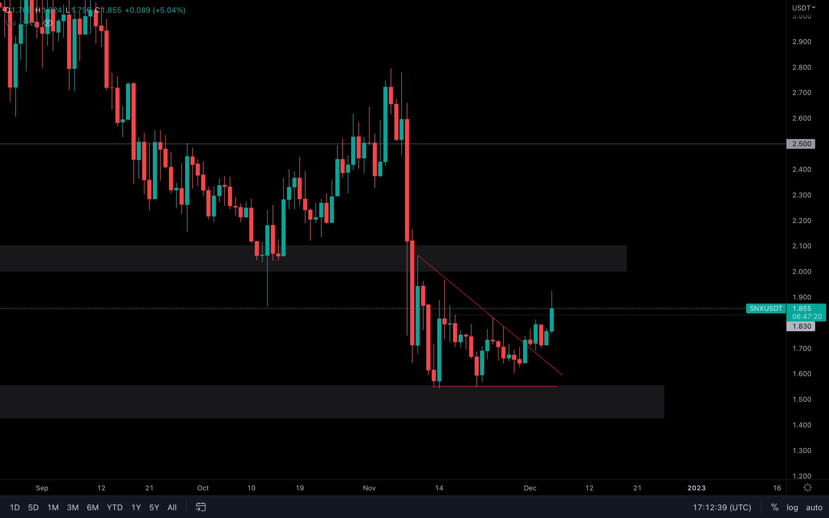
(Daily chart was used) SNX has broken out of this descending triangle and is experiencing some solid buying pressure today, even with the rest of the market taking a hit on lower timeframes. Technically, there's nothing stopping a $2 resistance test soon other than Bitcoin, of course.
If SNX's volume continues to counter Bitcoin's price action as it is doing right now, then $2 will be tested shortly.
THORChain
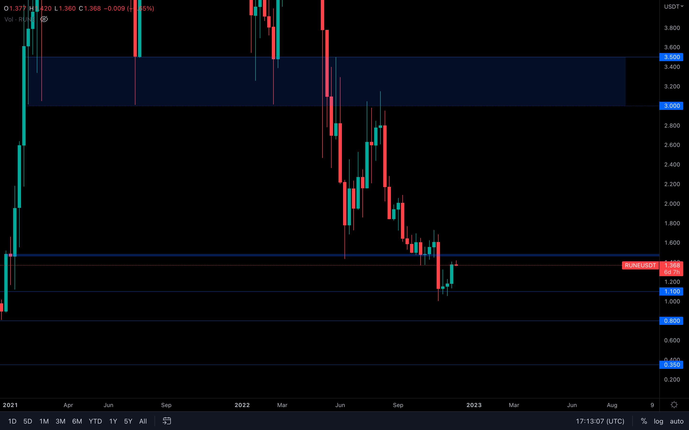
Interesting candle closure here as well, and actually quite surprising. RUNE is slowly approaching $1.50, and it looks like it's almost guaranteed at this point. But there's still the risk that Bitcoin could keep RUNE from testing that level if sellers regain control. We recommend monitoring this over the next few days and treating a $1.50 retest with caution, even if the odds of it happening are high.
Solana
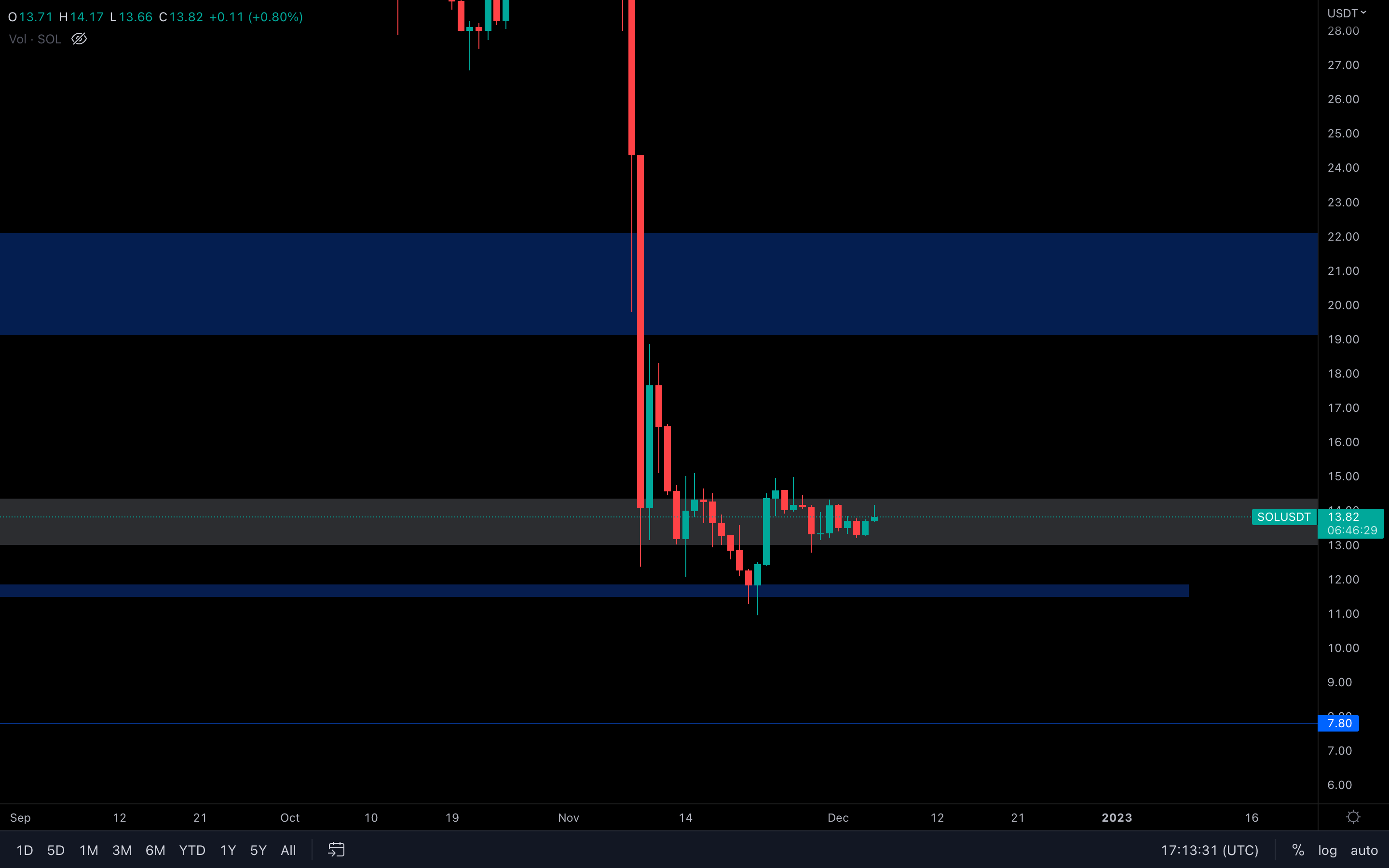
(Daily chart was used) Choppy price action is definitely not helping. For now, we'd like to see either a daily closure above the highlighted area ($14.35) or a daily closure under the area ($13). Other than that, this chart doesn't provide us with any interest.
Synapse
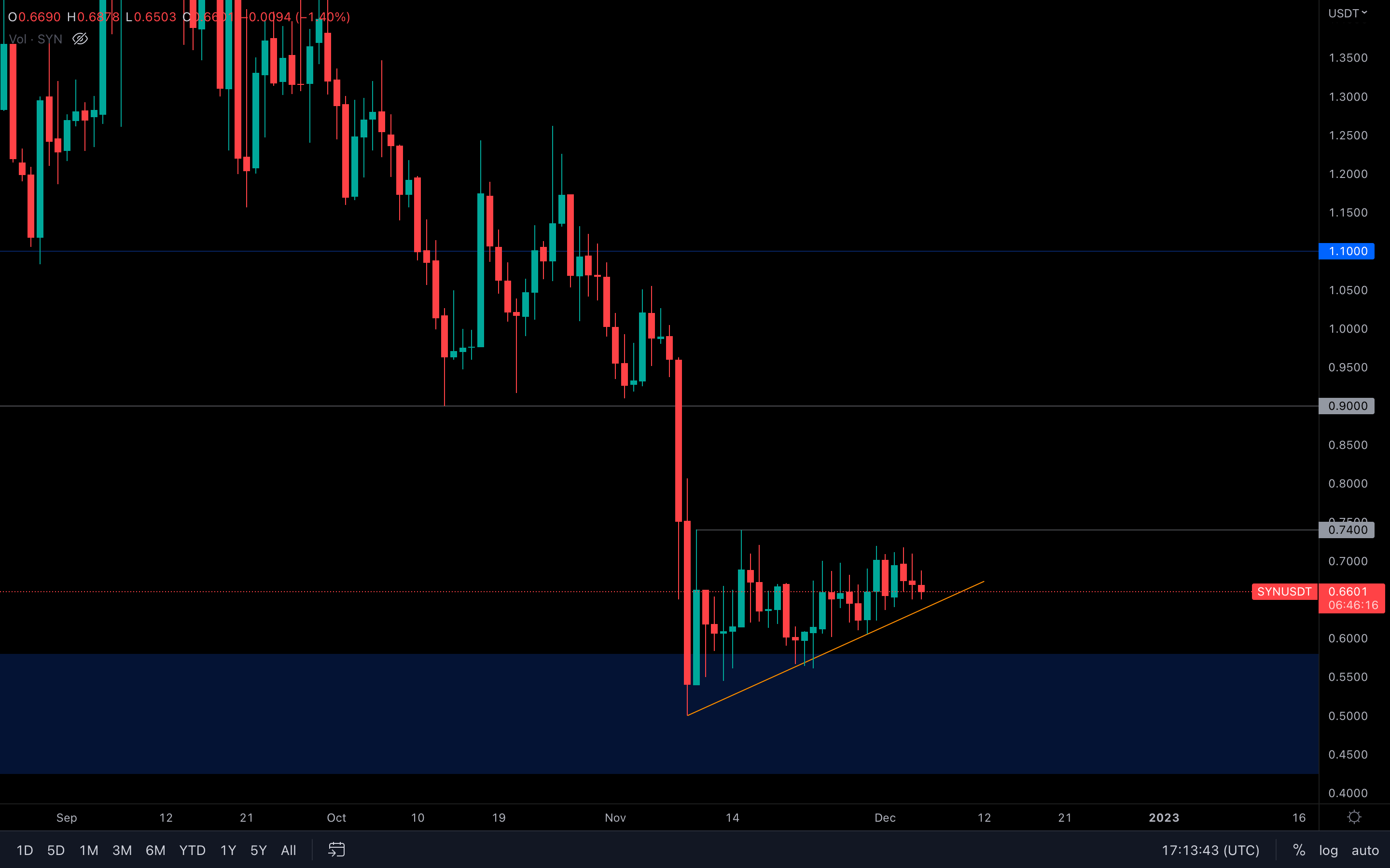
(Daily chart was used) First of all, we can see that the overall trend in the past weeks has been bullish (kinda). SYN has been forming continuous higher lows on the daily timeframe but has also encountered resistance at the same level for the same period of time. What we'd like to see here is a break above $0.74. Otherwise, SYN will probably lose its supporting trend line and head lower.
MINA
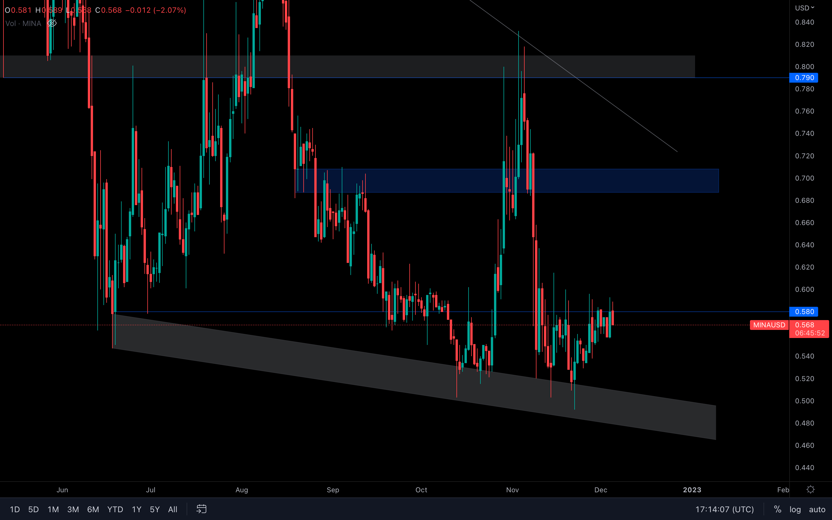
(Daily chart was used) We can see that MINA has been battling with $0.58 for some time, even registered a bullish engulfing candle yesterday, yet it still wasn't enough to break through the resistance. We need to wait for a break above $0.58 here. Otherwise, MINA could continue to range or even head lower due to low volumes.
dYdX
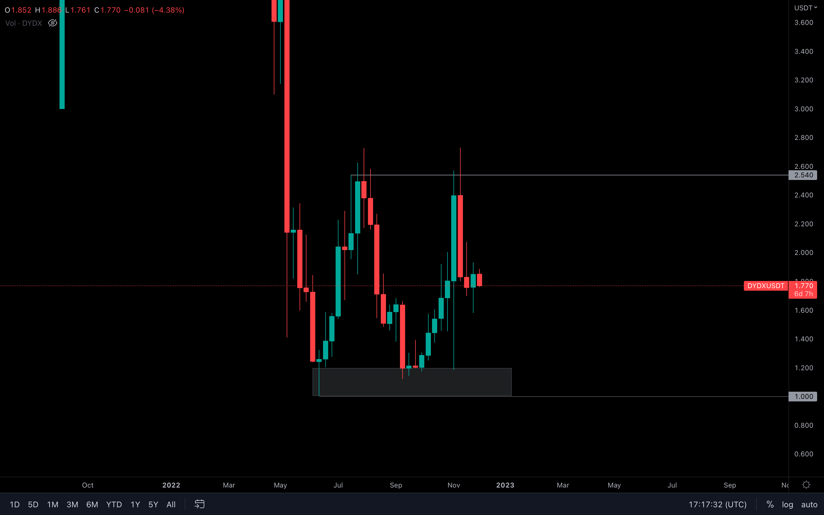
From a technical standpoint, last week's candle is a bullish engulfing - it closed above the previous candle's opening, which means buyers have invalidated the previous selling pressure. However, with Bitcoin showing short-term signs of pain, dYdX's candle could be invalidated entirely. If Bitcoin plays well, dYdX can likely test $2 and other above levels. If not, then dYdX's price action will be led by Bitcoin, and where that will head remains to be seen.
Summary
The current level of sentiment in the space is very bearish, and we have seen the number of Shorts rise significantly along with sellers coming forward into break-even levels. These are just several characteristics of participants in late-stage bear markets, and we should be wise in recognising this and then positioning accordingly.
Ultimately, many of the metrics are at macro lows compared to past bear market cycles. It would therefore be wise to begin DCA’ing into the $14,000 - $18,000 area, with a time horizon of holding the coins at least into Q3 2024 (another six quarters).
Recommended from Cryptonary