Save 23% ($351) & Get a Free 1-1 Call with our Team ⏰ : 0d 2h 59m 43s

Machine learning models are at the core of these strategies, designed to identify patterns and trends across various asset pairs, providing a clear roadmap to profitable decisions.
Backed by experimental research, our models have shown a strong fit, uncovering hidden market trends and patterns that give you the competitive edge to act before the market does.
Curious to know more? Let’s dive in…
In this report:
- What is machine learning and how to apply it in markets
- Our working models
- Closing thoughts
Disclaimer: This is not financial or investment advice. You are responsible for any capital-related decisions you make, and only you are accountable for the results.
What is machine learning?
Machine learning is a process that enables computers to learn from data and improve their performance over time without being explicitly programmed for each task. Imagine teaching a child to recognise different animals by showing them numerous pictures; over time, the child becomes better at identifying animals based on patterns and features they've observed. Similarly, machine learning algorithms analyse vast amounts of data to detect patterns, make predictions, or make decisions based on the information they've processed.The crypto market is known for its volatility and the sheer volume of data generated every second, including price movements, trading volumes, social media sentiment, and more. Machine learning models can sift through this complex data to identify trends and patterns that might not be immediately apparent to humans.
It can provide an edge in decision-making, and we can use it to our advantage when investing or trading as long as we find good working models. So here are some...
Working models
We have tried many models on many pairs, and here are some that were insightful and stood out for us. To find working models we used an additive regression. Simply speaking, additive regression is like making a smoothie where each ingredient (variable) independently adds its own flavour (effect) to the final taste (prediction). You can add each ingredient in any amount or form (raw, blended, etc.) to see how it changes the smoothie without mixing the effects of different ingredients together. As "ingredients", we used historical prices with a trend component, seasonality component and error term. Now let’s move to the juiciest part: the modelsBTC-to-Gold
This chart presents a BTC-to-Gold Ratio Forecast model, comparing the long-term price trends of Bitcoin (BTC) versus Gold.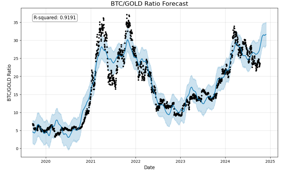
The y-axis represents the ratio of Bitcoin's price relative to Gold's price. A higher value means Bitcoin is more expensive relative to Gold, and a lower value means the opposite.
The R-squared value of 0.9191 shows that the model has a strong fit. This value indicates that about 91.91% of the variation in the BTC-to-Gold ratio can be explained by the model, meaning it is highly reliable for forecasting trends.
When the actual price (black dots) goes above the blue-shaded area, this typically indicates that Bitcoin is overvalued relative to Gold at that point. Historically, this has often been a signal that a trend reversal could occur, leading to a price correction where the BTC-to-Gold ratio falls back closer to the predicted range.
When the actual price goes below the shaded area, it generally signals that Bitcoin is undervalued relative to Gold. This situation often suggests a potential upward correction, where the BTC-to-Gold ratio may increase in the near future to align more closely with the forecasted trend.
It’s important to note that because this is a high-timeframe chart, trend reversals are not typically confirmed by just a few data points. It generally takes multiple dots consistently above or below the shaded area to signal a meaningful trend reversal. Isolated dots outside the forecast range may represent temporary market fluctuations, but when a sustained pattern of data points appears above or below the shaded area, it becomes a stronger indication of overvaluation or undervaluation and a potential shift in the trend.
As of now, Bitcoin has been below the blue area for some time, which suggests it is undervalued relative to gold and signals a reversal of the downtrend soon.
BTC-to-Gold (shorter timeframe)
This chart displays the BTC-to-GOLD ratio over a shorter timeframe, tracking its trend from the beginning of the bull market in Nov 2022.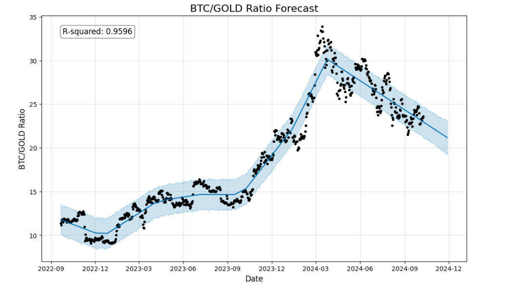
The model has an R-square of 0.95. It is very high, meaning that the model explains 95.96% of the variance in the BTC-to-Gold ratio, which suggests that the model is a good fit for the data unless we are overfitting the model to the data.
Currently, the ratio is in the middle of the blue area and it suggests further downside for BTC against Gold in the short term. However, we should also note this model relies on trends, and projects a different outcome once a new trend is established. Right now, the trend is to the downside however trends can shift. Let’s have a look at the next model to see how.
BTC-to-USD
And, lastly, the BTC/USD model is here. This is an example of how the trend has been bearish and after some time turned bullish altering the model and creating a completely different scenario. If you were to play this trend, you should be risking-on below the blue area and derisking above the area. Right now we are in the middle.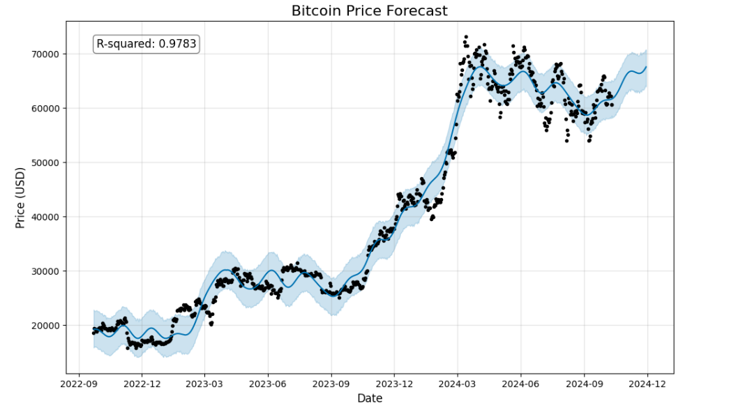
Closing thoughts
On a higher timeframe, there is a strong case for Bitcoin being undervalued relative to Gold. We believe the reversal of the downtrend in the BTC/Gold ratio is around the corner.However, in a shorter timeframe, the downtrend hasn’t been broken yet. If the ratio goes below the blue area, that will be a good area to bid on a potential reversal in the BTC/Gold ratio.
Interestingly, BTC/USD has also been on a downtrend, but the trend has recently been broken and turned bullish. If it goes below the blue area, that will be a good area to bid.
POPCAT-to-WIF
This is one of our favourite models that we shared on our Discord. It has played out 3 times since then.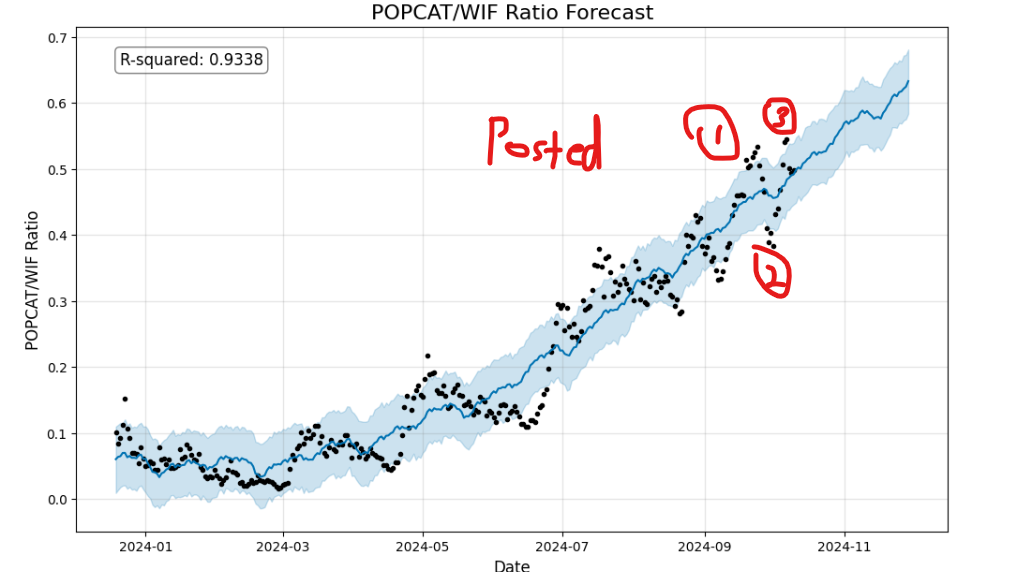
First of all, the main trend of the model remains intact, meaning the POPCAT/WIF ratio is likely to continue going upward unless the trend is broken. Secondly, whenever the ratio is above the blue line that is a signal to reallocate to WIF; and whenever the ratio is sustainably below the blue line that is a signal to reallocate to Popcat. If you are not a trader but just an investor, this chart can help you to time your entries and exits better.
A few days ago Popcat was overvalued (above the blue line) relative to WIF. However, it came back inside the blue area as our strategy suggested. For now, if you are looking to reallocate from WIF to POPCAT, we would suggest waiting until the ratio is below the blue area. Conversely, if you are looking to reallocate from POPCAT to WIF
POPCAT-to-SOL
Similar to the previous model, Popcat/Sol is in a strong uptrend. The model suggests the trend will continue going up. However, right now it suggests that POPCAT is overvalued relative to SOL. If you were looking to derisk your POPCAT to SOL, now is a good time to do so if you are looking for safer plays.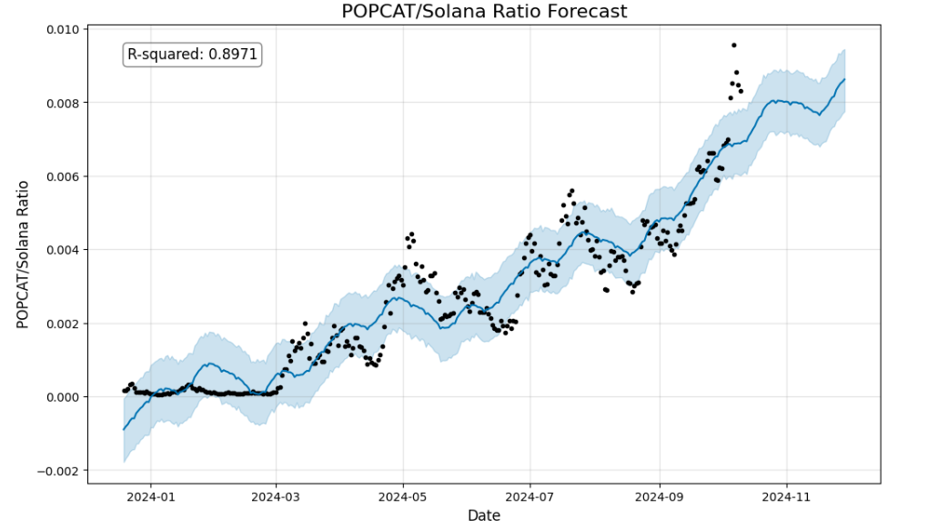
POPCAT-to-BTC
It's the same story with the POPCAT/BTC chart as well. The ratio has been sustainably above the blue area. If you were looking to derisk some POPCAT, now is a good time to do so according to the model. However, the bullish trend is still intact and likely to continue grinding upwards.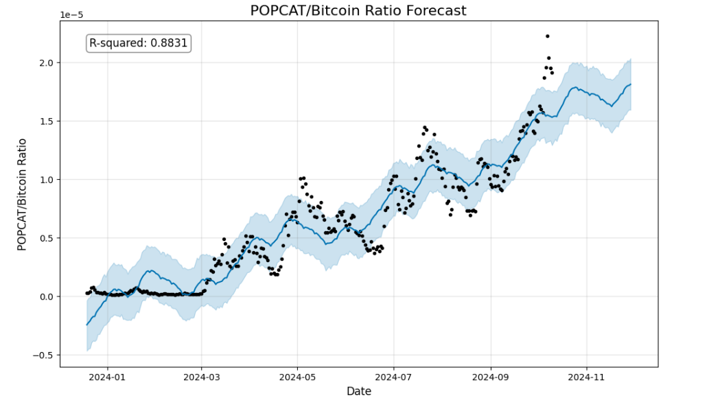
POPCAT-to-USD
Overall, the trend is bullish and directed up here as well. But, it also suggests overvaluation against USD in the short term. Again, if you were looking to book some profits, this is a good area to derisk according to the model. If we were to look for entries, anything below the blue area would be good to bid.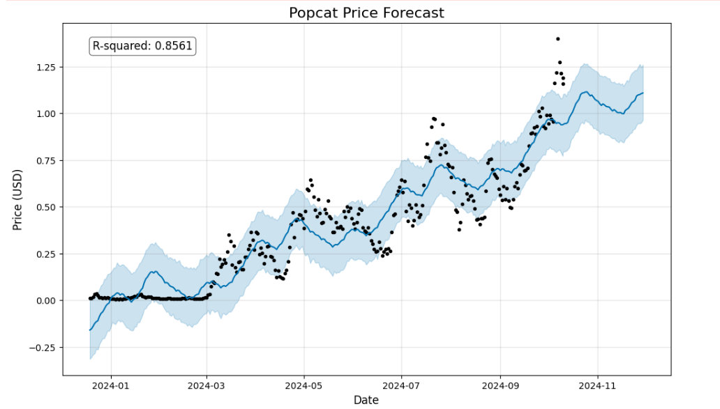
Closing thoughts
In general, POPCAT still holds a bullish trend against all mentioned pairs. A few days ago, POPCAT was overvalued relative to WIF and today it is back in the range. Despite the overall trend being bullish if you were looking to take profits on POPCAT, it is above the blue zone against SOL, BTC and USD, which suggests trend reversals on these pairs.Cryptonary’s take
This research is still in its experimental phase, and we are continuously refining and testing these models. Despite their early stage, some have already demonstrated reliability by aligning with real market behaviour multiple times.We also need to keep in mind that trends can change. As long as we play the trends, these models have the potential to be powerful tools. Given that we are still in the testing phase, it's advisable to use these models in conjunction with our market direction pieces for the time being.
So far, we've provided valuable insights into both BTC and POPCAT. Our analysis suggests that Bitcoin is undervalued relative to Gold and the trend should reverse soon. Popcat appears to be overvalued against SOL, BTC, and USD, however, it maintains a bullish trend across all pairs.
We are also closely monitoring other pairs, such as SOL-to-ETH, ETH-to-BTC, and RUNE-to-BTC. Although there are no immediate actionable insights from these pairs, we remain vigilant and will update the community with any significant developments or opportunities as they arise.
Peace!
Cryptonary, OUT!
Recommended from Cryptonary