Save 23% ($351) & Get a Free 1-1 Call with our Team ⏰ : 0d 2h 59m 44s
What in the Macro?
During this time, we would constantly assess many of the on-chain metrics that by early January 2022, had already come down a little bit. However, in a zoomed-out view, and with new macro conditions being forward guided by Powell and quantitative tightening yet to be really priced in, it became increasingly likely to us that these on-chain metrics could come down much further (if prices were to go down much further). Hence, we became increasingly bearish, and have been ever since. Since January, we have seen interest rates rise, quantitative easing stop, quantitative tightening begin, and asset prices have dropped off considerably.

Structure of Report:
- On-Chain Data.
- Macro – Inflation.
- Macro – Economic Growth and the State of the Economy.
- What Does This Mean for Stocks, Bonds and Crypto?
- How Will We Position Ouselves from Here?
Intro
This report will focus on the macro economy and on-chain data with the goal to determine when the crypto market may be bottoming. In early January of this year, we shifted our view from bullish to bearish on the markets (probably 6 weeks too late) and was laughed at by some in our field who remained bullish. In assessing many of the metrics outlined in this report, we will also highlight where we were in early January as to why our view flipped from bullish to bearish. We will now give a brief description of why we flipped to bearish in early January, before we dive into the remainder of the report and assess the current outlook of the market going forward.Pre-January 2022:
In Q3 of 2021, it is believed FED Chair, J Powell no longer believed that inflation was “transitory”, having consistently delivered to the markets in the months prior that it was. In October of 2021, Powell declared to Congress that he no longer thought inflation was “transitory”, and then in November (coinciding with the top in the crypto market), he suggested the FED may need to raise rates. With the markets at highs, and Powell giving forward guidance to the markets that rates will rise, along with the infamous quantitative easing likely to come to an end in the following months, it became increasingly probable that markets would come down. In terms of risk assets, crypto is perhaps one of the assets that’s furthest along the risk curve, and therefore likely to be one of the assets that struggles for liquidity and is hit the hardest – no longer will we see digital pictures of monkey’s catch bids (although, with the benefit of hindsight, they have remained stronger than we anticipated, but in the majority, they have come down significantly in value).With this backdrop now known, we will dive into the Bitcoin on-chain metrics and what they currently suggest. Following this, we will cover the macro and what changes may lie there and how that affects crypto (and our portfolio) going forward.
Bitcoin On-Chain Data
On-chain analysis is the method of using information from a blockchain ledger to determine what certain cohorts of addresses are doing with their coins and where the market sentiment is in comparison to history.Metric Cohort 1 – Wallet/Network Activity:
The first set of metrics we will dig into is the Addresses but Addresses by adoption. I’ll first cover Total Addresses.Total Addresses
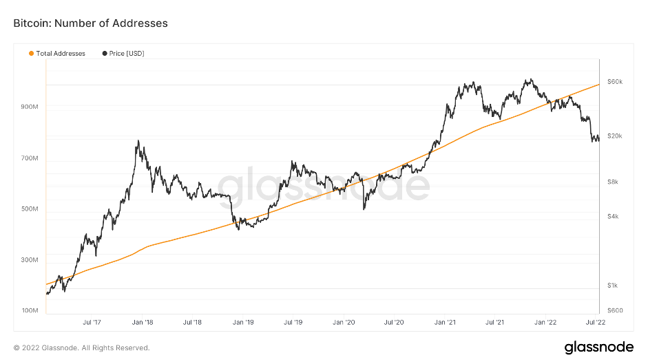
We can see from the above chart that Total Addresses has always been increasing.
Active Addresses
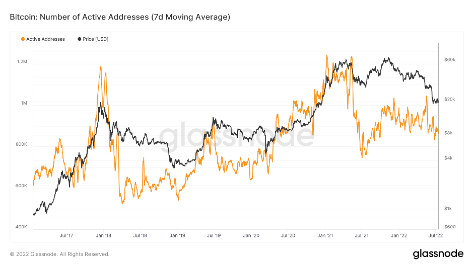
If we look at Active Addresses (above chart) we can see the number of Active Addresses is increasing, creating higher highs and higher lows, indicating that the userbase over time is growing.
New Addresses
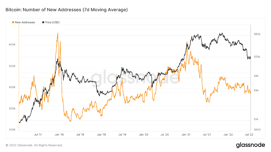
The New Addresses metric is very similar looking to that of the Active Addresses metric. Of course, when the price of Bitcoin increases significantly, new users/investors are attracted to the space and flow in. Then, once prices collapse, as they inevitably do at the end of every Bitcoin bull market, new users/investors aren’t inclined to join the space and we see the New Addresses metric much lower. However, all-in-all, the New Addresses metric shows higher highs (other than the last two cycles all-time-highs), and higher lows.
To summarise the above set of metrics, we’re seeing new users consistently coming into the space over the long-term. Bitcoin has seen increased adoption pretty much since it’s inception.
Metric Cohort 2 – Wallet Balances:
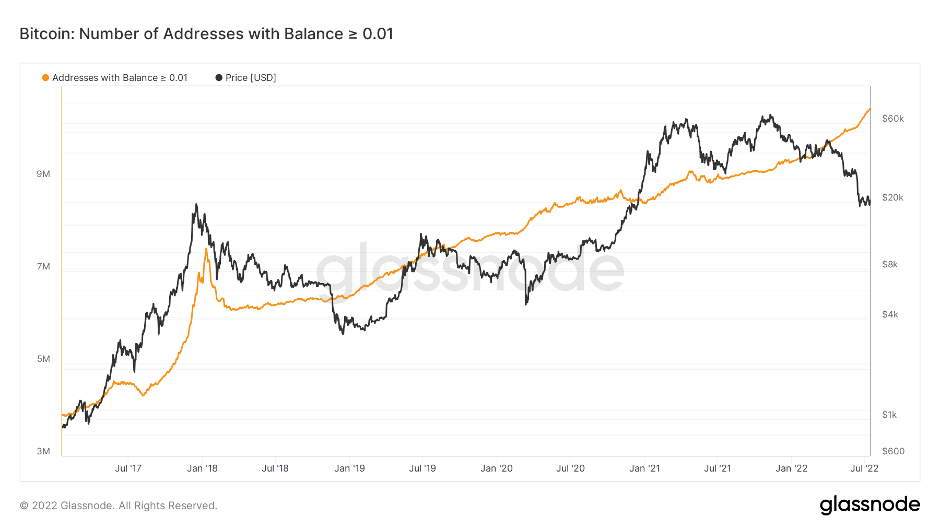
A significant advantage of on-chain data is it allows us to see what groups of wallets are increasing in number (adding Bitcoin to their wallets) or decreasing in number (selling Bitcoin from their wallets). These groups of wallets are broken down into sizes by the amount of Bitcoin they hold. Typically, the wallet holders who hold lots of Bitcoin are heavily observed as historically they must be more profitable simply due to the fact they’re able to buy/hold so much Bitcoin (via raising capital – institutions/funds, or they’re simply profitable traders). Wallet groups are broken down into the following:- Addresses with Balances > 0.01 Bitcoin.
- Addresses with Balances > 0.1 Bitcoin.
- Addresses with Balances > 1 Bitcoin.
- Addresses with Balances > 10 Bitcoin.
- Addresses with Balances > 100 Bitcoin.
- Addresses with Balances > 1,000 Bitcoin
- Addresses with Balances > 10,000 Bitcoin.
Addresses with Balance > 10,000 Bitcoin
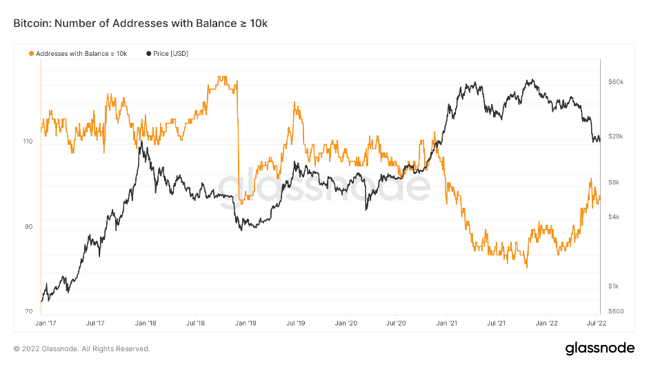
We can see in the above chart that following the Bitcoin all-time-high in price in late 2017, this group of wallets increased in number (buying Bitcoin) from approximately 113 wallets at the all-time-high to 126 wallets by October 2018. In this 10-month period, the price of Bitcoin decreased to approximately $6,000 (a 68.75% decline) ……… Between November 2018 and early December 2018, the price of Bitcoin crashed from $6,400 to $3,300, a near 50% decline further. As this happened, the number of wallets holding more than 10,000 Bitcoin decreased from 125 to 96. So, they accumulated throughout 2018 which saw a 67.75% decline, then Bitcoin crashed in a matter of just a few weeks from $6,400 to $3,300, and the number of wallets in this group then dropped significantly. Effectively, they accumulated through the bear market, then dumped a large portion of their Bitcoin during Bitcoin’s final flush out in price. Put it this way, if you counter traded them, you would have performed phenomenally.
Example 2: In early 2021, this group began selling off their supply (the number of wallets decreased). They got this right; however, they did begin sizing down quite early. But all-in-all, ok.
Example 3: Following the newest all-time-high in November 2021, the number of wallets in this group began increasing in February 2022. Since the start of the increase (84 wallets to now 94 wallets), the price of Bitcoin has fallen 51.64%.
What we're trying to say in the above is that this group of wallets are quite poor in terms of when to risk-on and when to risk-off, yet some people in the space look to this group and try to emulate their actions. In our opinion, the best group to watch and therefore try to emulate is the ‘Addresses with Balances > 1,000 Bitcoin’. We will dive into why we value them much more in the below.
Addresses with Balances > 1,000 Bitcoin
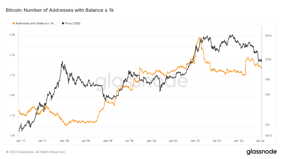
Looking at this group, the number of wallets containing more than 1,000 Bitcoin decreased throughout 2017.i.e., into the bull run and the all-time highs. The number of wallets then stayed relatively similar throughout 2018 when Bitcoin’s price fell from $19,200 to $5,000. In Q4 of 2018, the number of wallets in this group began increasing (they were buying Bitcoin). This was a tad premature as Bitcoin’s price went from $6,400 to $3,300 in mid-November of Q4 2018, however, this group accumulated more heavily into this price crash, unlike the 10,000 Bitcoin wallet group. ‘Be greedy when others are fearful and be fearful when others are greedy’. The ‘Addresses with Balances > 1,000 Bitcoin’ saw the number of wallets in this group increase pretty much all the way to the next all-time-high in price in May 2021, where they then began to sell-off dramatically. In Q1 2022, there is a large spike up suggesting this cohort accumulated heavily on this day, but this was not the case as we can see in the confirmed tweet below.
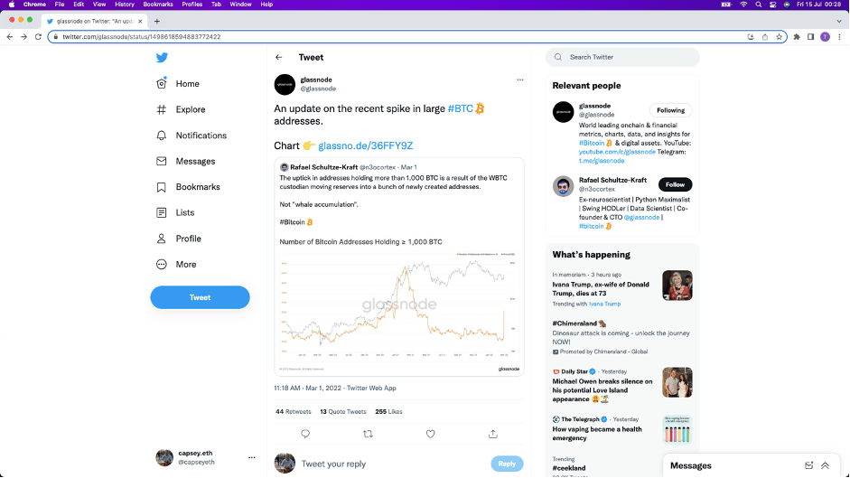
This tweet is from the co-founder and CTO of Glassnode (the data provider) and then Quote Retweeted by the main Glassnode Twitter account. This does not mean the print on the graph is a misprint, it is just not organic. So, in theory, this cohort have been risking-off (selling Bitcoin) throughout all of 2022. Now currently sat in early July of 2022, we know this was most definitely the right move. We therefore focus on this cohort more greatly than any other as their accuracy in when to be risking-on or off is high.
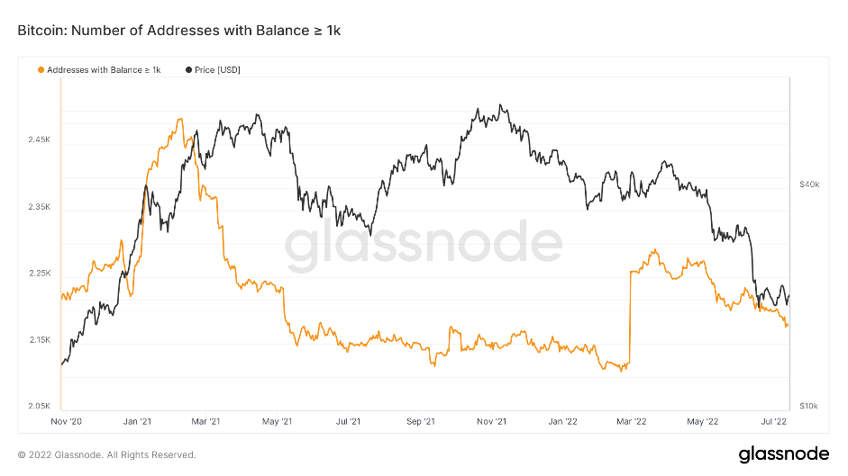
In a zoomed in version of this chart below, we can see that the number of wallets in this cohort are continuing to decrease (risk-off).
Addresses with Balances > 1,000 Bitcoin
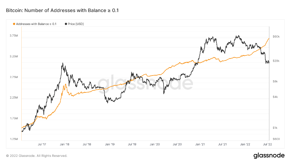
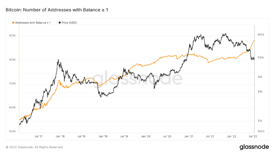
If we now look at the other cohorts of wallet groups, we can see that the Addresses with Balances > 0.01, 0.1 and 1 Bitcoin are in a constant uptrend pretty much, therefore not great indicators for us to use in terms of risking-on and off.
Addresses with Balances > 0.01 Bitcoin
Addresses with Balances > 0.1 Bitcoin
Addresses with Balances > 1 Bitcoin
This now leaves the last two remaining groups: Addresses with Balances > 10 Bitcoin and Addresses with Balances > 100 Bitcoin. We won’t go into explaining the correctness of either of these metrics, instead we will summarise them as a pair. Effectively, sometimes they are right and sometimes they are wrong. The Addresses with Balances > 100 Bitcoin are usually quite reactionary and is in a general downtrend over the years (likely as coins get more expensive). The Addresses with Balances > 10 Bitcoin, we would say are right more than wrong, but not enough to be intently watching their every move (in terms of risking-on or off). Again, they’re also reactionary, take the September 25th 2019 and the March 13th 2020 Covid crash as examples, the number of wallets decreased on both occasions as prices tanked, when really this was a great buying opportunity, yet they did the opposite.
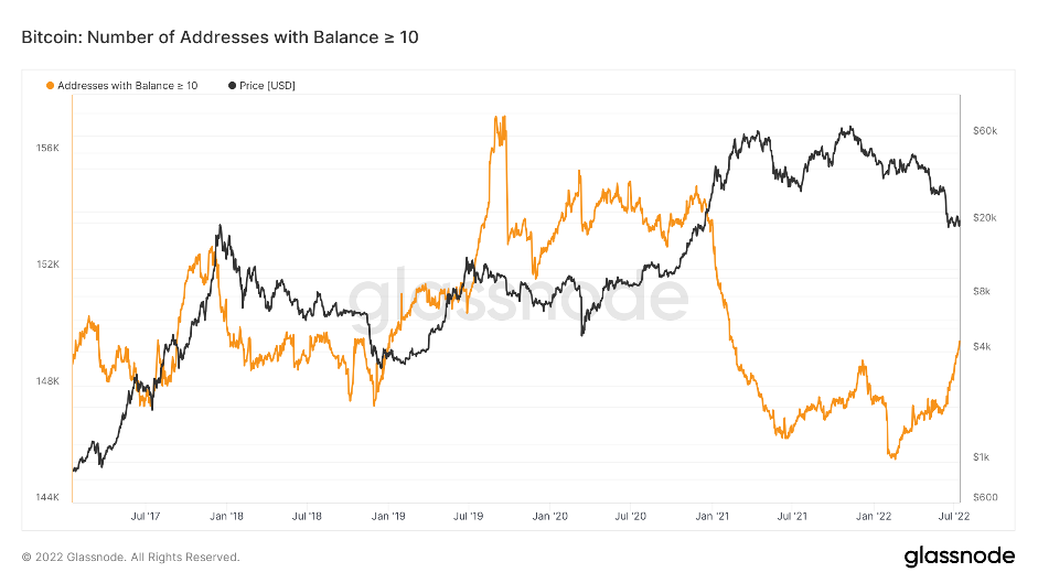
Addresses with Balances > 10 Bitcoin
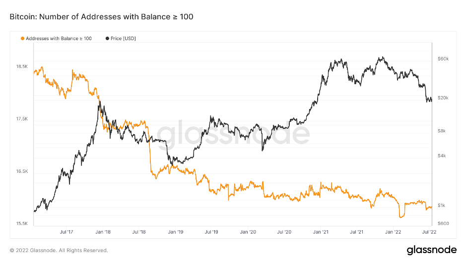
Addresses with Balances > 100 Bitcoin
In concluding this group of metrics, it can be said the only cohort worth following is the ‘Addresses with Balances > 1,000 Bitcoin’ and they are continuing to reduce their exposure to Bitcoin. The smaller Bitcoin wallet groups are constantly increasing, and the others aren’t consistently correct enough to be worth following and trying to emulate.
Metric Cohort 3 – Market Indicators:
We assess the ‘Market Indicator’ metrics to mostly gage a sense as to when Bitcoin is undervalued or overvalued relative to its “fair price”. In terms of determining a “fair price”, this is simply broken down into the expectation that Bitcoin is at least as valuable as what it costs to produce – “fair price”. However, we will cover this in greater detail in the ‘Mining’ metrics further down.The first of the ‘Market Indicator’ metrics is the MVRV Z-Score. This metric is used to assess when Bitcoin is undervalued or overvalued relative to its “realised value” (the average cost basis for the coins in existence). The red zone indicates an area in which the Bitcoin market can be considered overheated, the green zone is a highlighted area which considers Bitcoin to be undervalued when the MRVR Z-Score hits this zone.
MVRV Z-Score
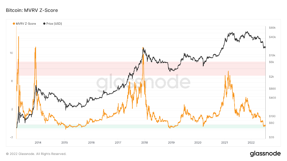
In the above, we can see that Bitcoin currently sits in the green zone indicating it is undervalued relative to its ‘realised price’. Note: the last three times (since 2015), Bitcoin has been in this zone, it has been the macro bottom of the bear market. Now, it doesn’t mean that Bitcoin can’t go lower price wise (currently $20,900 at time of writing), however, this above metric suggests that it may be worth considering Dollar Cost Averaging in.
The second ‘Market Indicator’ metric is the Net Unrealised Profit/Loss. The Net Unrealised Profit/Loss is the difference between the Relative Unrealised Profit and the Relative Unrealised Loss. Significant unrealised losses will see this metric move into an orange and then red zone. In previous times where this metric has reached the red ‘Capitulation’ area, Bitcoin has formed a bottom. The reason for this is that it is likely before the red zone was reached, many investors had already been flushed out of the market due to the falling USD value of Bitcoin. As Bitcoin’s price then comes down further (pushing this metric into the red ‘Capitulation’ zone), the last remaining and higher conviction investors are left. As they are plunged into a significant unrealised loss, they understand that selling in those times is not opportune and therefore they ‘hodl’ (hold) and the overall sell-pressure is more alleviated due to the much lower price in Bitcoin and ‘hodlers’ not wishing to sell at the low USD price.
Net Unrealised Profit/Loss
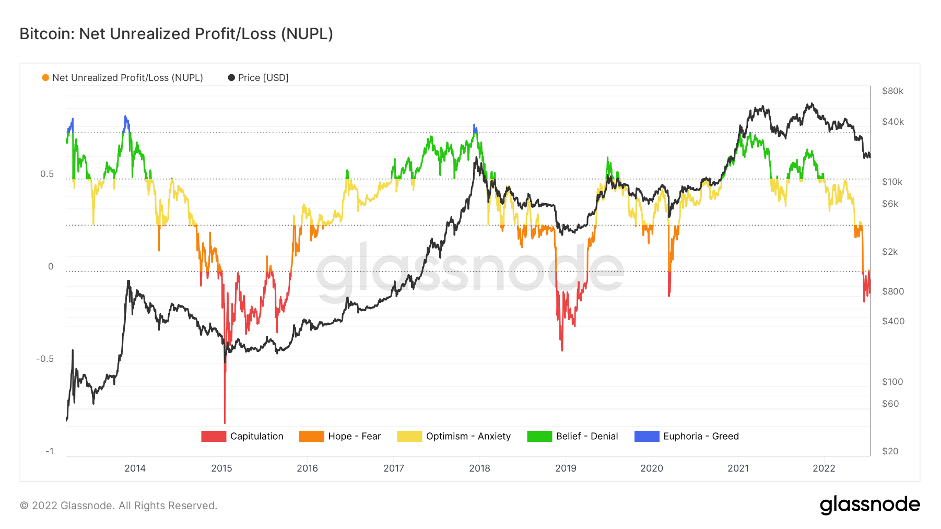
We are currently printing in this red zone, suggesting Bitcoin is a good buy. However, again, it is possible price does fall further but the red prints do suggest that DCA’ing a small percent may be worthwhile. Note: in the above, we are seeing almost a diminishing returns effect (lower highs and higher lows) as the network and overall market becomes more mainstream. With this being said, it may be the case we don’t come down significantly further, and that the value (on this graph) of -0.2 - -0.3 may be roughly the right area.
The last ‘Market Indicator’ metric is the Net Realised Profit/Loss. This is the difference between realised losses and realised profits of all moved coins (spent outputs). Now, for this metric, we have zoomed in more heavily – just showing 2017 to today. The reason for this is that Realised Profit/Loss is measured in USD, and since the price of Bitcoin has increased so dramatically over the years, the spikes (realised losses in USD terms) become greater and greater, and it’s tricky to even make them out if we scroll prior to 2016. We will the share the chart below to help emphasise my point before we dive in and explain our thoughts.
Net Realised Profit/Loss
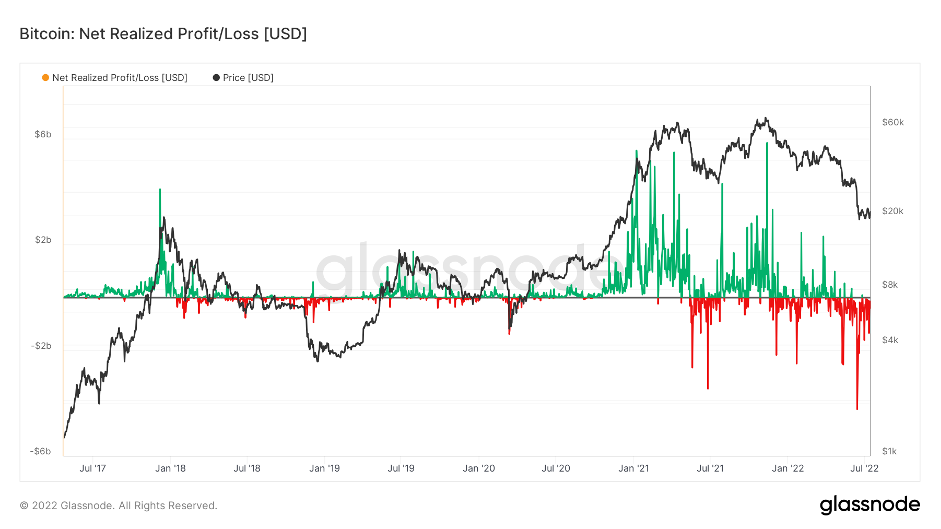
In a number of the past Bitcoin bear markets, there have been days/weeks where there is significant losses being realised (in USD). We look out for this as a sign that there is capitulation amongst investors, with the expectation after, that many will leave the space following these nasty days (usually large drawdowns in price of Bitcoin). We can see above that there was a large red spike at the end of 2018, which coincided with the bottom of the bear market. We then saw something similar in May 2021 which again was the macro/local bottom. If we now look back to June 14th, 2022, we had an even greater realised losses spike (the largest by USD value in Bitcoin’s history). It seems to us that every significant low is marked by a large spike in realised losses, and we had this at the most recent drop on June 14th, 2022. Again, this is another metric that would indicate that either the bottom is in, or very near.
Metric 4 – Realised Price by Addresses:
In our opinion, the ‘Realised Price by Addresses’ is the most important metric we view. The ‘Realised Price by Address’ visualises the average price at which current unspent Bitcoins belonging to each category of addresses were purchased for. Each address category represents addresses with balances within a given range. This is the definition provided by the data-provider Whalemap.Now this is a metric we have viewed closely since January 2022 and it immediately became clear to us that seeing this, along with our knowledge of the macro (expectations for prices to go lower), we were able to hone in on a possible bear market bottom price for Bitcoin. We wrote about this in many of the On-Chain Metrics Reports that we write for ‘Cryptonary’.
Here is an example:
https://cryptonary.com/market-analysis/on-chain-forensics-40/
At the time, Bitcoin was range-bound between $38,000 and $44,000, but from studying the prior bear markets of this metric, it became clear to us that we would test the realised price levels. In the below, we will look back at the 2015, 2018 and 2022 bear markets, and you will see that the graphs show very similar things and hence our conviction to talk about this months ago.
2015 Bear Market
2018 Bear Market
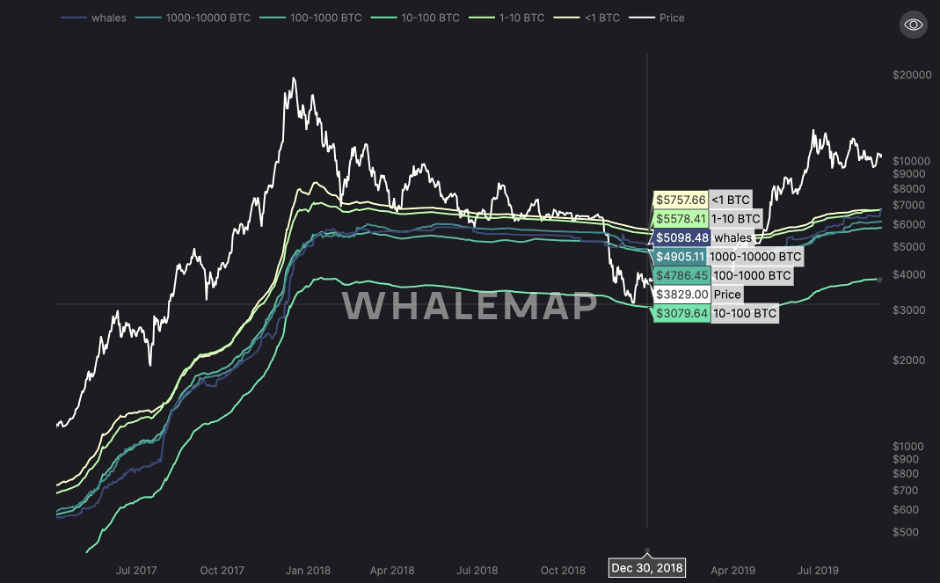
In the above graphs, we see that the Bitcoin price managed to hold above the realised cost basis of the majority of the cohorts of wallets for a prolonged period of time. However, price eventually broke below these realised cost levels and tested the resolve of the investors who had the lowest realised cost (a significant price drawdown to reach the lower address’s cohort).
At the time of the report above, this is what we saw.
2022 Bear Market
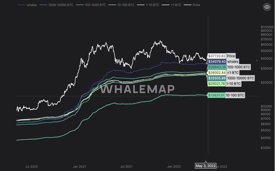
This is what this same chart now looks like.
Current 2022 Bear Market
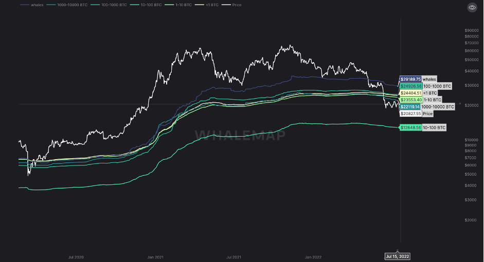
In the 2015 and 2017 bear markets, the Bitcoin price came down to the point in which it tested the 10-100 BTC cohorts realised price. This would currently see Bitcoin fall to $12,848.56. In the rest of this essay, we will assess how possible this is that we visit this level from current prices and provide our thoughts in the conclusion.
Metric Cohort 5 – Mining:
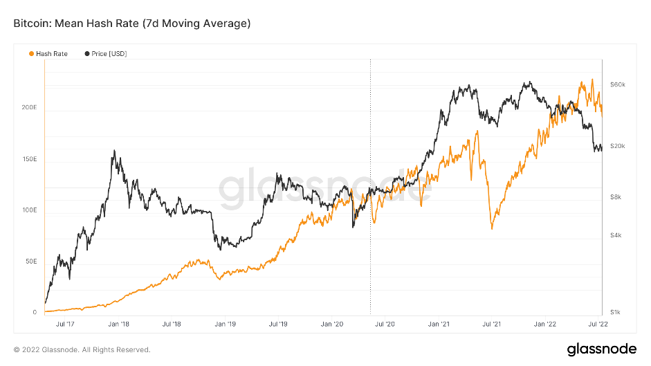
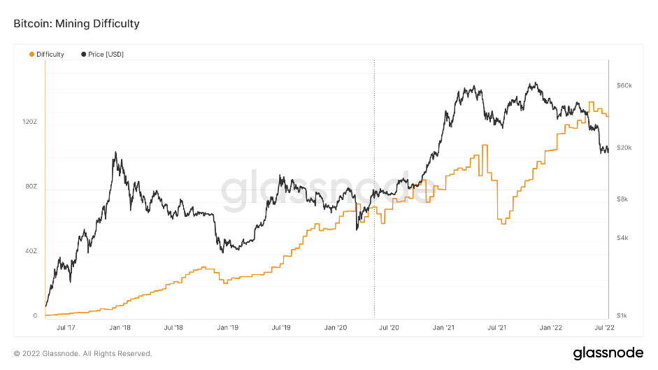
In the last set of metrics, we will dive into a number of the mining metrics to understand how close we are to a minor capitulation, which has historically signalled the end of bear markets for Bitcoin.What effectively happens during bear markets is the following; as the price of Bitcoin drops, miners who are not running efficiently (costs of electricity are too high for instance), begin to no longer run profitably because the value of their reward (Bitcoin) has decreased in USD value and now their revenue doesn’t cover their costs. These inefficient miners turn off their mining rigs which sees the hash rate and then the mining difficulty drop – there’s less competition between miners meaning the efficient miners are then paid greater rewards as they don’t need as much hash power for the same reward as before. As the efficient miners earn more, they begin to sell less of their rewards, seeing a reduction in sell pressure and they then look to expand. They expand through turning on new mining rigs, which in turn increases the hash rate and the difficulty and as a result the price of Bitcoin increases.
Mean Hash Rate
Difficulty
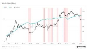
The last metric to cover in this cohort is the ‘Hash Ribbon’. This metric assumes that Bitcoin tends to reach a bottom when miners capitulate, i.e., when Bitcoin becomes too expensive to mine. The Hash Ribbon indicates that the worst of the miner capitulation is over when the 30d MA of the hash rate crosses above the 60d MA. This is the definition provided by the data-provider, Glassnode. We can see in the below that the MA’s are turning down. What we are looking for here is for them to turn down and actually downtrend, followed by the 30d MA showing a bottom and then crossing above the 60d MA (green crossing above blue).
Hash Ribbon
Many of the on-chain metrics we analyse are showing signs of a possible market bottom or at least that the market bottom may be near. With this information laid out, we will move on to assessing the macro environment to see what this may mean for possibly calling a market bottom in Bitcoin.
Macro
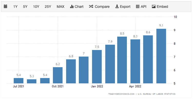
This section of the report will cover inflation, the state of the US economy and what this may all mean for Stocks, Bonds and most importantly, our favourite…. Crypto.In this past month, the new inflation print came out at 9.1%, the highest rate since November 1981. Currently, the FED has a dual mandate of maintaining price stability and a healthy job market. It’s clear that the price stability side is not where they would want it to be (their target is 2% - currently it’s 9.1%), and their other element, the job market, is strong…. on the surface.
Let’s start by digging deeper into the inflation point.
Inflation:
After last month's 9.1% headline print, the majority of the concern came from the fact that some of the components that make up the CPI basket accelerated. It was only a couple of months ago where some were saying that inflation had peaked, even here and now it is unlikely that inflation has peaked as we’ll explain below.In the below charts, we have the ‘Inflation Rate’ and the ‘Core Inflation Rate’ – ‘Core’ is less Food and Energy.
Inflation Rate
Core Inflation Rate
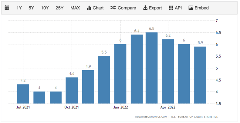
We can see that ‘Core Inflation’ is coming down, so straight away we can pinpoint that the drivers of the headline Inflation rate are Food and Energy.
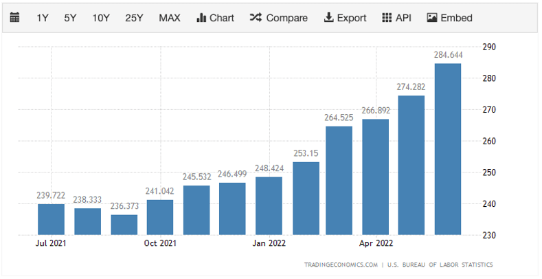
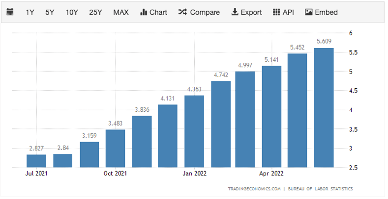
Food Inflation
Energy Inflation
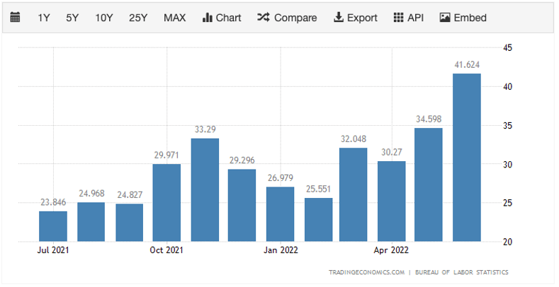
Energy inflation is clearly the largest contributing factor to the high Inflation prints that we’re getting. However, we are also beginning to see the acceleration in other components.
Transportation Inflation
Rent Inflation
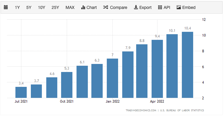
In simplifying the above, we can see that the month-on-month change in inflation is the highest it’s been since 2005 at a 1.3% increase.
Inflation Rate Month-on-Month
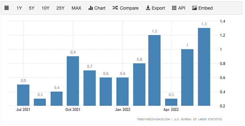
The above set of charts suggest that inflation isn’t peaking out and turning down like some suggested a few months ago, in fact, a number of elements are accelerating. However, it should be noted that the Inflation rates/prints are a lagging indicator which the FED and J Powell will be fully aware of. With all this being said, Powell has told us that inflation is currently the number one priority, and it is therefore likely that he will continue to raise rates. Now, the Bond market (smartest money) in recent weeks hasn’t compounded Powell’s continued hawkish stance (as he has suggested he will continue to raise rates to 3.5% by the end of 2022). So, a 75-100-basis points rate rise is unlikely next week, and the Bond market isn’t continuing to compound J Powell’s hawkish narrative. Why is this?
Note: when we say the Bond market hasn’t compounded Powell’s hawkish narrative, what we mean is that previously, hawkish statements were made, Bonds sold off and yields rose. But in the last few weeks, yields have come down and Bonds have stabilised… for now.
So, back to “why is this?” The Bond market is effectively saying, “ok J Powell, you keep saying you’re going to continue aggressively raising interest rates to combat inflation, but some of the economic data is suggesting a downturn is ahead of us. How can you raise rates into a downturn?”
This leads me on nicely to my second section, economic growth, and the state of the economy.
Economic Growth & The State of The Economy:
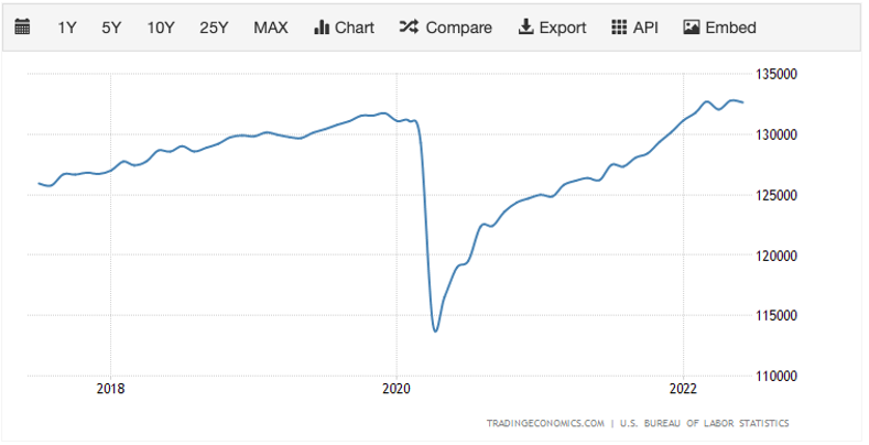
In this section we will focus on the jobs market.The last Unemployment Rate was released on July 8th at 3.6% with Non-Farm Payrolls coming in at 372k, smashing the Consensus and Forecast (268k and 300k respectively). On the surface this looks pretty strong, however, for the two prior months, Non-Farm Payrolls were adjusted down by -74k, in theory, wiping out the 72k extra jobs gained (against expectations) this past month. Perhaps there is a slight tweaking of the numbers with someone getting a gentle political touch on the shoulder. This is theoretical from us, but we believe they will try to show the best jobs figures they can leading into the November mid-terms. But enough of that, let’s dive into some of the data.
Full Time Employment looks as if it’s beginning to peak and turn down whilst Non-Farm Payrolls (the number of payrolls the US economy added) is much less than the numbers it was posting 6 months ago. Even though these metrics look as if they’re decreasing/down-turning, the positive side is that the June figures leave nonfarm employment down by only 524k or 0.3%, from its pre-pandemic level in February 2020.
Full Time Employment
Non-Farm Payrolls
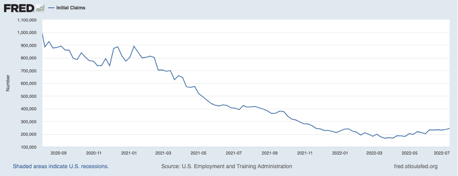
With this being said, there are some further cracks beneath the surface. Initial Jobless Claims (the number of Americans filing new claims for unemployment benefits) has been steadily increasing since April 2022, having been in a long-term downtrend since it peaked immediately after March 2020 (covid).
Initial Jobless Claims
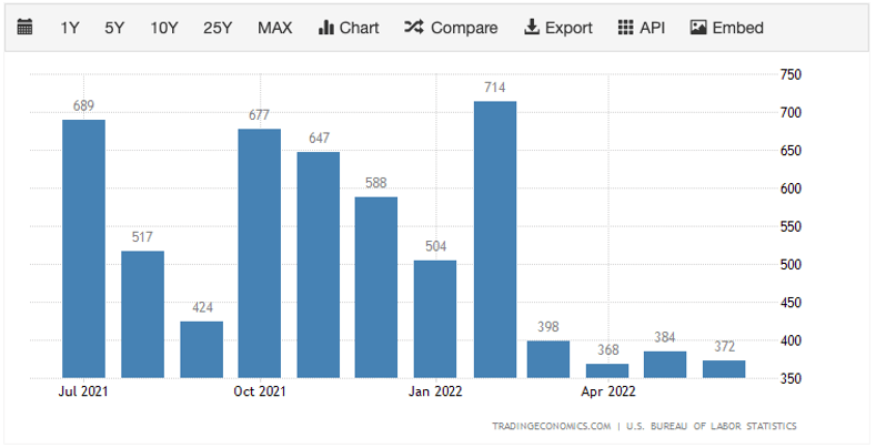
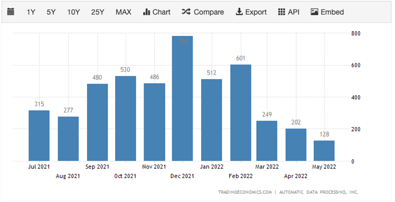
Another key piece of jobs data is to look at private businesses to see if they are hiring and if so by how much. We can see in the below chart that since February 2022, private businesses have hired less and less workers month-on-month. In May 2022, private businesses added 128k jobs which was well below the predicted 300k estimates. So, a severe slowdown in hiring from private businesses. This may be due to them seeing New Orders decreasing, i.e., higher interest rates are beginning to hurt demand.
ADP Employment Change
ISM Manufacturing New Orders
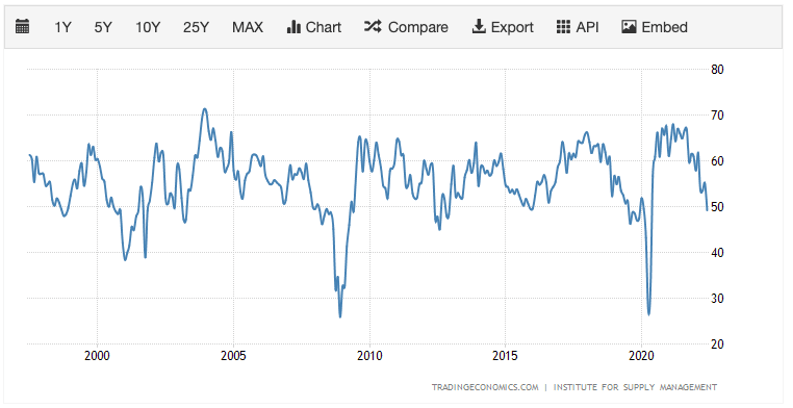
Note: this chart covers the last 25 years but note the significant drawdowns. 2008 (Great Financial Crash), 2020 (Covid), you get the picture.
The effect of this may be that the number of Job Openings comes down. Currently, there are a lot of available jobs. However, with interest rates going higher, companies are likely to be increasingly hit at the margin and therefore they may need to cut costs to re-improve margins and maintain earnings. We are already beginning to see a number of the big tech firms (especially in Crypto) either pause hiring or cutting %’s of their workforce. Here are some examples below:
- https://www.cbsnews.com/news/coinbase-layoffs-cryptocurrency-sell-off-brian-armstrong/
- https://www.livemint.com/companies/news/microsoft-announces-job-cuts-google-to-slow-hiring-11657705688985.html
- https://finance.yahoo.com/news/mark-zuckerberg-warns-staff-facebook-120626064.html?guccounter=1&guce_referrer=aHR0cHM6Ly93d3cuZ29vZ2xlLmNvbS8&guce_referrer_sig=AQAAANOwKJ4b59L8d7T7e4L2XuIeM99QuBt_RlNMbV4wEPqQCQv-kX4ZaYNeFG3GAU97wrSSosfmVfW40kGa0hjq3MoXnJLRAFDHlSz4aIrGaEKHJFT71naOhYjRk6m6p_QLihOr9gP23tQS0mBHZH2Y_PGSRSsuCq0vfBnfzPVwF1YO
Job Openings
Currently, Retail Spending is strong (came in at 1%, beating the 0.5% forecasted and the previous month of -0.1%).
Summary of The Macro So Far:
Effectively, we have inflation at 40-year highs, and the FED being extremely limited on what they can do to affect it. Unlike the inflation of the 70’s, current inflation is derived from supply-side issues that began during Covid (1970’s inflation was driven by a lack of demand).The FED is limited in what they can do to fight inflation. Raising interest rates is merely a lever on demand – raise interest rates, the cost of money becomes more expensive and as a result, demand falls. They are unable to affect the supply, they cannot quickly produce more oil and more food. So, the main instrument they can use is to raise interest rates making the cost of capital more expensive, therefore corporates put pauses on expansion plans as the cost of doing so has now increased. Due to this they may become more cautious in their outlook and therefore they may hire less, meaning spending in the wider economy may decrease. This brings down margins, which corporates then look to reduce costs to re-establish margins and maintain earnings. Reduce costs means sometimes reducing existing staff.
So, the FED has to keep raising at least for the next few meetings to show that they’re tough on inflation and for us to actually start seeing inflation come down (as we mentioned above, it is a lagging indicator). However, the economy is showing signs of slowing so the FED has a bit of a balancing act to do. They can’t be aggressively raising rates into an economic downturn, hence they are raising rates now whilst economic data is still holding up (ish) and the jobs market is still strong (again, ish).
This now leads us onto our final section; what does all this mean for Stocks, Bonds and Crypto. We would say we're not experts in Stocks and Bonds but we do our best in Crypto so we will prioritise that asset class in our explanation below.
What Does This Mean for Stocks, Bonds and Crypto?
Over the past 8-10 months, Equities, Bonds and Crypto have all come down. This is due to the expectancy that tightening will increase and therefore multiples and earnings will contract. We have seen multiples come down, but earnings are still relatively high. Usually, when equities come down, Bonds (smart money) act as a hedge, however, with inflation expectations higher than 2.5%, Bonds lose their attractiveness as a hedge because the yield doesn’t cover the purchasing power that is lost to inflation in the time period.However, in recent weeks, Bonds have not compounded Powell’s hawkish narrative as long-end Bonds (10+ years) have begun to catch a bid. The reason for this is what we mentioned earlier, “but J Powell, the economy looks as if it may soon enter a recession, how can you continue to raise rates into that environment?” What effectively has happened here is that the Bond market have begun to shift their focus from inflation (even though some aspects of it are accelerating) to economic growth, or a lack of. The Atlanta FED have predicted that economic growth for Q2 will be -1.9%, which would see two consecutive quarters of negative economic growth, which by some definitions would be a recession. Hence, the pause in the Bond market to no longer compound Powell’s hawkish forward guidance, as there is now a belief that Powell can’t continue to raise rates like he’s suggesting.
As Bond market participants have become increasingly focused on economic growth expectations rather than inflation concerns, we’ve seen yields stabilise and dip lower fuelling demand for risk assets. This may mean that in the next month, we may have a relief rally on risk assets (such as Crypto), whilst there is this further focus on economic growth (or lack of) and not inflation. Due to the focus on economic growth, this is seeing the Bond market potentially price in rate cuts as early as the end of Q1 2023. Our worry is that the market is getting slightly ahead of itself and that inflation will re-emerge as the priority in the coming months as we continue to see high prints. As it is we have already seen considerable tightening already with interest rates projected to be at 2.25% within a matter of weeks, the Dollar Index is as high as 108 and who knows, we could see oil stay high for the foreseeable future (granted it has sold off in the last few months), yet we’re still getting the highest inflation prints in over 40 years. If we continue to get these higher inflation prints, Powell will need to raise rates past current expectations – he is suggesting 3% - 3.5% by the end of 2022, but the Bond market isn’t in full belief of this just yet. This shift in focus back to inflation and increased rate rises may be the catalyst for the last major move down in risk assets such as Equities and Crypto.
In recent weeks, Powell also suggested that the FED may need to sell Mortgage-Backed Securities from its Balance Sheet – another form of tightening and something that can cause another liquidity issue. In our opinion, a reduction of the Balance Sheet (via MBS's) hasn’t yet been priced in.
All-in-all, we believe that inflation is still the issue, and so we expect for the yield curve to become even more deeply inverted. At the moment, the belly of the curve is leading the inversion, 5-10 year leading. But growth is decelerating, so can you continue raising rates, is it viable to do so? Our feeling is that markets are at an inflection point. It very much depends on does inflation come down due to these aggressive rate rises and with that, how badly is the economy affected by the demand destruction that the FED is trying to engineer.
How Will We Position Ourselves From Here:
We feel it is wise to be cautious at the moment. It is clear that many of the on-chain indicators for Bitcoin look as if they’re bottoming and therefore, a Dollar Cost Averaging strategy could be considered if we breach back down to the lows. However, we would rather continue sitting on the sides and taking the odd opportunity when they’re presented until either; inflation comes down, or the FED raises rates to a point in which they break something or demand destruction becomes so significant that we enter a full blown recession and the FED is forced to pivot and become accommodative again. This is what we are assessing on a daily basis as new data is presented.Recently, the smartest money (Bonds) has begun to move as PMI has come down and indicated that there will be an economic slowdown. This would result in corporations being hit at the margin and earnings coming down because of that. It is currently earnings season, and earnings have come in stronger than expected so it may be the case that we have to wait another quarter. This is the first time smart money has been on the buying side in some considerable time and as yields have fallen, the appetite for risk has increased slightly, hence we’re seeing a move up in risk assets.
Until the outcome of the inflation vs economic growth narrative has come to a conclusion, we feel it’s best to remain patient. However, if there is an indirect green light signal from Powell in any of the forward guidance, this may also enable me to shift back to risking-on (buying Crypto). These indirect green lights can be some forward guidance that aggressive rate rises are going to ease up or that they’ll flip to accommodative policy once again. We think flipping to accommodative policy is unlikely and we feel that after we get a 50 (maybe 75 but unlikely) basis point increase in September, the focus will be on Powell’s forward guidance about what future monetary policy changes there will be.
For now we still feel more comfortable being sat on the sides as we think the inflation problem will continue and therefore the FED will tighten for longer than what is currently being priced in and in this reality, we think that’s where we’ll see risk assets bottom. However, we will be flexible to changing data, i.e., if inflation comes down quicker than we expect, or economic data worsens faster than inflation comes down.
Now, our last and final part. Pricing. We think it’s extremely difficult to pick a price bottom and in reference back to our question earlier in this report, we think a $12,000 Bitcoin is still more unlikely than likely. We feel that somewhere between $12,000 to $16,000 will be Bitcoin’s bottom. So, assuming the worst of the data is behind us and it looks as if the inflation and economic growth issues are also resolvable, we will look to Dollar Cost Average into Bitcoin between $12,000 and $18,000 (assuming we get there). In the long-run, we believe a price entry point such as this can potentially see an upside of 500-1000% with a downside of a maximum of 50%.
Recommended from Cryptonary