Save 23% ($351) & Get a Free 1-1 Call with our Team ⏰ : 0d 2h 59m 43s
We take a top-down approach to building a portfolio and identifying plays we see as attractive today.
If you are new to or returning to the crypto journey and have fresh money to put to work today, this update and, more importantly, the screen recording videos will be for you.
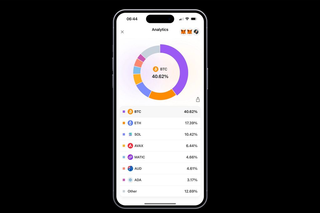
Your portfolio will probably look like this if you are new in the market.
But to make life-changing money in this cycle, you'll need to make some big changes to how you structure your portfolio.
That's the whole essence of today's market update.
Make sure to read all the way to the end and watch the embedded videos to get the full information on how to structure your portfolio.
We have split today's update into five stages.
- We first assess the macro situation to identify what monetary and fiscal policy will likely be going forward and how risk assets may perform in this environment. There are also big considerations for liquidity and corporate earnings.
- We then look at on-chain data to identify our current position in the potential timeline of this cycle. We are looking to assess how overheated or underheated the current market is.
- We will then look at the MCap Totals and the custom indexes we have built to assess whether we're in a Bitcoin-dominant period, altcoin season, etc.
- Penultimately, we build an idea of how we want our portfolio to look and identify specific plays and allocation weightings of each play. (Video)
- Lastly, we adopt the example portfolio we're given and make the necessary adjustments. (Video)
Disclaimer: This is not financial or investment advice. You are responsible for any capital-related decisions you make, and only you are accountable for the results. "One Glance" by Cryptonary sometimes uses the RR trading tool to help you quickly understand our analysis. These are not signals, and they are not financial advice.
Macro
We will keep this section relatively short.Inflation is moderating, but it has sticky components that are above the Fed's 2.0% mandated target.
However, annualised inflation suggests we are on a gradual path lower. The labour market is where economists expected some cracks; however, it has proven remarkably resilient.
While the labour market continues to hold up, the economy can continue to do well, and corporations can continue to see positive Earnings, which is ultimately positive for Equity valuations. The above suggests that the Fed should make fewer cuts this year than the market is expecting (4 x 25 bps due to the strength of the economy so far) and will likely do 1 or 2 cuts.
This will likely still be positive for risk assets, even with fewer cuts, particularly if corporate earnings continue to perform and overall market liquidity remains positive due to a large fiscal spend.
From a macro context, risk assets (equities and crypto) can continue to perform well.
On-chain data
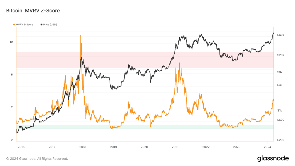
When looking at on-chain data to help us identify where the market is in the current cycle, the key metrics for this are the 'Market Indicator' metrics.MVRV Z-score
Perhaps the best 'Market Indicator' metric for identifying price bottoms and tops is the MVRV Z-Score.Historically, a move into the "red zone" on this metric has indicated an overheated market and a market top, or at least very close to one.
This metric shows that we're not close to an overheated area and, therefore, a potential price top.
This metric suggests there's a lot more upside to be had in the coming months/quarters.
Long-term holder NUPL
Another metric is the Long-Term Holder Net Unrealised Profit/Loss.This metric identifies UTXOs (coins) that haven't moved in the last 155 days (long-term) and the unrealised profit or loss they're in.
The red areas suggest that most UTXOs are recording a heavy unrealised loss.
The green and then blue areas suggest that the majority of UTXOs are making significant profits.
We notice in this metric that when the blue zone is reached, the price usually continues to climb for 3 to 6 months, putting in a price top.
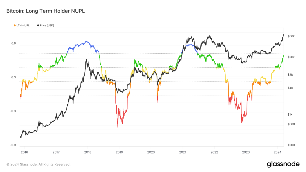
The above metrics suggest that the market is now entering the euphoric part of the cycle. This can last anything from 4 months to 12 months.
However, we have never entered this part of the cycle pre-Bitcoin-halving. Usually, we get to this euphoric part of the cycle 12-18 months post-Bitcoin halving.
So, we must appreciate that we're in a new environment with the ETF and what seems to be TradFi front-running the gains they believe are coming.
We, therefore, have to say, "ok, this cycle is now different to the prior ones, so do the on-chain metrics provide as much value as they have in prior cycles?"
Probably not, so again, this is something we must be aware of and now potentially slightly underweight the on-chain data that gives our top-down approach greater context.
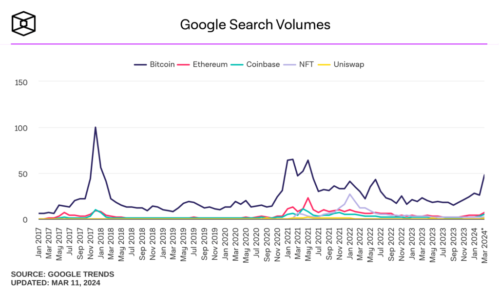
Are retail participants here?
So, the necessary adjustment we should make here is: how is retail behaving?Are they here yet? And if so, are we at the beginning of that stage, or are many retail participants piling in?
We ask ourselves this because peak retail participation usually marks cycle price tops. There are two metrics we can use for this:
- Google searches for the term "Bitcoin"
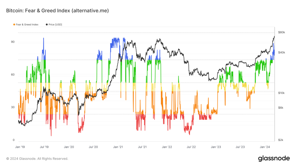
- Fear & Greed Index
Google searches for the term "Bitcoin"
If we look at the Fear & Greed Index, we can see in the last cycle (2021) that this metric spiked into the blue "Greed" zone and remained at that level from November 2020 to April 2021 - 6 months.
As we've suggested above, this euphoric phase of the cycle lasts 4 to 12 months, but it is more likely to last 6 to 8 months.
We entered the blue "Greed" zone at the end of February just a few weeks ago, suggesting we're at the beginning of this euphoric phase.
Fear & greed index
MCap totals and price indexes
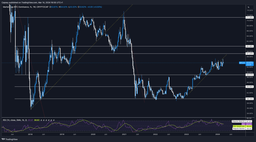
We will now examine Bitcoin's dominance and how alts seasons have started in prior markets.We have a few indicators to help you figure this out.
We'll then also look at the Big Caps Index to give us a greater idea of where we are regarding a timeline for and in an altcoin season. This will help us identify where to position our portfolio on the risk curve.
The first of these is Bitcoin dominance. We can see from the Weekly chart of BTC Dominance that Bitcoin usually leads prices higher each cycle before participants sell down their Bitcoin and move along the risk curve into alts. Bitcoin goes up. First, it gets close to the top, and then there is a rotation of capital out of BTC and into alts; hence, we see alts run later.
The chart below suggests we may see BTC Dominance move up to 57% before stalling out there and then declining, opening the door for an alt season.
BTC dominance
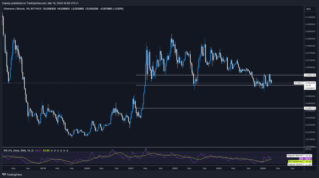
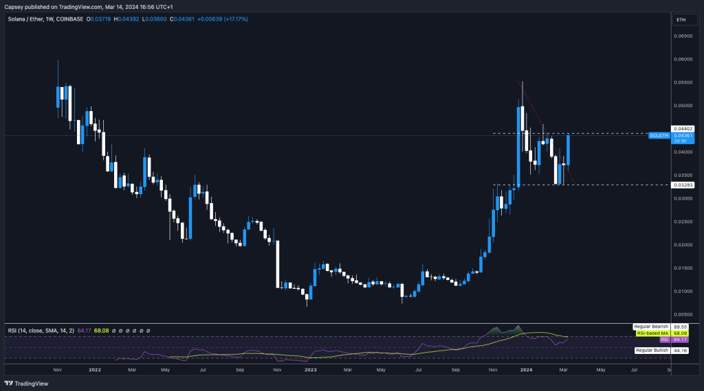
Other charts useful when identifying when an alts season may occur are ETH/BTC and SOL/ETH.
Below, we can see that ETH/BTC has found support and may move up from this level. Once there is a break above 0.0597, this will likely ignite an alt season.
If we turn our attention to SOL/ETH, we can see it's formed a perfect base and is now breaking out of a local downtrend line. A break above 0.044 would send the SOL ecosystem substantially higher.
ETH/BTC
SOL/ETH
Charts & opportunities
We have now set out the context for where we're at in the cycle.In the video below, we go through the above in greater detail and identify plays into which we would rotate capital and current positions.
This is the reconstruction of the current portfolio.
Building your crypto portfolio 1 (12 mins)
Building your crypto portfolio 2 (7 mins)
Building your crypto portfolio 3 (18 mins)
We hope the above was informative, showing how we assess the market and then build a portfolio from there.
If you have any questions or comments, feel free to drop those in the comment section.
If you found this report, please share it for the benefit of others.
Cryptonary, OUT!
Recommended from Cryptonary