Save 23% ($351) & Get a Free 1-1 Call with our Team ⏰ : 0d 2h 59m 43s

In today’s report, we will be looking into how the BTC price increase to above 60,000 USD has affected the sentiment and behaviour of investors.
Key Points:
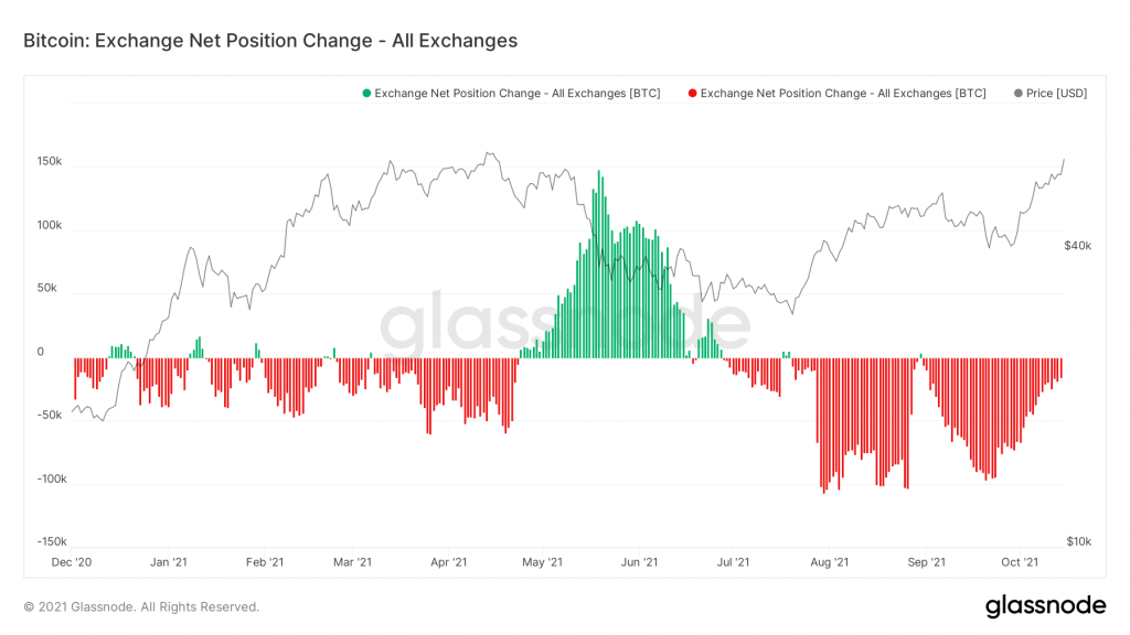
- The Exchange Net Position Change indicates that the aggressive accumulation that occurred when Bitcoin ranged between $40,000 - $50,000 has significantly slowed.
- Long-term investors, represented best by the 1-2 Year aged Coins cohort, have shown next to no interest in off-loading some of their Balances. HODLing remains their current sentiment.
- Whales have sold a small % of their holdings, but this selling volume is insignificant compared to the amount of Coins flowing into the Whale Wallets.
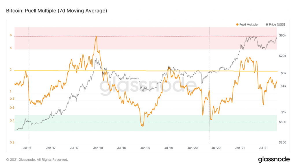
- The Puell Multiple indicates that there is still some distance till a market top; thus further upside should be expected.
Investors are still looking to add BTC to their balances, with long-term investors not offloading any significant size. The amount of BTC being bought and hodled still outweighs the amounts being sold. We all know what a reduction in supply mean for price action. The year of the Ox is looking to finish off strong.
Metrics 1 – Exchange Net Position Change
By now you should be familiar with what the Exchange Net position indicates, and why we check it in every report. For more detail on the metric refer here. In Thursday’s report which focused on Ethereum, we outlined the usual pattern between large accumulation and then small scale selling (consecutive small red and green bars) that we’ve seen occur multiple times this year. For Bitcoin what we are seeing is different. The heavy accumulation has slowed (big red bars) to smaller yet sustained accumulation (smaller red bars). This indicates that some investors are still adding BTC to their portfolios at these prices. With this steady accumulation period coinciding with the run up to the approval of the ETF. This is the ETF frontrunning that we mentioned in this weeks’ discord commentary.
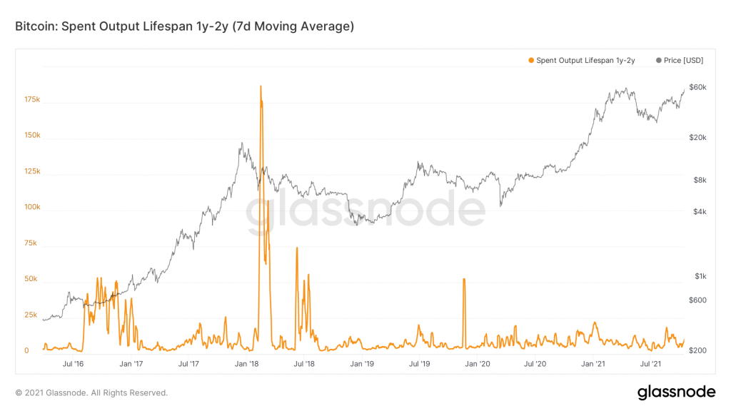
Metric 2 – Lifespan (1-2 Year)
Lifespan tracks the Coins that haven’t been interacted with for between 1-2 years. If these are interacted with, they show up in the below metric. We concentrate on this bracket/age of Coins as it best reflects the longer-term investors. It is critical that they do not look to start selling their holdings with this break above 60,000 USD.
You can see from below that there has been minimal selling from this cohort with the orange line remaining flat. This gives us confidence that sentiment remains bullish, despite approaching ATH areas.
Metric 3 – Whale Outflows
The Whale Outflows chart shows the amount of BTC that is being moved by Whales, along with the price, those bitcoins were bought at. This is a daily metric, and for the majority of days this year, the chart looks the same.
The larger the bubble the more Bitcoins a Whale has moved. The largest of the outflows below is less than 1,000 BTC. Keep this in mind when comparing against the chart below, where the largest bubble is around 100,000 BTC.
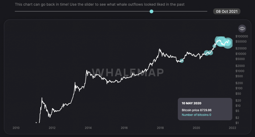
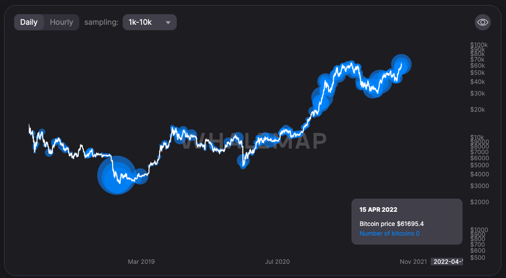
From the Large Wallet Inflows below, we can see similar bubble sizes but they actually represent a far greater scale/number of Coins. Also notice how the size of the bubbles currently is larger than what it was back in May. This is reflective of the better market conditions we find ourselves in, and Whales are exhibiting the same belief. It’s how we know that the level of selling from Whales and long term investors is nothing to be concerned about as it pales in size to the levels of accumulation that are still occurring.
Metric 4 - Puell Multiple
The Puell Multiple is the daily value of the issued BTC in USD divided by the 365 days moving average of the daily value of issued BTC in USD. What is important is that this metric has proven to consistently identify swing lows and highs. The correlation has held for both major halving associated bull market cycles, as well as the shorter term fluctuations. From below you will see that values greater than 2.0 indicated that a market top was approaching, and anything above 4.0 is code red.
In this years market cycle, we still haven’t seen the Puell multiple surpass 4.0. Back in May it topped out at 3.0. With BTC trading at above 60,000USD and the Puell multiple currently 1.4 (comfortably below the key level of 2.0), it indicates that there is still significant upside to be expected, something which long term investors look to be well aware of, as depicted by their behaviour.
Recommended from Cryptonary