Save 23% ($351) & Get a Free 1-1 Call with our Team ⏰ : 0d 2h 59m 44s

Disclaimer: Not financial nor investment advice. You are responsible for any capital-related decisions you make, and only you are accountable for the results.
Macro
Last week was dominated by the Jobs data. In the early part of the week, JOLT’s (Job Openings) decreased from 11 million to 10 million – a much larger than normal change. This provided some confidence that perhaps the labour market was beginning to feel the force of the FED’s interest rate hikes, which spurred the markets on Tuesday. However, Friday’s Jobs data showed that the Participation rate was falling which brought down the Unemployment Rate to 3.5% from 3.7%. This is not what the FED wants to see. They want to see that the labour market is beginning to struggle to help tame wage inflation, however, if participants keep leaving the labour market this will only aid wage inflation. What does this all mean? The likelihood has increased for the FED to continue along their hawkish tone and raise rates to above neutral (4.75% - 5.25%) by the end of Q1 2023. This will mean risk assets such as crypto likely continue to suffer.Alongside this, we have Earnings season, and Earnings are expected to come in lower, with some already having been revised down. This would likely see Equity prices come down.
Finally, there is also the escalating tension between Russia and Ukraine, which may mean investors keep capital on the sides until these geopolitical issues have been resolved.
TLDR
- Macro and geopolitical tensions mean that investors are still cautious and may not be looking to add to risk until some of the uncertainties ahead of us become clearer. This will likely negatively affect risk assets such as crypto.
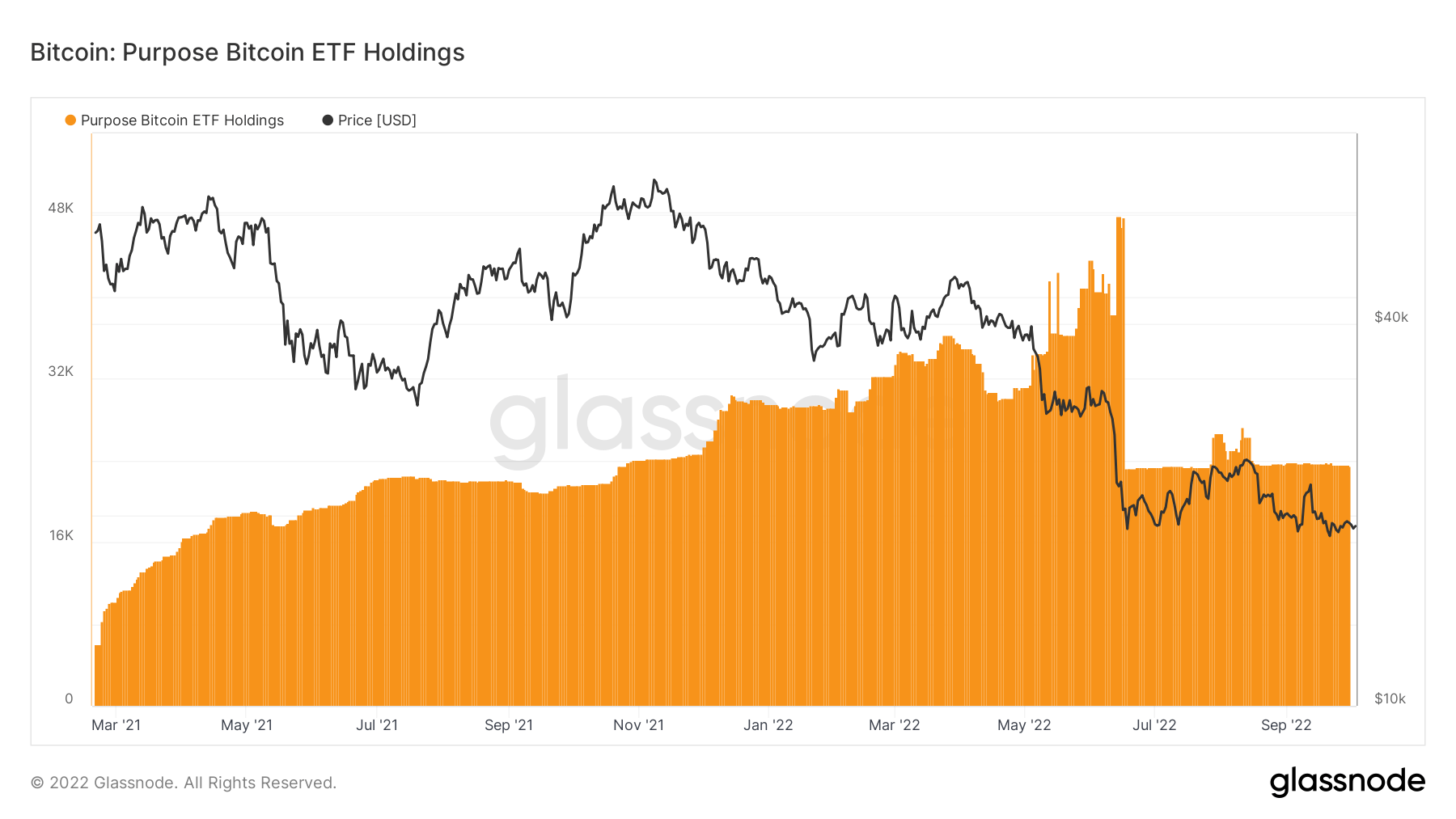
- The Purpose ETF shows that Institutional players remain cautious and have not added Bitcoin in great size recently.
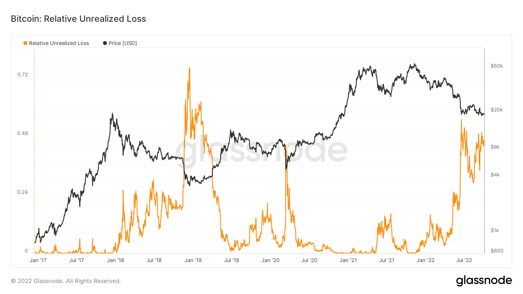
- The Relative Unrealised Loss metric shows that Bitcoin may have had its “puke out” in mid-June 2022, but that Ether may still be liable to further losses.
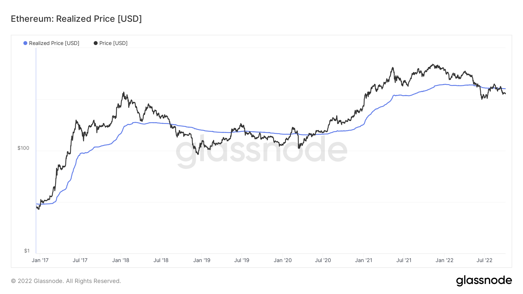
- Both Bitcoin and Ether trade below their Realised Price. This has historically been a good “value” price to buy in at if your time horizon is long-term.
Total Market Cap (Weekly)
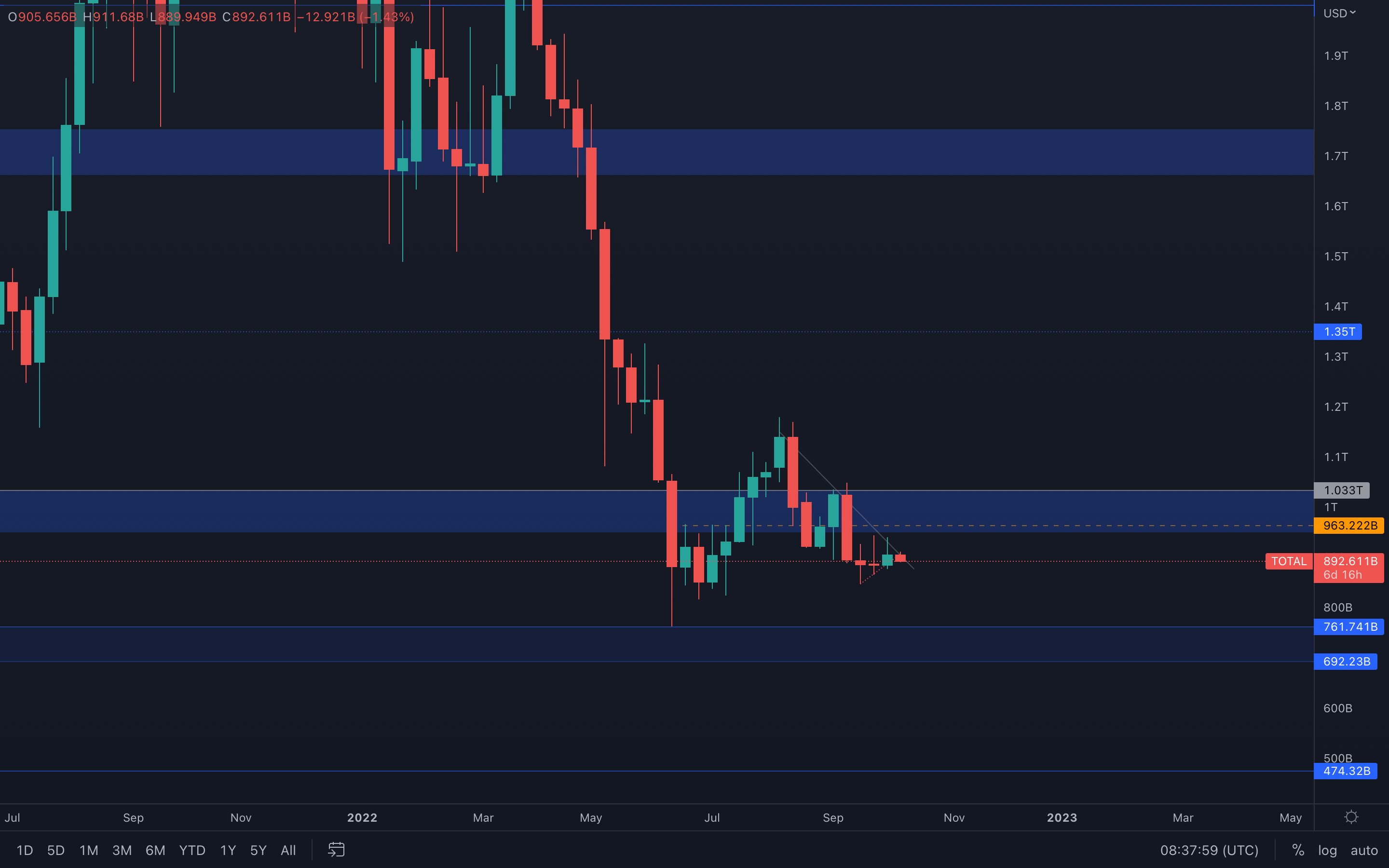 Last week, the Total Market Cap index has closed a green candle after consolidating and closing indecisive candles two weeks in a row. From a purely technical standpoint, the index is now on a path toward a potential $963B - $1.03T resistance test. Liquidity can be taken anywhere inside of that range - volatile, more sudden movements can occur.
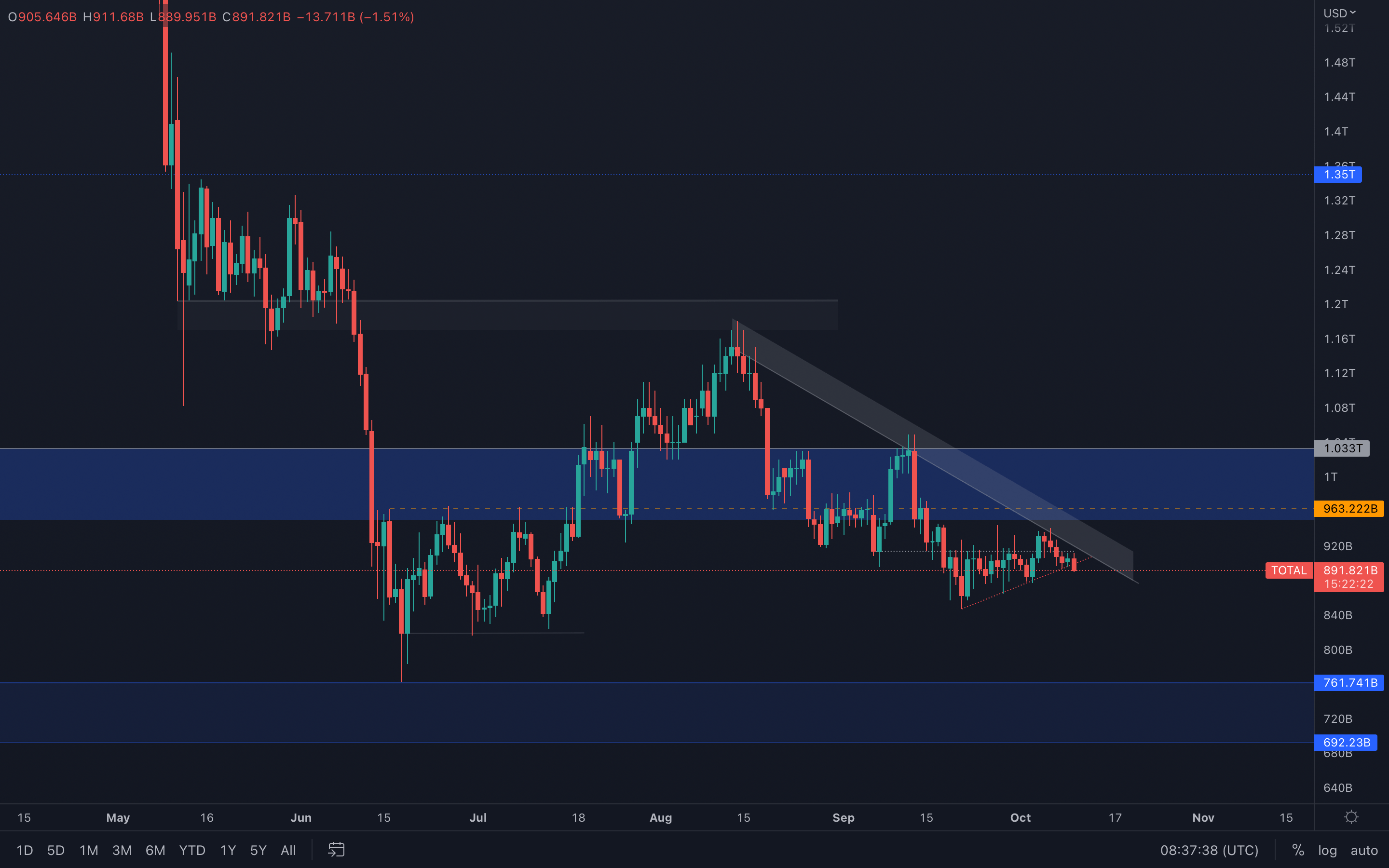
However, these movements, specifically bullish ones might find difficulty in breaking resistance after we dived into the daily timeframe. Here, we can see that the price has been rejected multiple times from the larger resisting trend line/channel, but also that the local trend line we placed on our chart is just about to be broken. A daily closure under the trend line will result in lower prices, most likely into new daily lows.
For now, we should expect a rise toward $963B - $1.03T, but should also be careful of any unwanted price movements to the downside as we are just under resistance.
👇 The daily Total MCap chart can be found below:
Total Market Cap (Daily)
Altcoins Market Cap (Weekly)
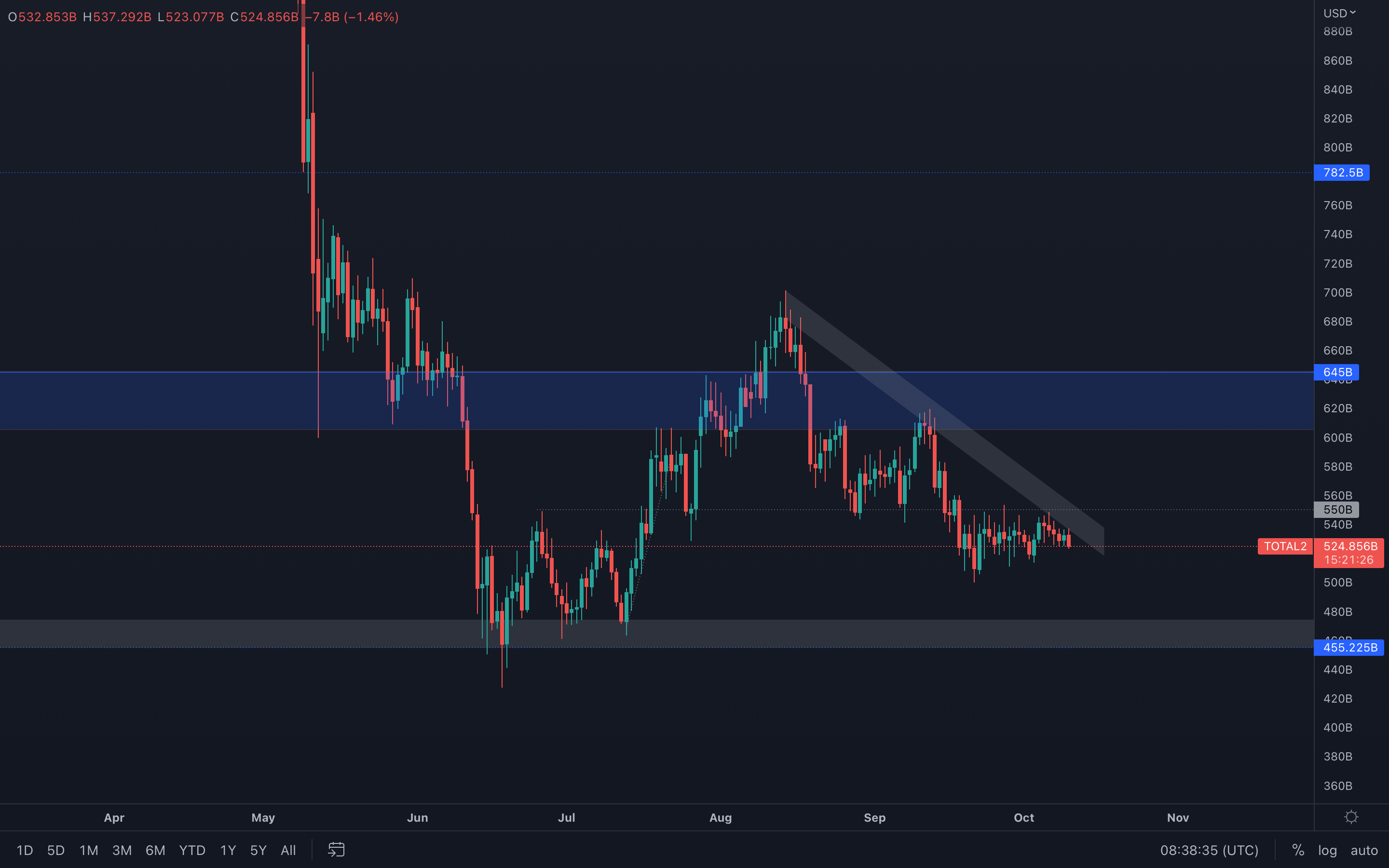
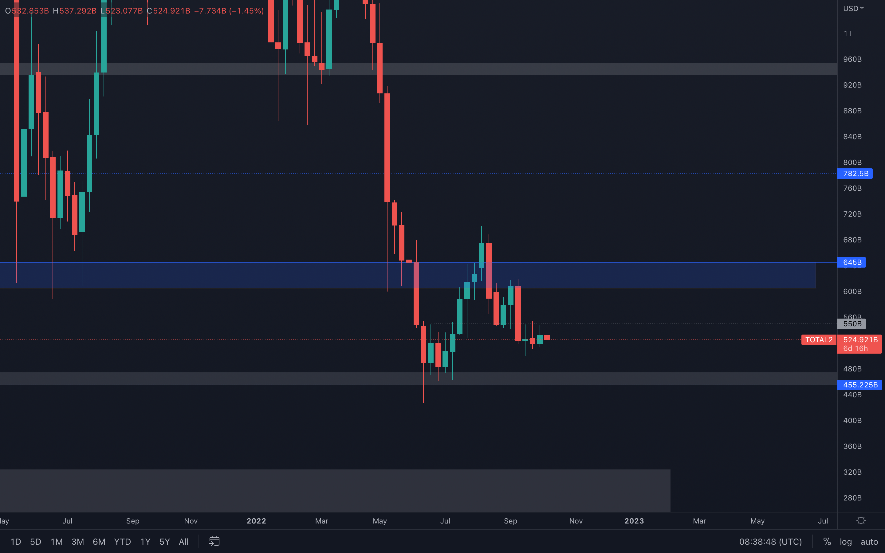 Identical charts, what has been said for the Total MCap index can be said for the Altcoins MCap index - although a resistance test can occur ($550B), if we dive on lower timeframes we are going to see the price sitting just under resistance.
Same statement stands here - failure in breaking resistance will lead to new lows, most likely to $455B in the weeks to come.
Altcoins Market Cap (Daily)
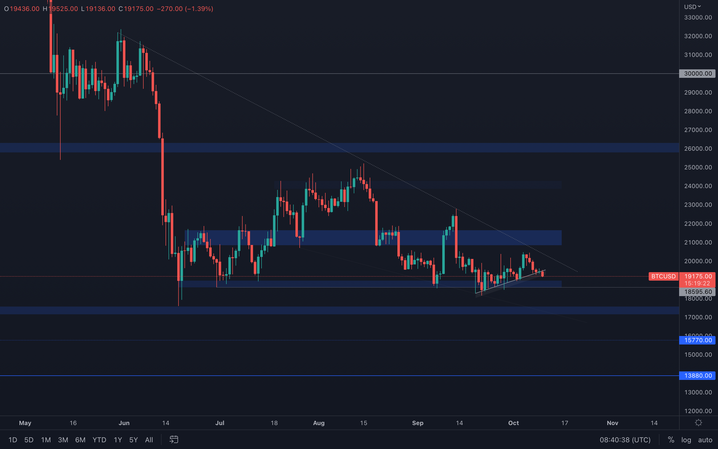
Bitcoin (Weekly) - Technical & On-Chain Analysis
 Bitcoin has found itself at the threshold of this almost 1-year old resistance, and we shouldn't get ahead of ourselves with that can be seen happening here - even though the asset has "broken" out, there are not enough confluences to suggest a technical-based break out here since volume is at the ground.
What I believe will happen here is that due to low volume, Bitcoin will get rejected from resistance and will continue its path toward $17,500, a target we mentioned in multiple reports at this point. Of course, there are intermediate levels that need to be broken before that target is achieved, so nothing is set in stone (& it never is).
The asset is also just about to break a local supporting trend-line on the daily timeframe, which if confirmed, will lead to a $18,600 - $19,000 support test this week. Check the chart below for context:
Bitcoin (Daily)
Metric 1 – Purpose Bitcoin ETF Holdings
The Purpose Bitcoin ETF is a good example of what some large Institutional players may be doing. We can see from the graph below that since mid-June 2022, The Purpose Bitcoin ETF has held a relatively consistent amount of Bitcoin, neither adding or selling more coins.
Bitcoin – Purpose Bitcoin ETF Holdings
Metric 2 – Relative Unrealised Loss
The second metric we will cover is the Relative Unrealised Loss. The Relative Unrealised Loss metric is defined as the total loss in USD of all coins in existence whose price at realisation time was higher than the current price. We can see in the below graph that this metric spiked (investors plunged into unrealised losses) in mid-June 2022 and that it does look remarkably similar to that of the spike in late 2018/Q1 2019. In terms of a capitulation event where many investors are in significant unrealised losses, the below suggests that we have perhaps already seen this market event for this bear cycle. However, it is still possible prices will go lower, particularly with the macro and geopolitical headwinds we have ahead.
Bitcoin – Relative Unrealised Loss
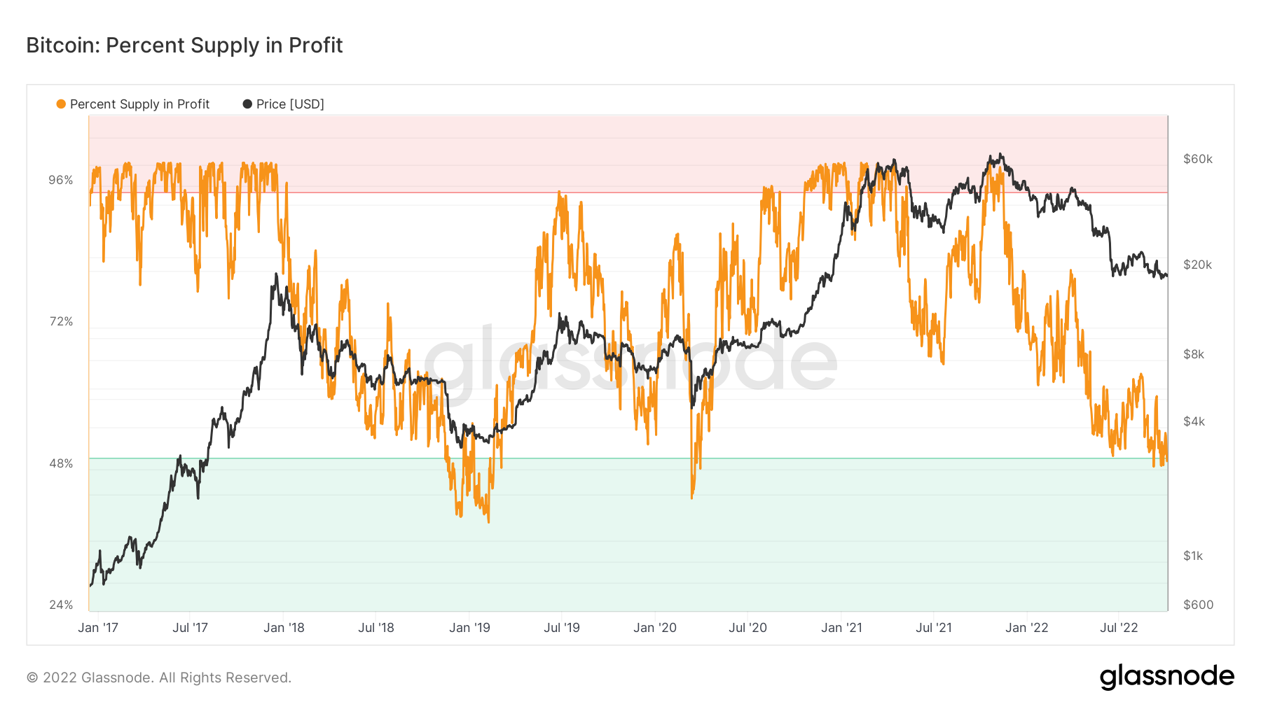
Metric 3 – Percent Supply in Profit
The Percent Supply in Profit metric is a follow on from the Relative Unrealised Loss metric. The Percent Supply in Profit shows us what percent of the overall coin supply is in a profit and by comparing this to previous bear market bottoms, we should be able to more accurately predict how much more supply is needed to dip out of being profitable that would indicate a possible long-term buying opportunity.
We can see on this metric for Bitcoin that we’re touching into the green “value” zone, which has historically been a good time to buy for the long-term. However, we’re only just touching side this zone, and this metric has proven before that it can go deeper into the green zone – price taking it lower.
Bitcoin – Percent Supply in Profit
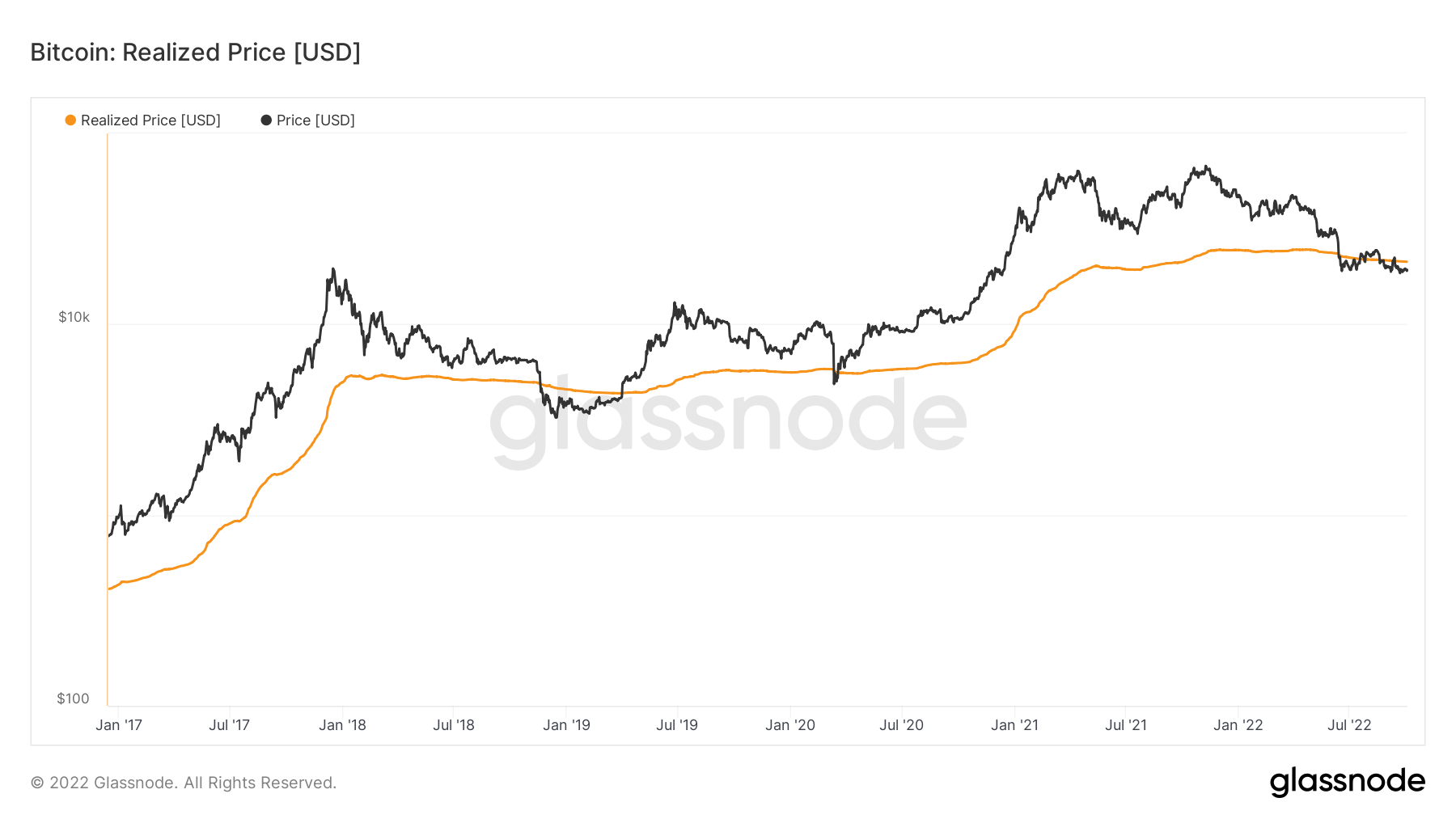
Metric 4 – Realised Price The last metric we will cover today is the Realised Price. The Realised Price is the average cost basis of coins on-chain. We can see that when Bitcoin price has traded below the Realised Price, this has historically been a good time to buy Bitcoin. We are currently trading roughly 10% Realised Price, however in 2018, Bitcoin’s price traded 35% below Realised Price.
Bitcoin – Realised Price
Metric 4 – Hash Ribbon
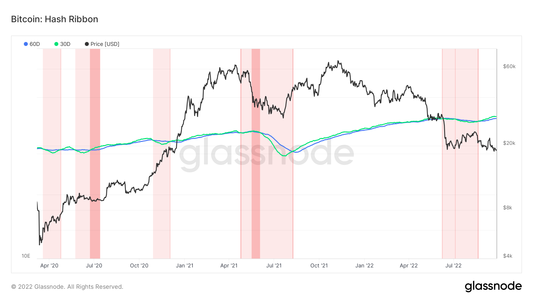
The last metric we will cover today is the Hash Ribbon. The Hash Ribbon is a market indicator that tends to suggest that Bitcoin reaches a market bottom when miners capitulate. This usually sees the 30d MA cross back above the 60d MA on the hash rate. We can see below that this has already happened, however, Difficulty and Hash Rate are at all-time highs, so it is likely that it is just the most efficient miners remaining. But with the 30d MA turning lower again (due to the price of BTC turning lower) could we see another dip underneath the 60d MA from the 30d MA if the price were to capitulate again? This would likely be due to another macro shock i.e., another bad inflation print.
Bitcoin – Hash Ribbon
S&P 500 Index
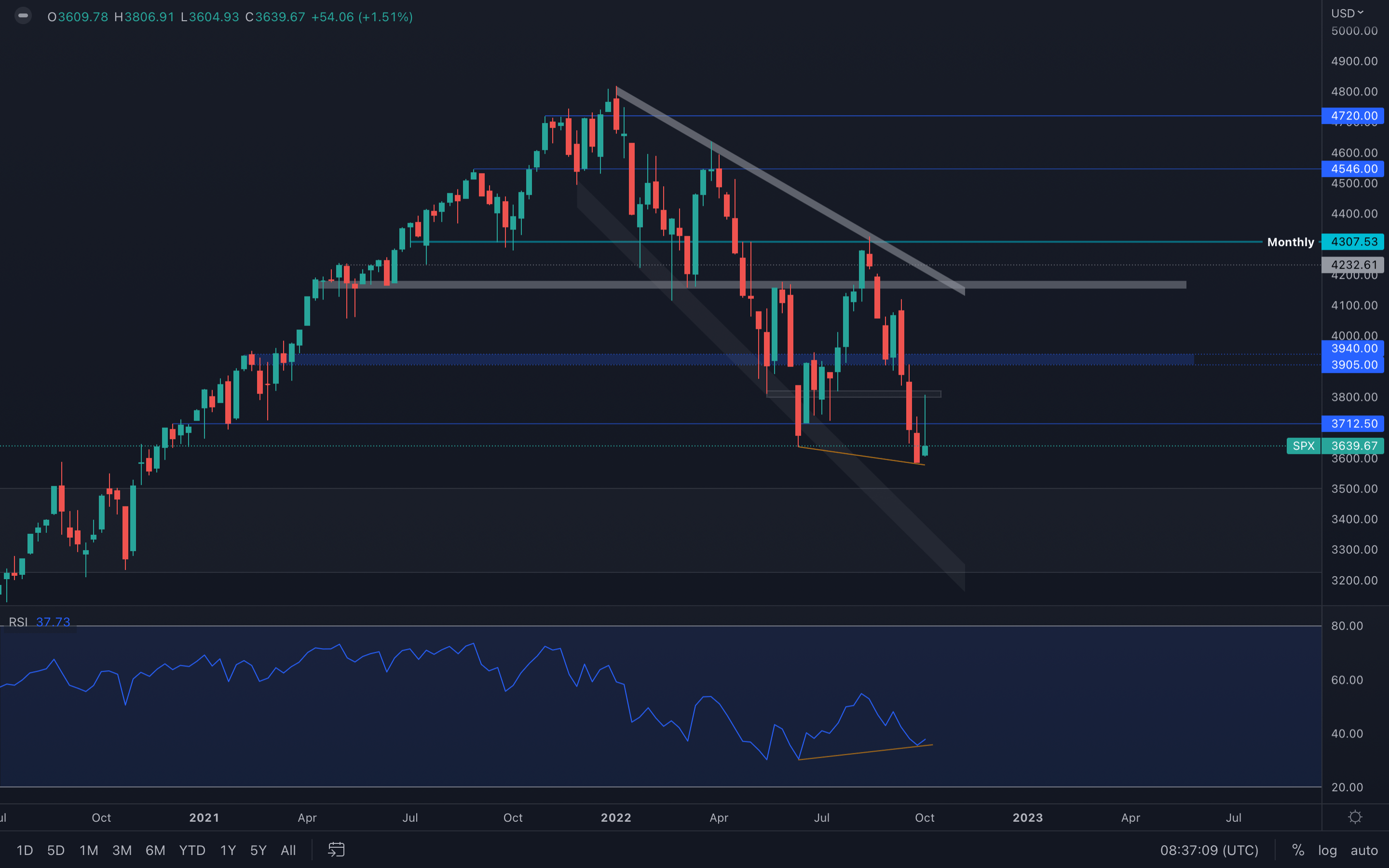 The S&P 500 Index has seen a strong upswing to its local $3800 resistance area, where sellers jumped in and almost invalidated the candle entirely. For starters, $3700 needs to be reclaimed first as we've seen that level also act as both resistance and support in the past.
There is one important thing to note here, and that's a bullish divergence on the weekly timeframe - the RSI can be seen forming a higher low as the SPX is forming a lower low. However, is that enough to push prices higher?
Technical analysis, at its core, is a game of probabilities - these probabilities are statistically picked by analysing past data in order to predict future movements, and we're not talking just candlesticks and indicators, we're talking everything data. With that said, there are now two possibilities:
1️⃣ The bullish divergence acts as a buying signal and can lead to the markets pushing higher. 2️⃣ The bullish divergence will be invalidated entirely due to uncertain macro conditions and lack of volume in the markets.
I think option 2 wins the probability game. Do you?
Ether - Technical & On-Chain Analysis
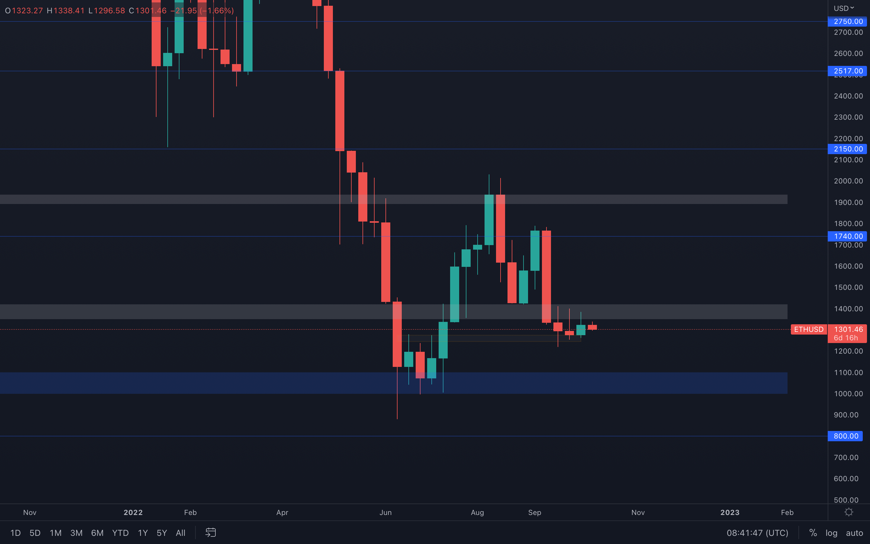 With Ether still above this local support area ($1275 - $1250), a $1400 resistance test can occur if no sudden bearish movements or volatility enter the market. However, we should prepare for even lower prices, such as the psychological and technical level of $1000.
The reason for that is truly simple - all timeframes are currently in a bearish market structure, which tells us there is absolutely no reason to expect bullish movements anytime soon. Our bias remains bearish and so should yours, otherwise, we can easily end up getting trapped by complicating something that should remain simple.
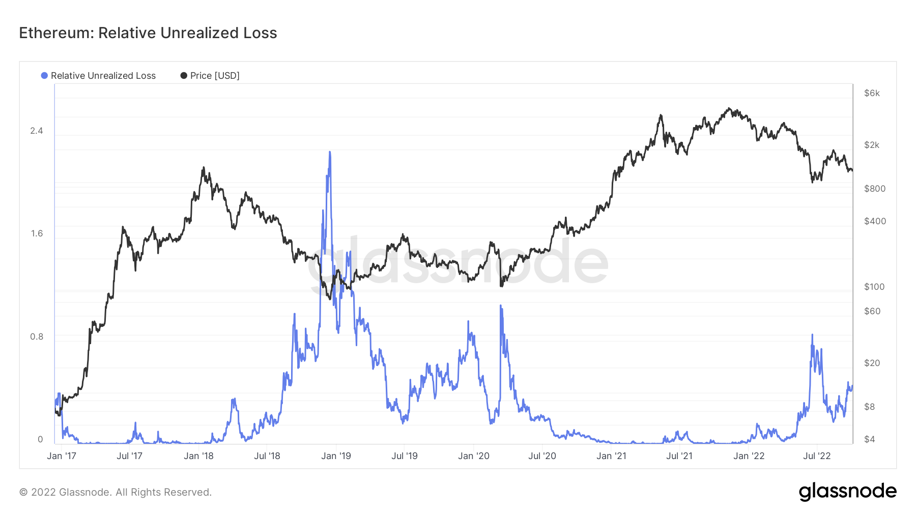
Metric 1 – Relative Unrealised Loss
If we look at the same metric but for Ether, we can see that the mid-June 2022 lows was similar to that of the Covid crash in March 2020. However, it was nowhere near the Unrealised Losses that we saw in late 2018/Q1 2019. It’s possible we see greater unrealised losses if Ether was to dip back below the $1,000 mark, potentially pushing this metric to spike higher and therefore signalling to us that enough of the market is in an unrealised loss that it may once again be worth buying back in.
Ether – Relative Unrealised Loss
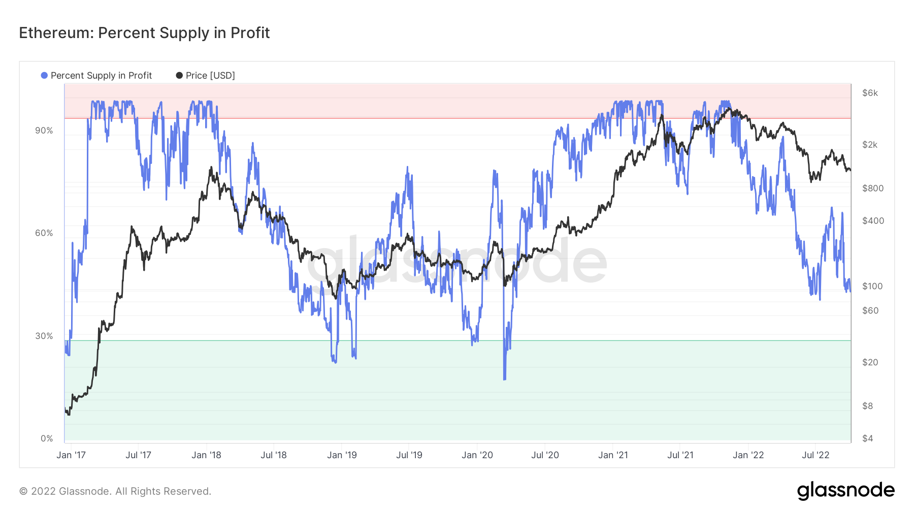
Metric 2 – Percent Supply in Profit
If we look at the same metric for Ether, we can see that this metric is still far away from it’s green “buy” zone, which may indicate there is further room for it to come down.
Ether – Percent Supply in Profit
Metric 3 – Realised Price
We can see in the same metric for Ether, that price currently trades below the Realised Price. However it’s possible that price could still go lower.
Ether – Realised Price
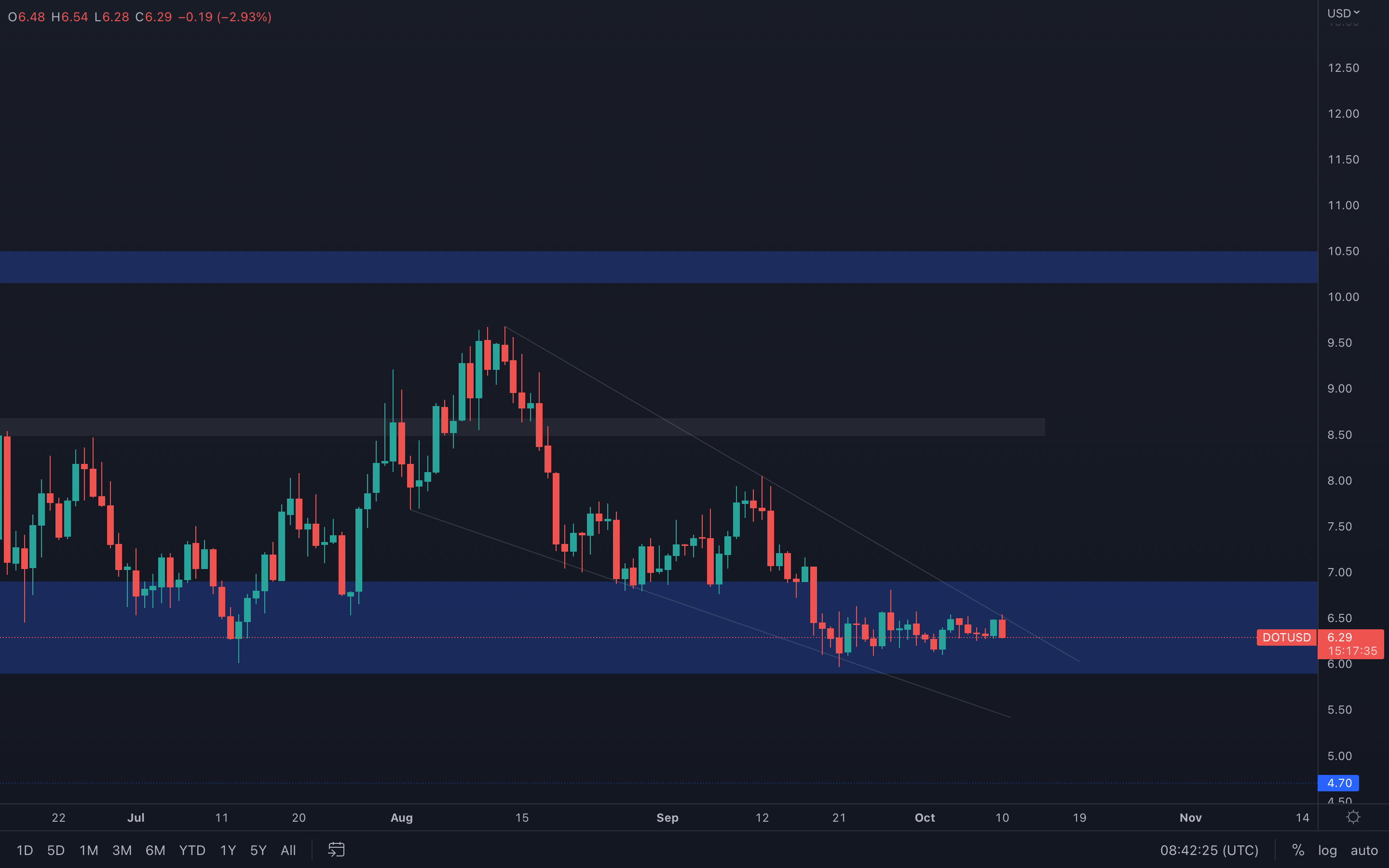
DOT (Weekly)
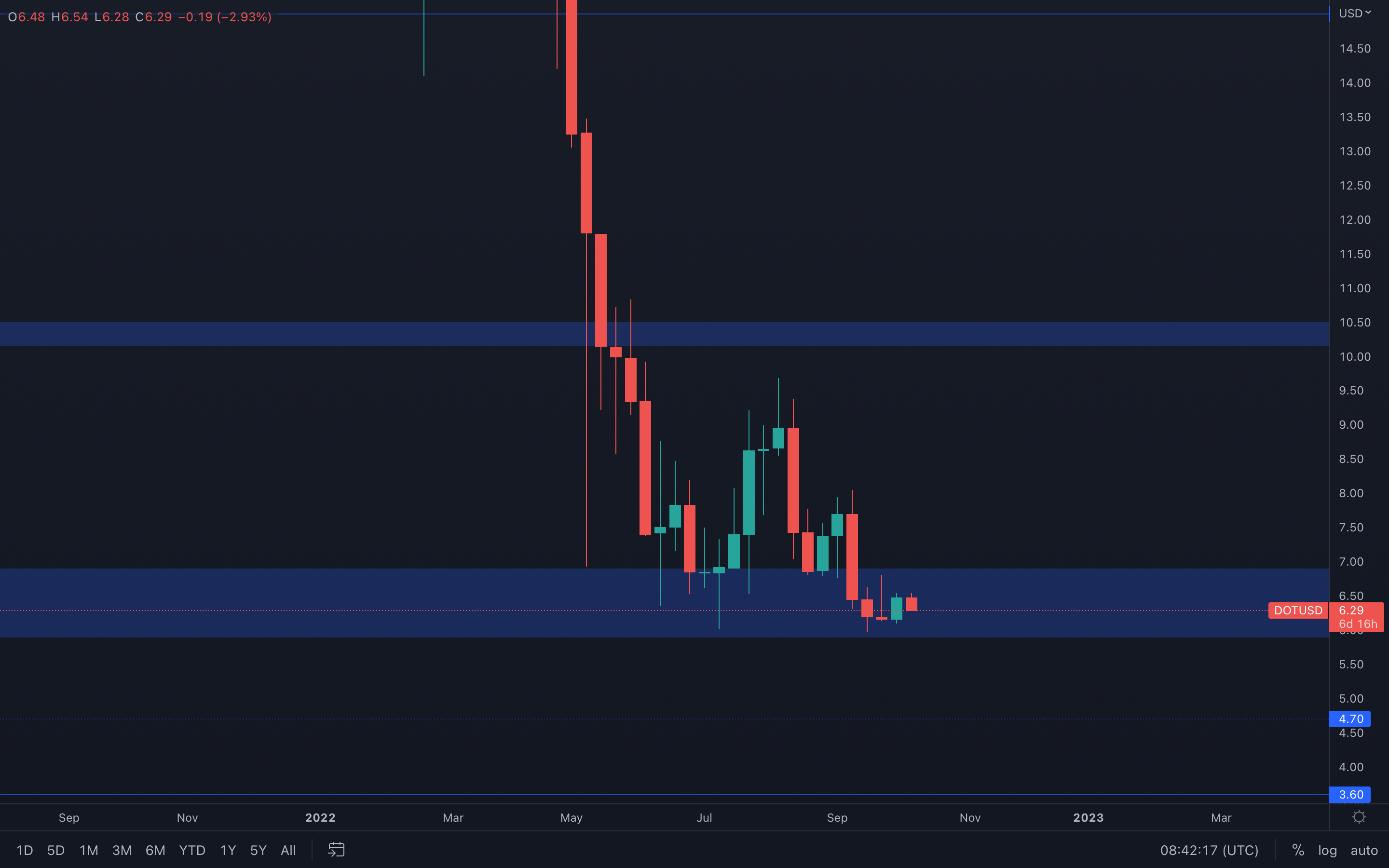 DOT registered an almost full-bodied candle last week, creating a clean path toward the top part of its current support area, $7. Because the weekly timeframe doesn't really suggest any market structure shift in the near future, the higher-timeframe market structure remains bearish.
After diving into the daily timeframe, we can see that there is a falling wedge in play and DOT is getting rejected at resistance as we speak. Failure in breaking above the top trend line will push DOT to $6 once again and invalidate a $7 resistance test for now.
DOT (Daily)
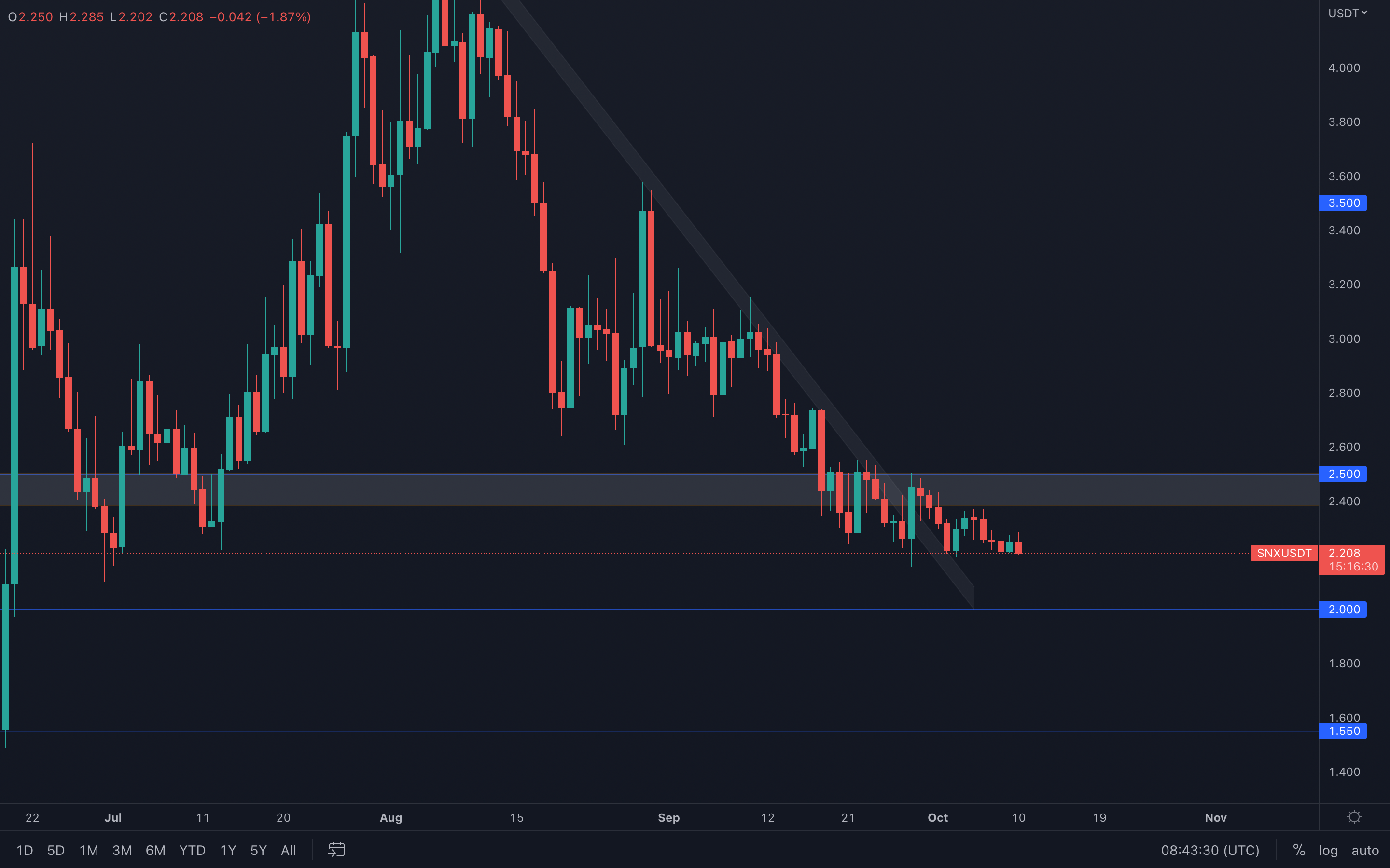
SNX (Weekly)
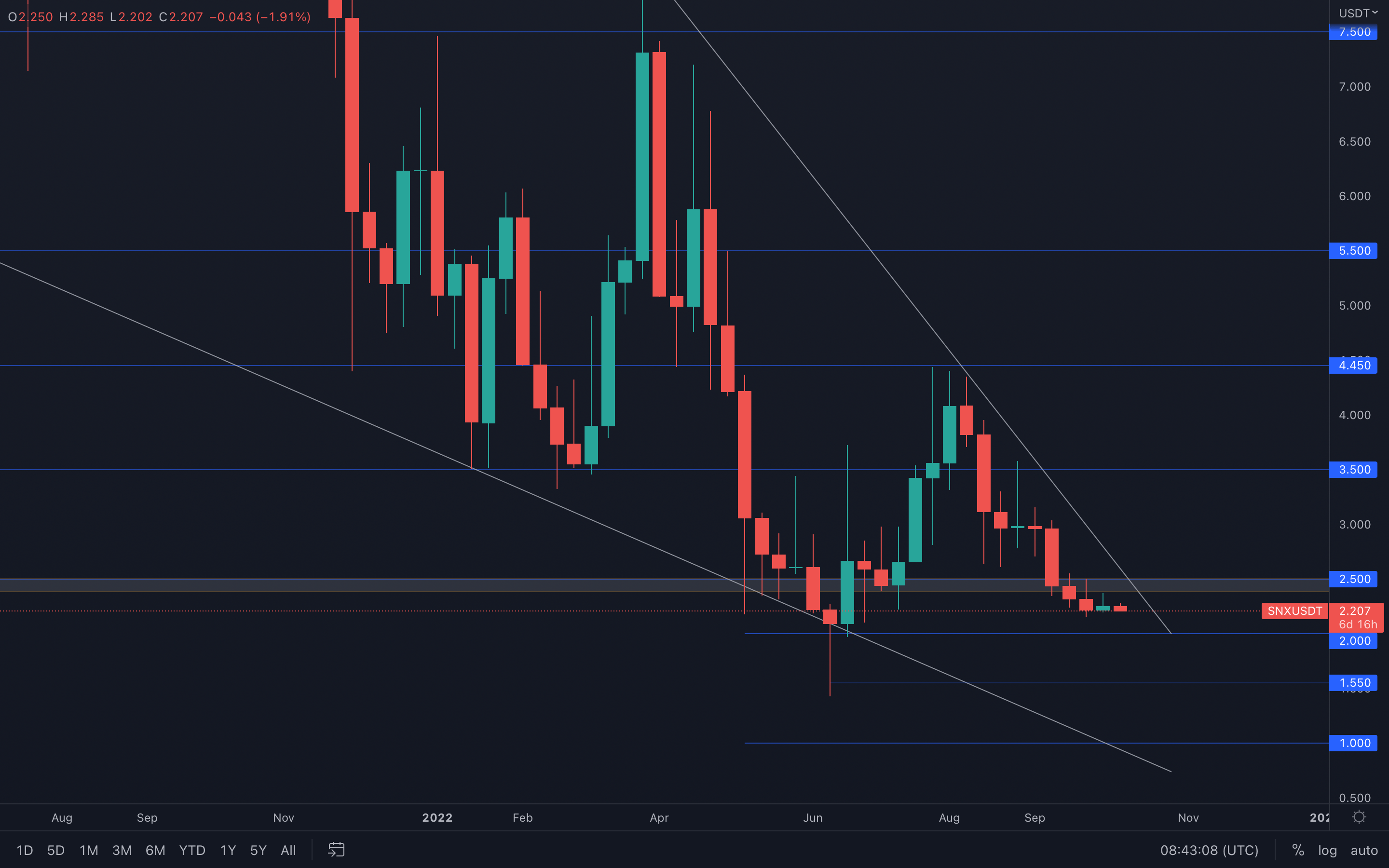 It seems SNX is experiencing some choppy price action as indecisive candles keep closing on a weekly basis. This obviously implies that there is currently not enough attention to this asset and that volume is at minuscule levels. However, from a technical standpoint there's nothing stopping SNX from testing $2 at this point.
If we dive into the daily timeframe, we can see that SNX is in a constant downtrend, with lower highs formed frequently. Unless $2.5 is reclaimed on the weekly timeframe, then $2 is next for SNX.
SNX (Daily)
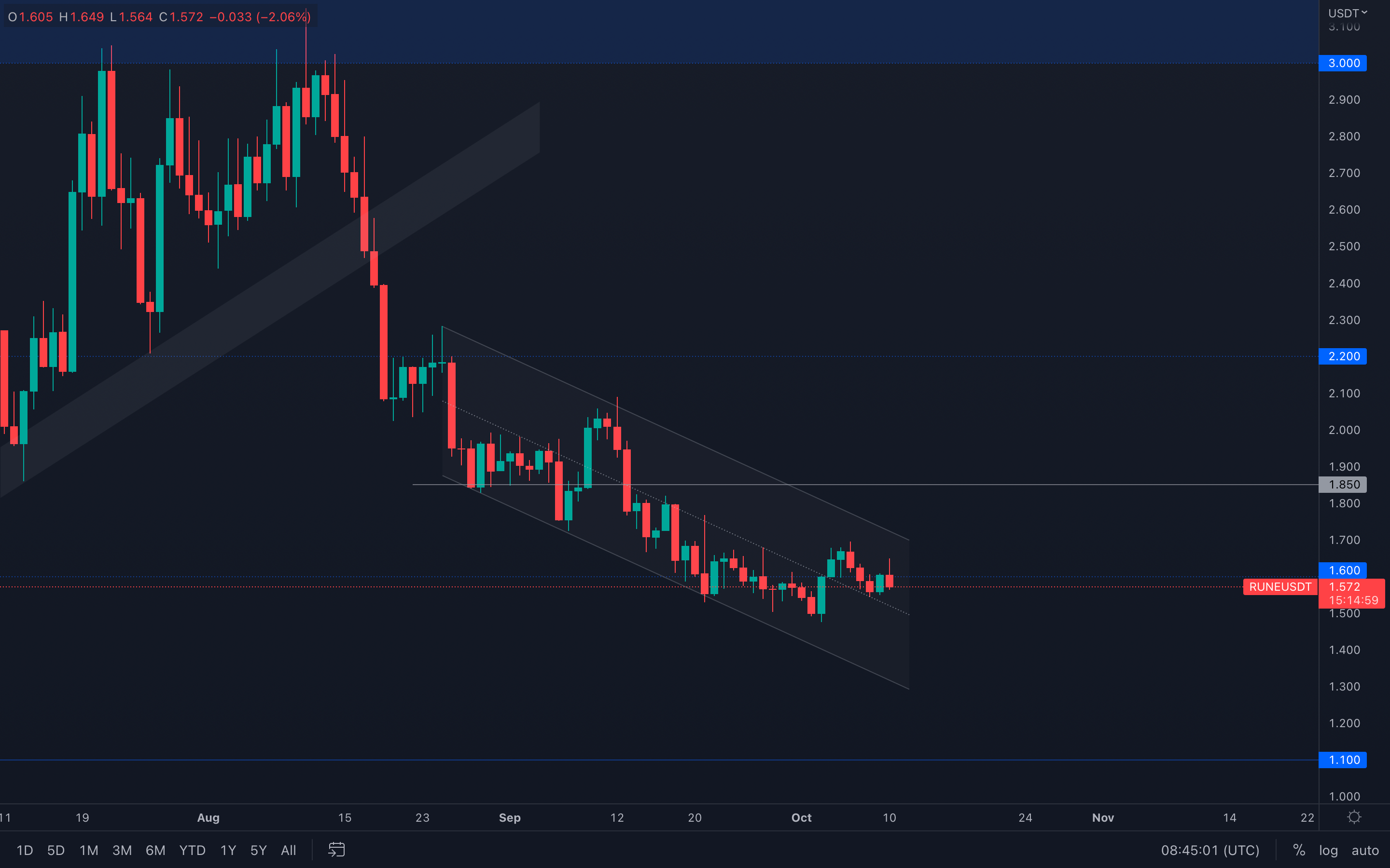
RUNE (Weekly)
 Candlesticks never lie.
Last week, RUNE registered a bullish engulfing candle right from its $1.50 support. Having an asset test its support is one thing, having an asset form a bullish candle after testing its support is another thing, which is why a "bullish" scenario is reinforced in this case.
Based on $1.50 as support just below the current price, and last week's bullish engulfing candle, we can only assume that RUNE can test $1.85 soon. However, RUNE is trading inside a descending channel on the daily timeframe, which implies that we need a confirmed break out form this channel before expecting $1.85.
Worst case? RUNE ranges between $1.85 and $1.50 until either of these levels are broken via candle closures above or under.
RUNE (Daily)
SOL
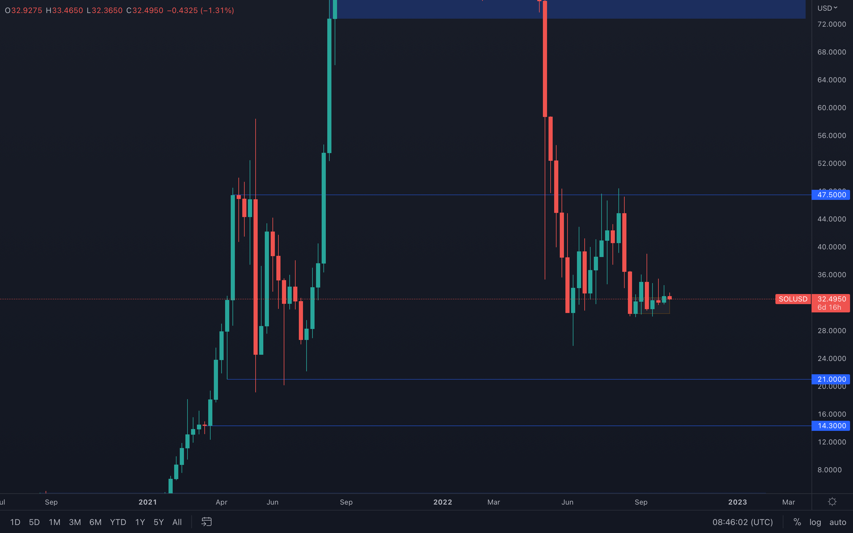 SOL has seen a steady increase in value over the last few weeks and is still managing to hold itself above the $30 weekly level.
From a technical standpoint, not much has changed from previous weeks - because SOL hasn't lost its $30 support level, a move toward $36 remains on the cards for the next weeks.
SRM
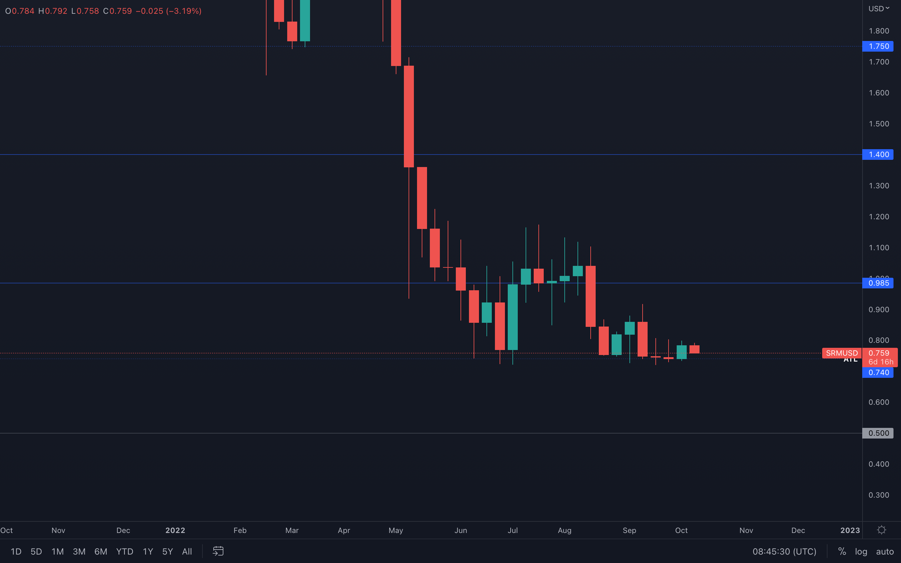 SRM is still battling with the $0.74 level, its current all-time low. The asset has been ranging above this level for multiple months now, which is why, at some point, this level can collapse due to buy orders constantly being filled.
I believe the above is a matter of when, not if.
On a more shorter-term, we could be looking at another green week after last week's closure. Buyers accurately stepped in at $0.74 and pushed the price higher, closing the week in ~6% profit. Similar price action can occur this week, given how buyers are now in control over the short-term (at least until proven otherwise).
FTT
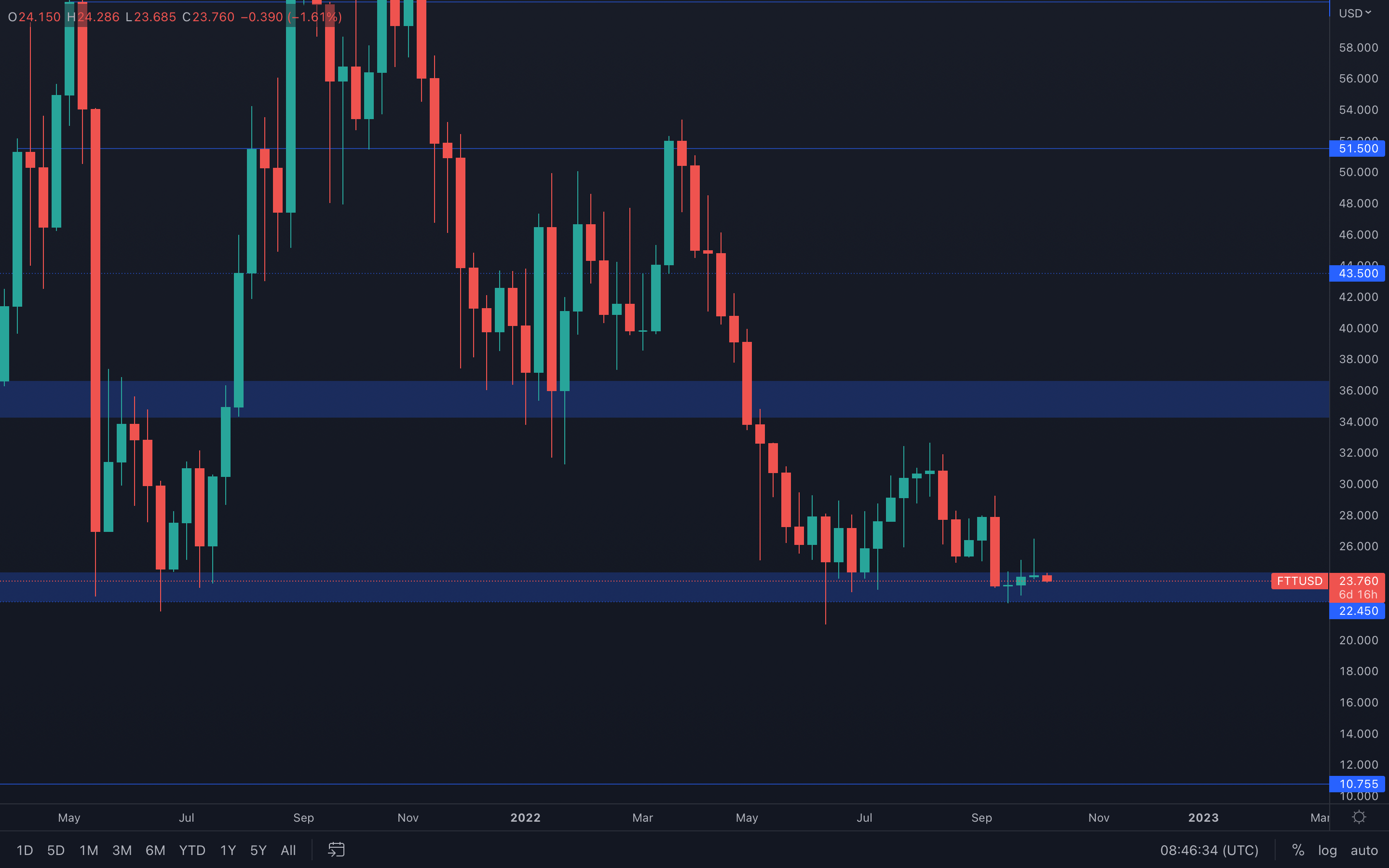 FTT has seen a decrease in volume in the last few weeks, compared to previous weeks which were more packed. This obviously is a sign of weakness, weakness that can also be seen in last week's candle.
What happened there is that initially, buyers managed to push price higher but were ultimately invalidated by a higher selling pressure. This lead to a bad weekly closure as the candle can be interpreted as a potential bearish evening start candlestick pattern - this will push FTT to $22.45 and unless buyers manage to save the days once again, we could be seeing a sub $22.45 FTT.
The above still needs confirmation, specifically a bearish candle closure. The bearish candle finishes the pattern's formation by closing at least halfway up the first bullish candle.
MINA
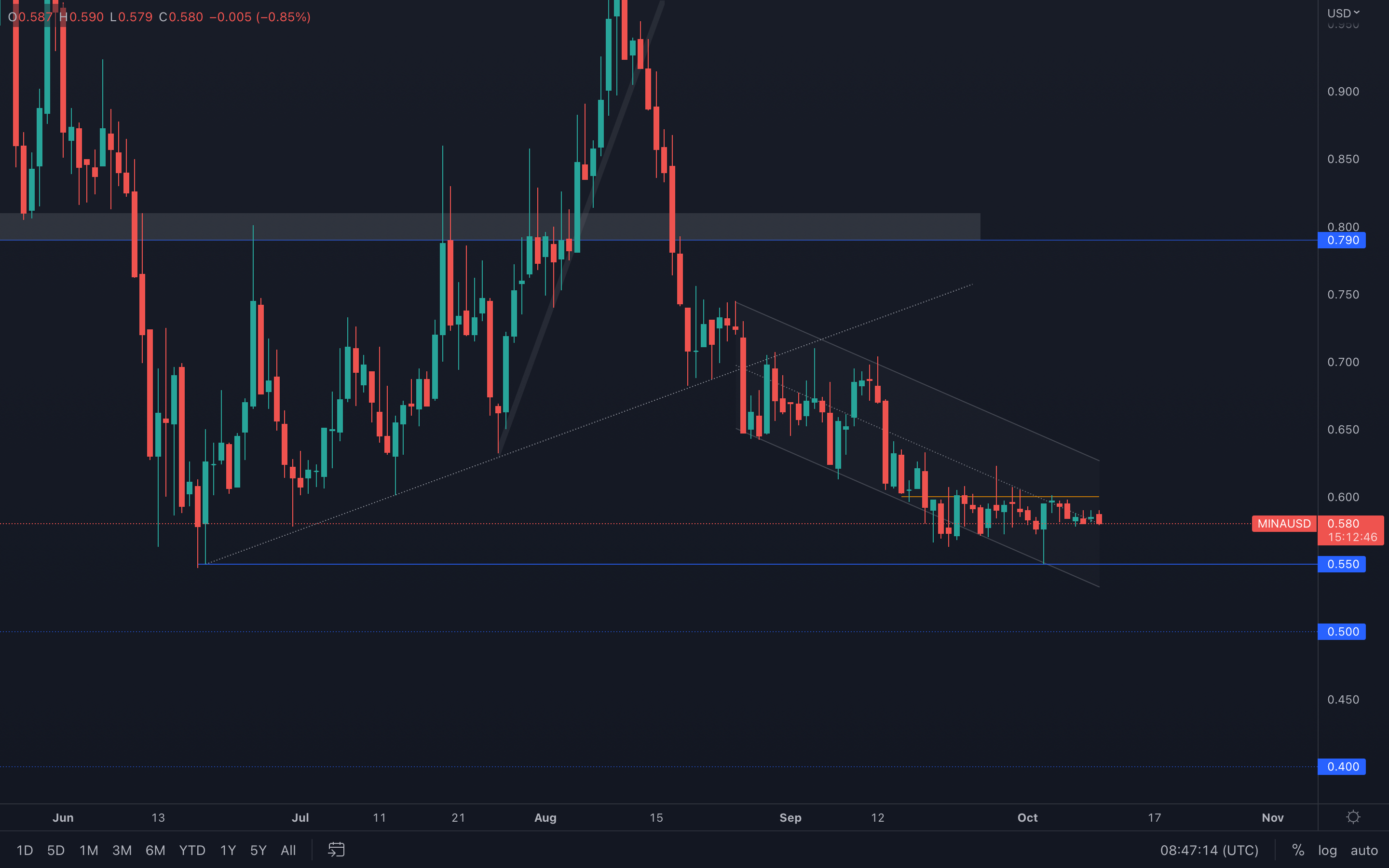 (Daily chart was used)
We can see that MINA formed a local resisting trend line and was unable to break above it so far. However, due to that big-wicked bullish candle that was registered a few days ago, a bullish morning star candlestick pattern was formed on the weekly timeframe.
(Daily chart was used)
We can see that MINA formed a local resisting trend line and was unable to break above it so far. However, due to that big-wicked bullish candle that was registered a few days ago, a bullish morning star candlestick pattern was formed on the weekly timeframe.
If backed by an increase in volume, we could see MINA break above its local $0.60 resistance level soon, otherwise the asset is going toward $0.55 once more. MINA is also still in a descending channel which currently requires more data, so we're gonna keep you updated with any changes in our usual technical reports and analysis.
dYdX (Weekly)
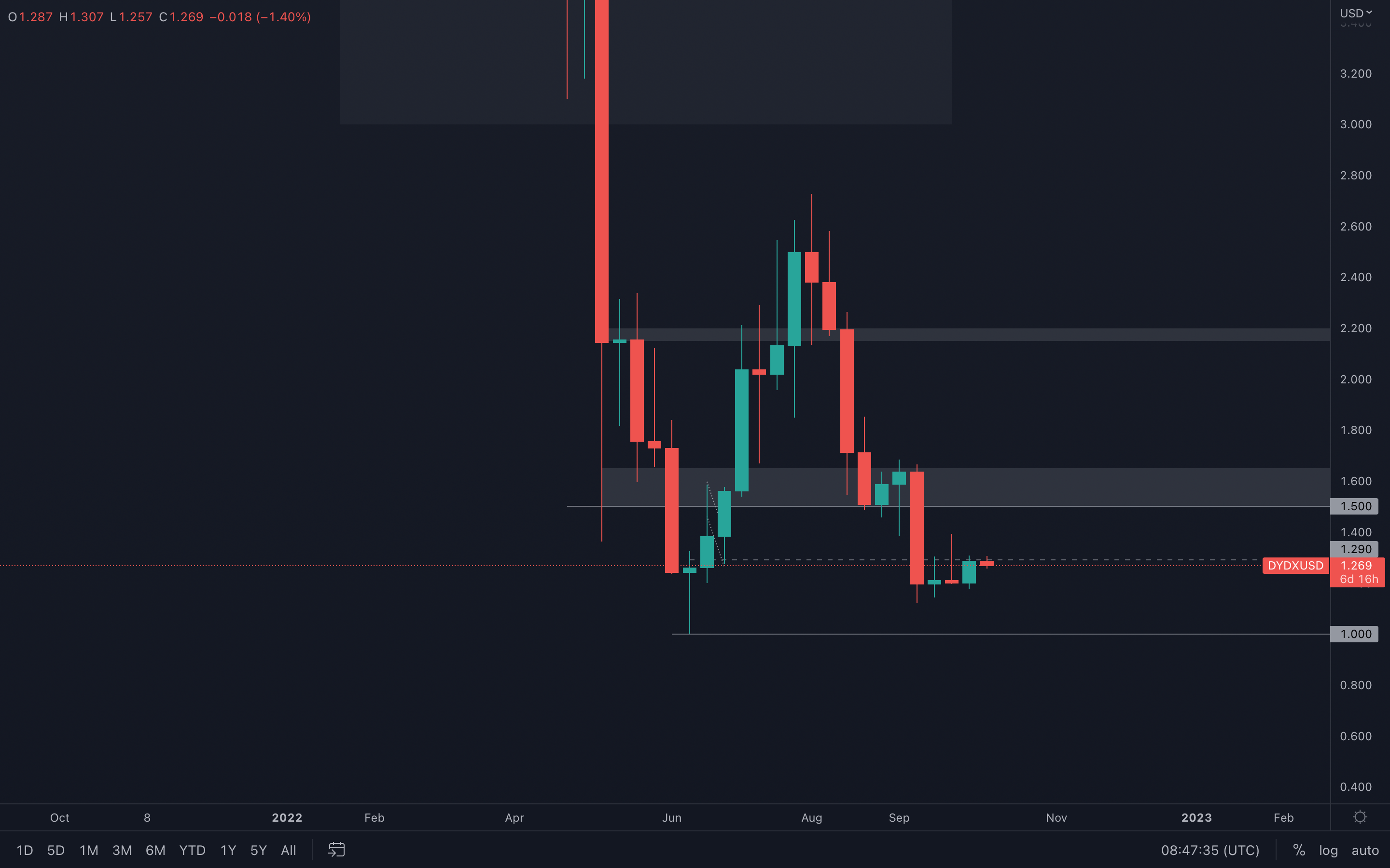 dYdX experienced a weekly candle closure into resistance - although the $1.29 level is an intermediate level with low supply, it's still a level that needs to be broken to confirm further upside.
For this week, we need to monitor dYdX's price action on lower-timeframes and wait for a daily closure above $1.29. If/When that happens, dYdX will be on a path toward $1.5o.
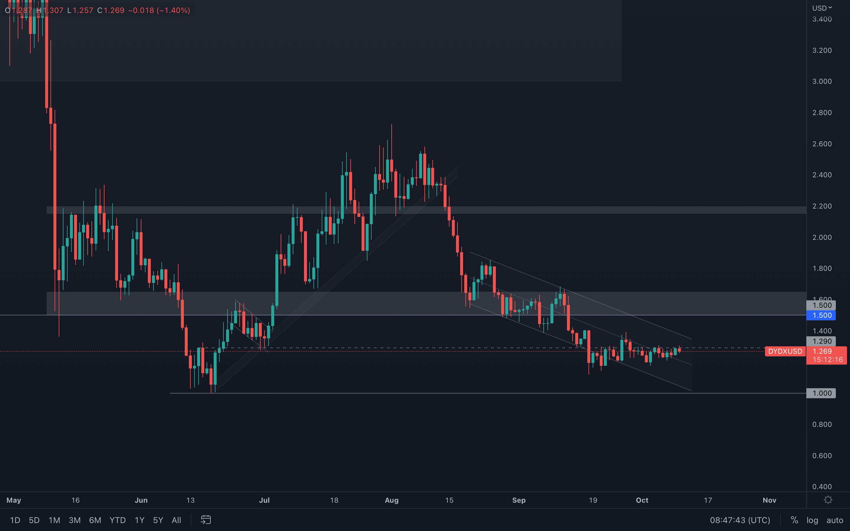
However, if we dive into the daily timeframe, we can see that a descending channel is formed and dYdX is still trading inside it. If we were to visit $1.50 anytime soon, this channel needs to be broken which at the current time is debatable.
dYdX (Daily)
Summary
The above report can be summarised that Bitcoin and Ether are trading in “value” ranges which historically have proven to be good long-term buying opportunities. However, with the macro and geopolitical headwinds that may arise, it’s possible that prices may trade lower still. It can therefore be said that current prices warrant a partial dollar-cost averaging strategy, assuming the time horizon is 1 year plus.Recommended from Cryptonary